Welcome to a new macOS tutorial! In previous posts we talked about table views and outline views as means to display collections of data in a structured way. Both present quite common behaviour and they’re close to the way they’re being handled. However, these are not the only Cocoa controls provided for managing collections of data. There’s another one quite important too; the collection view.
If you’re coming to macOS from iOS, then the concept of the collection view is not unknown to you. However, collection views on macOS have one fundamental difference. They do not use cells to present data. What they use is collection view items (NSCollectionViewitem objects). Simply put, items are actually plain NSView objects with some “extras” that make them work with collection views. The way a collection view is handled along with the items though is quite similar to table views, outline views, even collection views on iOS. There are still delegate and datasource methods to implement, there’s still the concept of creating and reusing an item (instead of dequeue it’s called makeItem), number of sections, items per section, and so on.
So, in this post we’re going to meet all that, plus some more common scenarios that interact with collection views. I don’t know if you were expecting to deal with cells once again here, but in my opinion the use of items makes working with collection view easier. In any case, come along in the following parts, and you’ll find both familiar and new stuff to read about!
Demo App Overview
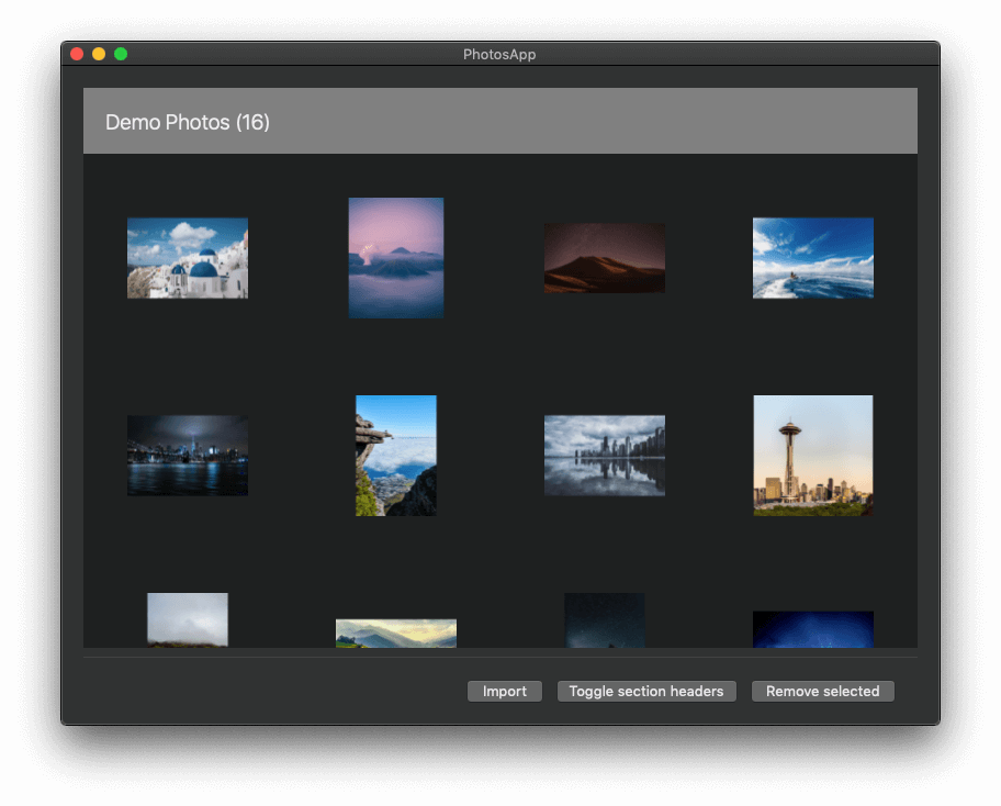
The best example one can show when talking about collection views is something that provides collections of data that will make collection views’ concepts easy to be understood. And what’s better than… photos? We all have photos in our computers, so it’s going to be easy for everyone to find sample data to use with the demo app we’ll be building here.
Now that you know that we’re about to build a small photos app, there’s a starter project for you to download and open in Xcode. Before I get into a few details about it, let me tell you that it’s the first one in the series of our tutorials that was made in Xcode 11. Inevitably, expect to find some differences in Xcode’s UI, but that’s not a reason to worry about; in any case I’m including graphic representations (screenshots) of the various actions that have to be done, especially in Interface Builder.
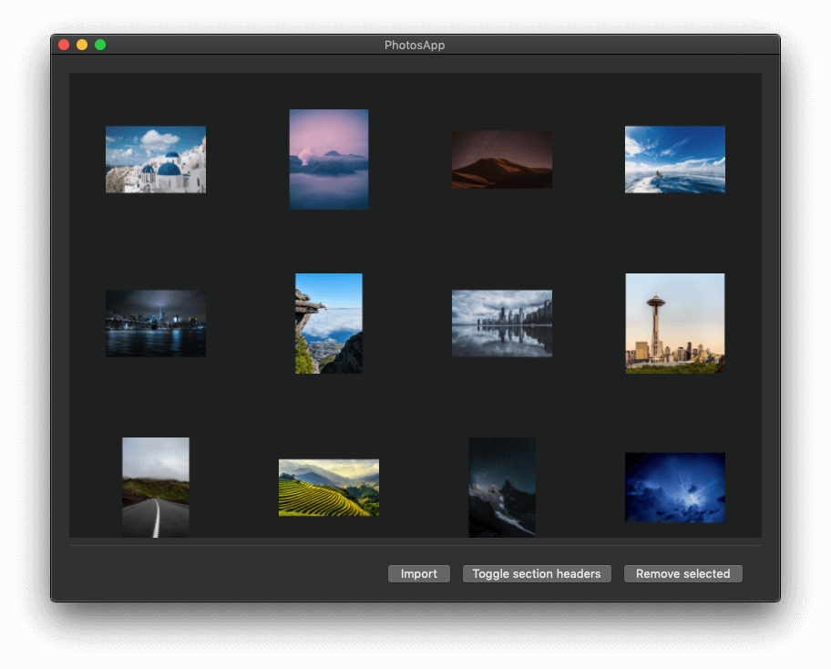
On the starter project now, there are a lot of things you’ll find implemented. Starting from the user interface (UI), most of it is ready, with the missing parts being only the collection view and the collection view items implementation. The app offers three buttons to perform the following actions that include work with the collection view:
- Import photos.
- Show and hide section headers.
- Remove selected items.
The collection view’s data source is going to be an array named photos. It’s already declared along with some more properties in the ViewController class, and it’s a two dimensional array. Each inner array in the photos collection contains items of a custom type called PhotoInfo (included in the project). Such an object represents a photo in the app and it has two properties: A URL for each photo’s actual URL, and a NSImage for the resized version (thumbnail) of each photo.
Based on the fact that photos collection contains other arrays as its items, it’s becoming obvious that our collection view is going to have multiple sections. Section headers won’t be functioning from the beginning, but we’ll deal with that later in the tutorial. Even though we won’t talk about section footers, I can tell you from now that they are being handled in the same fashion you’ll see for headers. The starter project includes two files related to section headers, HeaderView.swift and HeaderView.xib file, and both of them implement the header views that will be shown in the collection view. I provide them already prepared as they have nothing new to add to the learning process; it’s like creating a custom view.
All photo-related tasks are being processed by a class that’s also provided implemented in the starter project, called PhotoHelper. It does all the heavy work for us; from loading the URLs of photo files in a selected folder, to resizing the actual photos and creating thumbnails of them. Note that it wouldn’t be reasonable to present the original photos in the collection view; it would take up lots of resources, even GBs of RAM memory to present a bunch of photos in high resolution. And since the resizing process might be slow in case of selecting a folder with several photos in it, there’s a progress bar that indicates the overall progress of the thumbnail making.
One of the things we’ll meet in this post is how to deal with double click actions on collection view items. I won’t go to details on that right now as we’ll go through the process, but all I can tell at this point is that when double-clicking on a photo the familiar Quick Look panel will show up to present the selected photo.
And with that said, it’s about time to start discussing about collection views. Take your time to explore the starter project if you want, and when you feel like it just keep reading!
Making The App Capable Of Loading Photos
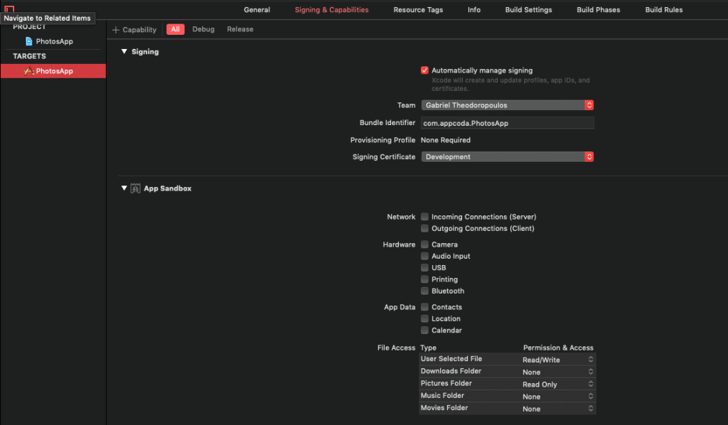
By default a macOS app is sandboxed and it cannot read or write files to any folder that does not belong to it. In the demo app of this tutorial we need to have access to folders that contain photos, and to make that happen there’s a specific process we should follow.
In Xcode select the project in the Project Navigator and click on the Signing & Capabilities tab. In the bar right below the tabs there’s a button on the left titled + Capability. Click on it, and in the window with the various capabilities that appears, double click on the App Sandbox. A new section will appear in front of you. Here you can choose which resources and folders app will have access to. Generally speaking, don’t allow permissions if your app doesn’t need them. Enable only what’s necessary to make your app functioning properly.
Since we’re talking about photos, quite probably you’ll want to allow access to the Pictures folder on your Mac. In the File Access Type section, click on the Pictures Folder popup and select the Read Only access. We won’t save any photos there, we don’t need write permissions. Also, open the User Selected File popup and select the Read/Write option (required to avoid crashes).
The above changes are written in the PhotosApp.entitlements file which you can find in the Project Navigator along with the rest of the project files.
Creating A Collection View
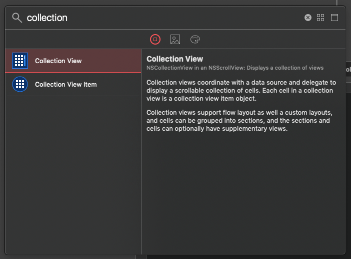
Let’s get started by opening the Main.storyboard file and by revealing the window and view controller in Interface Builder. As the most part of the user interface already exists, here we’ll focus on the missing parts only. The first thing we need to do is to add a collection view control, and we’ll do that by clicking on the Library button on Xcode’s toolbar.
In the window that will pop up, start typing the term “collection” (without the quotes) so objects in library to be filtered out. Once you find the Collection View control, drag and drop it to the view controller’s view.
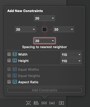
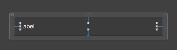
Time to set its constraints. Set 20px to Top, Leading and Trailing, and 8px to Bottom as shown next:
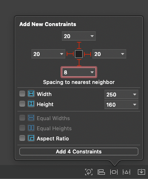
Here’s what you should end up with:
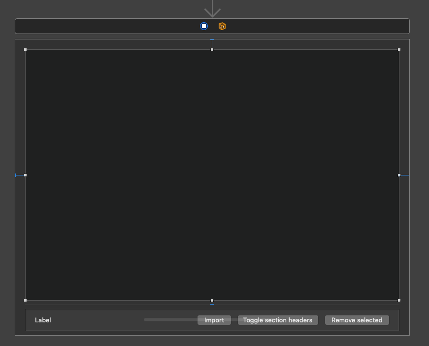
Go to the Document Outline pane now, and expand the Bordered Scroll View > Clip View until the Collection View object is revealed (or just double click in the collection view control). Similarly to other Cocoa controls we met in previous macOS tutorials, the collection view is contained into a clip view, which in turn is contained into a scroll view. So, never be sure that you’ve actually selected the collection view itself when clicking on it; always check out the Document Outline to be sure!
Collection View Attributes
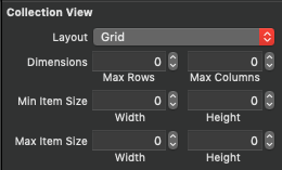
With the collection view selected, open the Inspectors pane and go to the Attributes inspector. You’ll find a few properties you can configure there. The first property you’ll meet is the layout of the collection view. By default, the Flow layout is selected, and right below there are several text fields where you can specify the details of it. You can also set the scroll direction by choosing Vertical or Horizontal in the respective popup button. The default option is Vertical, which means that if there are enough elements to make the collection view scrollable, scrolling will be up and down to the vertical axis.
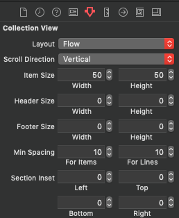
The layout-related text fields you see here can also be found if you expand the Collection View object in the Document Outline and you select the Collection View Flow Layout element. By doing so, in the Attributes inspector you can set the scrolling direction. Layout details can be set in the Sizes inspector.
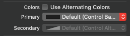
Back to the collection view object itself and in the Attributes inspector. Besides the layout fields, there are also options for setting the background color of the collection view and whether alternating colors will be applied to the collection view’s items. To do so, just check the Use Alternating Colors check box and set the primary and secondary colors right below. Note that if the color you apply has no effect, then you should check if the container controls (clip view and scroll view) are not drawing their own background colors. That’s something you can check in the Attributes inspector as well by selecting either the clip view or the scroll view on the Document Outline.
What you’ll probably find more interesting are the Selection options. There are three check boxes there:
- Selectable: Check that check box to allow selecting items in the collection view. If that’s turned off, selecting displayed items on the collection view will have no effect.
- Allows Empty Selection: By default it’s checked, and it means that it’s not required to have any item selected in the collection view. If it’s off, then at least one item should be always selected.
- Allows Multiple Selection: Quite obvious; turn it on to allow multiple item selections simultaneously.
The above three properties can be also configured in code, and we’ll do so in the next part.
A Few More Things On Layout
Before we continue, let’s discuss a little bit more about the collection view layout. As I said right before, the default layout is set to Flow automatically. However, if you click on the Layout popup button you’ll find more options:
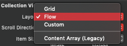
What you’ll never need is the Content Array (Legacy), and unless you subclass the NSCollectionViewFlowLayout or the NSCollectionViewGridLayout class to customize the layout, you don’t need the Custom option either. Actually, even in that case you can skip setting your custom layout here as you can do it programmatically as well.
The only other option (besides Flow) that remains is the Grid layout style. By using it, items of the collection view will be displayed as a grid. Use the provided text fields in the Attributes inspector to specify the layout details.
And here’s a small secret: Forget what you just read in the previous line!
Even though any Flow layout settings made in the Attributes inspector have effect in the collection view, settings made for the Grid layout do not!
So, if you want to apply a grid layout to the collection view, there’s one way only; to do it programmatically. Generally speaking, it’s always a better idea to configure and set the layout programmatically than doing it in Interface Builder. And for the purposes of this tutorial, we’ll see how to do that for both flow and grid layout.
An IBOutlet Property To Connect
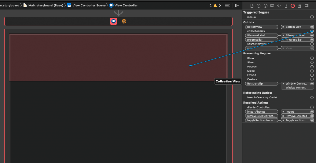
In the ViewController class there’s an IBOutlet property already declared for the collection view named (what else) collectionView. Now it’s time to connect the collection view control to that outlet property. To do that easily, select the View Controller object either on the canvas, or in the Document Outline (it’s the blue icon in the bar above the view controller’s view). Then, open the Connections inspector and locate the collectionView outlet. Click and drag until the mouse is above the collection view, then release. The connection will be made.
Creating A Collection Item
On the contrary to the collection views in iOS (UICollectionView), collections views on macOS do not have cells; they have items. An item is an instance of the NSCollectionViewItem class. However, creating and using items is quite similar to creating and using cells, and apart from a couple of particularities, you’ll find the entire process quite straightforward.
To start creating a new collection view item go to menu File > New > File… or simply press Cmd + N on your keyboard. In the templates window that will appear, choose the Cocoa Class template and click Next.
In the step that follows:
- Set the NSCollectionViewItem as the value of the Subclass of: field.
- Name the class PhotoItem.
- Select to check the Also create XIB file for user interface check box. By doing so an accompanying XIB file will be created along with the PhotoItem.swift file.
Click Next when you’re done. Finally, click on the Create button to let Xcode create the two files.
Designing The Item’s UI
Let’s get started with the PhotoItem.xib file where we’ll design the UI for our collection view item. Follow the next steps:
- Select the view you’ll find in the canvas, and open the Sizes inspector in the Inspectors pane. Resize it to 150x150px.
- Click on the Library and search for an image view object (just type “imageview”). Once you find it, drag and drop it onto the view.
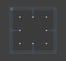
- With the image view selected, set the Top, Leading, Trailing and Bottom constraints to 20px.
This is what you should be seeing right now in the Interface Builder:
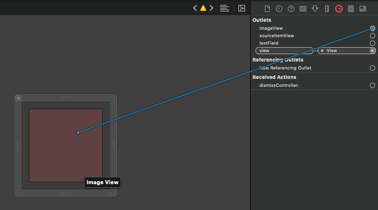
This image view should be connected to an IBOutlet property so we can access it programmatically and set an image to it. Before we do that, click on the File’s Owner object in the Document Outline and then in the Identity inspector in the Inspectors pane. You’ll see that the PhotoItem has been automatically set as the class of the File’s Owner object.
That’s really convenient, as the File’s Owner object is gets some additional properties from the NSCollectionViewItem (the parent of the PhotoItem). An image view IBOutlet property is among them. Click on the Connections inspector to find all outlets provided automatically. See that there’s an outlet property for the view in the XIB file which is already connected! There’s also a text field property which can be useful in other cases as well. For now, click on the circle on the right side of the image view property, and drag to the image view object inside the view to make the connection.
Even though the File’s Owner class has been automatically set to PhotoItem, this XIB is still not representing a collection view item. An additional action is required for that: To add a collection view item object. To do so:
- Click on the Library button and type “item”.
- In the results there is a Collection View Item object. Drag and drop it to the Document Outline pane.
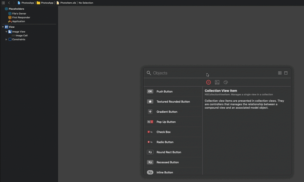
Once you have it, click on it and open the Identity inspector in the Inspectors pane. In the Class field type PhotoItem. Open the Attributes inspector, and in the Title field type “photoItemIdentifier” (without the quotes). What we just managed is to indicate that this XIB file represents a collection view item, we related it to the PhotoItem class, and we assigned to it a unique identifier so we can refer to it later on programmatically.
Preparing Item’s Selected State
Switch to the PhotoItem.swift file now to add a few bits of code. To explain what we’ll do here, it’s necessary for you to know that when selecting an item in a collection view, there’s no visual selection indication to show that. An item doesn’t show whether it’s selected or not when it’s clicked. So, in this part we’re going to take care of that by doing something really simple:
When the item is selected, we’ll be changing the background color of the view (the view in the PhotoItem.xib file) to the highlight color chosen in the Mac’s settings:
When the item gets deselected, we’ll set the background color of the item to clear.
Background colors in Cocoa views are drawn in their layers, but views have no layers by default. So, the first thing we have to do is to indicate that our view “wants” to use a layer. We can round the corners a bit as well. Add the following line to the viewDidLoad() method:
|
1 2 3 4 5 6 7 |
override func viewDidLoad() { super.viewDidLoad() // Do view setup here. view.wantsLayer = true view.layer?.cornerRadius = 8.0 } |
The view property is the IBOutlet automatically connected to the view in the PhotoItem.xib file.
Next, we need to determine when the view is selected or not, and to change the background color accordingly. NSCollectionViewItem class provides a property named isSelected that indicates that state exactly, and we’ll override it here so we can perform the custom actions we want each time its value gets changed.
Go after the closing curly bracket of the viewDidLoad() and add the following:
|
1 2 3 4 5 6 7 8 9 10 11 |
override var isSelected: Bool { didSet { super.isSelected = isSelected if isSelected { view.layer?.backgroundColor = NSColor.selectedControlColor.cgColor } else { view.layer?.backgroundColor = NSColor.clear.cgColor } } } |
The above code does what exactly I described right before. The collection view item is ready for now, so let’s go to configure the collection view. Note that a collection view item like this one can contain any custom code or logic you need, not just a way to indicate whether it’s selected or not.
Configuring The Collection View
So, open the ViewController.swift file where we’ll write almost all of our remaining code in this project. Our starting point will be the definition of a new method in the ViewController class:
|
1 2 3 |
func configureCollectionView() { } |
The first thing we have to do is to set the ViewController class as the delegate and datasource of the collection view:
|
1 2 |
collectionView.delegate = self collectionView.dataSource = self |
Don’t worry about the error messages that Xcode will show; will fix them soon.
Next, we’ll set the properties that we already met in the attributes of the collection view in Interface Builder. Keep in mind that it’s not necessary to set them in both places; if you do that in IB, then there’s no need to do it in code. If you do it in code, don’t do it in IB.
|
1 2 3 |
collectionView.isSelectable = true collectionView.allowsEmptySelection = true collectionView.allowsMultipleSelection = true |
Another useful property that most probably you will want to set is this:
|
1 |
collectionView.enclosingScrollView?.borderType = .noBorder |
With it we define the border type of the scroll view that contains the collection view. When we’ll make this app functioning, go and change the noBorder value to other provided values and see what the effect will be.
The above are the properties that you’ll be changing most commonly. On top of them, I encourage you to check out other properties (or methods) the NSCollectionView class provides through the Xcode’s autosuggestion (just type collectionView.) and read the documentation on whatever you find interesting and I haven’t included here.
Lastly, and that’s really important and necessary, we must register the collection view item we created in the previous part so it’ll be used by the collection view. Here’s how it’s done:
|
1 2 |
let nib = NSNib(nibNamed: "PhotoItem", bundle: nil) collectionView.register(nib, forItemWithIdentifier: NSUserInterfaceItemIdentifier(rawValue: "photoItemIdentifier")) |
The above method accepts two arguments: A NSNib object that represents the XIB file that contains the collection view item, and the item’s identifier as a NSUserInterfaceItemIdentifier object.
The two lines shown above can be combined in one line only:
|
1 |
collectionView.register(NSNib(nibNamed: "PhotoItem", bundle: nil), forItemWithIdentifier: NSUserInterfaceItemIdentifier(rawValue: "photoItemIdentifier")) |
In addition to that, the second argument of the register(_:forItemWithIdentifier:) method is something that we’re going to need again shortly. So, instead of writing multiple times:
|
1 |
NSUserInterfaceItemIdentifier(rawValue: "photoItemIdentifier") |
Why not to create a property in the ViewController class with it and then simply access it?
Go to the beginning of the ViewController class in the section with the declarations of the various properties. Add this:
|
1 |
let photoItemIdentifier: NSUserInterfaceItemIdentifier = NSUserInterfaceItemIdentifier(rawValue: "photoItemIdentifier") |
Then, return to the configureCollectionView() method and update the register(_:forItemWithIdentifier:) similarly to this:
|
1 |
collectionView.register(NSNib(nibNamed: "PhotoItem", bundle: nil), forItemWithIdentifier: photoItemIdentifier) |
Much better, since the photoItemIdentifier is something that we’re going to need again.
The configureCollectionView() method should now look like this:
|
1 2 3 4 5 6 7 8 9 |
func configureCollectionView() { collectionView.delegate = self collectionView.dataSource = self collectionView.isSelectable = true collectionView.allowsEmptySelection = true collectionView.allowsMultipleSelection = true collectionView.enclosingScrollView?.borderType = .noBorder collectionView.register(NSNib(nibNamed: "PhotoItem", bundle: nil), forItemWithIdentifier: photoItemIdentifier) } |
Of course, do not forget to call it. That will happen in the viewDidLoad() method:
|
1 2 3 4 5 |
override func viewDidLoad() { ... configureCollectionView() } |
Specifying The Layout Style
The basic properties for the collection view are set, and the item to use has also been registered. Now, let’s take care of the layout style that the collection view should use. We’ll start by configuring a flow layout instance in a new method:
|
1 2 3 |
func configureFlowLayout() { let flowLayout = NSCollectionViewFlowLayout() } |
Next, let’s set the mimunim spacing among items in the horizontal axis:
|
1 |
flowLayout.minimumInteritemSpacing = 30.0 |
The above says that even if the window gets resized and becomes smaller, the distance between two items horizontally won’t go less than 30px. Items that won’t fit will move to the next line. Of course, that distance can be increased if the window becomes big enough so items are laid out to cover the available space horizontally.
With the same logic, we’ll define the minimum distance among lines:
|
1 |
flowLayout.minimumLineSpacing = 30.0 |
The last two properties define the spacing among items both horizontally and vertically. However, they do not define any padding between items and the collection view sides. To change that, we can set the sectionInset property:
|
1 |
flowLayout.sectionInset = NSEdgeInsets(top: 20.0, left: 20.0, bottom: 20.0, right: 20.0) |
With the above line, items will be 20px away from each side of the collection view. Also, sections will have the same distance among them.
There’s also another property called itemSize. It can be used to specify the size of the items in the collection view:
|
1 |
flowLayout.itemSize = NSSize(width: 150.0, height: 150.0) |
However, we won’t use it here, we’ll set the item size later in a delegate method. So, just don’t add this line.
Finally, once the flow layout configuration is finished, we have to assign it to the collection view:
|
1 |
collectionView.collectionViewLayout = flowLayout |
Here’s how the configureFlowLayout() should look now:
|
1 2 3 4 5 6 7 |
func configureFlowLayout() { let flowLayout = NSCollectionViewFlowLayout() flowLayout.minimumInteritemSpacing = 30.0 flowLayout.minimumLineSpacing = 30.0 flowLayout.sectionInset = NSEdgeInsets(top: 20.0, left: 20.0, bottom: 20.0, right: 20.0) collectionView.collectionViewLayout = flowLayout } |
This method must be invoked somewhere. Go to the configureCollectionView() and right after all existing statements add this:
|
1 2 3 4 5 |
func configureCollectionView() { ... configureFlowLayout() } |
Using A Grid Layout
Even though flow layout is usually the must-go solution in collection views, let me show you fast how you can use the grid layout instead. What we just did right before regarding the flow layout is pretty much what we also do to set up a grid layout. So, at first we need to initialize a NSCollectionViewGridLayout object, and then to set values to a few properties. We already met a couple of them:
|
1 2 3 4 5 6 |
func configureGridLayout() { let gridLayout = NSCollectionViewGridLayout() gridLayout.minimumInteritemSpacing = 30.0 gridLayout.minimumLineSpacing = 30.0 } |
In a grid layout you can limit the number of visible columns and rows, but in most cases that’s not going to be suitable. However, here’s how to do it if you ever need so:
|
1 2 3 4 5 6 |
func configureGridLayout() { ... gridLayout.maximumNumberOfColumns = 3 gridLayout.maximumNumberOfRows = 2 } |
I said previously that setting the item size in the flow layout configuration wasn’t necessary. However, in grid layout it is. Here you have the option to set a minimum and maximum size for the presented items. For simplicity here, we assign the same size to both:
|
1 2 3 4 5 6 |
func configureGridLayout() { ... gridLayout.minimumItemSize = NSSize(width: 150.0, height: 150.0) gridLayout.maximumItemSize = NSSize(width: 150.0, height: 150.0) } |
Of course, do not forget to assign the layout to the collection view:
|
1 2 3 4 5 |
func configureGridLayout() { ... collectionView.collectionViewLayout = gridLayout } |
There’s no section inset to set here, the layout will be shown “stuck” to the top left side of the window.
In the configureCollectionView() method you can call the configureGridLayout() as we did with the configureFlowLayout(). However, I would recommend to keep it commented out at first and wait until we finish with the app preparation. Once the app works properly with the flow layout, then switch to grid and play around with it to find out its pros and cons.
Implementing Datasource methods
With the collection view and the flow layout being configured, let’s proceed to the implementation of the minimum required data source methods. For that purpose, we’ll create the following ViewController extension after the closing of the ViewController class:
|
1 2 3 |
extension ViewController: NSCollectionViewDataSource { } |
As said in the beginning of this post, the photos array is going to be providing the data displayed on the collection view. Each item in this array is another array that will be containing PhotoItem objects (see the PhotoInfo.swift file). Such an object has two properties only, one for the URL of the source file of a photo, and one for the thumbnail image (a NSImage object) of the photo.
Each inner array in the photos collection represents photos loaded from a specific folder on the computer. In collection view, the number of inner arrays specify the number of sections that the collection view should show. And with that, let’s implement the first data source method:
|
1 2 3 |
func numberOfSections(in collectionView: NSCollectionView) -> Int { return photos.count } |
Next, it’s necessary to indicate how many items each section in the collection view is going to have. This is the number of PhotoItem objects in each inner array of the photos collection:
|
1 2 3 |
func collectionView(_ collectionView: NSCollectionView, numberOfItemsInSection section: Int) -> Int { return photos[section].count } |
Finally, there’s one more data source method required to be implemented. In it we must either create or reuse a collection view item that will display the actual photo for any given index path of the collection view:
|
1 2 3 |
func collectionView(_ collectionView: NSCollectionView, itemForRepresentedObjectAt indexPath: IndexPath) -> NSCollectionViewItem { guard let item = collectionView.makeItem(withIdentifier: photoItemIdentifier, for: indexPath) as? PhotoItem else { return NSCollectionViewItem() } } |
The makeItem(withIdentifier:for:) method above is the one that does the job. It’s the equivalent of dequeueing a cell in table views. But here we don’t have cells, we have items. It accepts the item identifier and the index path as arguments, and either initializes a new PhotoItem object, or it reuses a previously created one.
Note the following:
- The item identifier is the
photoItemIdentifierproperty we added earlier to theViewControllerclass. Remember that it’s not a String value, but aNSUserInterfaceItemIdentifierobject. makeItem(withIdentifier:for:)method returns aNSCollectionViewItemobject, so we manually need to cast to aPhotoItemobject.- If doing the above fails, then we return just an initialized collection view item since the method requires a return value.
If things go well and the item object above is successfully initialized, we assign the thumbnail image of the matching PhotoInfo object to the item’s image view, and then we just return that item:
|
1 2 |
item.imageView?.image = photos[indexPath.section][indexPath.item].thumbnail return item |
See how the index path’s section and item properties are being used to access the proper PhotoInfo object.
Note: All the above should look easy and familiar to you if you have prior experience on table views.
Here’s the last data source method all together:
|
1 2 3 4 5 |
func collectionView(_ collectionView: NSCollectionView, itemForRepresentedObjectAt indexPath: IndexPath) -> NSCollectionViewItem { guard let item = collectionView.makeItem(withIdentifier: photoItemIdentifier, for: indexPath) as? PhotoItem else { return NSCollectionViewItem() } item.imageView?.image = photos[indexPath.section][indexPath.item].thumbnail return item } |
We’ll come back later here to add one more data source method regarding the section headers. For now, however, we’re done with the data source methods.
Implementing Delegate Methods
Similarly as before, we are going to define another extension of the ViewController class for the few delegate methods we’ll implement:
|
1 2 3 |
extension ViewController: NSCollectionViewDelegateFlowLayout { } |
Notice that we adopt the NSCollectionViewDelegateFlowLayout protocol instead of the NSCollectionViewDelegate. By doing that we’ll be accessing the delegate methods we want, plus a few more regarding the size of the items in the flow layout of the collection view.
With the following delegate method the ViewController class is being notified when an item is clicked:
|
1 2 3 |
func collectionView(_ collectionView: NSCollectionView, didSelectItemsAt indexPaths: Set<IndexPath>) { } |
For the demonstration purposes, we’ll be displaying the file name of the matching photo to a label called filenameLabel (it already exists in the starter project). We’ll ignore multiple selections if that’s the case, and we’ll show only the file name of the first item selected.
The following code gets the first index path of the indexPaths Set:
|
1 |
guard let indexPath = indexPaths.first else { return } |
Next, we’ll try to get the matching photo’s file name from its URL in the PhotoInfo object. If that fails, we’ll assign an empty string as the displayed value to the filenameLabel:
|
1 2 |
guard let url = photos[indexPath.section][indexPath.item].url else { filenameLabel.stringValue = ""; return } filenameLabel.stringValue = url.lastPathComponent |
In the above code, lastPathComponent property will give the actual file name along with the extension. If for example the URL is “file:///some/url/to/photo.png”, the above will give the “photo.png” only.
Here’s the above delegate method in one piece:
|
1 2 3 4 5 6 |
func collectionView(_ collectionView: NSCollectionView, didSelectItemsAt indexPaths: Set<IndexPath>) { guard let indexPath = indexPaths.first else { return } guard let url = photos[indexPath.section][indexPath.item].url else { filenameLabel.stringValue = ""; return } filenameLabel.stringValue = url.lastPathComponent } |
Note: The optional unwrapping taking place in the second guard statement could have been written in the first guard. However, we’ll keep that way for demonstration and educational purposes of the tutorial.
With the next delegate method we are actually specifying the size of each item in the collection view. This is what collection view will respect when it’s time to render an item. It doesn’t really matter how big or small we make the item when designing it, like in the PhotoItem.xib.
|
1 2 3 |
func collectionView(_ collectionView: NSCollectionView, layout collectionViewLayout: NSCollectionViewLayout, sizeForItemAt indexPath: IndexPath) -> NSSize { return NSSize(width: 150.0, height: 150.0) } |
Even though there’s a bunch of methods provided by the NSCollectionViewDelegateFlowLayout protocol, for now we’ll stick to the above two. We’ll come back later to add one more regarding the section headers, but besides that I invite you to take the time and explore what other methods exist.
Creating Photo Thumbnails And Updating The Collection View
The collection view is now fully configured, so we can move forward to other aspects of the app that have to do with the collection view and perform actions on it. If you run the app right now and you click on the import button, you’ll see an open panel showing up to choose a folder with photos, however when you click on its Open button nothing happens.
The reason for that is that the body of the createThumbnails() method is missing, even though that method has been defined in the ViewController class. It’s called in the importPhotos(_:) IBAction method, after the URLs to the photos of the selected folder have been gathered. Take a look to importPhotos(_:) for details on what it’s doing exactly.
Note: We’ll work in the createThumbnails() method, but our purpose is not to implement the code that will do what the name of the method says. In fact, all that code is already implemented in the starter project. What we’ll be doing is to call other methods that do the actual job, and focus on the interaction with the collection view while original photos are being resized and the thumbnail creation task is in progress.
With the above said, go to the createThumbnails() method where the first step is to access the last collection of PhotoInfo objects that was inserted to the photos array:
|
1 2 3 |
func createThumbnails() { guard let recentPhotos = photos.last else { return } } |
Next, we’ll prepare the user interface for the thumbnail creation process. In particular, we’ll hide all controls lying to the bottom side of the view (the buttons along with the file name label), and we’ll make visible a progress bar that will show the progress of the task. All these steps are already implemented in the following method:
|
1 2 3 4 5 |
func createThumbnails() { ... prepareToCreateThumbnails(for: recentPhotos.count) } |
The number of imported photos given as an argument above is necessary for configuring the progress bar properly (see the prepareToCreateThumbnails(for:) method).
Next, we’ll start a task in the background that will perform the thumbnail creation. PhotoHelper class implements all photo-related functionality and there’s no point to get into details. Here, we’ll call the following method using the shared instance of the PhotoHelper class:
|
1 2 3 4 5 6 7 8 9 |
func createThumbnails() { ... PhotoHelper.shared.createThumbnails(for: recentPhotos, desiredSize: thumbnailSize, progress: { (currentPhoto) in }) { () in } } |
What we provide to the above method is the collection of the most recent PhotoInfo objects and the size of the thumbnails we desire. Then, there are two closures to implement. The first one is called each time a photo is being processed, while the second is the completion handler that notifies the method when thumbnail creation is finished.
In the first closure we’ll do the following: For every 20 photos processed, we’ll be getting the created thumbnails and we’ll be updating the collection view (we’ll reload its data). Also, we’ll automatically scroll towards bottom every time a new set of thumbnails is being displayed. All these will happen on the main thread of the app; it’s UI we’re dealing with here:
|
1 2 3 4 5 6 7 8 9 10 11 12 13 14 15 16 17 18 19 |
func createThumbnails() { ... PhotoHelper.shared.createThumbnails(for: recentPhotos, desiredSize: thumbnailSize, progress: { (currentPhoto) in DispatchQueue.main.async { self.updateProgress(withValue: currentPhoto) if currentPhoto.isMultiple(of: 20) { self.getProcessedPhotos() self.collectionView.reloadData() self.collectionView.enclosingScrollView?.contentView.scroll(to: NSPoint(x: 0.0, y: self.collectionView.collectionViewLayout?.collectionViewContentSize.height ?? 0.0)) } } }) { () in } } |
Here’s what’s going on here:
updateProgress(withValue:)updates the progress bar.isMultiple(of:)is the new way in Swift to check if a number is divided perfectly with another. It’s the equivalent tocurrentPhoto % 20 == 0, where when that’s true then we know that 20 more thumbnails have been processed.getProcessedPhotos()method gets thePhotoInfoobjects for which thumbnails have been created from thePhotoHelpershared instance.- The collection view is being reloaded with the
self.collectionView.reloadData()and it’s similar to reloading data to table views. - The last line shows the technique to scroll the collection view to bottom. See that once again we’re using the
enclosingScrollViewproperty of the collection view for accessing its scroll view.
In the second closure we’ll do pretty much the same but with the following differences:
- We won’t update the progress bar – the task is finished.
- We’ll revert the UI, meaning that we’ll show the controls to the bottom and we’ll hide the progress bar.
Here we go:
|
1 2 3 4 5 6 7 8 9 10 11 12 13 14 |
func createThumbnails() { ... PhotoHelper.shared.createThumbnails(for: recentPhotos, desiredSize: thumbnailSize, progress: { (currentPhoto) in ... }) { () in DispatchQueue.main.async { self.getProcessedPhotos() self.performPostThumbnailCreationActions() self.collectionView.reloadData() self.collectionView.enclosingScrollView?.contentView.scroll(to: NSPoint(x: 0.0, y: 0.0)) } } } |
The new thing here is the performPostThumbnailCreationActions() method which is responsible for restoring the UI. Also, we’re scrolling the collection view to top so users don’t have to manually do that for seeing the first photo.
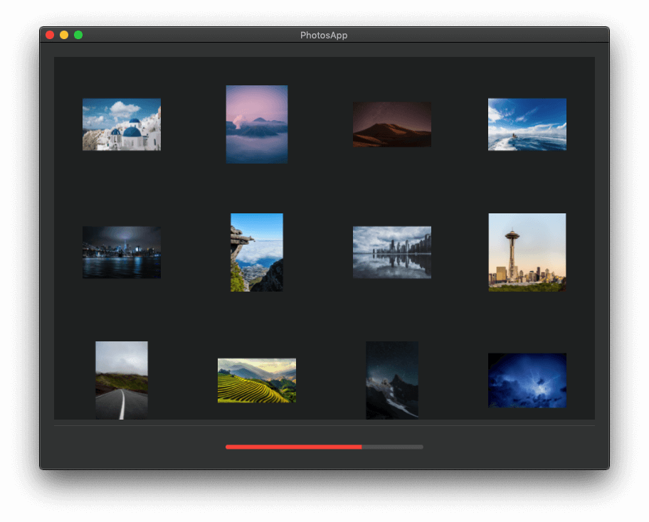
Run the app now and click on the Import button to choose a folder with photos. Click Open and you’ll see how thumbnails are being displayed while original photos are being resized, how the collection view scrolls to bottom or to top, and how the progress bar reports the actual progress of the task. In addition, click on any imported photo to see its name in the file name label, and try to select multiple photos as well! If you try to import more photos, new sections will be created in the collection view; remember that each selected folder of photos matches to an inner array in the photos collection.
Removing Photos
You’ll need quite often to remove items from a collection view. And this can be done by removing first the respective data source items in the data source array. In our demo application here we have a button for removing selected photos, and it’s connected to the removeSelectedPhotos(_:) IBAction method which is still empty.
The initial step before trying to remove anything is to check if there are selected items actually to remove. If not, there’s nothing to do. Here’s how we check if a collection view has selected items:
|
1 2 3 4 5 |
@IBAction func removeSelectedPhotos(_ sender: Any) { if collectionView.selectionIndexPaths.count > 0 { } } |
selectionIndexPaths represents a Set with the index paths of items that are being currently selected in the collection view. Those index paths are not ordered in the selectionIndexPaths set. Usually their order matches to the order the selection was made. However that’s not convenient for us. We need to remove the corresponding objects from the inner arrays in the photos collection, and we risk to have “out of bounds” exceptions by deleting random objects at random indexes. The best approach to avoid crashes would be to start from the end and move to the beginning of each array.
Based on that, let’s get an array with the elements of the selectionIndexPaths set ordered in a descending order:
|
1 |
let sortedSelectedIndexPaths = collectionView.selectionIndexPaths.sorted(by: >) |
The “>” as argument in the sorted(by:) methods dictates the descending order.
Now we can remove the actual PhotoInfo items from any inner array in the photos collection safely:
|
1 |
sortedSelectedIndexPaths.forEach { photos[$0.section].remove(at: $0.item) } |
And here’s a new collection view method that deletes items specified by a set of index paths like the selectionIndexPaths one:
|
1 |
collectionView.deleteItems(at: collectionView.selectionIndexPaths) |
Run the app now and select one, multiple, or even all photos to delete. It’ll work just fine!
Note: If you consider that the ordering of the index path as an unneeded step, then replace the first two statements above with the next one:
|
1 |
collectionView.selectionIndexPaths.forEach { photos[$0.section].remove(at: $0.item) } |
Then run the app and select all photos after you import them (you can press Cmd + A). Click on the Remove selected button. If you have several photos imported, most likely the app will crash. When the app will try to remove a PhotoInfo object to an index greater than an index that had been already removed, an “out of bounds” exception will be raised. The size of the array is smaller than the index of the position where the app tries to remove an element from.
Back to our normal flow again, there’s a small problem with the above code. If all objects from one or more inner arrays in the photos collection are deleted, then these arrays will remain empty in the photos collection. Even if you import the deleted photos again, new arrays of PhotoInfo items will be created for them. The previous ones will still remain empty. Let’s fix that.
By reverse traversing the photo arrays now, we’ll check the size of each inner array. If we find any with zero elements in it, then we’ll just remove it. Here it is:
|
1 2 3 4 5 6 |
for (index, _) in photos.enumerated().reversed() { if photos[index].count == 0 { photos.remove(at: index) collectionView.reloadData() } } |
Lastly, there’s a small cherry we’ll put on the cake. If a selected photo whose file name is being displayed on the file name label gets deleted, that name will remain visible even though the matching photo no longer exists. Fixing that is as easy as it’s shown next:
|
1 |
filenameLabel.stringValue = "" |
Finally, the entire removeSelectedPhotos(_:) IBAction method is this:
|
1 2 3 4 5 6 7 8 9 10 11 12 13 14 15 16 |
@IBAction func removeSelectedPhotos(_ sender: Any) { if collectionView.selectionIndexPaths.count > 0 { let sortedSelectedIndexPaths = collectionView.selectionIndexPaths.sorted(by: >) sortedSelectedIndexPaths.forEach { photos[$0.section].remove(at: $0.item) } collectionView.deleteItems(at: collectionView.selectionIndexPaths) for (index, _) in photos.enumerated().reversed() { if photos[index].count == 0 { photos.remove(at: index) } } filenameLabel.stringValue = "" } } |
As you realize, there are a bit more things to consider when it’s about time to remove items from a collection view.
Showing Section Headers
Even though we can import photos to the app from multiple folders and create several sections in the collection view that way, it’s still not easy to see where a section ends and another starts. To work around that, we can display either section headers or footers. Both of them are views that appear on top or to the bottom of a section respectively. They have a special name, they are called supplementary views, but they are simple NSView objects. In this post we are going to create section headers, but the steps we’ll see right next are pretty much the same for footers.
The first thing we need for showing a section header is a view. This view can be created either in Interface Builder (a .xib file), or in code. For simplicity we’ll use a .xib file here, and to speed up things for us you will find a file named HeaderView.xib, and its counterpart HeaderView.swift in the starter project. Both these files implement the header view that we’ll show in the collection view.
Start by opening the HeaderView.xib file. You’ll see a view with a label in it. In this label we’ll be displaying the path to the source folder of the photos in a section, along with the total number of photos currently existing in the section.
The label has been connected to an IBOutlet property in the HeaderView.swift file. Also, the HeaderView class has been set as the class of the view in the Identity inspector in the Inspectors pane.
In the HeaderView.swift file now there’s not much to see. Besides the IBOutlet property I just said about, there’s a small implementation that sets the view’s background color to gray.
Providing Header View Content
Now that we’ve gone through the files that implement the section header view, it’s time to make collection view use them. For starters, go to the ViewController extension where we implement the data source (NSCollectionViewDataSource) methods. We need one more method here that will set the value of the header view label:
|
1 2 3 |
func collectionView(_ collectionView: NSCollectionView, viewForSupplementaryElementOfKind kind: NSCollectionView.SupplementaryElementKind, at indexPath: IndexPath) -> NSView { } |
The first step is to ask from collection view to create a supplementary view as shown next:
|
1 |
guard let view = collectionView.makeSupplementaryView(ofKind: NSCollectionView.elementKindSectionHeader, withIdentifier: NSUserInterfaceItemIdentifier(rawValue: "HeaderView"), for: indexPath) as? HeaderView else { return NSView() } |
Note that in case of a footer, the first argument would have to be NSCollectionView.elementKindSectionFooter. The second argument is an identifier, and like other identifiers we’ve seen in this and previous tutorials, it’s a NSUserInterfaceItemIdentifier object. The value provided to it is the name of the class that implements the header view, in our case “HeaderView”. The above method returns a NSView object, so casting to HeaderView is necessary.
As I said a bit earlier, the label in the header view will be showing the name of the origin folder of the photos shown in a section. We don’t keep that anywhere, but it’s included in the url property of each PhotoInfo object in the inner arrays of the photo collection. So, why not to take it from the first PhotoInfo item in the array that matches to the section pointed by the index path?
There are two things to check: First, if the array matching to a collection view section contains items; second, if the url property of the first item isn’t nil. The following guard statement does that:
|
1 |
guard photos[indexPath.section].count > 0, let url = photos[indexPath.section][0].url else { return NSView() } |
The local url property now contains the URL to the first photo in the section indicated by the index path. A URL is in this form: “file:///path/to/folder/photo.png”. The first goal is to get rid of the “photo.png” and we do that as follows:
|
1 |
url.deletingLastPathComponent() |
deletingLastPathComponent() method returns a new URL object without the last component which is the file name with the extension. On that new URL we want to get the last part (the “folder” in the above example). URL class has a property for that:
|
1 |
url.deletingLastPathComponent().lastPathComponent |
lastPathComponent not only returns the last part of the URL, but it’s also a String value. Now that we know how to get the folder name of the photos in the section, let’s compose the content of the label in the header view:
|
1 |
view.label.stringValue = url.deletingLastPathComponent().lastPathComponent + " (\(photos[indexPath.section].count))" |
In the folder name we append a space character and the total photos in the matching array in parentheses. All this is assigned to the stringValue property of the label.
Finally, we must return the header view:
|
1 |
return view |
The method which we just implemented step by step is responsible for showing the content of the label on each section in the collection view. Right next it’s given again in one piece:
|
1 2 3 4 5 6 7 8 |
func collectionView(_ collectionView: NSCollectionView, viewForSupplementaryElementOfKind kind: NSCollectionView.SupplementaryElementKind, at indexPath: IndexPath) -> NSView { guard let view = collectionView.makeSupplementaryView(ofKind: NSCollectionView.elementKindSectionHeader, withIdentifier: NSUserInterfaceItemIdentifier(rawValue: "HeaderView"), for: indexPath) as? HeaderView else { return NSView() } guard photos[indexPath.section].count > 0, let url = photos[indexPath.section][0].url else { return NSView() } view.label.stringValue = url.deletingLastPathComponent().lastPathComponent + " (\(photos[indexPath.section].count))" return view } |
Header View Size
If you scroll to the beginning of the ViewController class in Xcode, you’ll find a property called showSectionHeaders with an initial value set to false:
|
1 |
var showSectionHeaders = false |
This flag plays no role so far, it’s just declared to the class. It’s going to start having a meaning right next, where we’ll specify the height of the header view. And the meaning will be this:
When showSectionHeaders is false, then section header height will be zero and no headers will be visible. When it’s true, then the height for the headers will be a non-zero value. But where is this height specified?
Go to the second ViewController extension where we implement the delegate methods of the collection view. This time we’ll define this one:
|
1 2 3 |
func collectionView(_ collectionView: NSCollectionView, layout collectionViewLayout: NSCollectionViewLayout, referenceSizeForHeaderInSection section: Int) -> NSSize { } |
The above method must return a size (NSSize) for the header view. The width that is given to that size is not taken into account, therefore it can be set to zero (it’ll take the width of the collection view automatically). But the height matters. It’s generally a good idea to provide the same height you use when designing the header view in the XIB file. In the HeaderView.xib file the view is 60.0px high, so we’ll use that here too.
Besides all that, the logic we’ll follow in this method is simple: If showSectionHeaders is true we’ll return a NSSize value with height of 60.0px. If it’s false, we’ll return a zero size:
|
1 2 3 4 5 |
if showSectionHeaders { return NSSize(width: 0.0, height: 60.0) } else { return .zero } |
The above if statement is simple and it can be written in one line only using the turnary operator:
|
1 |
return showSectionHeaders ? NSSize(width: 0.0, height: 60.0) : .zero |
So, here’s the one-liner method:
|
1 2 3 |
func collectionView(_ collectionView: NSCollectionView, layout collectionViewLayout: NSCollectionViewLayout, referenceSizeForHeaderInSection section: Int) -> NSSize { return showSectionHeaders ? NSSize(width: 0.0, height: 60.0) : .zero } |
Toggling Section Headers
Even though the collection view is now supporting section headers, there’s still no way to make them visible because we don’t change the value of the showSectionHeaders flag. No need to worry however; we’re a couple of lines away from that.
In the user interface of the app there’s a third button we haven’t worked with yet, titled Toggle section headers. This button is connected to the toggleSectionHeaders(_:) IBAction method and you can find it in the ViewController class. We’ll add the following two lines:
|
1 2 3 4 |
@IBAction func toggleSectionHeaders(_ sender: Any) { showSectionHeaders = !showSectionHeaders collectionView.reloadData() } |
The above makes the showSectionHeaders true when it’s false, and vice versa. By reloading the collection view, we actually force it among other things to “read” again the size of the section header views, and headers will get the correct height by doing that.
Run the app and try what we just did out! After you import photos to the app, use the Toggle section headers button to show and hide the section headers.
Handling Double Click
The last thing we’re going to see in this post is how to handle double click events happening on collection view items, and how to react on them.
Let’s start with a fact: There’s no direct way to detect double click events. That means that a developer should come up with custom solutions to make an app “understand” when double clicks are happening.
The usual approach to that is to observe for mouse down events in the implementation of the collection view item (aka PhotoItem class here), and then propagate this information to the class that implements the collection view. To see how this can be done, open the PhotoItem.swift file and override the following method:
|
1 2 3 4 |
override func mouseDown(with event: NSEvent) { super.mouseDown(with: event) } |
Note that the above method is called every time a mouse click is happening on an item, no matter if it’s single or double click. The event parameter value has a property named clickCount that contains the information of how many clicks took place on the item. We can determine if a double click happened like this:
|
1 2 3 |
if event.clickCount == 2 { } |
What you’ll do in the body of the above if statement it’s up to you. You can use delegation pattern to notify the class that implements the collection view about the double click, notifications (NSNotificationCenter), or closures. The last one is what we’ll use here. First, declare the following property in the PhotoItem class:
|
1 |
var doubleClickActionHandler: (() -> Void)? |
Then call it in the body of the if statement:
|
1 2 3 4 5 6 |
override func mouseDown(with event: NSEvent) { super.mouseDown(with: event) if event.clickCount == 2 { doubleClickActionHandler?() } } |
Back in the ViewController class we need to implement the doubleClickActionHandler closure. We’ll do that in the place where collection view items are being initialized; in the collection(_:itemForRepresentedObjectAt:) data source method.
Locate the following line:
|
1 |
item.imageView?.image = photos[indexPath.section][indexPath.item].thumbnail |
Right after that, and before returning the item object from the method add the following lines:
|
1 2 3 4 |
item.doubleClickActionHandler = { [weak self] in self?.previewURL = self?.photos[indexPath.section][indexPath.item].url self?.configureAndShowQuickLook() } |
The above shows a double-clicked photo to a Quick Look window. Being more detailed, the previewURL is a property declared in the ViewController class, and the purpose of its existence is to keep the URL to the actual file of a double-clicked photo. This URL is then used by the Quick Look panel that’s being configured and presented in the configureAndShowQuickLook() method.
Run the app again and double click on any photo you want. You’ll see that the selected photo is opening in the Quick Look just like if you did so in the Finder. Note that the Quick Look implementation I’m providing in the starter project doesn’t support the opening of multiple files, so even if you have multiple photos selected the clicked one is what Quick Look will show.
Summary
Finally, we made it to the end of this post. What we met in all previous parts is all you need in most cases when working with collection views on macOS. Of course, there are aspects left untouched, but it’s impossible to present everything in one simple tutorial. I hope that it was made obvious that treating collection view items instead of cells has no great difference, and that’s easier sometimes to work with items than cells. Feel free to improve the demo app we built here, and explore even more new possibilities of collection views. In any case, thanks for reading, and we’ll see you soon again with another cool topic on macOS programming!
For reference, you can download the complete project on GitHub.
Credits: Images shown in sample screenshots are a courtesy of Pexels!

Gabriel has been a software developer for almost about two decades and he’s got long experience in programming using various languages. iOS development is what he’s being doing since 2010. On top of that, he’s added macOS programming to his repertoire over the last few years. Using Swift of course! Follow Gabriel at Google+ and Twitter.