Create Grid Layout Using UICollectionView in iOS 6
Do you still remember the Recipe app that we have worked on several months ago? At that time, we showed you how to display a list of recipes using UITableView. Wouldn’t be great if it can display the recipe in a nice grid view?
The iOS 6 SDK introduces a new class called UICollectionView that allows developers to create grid-like layout out of the box.
If you have no idea about grid-like layout, just take a look at the built-in Photos app. The app presents your photos in grid format. In the pre-iOS 6 world, you have to write lots of code or make use of other libraries in order to build a similar layout. The UICollectionView, in my opinion, is the most spectacular API in iOS 6. Not only it simplifies the way to arrange visual elements in grid layout, it even lets developers customize the layout (e.g. circular, cover flow style layout) without changing the data.
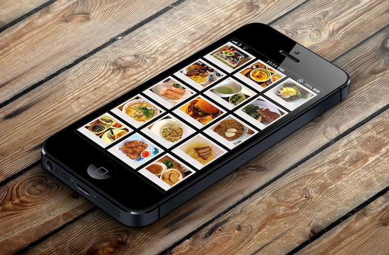
In this tutorial, we will build a simple app to display a collection of recipe photos in grid layout. Here are what you’re going to learn:
- Introduction to UICollectionView
- How to Use UICollectionView to build a simple Grid-based layout
- Customizing the Collection Cell Background
UICollectionView Basics
The UICollectionView operates in a similar way to UITableView. While UITableView manages a collection of data items and displays them on screen in a single-column layout, the UICollectionView class offers developers flexibility to present items using customizable layouts. By default, the SDK comes with a UICollectionViewFlowLayout class that organizes items into a grid with optional header and footer views for each section.
The UICollectionView class manages an ordered collection of data items and presents them using customizable layouts. Collection views provide the same general function as table views except that a collection view is able to support more than just single-column layouts. Collection views support customizable layouts that can be used to implement multi-column grids, tiled layouts, circular layouts, and many more. You can even change the layout of a collection view dynamically if you want.
The UICollectionView is composed of several components:
- Cells – instances of UICollectionViewCell. Like UITableViewCell, a cell represents a single item in the data collection. The cells are the main elements organized by the associated layout. If a UICollectionViewFlowLayout is used, the cells are arranged in a grid-like format.
- Supplementary views – Optional. It’s usually used to implement the header or footer views of sections. (We’ll cover this in the next tutorial)
- Decoration views – think of it as another type of supplementary view but for decoration purpose only. The decoration view is unrelated to the data collection. We simply create decoration views to enhance the visual appearance of the collection view. (We’ll cover this in the next tutorial)
Create Simple App with Grid Layout
To better understand how UICollectionView work, let’s get some hand-on experience and build a simple app. Open Xcode and create a new project using the “Single View application” template. Name the project as “RecipePhoto” with “Use Storyboard” and “Use Automatic Reference Count” enabled.

RecipePhoto – New Xcode Project
Designing the Collection View
Go to Storyboard and delete the default view controller. Instead, add a Collection View Controller from object library.

Add a Collection View Controller
In the “Size Inspector” of the Collection View, you can change various size-related attributes. Let’s alter the size of the cell and change it to 100 by 100 pixels.

Change the size of Collection View Cell
Next, select the Collection View Cell and set the identifier as “Cell” in the Attribute Inspector.

Cell Reuse Identifier
Then, add an Image View to the cell. Xcode automatically resizes the image view and make it fit into the cell. In the “Attribute Inspector”, set the tag value to 100 for later reference.

Add Image View to Cell
Coding the Collection View
In Project Navigator, right-click and select “New File”. Create a new class that is a subclass of UICollectionViewController and name it as RecipeCollectionViewController.

Create RecipeCollectionViewController
Go back to Storyboard and assign it as the custom class of the Collection View Controller.

Assign RecipeCollectionViewController as the custom class
As said, the UICollectionView operates in a very similar way to UITableView. To populate data in UITableView, we have to implement two methods defined in the UITableViewDataSource protocol. Much like the UITableView, the UICollectionViewDataSource protocol defines data source methods for providing the data of the collection view. At least, you have to implement the collectionView:numberOfItemsInSection: and collectionView:cellForItemAtIndexPath: methods.
Let’s move on to code the RecipeCollectionViewController class. First, download this image pack, unzip it and add all the images into the Xcode project.
In RecipeCollectionViewController.m, declare an array for the image files:
|
1 2 3 |
@interface RecipeCollectionViewController () { NSArray *recipePhotos; } |
And initialize it in viewDidLoad method:
|
1 2 3 4 5 6 7 8 |
- (void)viewDidLoad { [super viewDidLoad]; // Initialize recipe image array recipeImages = [NSArray arrayWithObjects:@"angry_birds_cake.jpg", @"creme_brelee.jpg", @"egg_benedict.jpg", @"full_breakfast.jpg", @"green_tea.jpg", @"ham_and_cheese_panini.jpg", @"ham_and_egg_sandwich.jpg", @"hamburger.jpg", @"instant_noodle_with_egg.jpg", @"japanese_noodle_with_pork.jpg", @"mushroom_risotto.jpg", @"noodle_with_bbq_pork.jpg", @"starbucks_coffee.jpg", @"thai_shrimp_cake.jpg", @"vegetable_curry.jpg", @"white_chocolate_donut.jpg", nil]; } |
Next, implement the two mandatory methods of UICollectionViewDataSource protocol:
|
1 2 3 4 5 6 7 8 9 10 11 12 13 14 15 |
- (NSInteger)collectionView:(UICollectionView *)collectionView numberOfItemsInSection:(NSInteger)section { return recipeImages.count; } - (UICollectionViewCell *)collectionView:(UICollectionView *)collectionView cellForItemAtIndexPath:(NSIndexPath *)indexPath{ static NSString *identifier = @"Cell"; UICollectionViewCell *cell = [collectionView dequeueReusableCellWithReuseIdentifier:identifier forIndexPath:indexPath]; UIImageView *recipeImageView = (UIImageView *)[cell viewWithTag:100]; recipeImageView.image = [UIImage imageNamed:[recipeImages objectAtIndex:indexPath.row]]; return cell; } |
The collectionView:numberOfItemsInSection: method returns the number of recipe images. The cellForItemAtIndexPath: method provides the data for the collection view cells. We first define a cell identifier and then request the collectionView to dequeue a reusable cell using that reuse identifier. In iOS 6, you no longer need to create the cell manually. The dequeueReusableCellWithReuseIdentifier: method will automatically create a cell or return you with a cell from re-use queue. At last, we get the image view by using the tag value and assign it with a recipe image.
Now compile and run the app. You should have a grid-based photo app.

RecipePhoto App with Grid-based Layout
Customizing the Collection Cell Background
Isn’t UICollectionView great? With a few lines of code, you can create a grid-based photo app. But what if you want to add a picture frame to the photos? Like other UI elements, the design of the collection view cell lets developers customize the background easily. The UICollectionViewCell is actually comprised of three different views including background, selected background and content view. It’s best to illustrate the cell views using a picture:
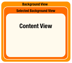
- Background View – background view of the cell
- Selected Background View – the background view when the cell is selected. When user selects the cell, this selected background view will be layered above the background view.
- Content View – obviously, it’s the cell content.
We have already used the content view to display the recipe photo. We’ll make use of the background view to show the picture frame. In the image pack you downloaded earlier, it includes a file named “pic_frame.png”, which is the picture frame. The size of the frame is 100 by 100 pixel. In order to frame the recipe photo, we’ll first resize the image view of cell and re-arrange its position.
Go to Storyboard and select the image view. Set X to 5 and Y to 8. The width and height should be changed to 90 and 72 pixels respectively.

Resize image view to fit into the photo frame
In the cellForItemAtIndexPath: method of RecipeCollectionViewController.m, add the following line of code:
|
1 |
cell.backgroundView = [[UIImageView alloc] initWithImage:[UIImage imageNamed:@"photo-frame.png"]]; |
We first load the photo frame image and set it as the cell background. Now compile and run the app again. Your app should look like this:

RecipePhoto App with Photo Frame
What’s Coming Next
Cool, right? That’s why I said the UICollectionView is a great addition in iOS 6 SDK. In this tutorial, we just explore the basics of the class and using the default grid-based layout (i.e. UICollectionViewFlowLayout). By developing custom layout, you can organize the collection of data in coverflow style or even more stylish format.
In later tutorials, we’ll further talk about the decoration view, supplementary view and show you how to create your own layout. If you’ve followed our Recipe App tutorial, try to modify the app and convert it to use UICollectionView.
For your complete reference, you can download the full source code here. As always, leave us comment and share your thought about the tutorial.

Founder of AppCoda. Author of multiple iOS programming books including Beginning iOS Programming with Swift and Mastering SwiftUI. iOS App Developer and Blogger. Follow me at Facebook, Twitter and Google+.
Comments
 Việt Coding
AuthorNice tutorial ! But it’s if run on iOS < 6.0 ?
 Simon Ng
AuthorNo, UICollectionView is available on iOS 6 only. If you want to create a similar layout, you may check out this open source library:
https://github.com/steipete/PSTCollectionView
 Osvaldo Cipriano
AuthorHow can we make the photo to display in a new window and also pass them with the finger to the next one. Also with double click to make zoom.
 napolux
AuthorCopyright suggestion: polaroid owns the copyright for the bordered picture with more “white” at bottom. Avoid using this in your app, it could be rejected. http://www.pcworld.com/article/197976/App_Store.html
 _Mac
_Mac
AuthorGood point! But I belive it’s enough to just make the white background color a bit gray (or any other color than white), right?
 Toby
Toby
Authoranother fantastic tutorial, this is my favorite ios resource, great, easy to understand tutorials!
keep making these tuts!!!! thanks
 Joe G
Joe G
AuthorI would like to be a me to click on the collection cell and have a full size view of the image. How would I go about it? Love your tutorials!!
 _Mac
_Mac
Author+1
 Wouter
AuthorI just managed to do this, piecing together what we learned in previous tutorials! Allow me to write you a mini tutorial for it, since I am trying to impress Simon so he will do next tutorials on using web services as I asked in another comment 🙂
Anyway, the steps:
– first you need to make sure to embed your collection view in a ‘navigation controller’ by clicking it and then in the menu choose Editor > embed in > navigation controller. This enables you to use segues.
– then add a new View Controller on your storyboard. CTRL-drag from the collectionview cell to that new view controller and select ‘push’ as segue. Click the segue thingie and give it the identifier ‘displayDetail’.
– in your file navigator, rightclick and do ‘new file…’, Chose Objective C class, name it RecipeDetailView Controller and make it a subclass of UIViewController. Go Back to the storyboard, and of that latest view, change the class from the default ‘UIViewController’ to your ‘RecipeDetailViewController’ (creating this sub class because we will want to add an image property to it!).
– In storyboard, drag an image view on your detail view. Switch to ‘assistant editor’ mode in the top right, and control-drag that imageview to RecipeDetailViewController.h, so it will create the new IBOutlet UIImageview property thingie. Give it a name like ‘imageview’, and make sure there is an @synthesize imageview; in the RecipeDetailViewController.m.
– to assure that we will be able to set the image from that imageview from another class (we will set it in the segue like Simon did in a previous tutorial): also add @property (nonatomic, strong) bigimage; to your RecipeDetailViewController.h, and the corresponding @synthesize bigimage; in the RecipeDetailViewController.m
– now you can configure that necessary prepareForSegue method in RecipeCollectionViewController.m. Make sure there is an #import “RecipeDetailViewController.h” at the top, and then add a function like this, completely analogous to the ‘passing data between views with a segue’ tutorial:
– (void)prepareForSegue:(UIStoryboardSegue *)segue sender:(id)sender {
if ([segue.identifier isEqualToString:@”displayDetail”]) {
NSLog(@”Was here”);
NSIndexPath *indexPath = [[self.collectionView indexPathsForSelectedItems] objectAtIndex:0];
DetailViewController *destViewController = segue.destinationViewController;
NSString *imagename = [recipeImages objectAtIndex:indexPath.row];
NSLog(@”Image named: %@ at row %d”, imagename, indexPath.row);
destViewController.bigimage = [UIImage imageNamed:imagename];
}}
– The ‘bigimage’ property of your detailview will now be filled with the correct image that you selected. The last thing to do is to actually show it in that imageview UI object: in RecipeDetailViewController.m, add the following line to the viewDidLoad function:
imageview.image = bigimage;
…
Tataaah, that should do it! If you run your app now and tap one of his images, it should now go to a ‘detail view’ showing a large version of the image.
 Rodrigo
AuthorHi! Thanks for your mini-tutorial.
I think you made a mistake: “also add @property (nonatomic, strong) bigimage;”
@property (nonatomic, strong) UIImage *bigimage;
Thanks again 🙂
 LighthouseRich
AuthorWouter, Thanks for that extra tutorial. I found it very helpful as Simon’s kept crashing for no apparent reason where as your’s seems to do the trick without being overcomplicated.
For other newbies, I picked up slight typo in your code:
Within the segue section the line of code
DetailViewController *destViewController = segue.destinationViewController;
should read:
RecipeDetailViewController *destViewController = segue.destinationViewController;
Thanks again,
Lighthouse Rich.
 _Mac
_Mac
AuthorNice introduction to UICollectionView Simon – thank’s, just what I needed. Clean, simple tutorial with just the basics. That I then can mess around with. Really looking forward to the “customization” tutorials on this 🙂
Q: Do you know if it’s possible to use UIColletionrow to make items scroll horizontially / section? Would make a very nice UI for apps w different categories and subitems.
BTW: Found a little typo in your tutorial…
In the interface you create the iVar “NSArray *recipePHOTOS;” but in the viewDidLoad you initialize “recipeIMAGES = [NSArray arrayWithObjects:@”angry_birds_cake.jpg”…”
 C.H
C.H
AuthorWhen I use tabBarController as project, It will crash.
 Hugh Jeremy
AuthorIt would be great if you could post a tutorial on giving it a detail view for this collection view. I had a go myself but couldn’t get it to work. Thanks
 Simon Ng
AuthorYes, we’ll talk about it later. Stay tuned.
 Wouter
AuthorFYI for those here looking for the same: I wrote in another comment a bit below a fairly detailed explanation of how to do just this, using only the stuff that we already learned here!
 LittlePeculiar
AuthorGreat starter for me. thanks
 Pattyla Patty
AuthorHey, how to create (tab bar+collection)–>navigation–>tableView–> viewController by storyboard or code only?
 Simon Ng
AuthorBoth will work. But for beginner, it’s easier to use Storyboard to embed a view controller into a navigation controller / tab bar controller. First, select the view controller you want to embed in Storyboard. From the Xcode menu, select Editor -> Embed in -> Navigation Controller / Tab Bar Controller.
We have written a Tab Bar tutorial some time ago. You can refer to the following link for details:
http://104.131.120.244/storyboard-tutorial-create-tab-bar-controller-and-web-view/
 Pattyla Patty
AuthorTks! no problem for the courses(TabBar+Nav+Table) &(Collection+ViewController/WebView), but my idea app is like yours style https://itunes.apple.com/us/app/tips-tricks-handbook-for-iphone/id463462029?mt=8 ….select a collectionCell–>show a table list –>ViewController(ImageView/webView…) How to write a segue for UICollectionViewCell + UITableViewController
 Mcgvr
Mcgvr
AuthorWhat do you write in the RecipeCollectionViewController.h ?? I cant seem to connect the code with the Storyboard, PLEASE HELP 😀
 Joshua Dance
AuthorYou don’t put anything in the .h file. The important step is to tell the storyboard which class it is. Simon tells you how to do this in the Coding the CollectionView section of the tutorial. If you can’t get it look up how to assign a custom class to the storyboard.
 João Pinho
AuthorGreat tutorial!
How can i make the cell stay always in the center of the collection view?
Thanks!!!
 maxn00b
AuthorHi all, im a complete beginner and i tried to to complete this tutorial but when i run the project it stops at main.m:
return UIApplicationMain(argc, argv, nil, NSStringFromClass([AppDelegate class]));
I don’t get the grid layout and the app crashes in the simulator.
im using Xcode 4.6.1, What am i doing wrong?
Thanks in advance.
 Joshua Dance
AuthorWe would need more info to find your problem. I would try downloading the source code and then compare your project to the working one side by side. You can then see what you did wrong.
 Govind Narayan
AuthorHi,nice tutorial.i need a help.i am creating a sound based app.when person click on grid element a corresponding sound to be played.can you tell me how to get it done?
 art
art
AuthorI get “Unknown receiver ‘collectionView’. Did you mean ‘UICollectionView’?” error at the line that contains “UICollectionViewCell *cell = [collectionView dequeueReusableCellWithReuseIdentifier:identifier forIndexPath:indexPath];”
Anybody have any idea on this error?
 Bruno Paulino
Authorin the method declaration do you have like that?
– (UICollectionViewCell *)collectionView:(UICollectionView *)collectionView cellForItemAtIndexPath:(NSIndexPath *)indexPath
because the collectionView variable was passad in the method argument, and you need a reference to use. maybe the method declaration are diferent in your code.
when I use default DataSources and Delegates, I copy the method declaration in the apple reference.
look this link:
https://developer.apple.com/library/ios/documentation/uikit/reference/UICollectionViewDataSource_protocol/Reference/Reference.html#//apple_ref/occ/intfm/UICollectionViewDataSource/collectionView:cellForItemAtIndexPath:
 npersson
AuthorIf you want IOS 5 support this totorial still works with the PSTCollectionView
 Juan González
AuthorHi, this is a great initiation tutorial for UICollectionView. I have a few questions though. First, why don’t you set the protocols and delegates at the @interface section of the .m file? Also, when I implemented the same example on my app whenever I try to scroll the app crashes with no more output that “(lldb)” and a EXEC_BAD_ACCESS on Thread 1.
Any idea of what could be happening? I’ve checked many times item by item on your code and my implementation and it’s exactly the same.
Thanks again for such a great example!
 Ankit
Ankit
Authornice Tutorial..!!
 k0e3
k0e3
AuthorWhy is it that in UITableView we had to add the protocols UITableViewDelegate and UITableViewDataSource, but here we don’t?
 Anonymous
AuthorThe tutorial with the UITableView used a ViewController but here it starts off as a CollectionViewController instead of a ViewController with a CollectionView on it.
 DoctorCobweb
Authoralso, since we are subclassing UICollectionViewController it implicitly implies that the controller adheres to the UIControllerViewDataSource protocol (even though you dont see the typical thing in the .h file)
 Abilash
AuthorI used your code. In the UICollectionview, is there any way to limit the number
of rows in section to 1 row per section. I kept multiple images under
one section. but these images are equally divided and kept under section
in some ‘n’ rows. My requirement is to keep all the images under one
row and let the user scroll horizontally. Is it possible to limit the
number of rows per section?
 abdullatif
Authornice Tutorial
 Artem
Artem
AuthorHello,
Thank you for this introduction tutorial. It looks very interesting for me (I am totally new to iOS development). I am trying to follow these instructions and was stuck on the following line
recipeImageView.image = [UIImage imageNamed:[recipeImages objectAtIndex:indexPath.row]];
I got the following exception
-[UICollectionViewCell setImage:]: unrecognized selector sent to instance 0x1d0210a0
Probably I missed something but can not see what is wrong.
Could you please advise what should I check (I fixed recipePhotos/recipeImages typo)
 John Kealy
AuthorI have the same issue. Did you manage to fix this on your end?
 raj
raj
AuthorI had this same problem and for the life of me couldn’t figure it out at first. Finally, I realized that I had used the ‘100’ tag for BOTH the CollectionViewCell and the UIImageView. Only the UIImageView should be tagged 100
 Hok Shun Poon
AuthorThe tutorial sets 100 for both the CollectionViewCell and the UIImageView. I unset the one on the CollectionViewCell, but now nothing shows up.
 raj
raj
AuthorI used something else for CollectionViewCell. Can’t remember at the moment, but probably something like 101.
 Elro
Elro
AuthorHello, I have a problem with code when I add this line: recipeImageView.image = [UIImage imageNamed:[recipeImages objectAtIndex:indexPath.row]];the bug is “property image is not found on object of type Array, are we declaring it?
 DoctorCobweb
Authorthere is an error in this tutorial code show here:
1.the declared name of the photos array is NSArray *recipePhotos
but
2. the rest of the tutorial refers to NSArray *recipeImages
so just rename recipePhotos to be recipeImages and it hopefully should work.
 gaztesk
AuthorThanks !!
 sankar ram
AuthorNice Tutorial !!!!! But in here I am Unable to set the Frame Setting of the Cell that you Set here X=0,Y=20& length and width I can’t set the value Please help me in this!!!!!!
 abhi ram
AuthorI am struggling how to use CollectionViewFlowLayout… I need to add Labels dynamically using collection view… I have posted an image below… I want exactly the same layout… Please help me out… I would be very grateful to you…. Thanks in advance….
 sankar ram
AuthorI hope You had follow the Tutorial for UICollectioView Layout UI so to integrate the Grid View With Label and Some other UI elements you have to use UIView in the collection View Cells , Adding those give UI-elements with UICollectionView is Simple .here I given the ScreenShot that to delete the Default viewController in the Storyboard and get the UICollectionView Controller That it!!!!
 Guest
Guest
Authorgreat. thanks for the tutorial.
 cybergenie
AuthorWhen I run this app, it complies without errors but shows blank screen on the simulator. Can anyone suggest what would be the problem.
 DoctorCobweb
Authorit probably means that you have not set the UICollectionViewController to use the custom RecipeCollectionViewController class you wrote.
in the storyboard, click on the UICollectionViewController, then on the right hand side panel click Identity Inspector. then in the Custom Class field select the RecipeCollectionViewController option.
hope that works.
 jagveer
Authorthere is no option to add RecipeCollectionViewController as custom class.. even i added class with name of RecipeCollectionViewController .. can u tell me whats wrong with it???
 abhi ram
AuthorI am struggling how to use CollectionViewFlowLayout… I need to add Labels dynamically using collection view… I have posted an image below…I am adding labels dynamically by using a text field and depending on the width of the string the cell size should be increasing….I am unable to make size of cell…. I want exactly the same layout as shown in below image … Please help me out… I would be very grateful to you…. Thanks in advance….
 abhi ram
AuthorPlease anybody help me out
 Peter
Peter
AuthorThank You.. I always get proper solution from this site. Thanks.
 Yuva Bharathi
Authorits a cool tutorial
 DoctorCobweb
Authorgreat. thanks for the tutorial!
 AJ
AJ
AuthorThat was really helpful and easy to understand, thnx
 BorisYurkevich
AuthorThanks, for the article. Dropbox link to ZIP archive is broken
 Simon Ng
AuthorJust tried the dropbox link again. It works. Would you please try again?
 Francisco Paredes
AuthorHello, this is a great tutorual! I am creating my own app which has a collectionview, within it I have collection cells containing images. When I run the simulator everything runs smoothly and my collectionview has a nice image gallery.
When I try to archive the project and ad-hoc test it on my phone everything works perfectly but the collectionview. All my collection cell images seem to disappear and are replaced with grey blocks. Any suggestions or ideas??
 Iván Ávalos
Author11:11 in the first image. Second in-picture 11:11 in this week.