Pie charts and donut charts are two popular chart types used in data visualization. Prior to iOS 17, if you want to create these types of charts using SwiftUI, you’ll have to build the charts on your own using components like Path and Arc. Previously, we wrote a detailed tutorial on how to implement pie charts and donut charts from scratch. However, in the upcoming release of iOS 17, this is no longer necessary. SwiftUI simplifies the process of creating these charts by introducing a new mark type called SectorMark. This makes it easy for developers to build all kinds of pie and donut charts.
In this tutorial, we will guide you through the process of building pie charts and donut charts using SwiftUI. On top of that, you’ll also learn how to add interactivity to the charts.
To follow the code sample of this tutorial, please make sure you use Xcode 15 (Beta 2 or up).
Revisiting Bar Charts
Let’s start by implementing a simple bar chart using the Charts framework. Assuming you have created a new SwiftUI project, insert the lines of code below to initialize the sample data for the bar chart:
private var coffeeSales = [
    (name: "Americano", count: 120),
    (name: "Cappuccino", count: 234),
    (name: "Espresso", count: 62),
    (name: "Latte", count: 625),
    (name: "Mocha", count: 320),
    (name: "Affogato", count: 50)
]
These are just some random data on coffee sales for chart rendering. For simplicity, I used an array of tuples to hold the data. The Charts framework makes it very easy for developers to create a bar chart from these data.
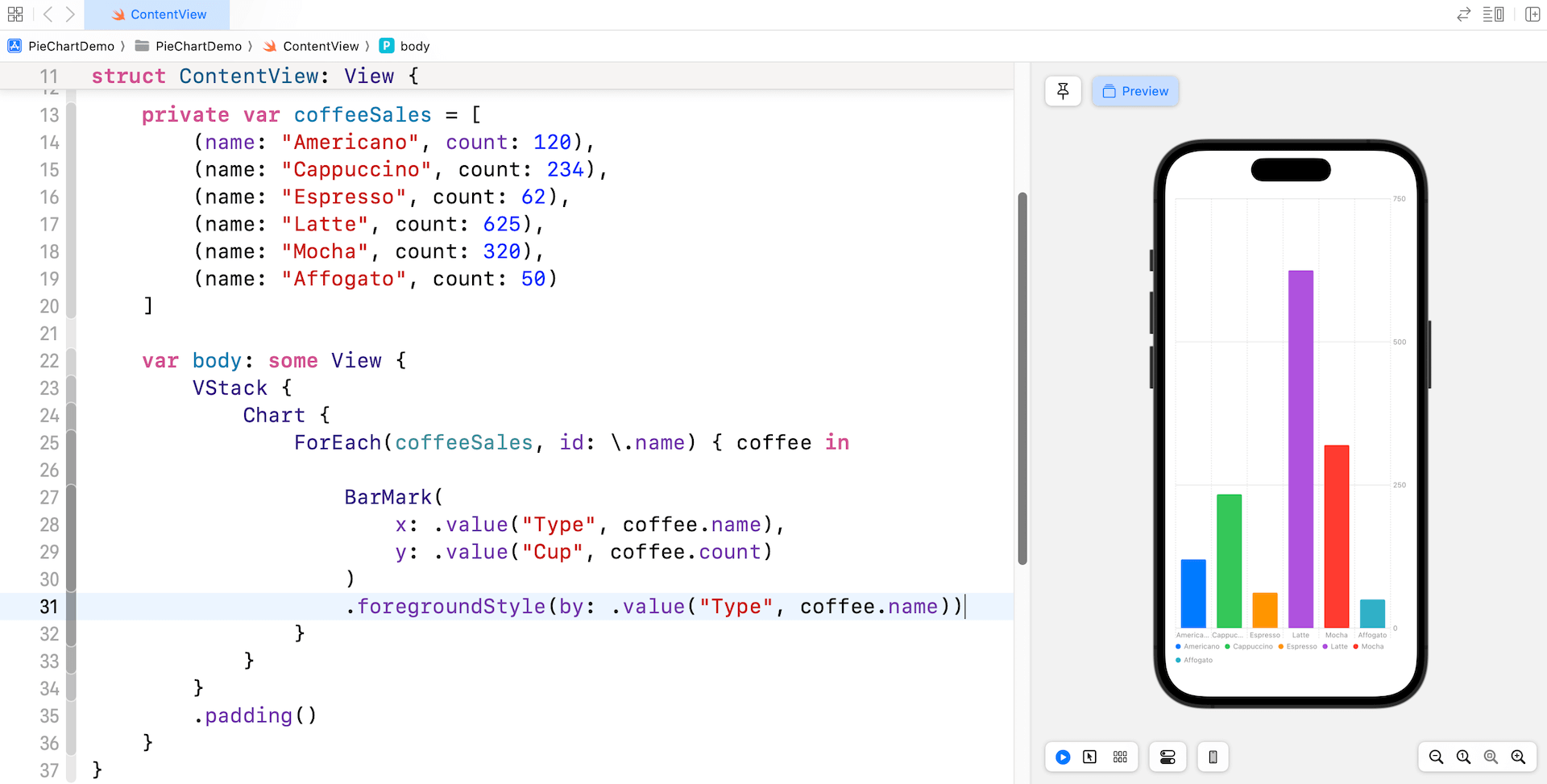
First, import the Charts framework and replace the body part with the following code:
VStack {
    Chart {
        ForEach(coffeeSales, id: \.name) { coffee in
            BarMark(
                x: .value("Type", coffee.name),
                y: .value("Cup", coffee.count)
            )
            .foregroundStyle(by: .value("Type", coffee.name))
        }
    }
}
.padding()
Whether you’re creating a bar chart or a pie chart, it all starts with the Chart view. Within this view, we define a set of BarMark for rendering a vertical bar chart that plots coffee types on the x-axis and counts on the y-axis. The foregroundStyle modifier automatically assigns a unique color for each of the bars.
You can easily create a different type of bar chart by altering some of the BarMark parameters.
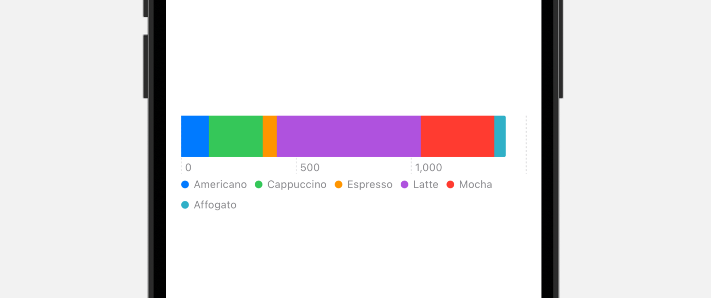
For example, if you want to create a one dimensional bar chart, you just need to provide the values for the x or y axis:
VStack {
    Chart {
        ForEach(coffeeSales, id: \.name) { coffee in

            BarMark(
                x: .value("Cup", coffee.count)
            )
            .foregroundStyle(by: .value("Type", coffee.name))
        }
    }
    .frame(height: 100)
}
.padding()
By default, it shows the accumulated count in the x-axis. If you want to normalized the values, simple specify the stacking parameter for BarMark like this:
BarMark(
    x: .value("Cup", coffee.count),
    stacking: .normalized
)
.foregroundStyle(by: .value("Type", coffee.name))
Creating Pie Charts with SectorMark
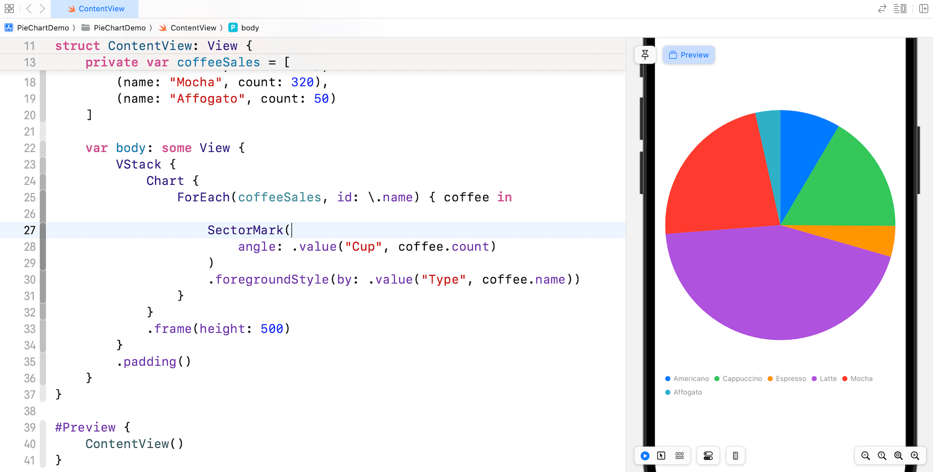
Now that we’ve built a bar chart, let’s how it can be converted to a pie chart using the new SectorMark introduced in iOS 17.
The SectorMark, as the name suggests, represents a sector of the pie chart that corresponds to a specific category. Each SectorMark is defined by the value it represents. By using SectorMark, developers can easily create various types of pie (or donut charts) without having to build them from scratch using components like Path and Arc.
For example, if we want to convert the bar chart into a pie chart, all you need to do is replace BarMark with SectorMark like this:
Chart {
    ForEach(coffeeSales, id: \.name) { coffee in

        SectorMark(
            angle: .value("Cup", coffee.count)
        )
        .foregroundStyle(by: .value("Type", coffee.name))
    }
}
.frame(height: 500)
Instead of specifying the value of x-axis, you pass the values to the angle parameter. SwiftUI will automatically compute the angular size of the sector and generate the pie chart.
Customizing the Pie Chart
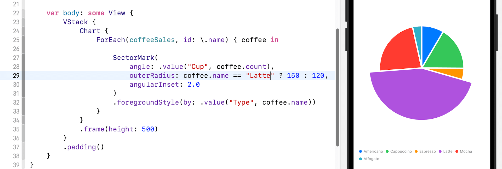
SectorMark comes with a number of parameters for you to customize each of the sectors. To add some spacing between sectors, you can provide the value of angularInset.
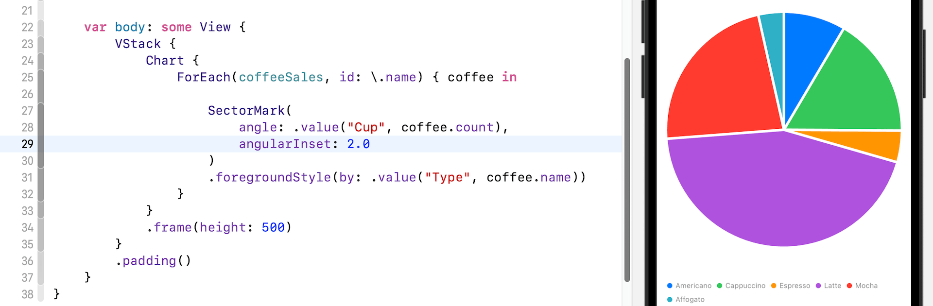
You can control the size of the sectors by specifying a value for the outerRadius parameter. For example, if you want to highlight the Latte sector by making it a bit larger, you can add the outerRadius parameter.
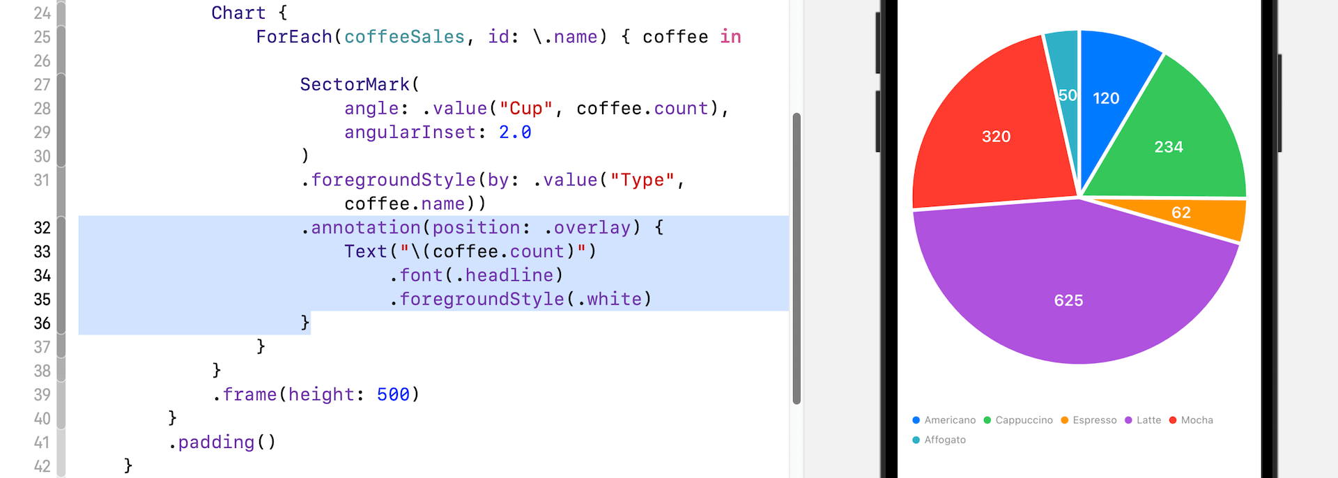
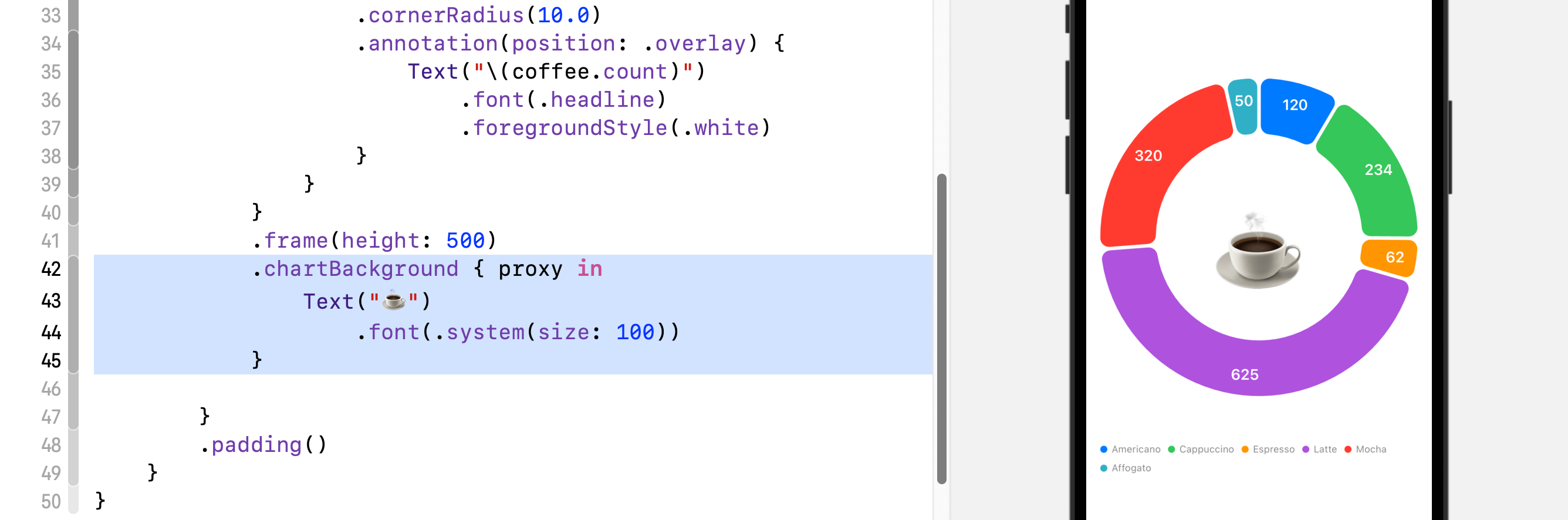
To add a label for each sector, you can attach the annotation modifier to SectorMark and set the position to .overlay:
.annotation(position: .overlay) {
    Text("\(coffee.count)")
        .font(.headline)
        .foregroundStyle(.white)
}
Here, we simply overlay a text label on each sector to display the count.
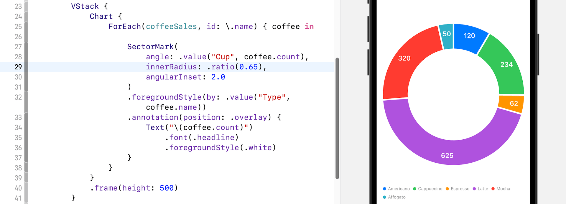
Converting the Pie Chart to Donut Chart
So, how can you create a donut chart? The new SectorMark is so powerful that you just need to add a single line of code to turn the pie chart into a donut chart. There is an optional parameter for SectorMark that I haven’t mentioned before.
To create a donut chart, simply specify the innerRadius parameter of the sector mark and pass it your preferred value:
SectorMark(
    angle: .value("Cup", coffee.count),
    innerRadius: .ratio(0.65),
    angularInset: 2.0
)
The value of innerRadius is either a size in points, or a .ratio or .inset relative to the outer radius. By having a value greater than zero, you create a hole in the pie and turn the chart into a donut chart.
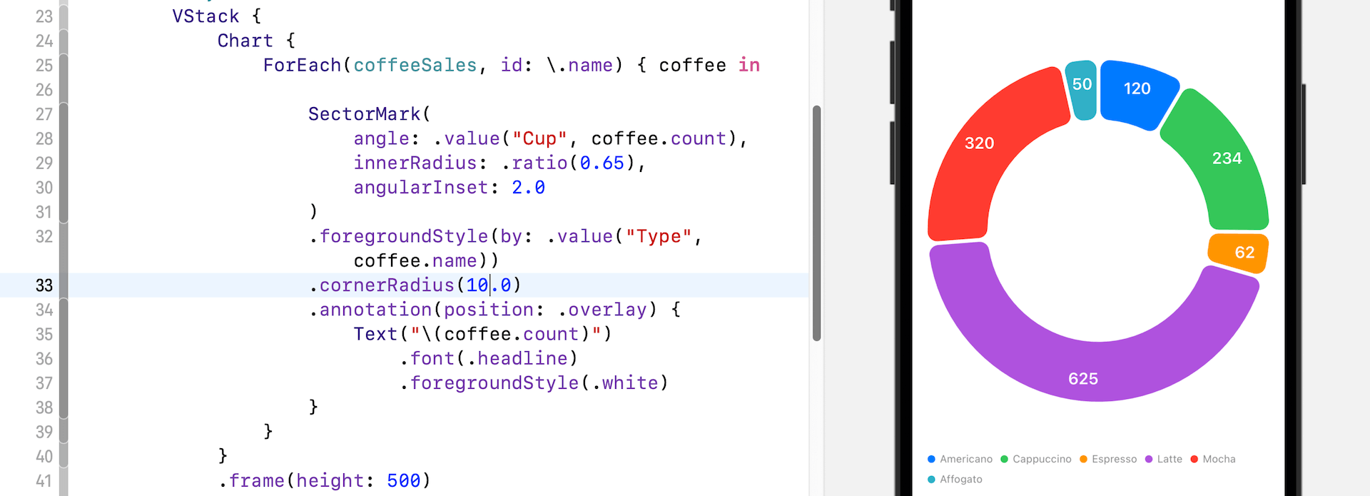
Optionally, you can attach a cornerRadius modifier to the sector marks to round the corners of the sector.
You can also add a view to the chart’s background by attaching the chartBackground modifier to the Chart view. Here is an example.
Interacting with Charts
Other than introducing SectorMark, the new version of SwiftUI comes with new Chart APIs for handling user interactions. For both pie and donut charts, you attach the chartAngleSelection modifier and pass it a binding to capture user’s touches:
@State private var selectedCount: Int?

Chart {

    .
    .
    .

}
.chartAngleSelection(value: $selectedCount)
The chartAngleSelection modifier takes in a binding to a plottable value. Since all our plottable values are in integer, we declare a state variable of the type Int. With the implementation, the chart now can detect user’s touch and capture the selected count of the donut (or pie) chart.
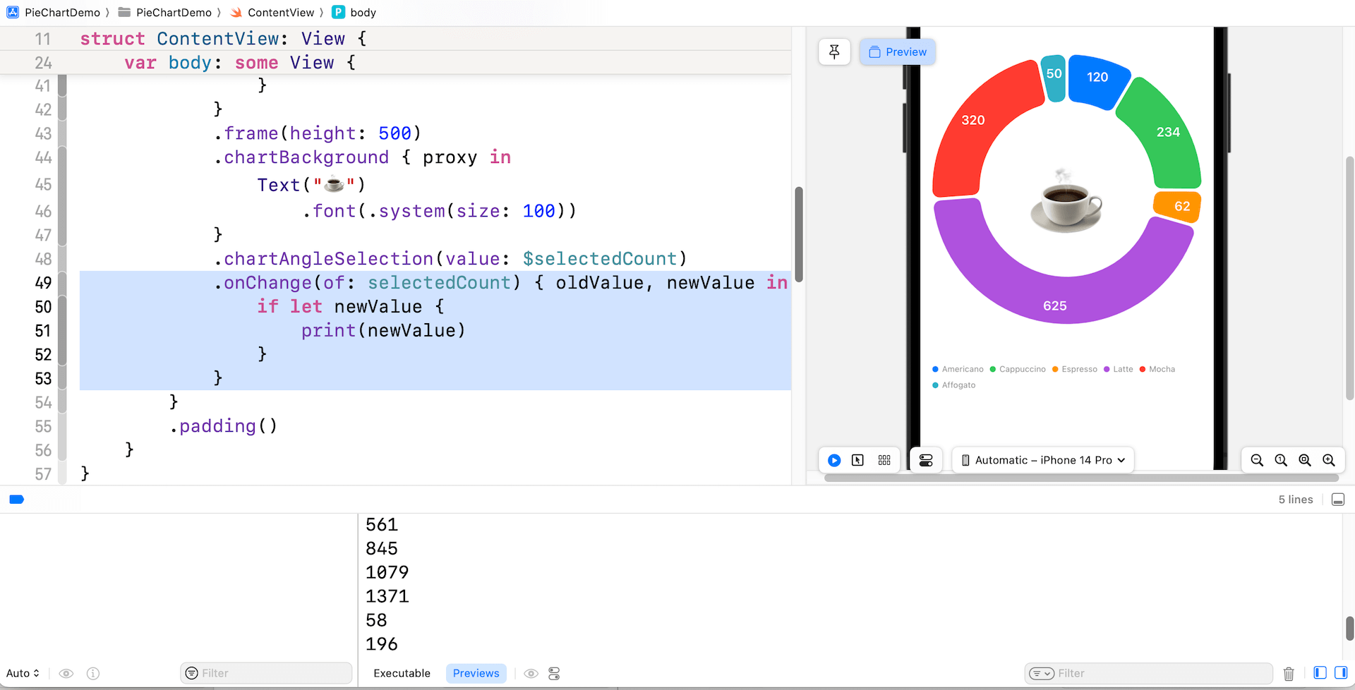
You may attach the onChange modifier to the chart to reveal the selected value.
.onChange(of: selectedCount) { oldValue, newValue in
    if let newValue {
        print(newValue)
    }
}
The value captured doesn’t directly tell you the exact sector the user touched. Instead, it gives a value of the selected coffee count. For example, if the user taps the trailing edge of the green sector, SwiftUI returns you a value of 354.
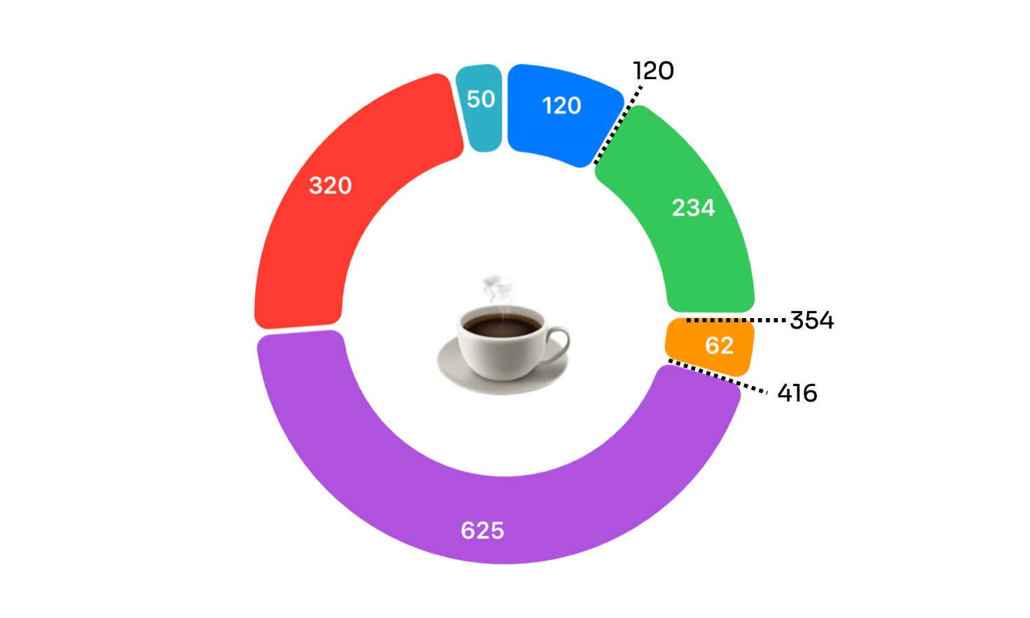
To figure out the sector from the given value, we need to create a new function. This function takes the selected value and returns the name of the corresponding sector.
private func findSelectedSector(value: Int) -> String? {

    var accumulatedCount = 0

    let coffee = coffeeSales.first { (_, count) in
        accumulatedCount += count
        return value <= accumulatedCount
    }

    return coffee?.name
}
With the implementation above, we can declare a state variable to hold the selected sector and make some interesting changes to the donut chart.
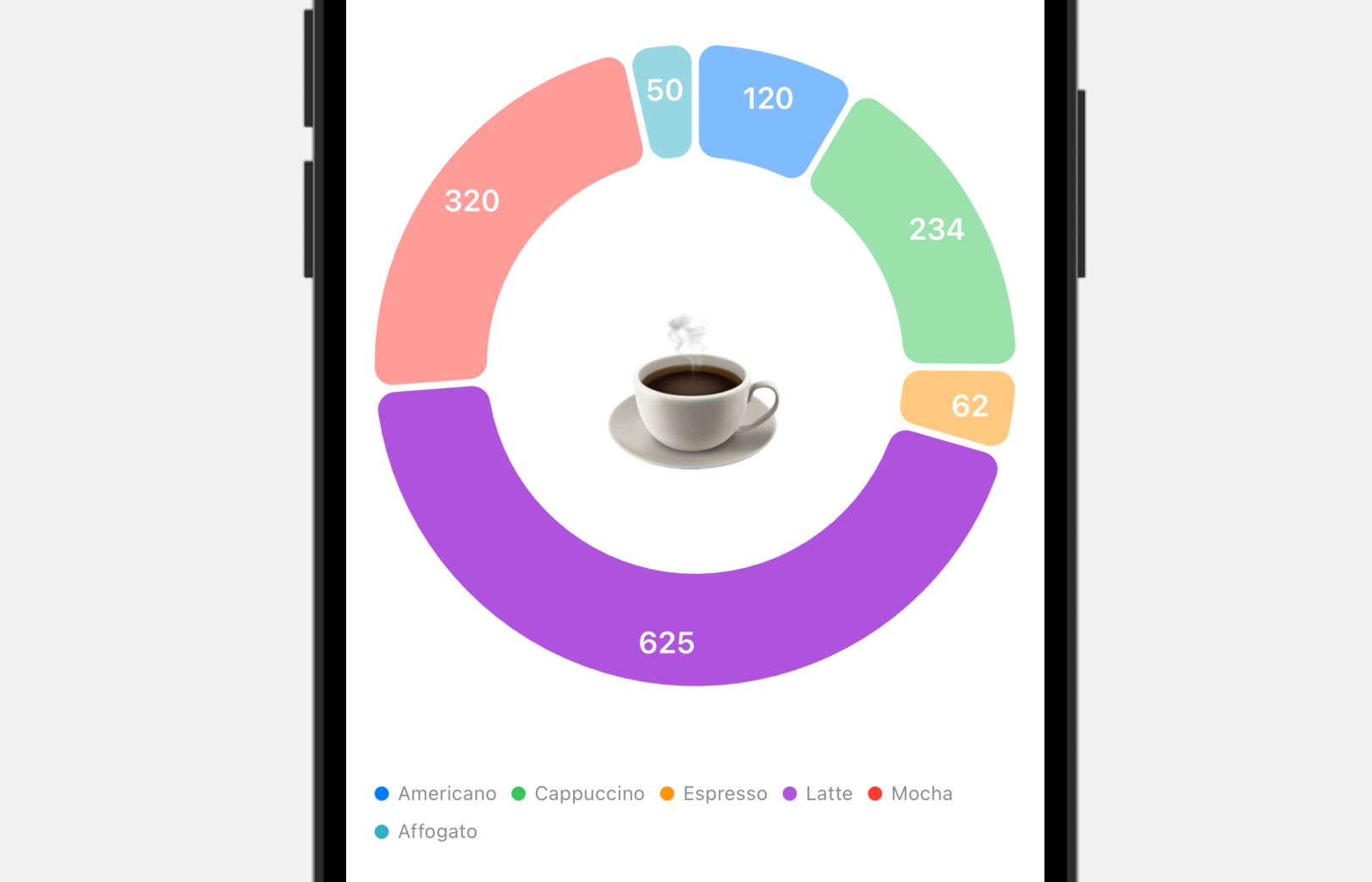
@State private var selectedSector: String?When a sector of the chart is selected, we will dim the remaining sectors to highlight the selected sector. Update the onChange modifier like this:
.onChange(of: selectedCount) { oldValue, newValue in
    if let newValue {
        selectedSector = findSelectedSector(value: newValue)
    } else {
        selectedSector = nil
    }
}
And then attach the opacity modifier to SectorMark like this:
SectorMark {

...

}
.opacity(selectedSector == nil ? 1.0 : (selectedSector == coffee.name ? 1.0 : 0.5))
We keep the original opacity when there is no selected sector. Once a user touches a specific sector, we change the opacity of those unselected sectors. Below shows the appearance of the donut chart when the Latte sector is selected.
Summary
In this tutorial, we have guided you through the process of building pie charts and donut charts using SwiftUI. Prior to iOS 17, if you wanted to create these types of charts using SwiftUI, you had to build the charts on your own using components like Path. However, with the introduction of the new Chart API called SectorMark, it’s now easier than ever to create all kinds of pie and donut charts. As you can see, turning a bar chart into a pie (or donut) chart only requires some simple changes.
We also discussed with you how to add interactivity to the charts. This is another new feature of the SwiftUI Charts framework. With a few lines of code, you can detect users’ touches and highlight a certain part of the chart.
I hope you enjoy reading this tutorial and start building great charts with all the new functionalities provided in iOS 17.