

Earlier, we’ve talked about the new features of Swift 2. Starting from this tutorial, we will cover some cool new features in iOS 9. The upcoming version of iOS comes with a lot of new features. For developers, the introduction of Stack View deserves the first mention. I know some developers find it difficult to use auto layout to design complex user interfaces. Stack views are here to help and make our developers’ job much easier.
The stack view provides a streamlined interface for laying out a collection of views in either a column or a row. For views embedded in a stack view, you no longer need to define auto layout constraints. The stack view manages the layout of its subviews and automatically applies layout constrants for you. That means, the subviews are ready to adapt to different screen sizes. Furthermore, you can embed a stack view in another stack view to build more complex user interfaces. Don’t get me wrong. It doesn’t mean you do not need to deal with auto layout. You still need to define the layout constrants for the stack view. It just saves you time from creating constraints for every UI element and makes it super easy to add/remove views from the layout.
Xcode 7 provides two ways to use stack view. You can drag a Stack View (horizontal / vertical) from the object library, and put it right into the storyboard. You then drag and drop view objects such as labels, buttons, image views into the stack view. Alternatively, you can use the Stack option in the auto layout bar. For this approach, you simply select two or more view objects, and then click the Stack option. Interface Builder will embed the objects into a stack view and resize it automatically. If you still have no ideas about how to use a stack view, no worries. We’ll go through both approaches in this tutorial. Just read on and you’ll understand what I mean in a minute.
The Demo App
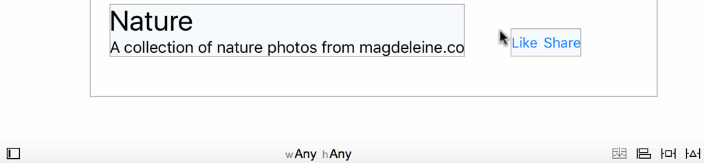
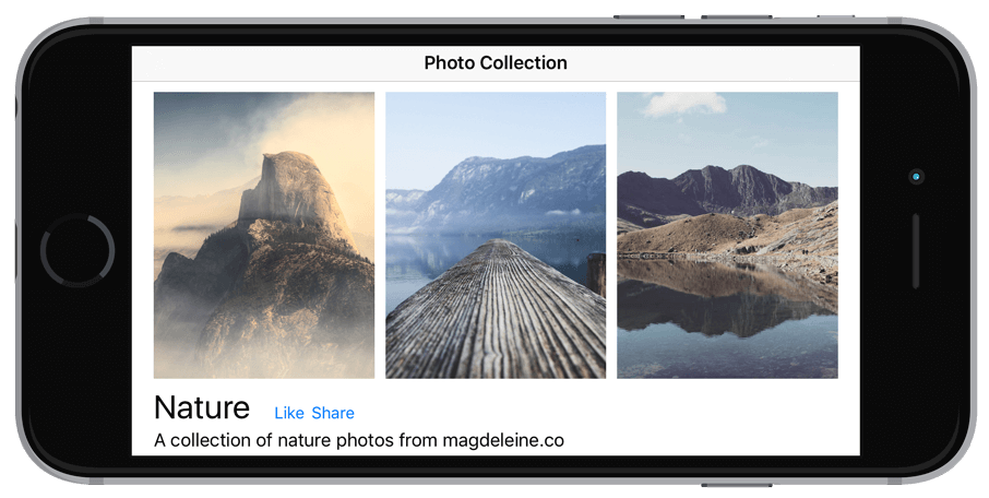
Let’s first take a look at the demo app we’re going to build. In this tutorial, I will show you how to layout a user interface like this using stack views:
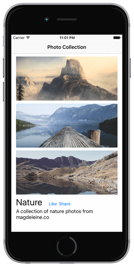
You can create the same UI without using stack views. But as you will see, stack views completely change the way how you layout user interfaces. There is no coding in this tutorial. We will just focus on using Interface Builder to layout the user interface.
To begin with, please download the starter project. You need to use Xcode 7 beta 4 (or up) to build the project. If you haven’t installed it, you can download it here. The project template is very simple. It only prebuilt the navigation controller and bundled the sample images in the image asset.
Adding Stack Views from the Object Library
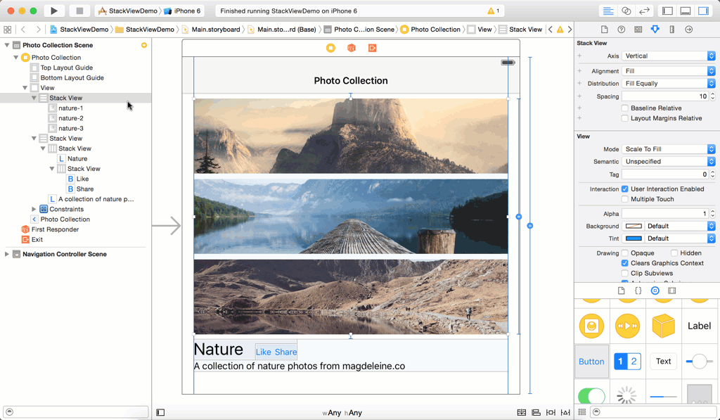
Now fire up Xcode 7 and open Main.storyboard. From the object library, drag a Verticle Stack View object to the view controller in the storyboard. Stack view can arrange its subviews (known as arranged views) in both vertical and horizontal layouts. Because we’re going to layout the image views vertically, we choose the Verticle Stack View object.
Next, drag an image view from the object library. As you drop the image view into the stack view, the image view is automatically resized. Repeat the same step and add two more image views to it. That’s where the magic happens. When you add another image view to it, the stack view automatically layouts the image view vertically, setting up the necessary constraints for you. Cool, right?
Defining Layout Constraints for the Stack View
Stack views save developers from defining layout constraints for every objects in the layout. That being said, you are required to provide the layout constraints for the stack views. For the one we have just added, we will define the following layout constraints:
- Set spacing constaints for the top, left and right sides of the stack view, such that the stack view sits at the top of the screen.
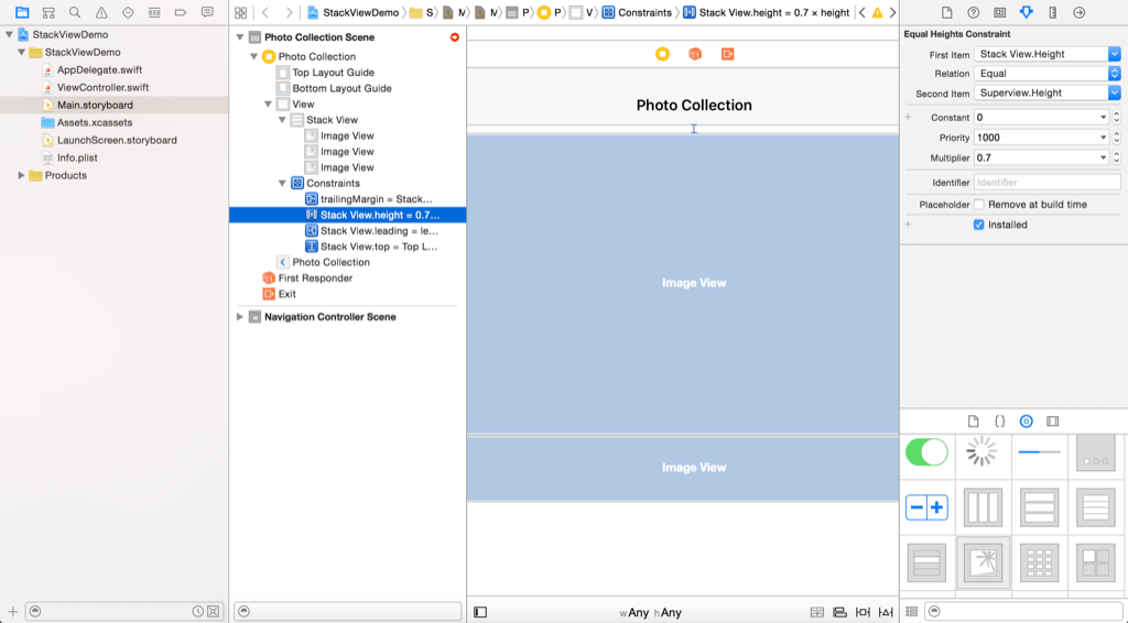
- Set a height constraint for the stack view, such that the stack view takes up 70% of the superview’s height.
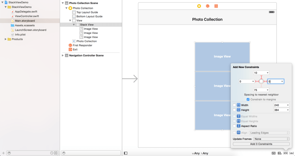
Now select the stack view and click the Pin button in the layout button. Set the space constraints of the top, left and right side to 10, 0 and 0 respectively. Then click the “Add 3 Constraints” button to add the constraints.
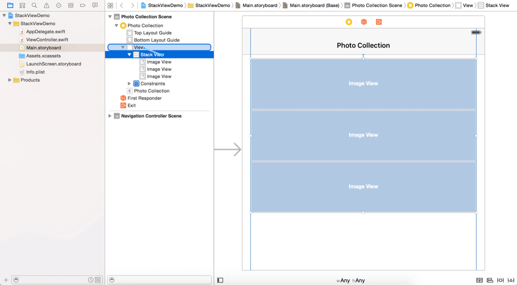
The current position of the stack view doesn’t meet the constraints. You can just click the warning indicator (i.e. yellow arrow) in the Document Outline to fix the misplacement.
To set the height constraint, go the Document Outline of Interface Builder. Control-drag from Stack View to View. After releasing the buttons, select Equal Heights.
This sets the height of the stack view to the height of the view. However, the stack view should only take up around 70% of the view’s height. So, select the “Stack View.height” constraint and go to the Attributes inspector. Change the value of Multiplier from 1.0 to 0.7.
Setting the Properties of Stack Views
The stack view doesn’t look as expected. Once you have a stack view, you can alter a number of the stack view’s properties to change its appearance. The axis option indicates whether the arranged views should be layout vertically or horizontally. The alignment option controls how the arranged views are aligned. For example, if it is set to Leading, the stack view aligns the leading edge of its arranged views along its leading edge.
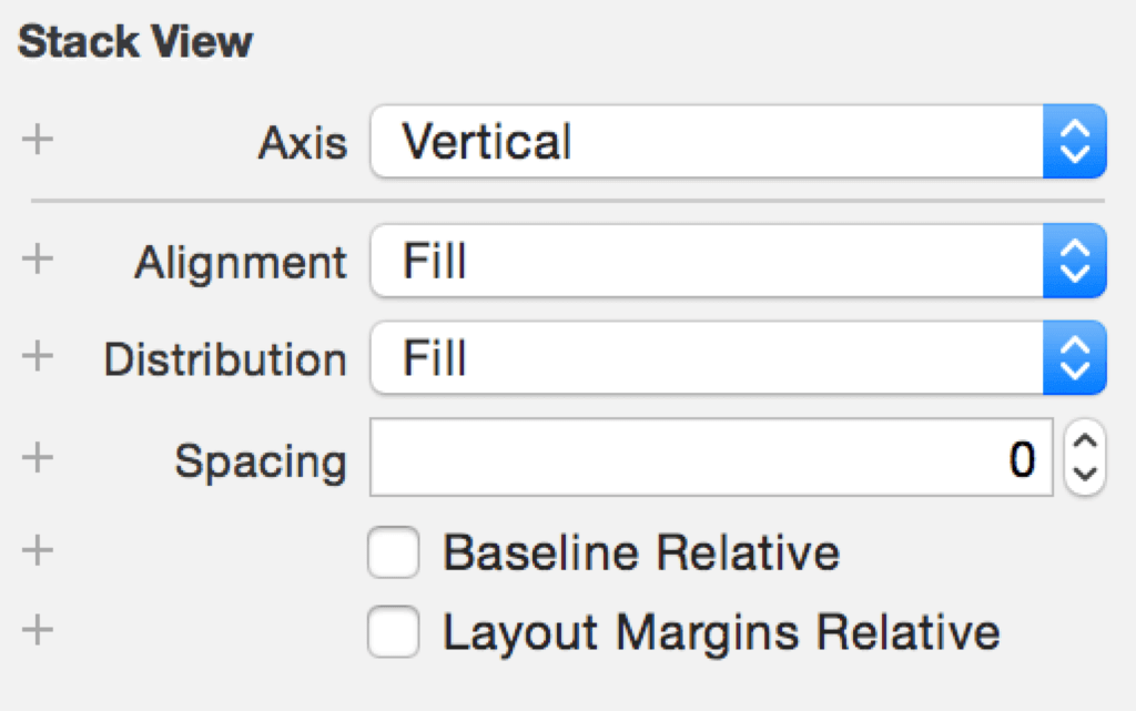
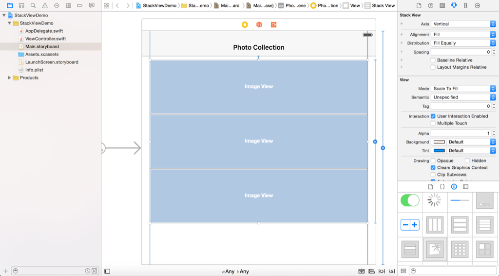
The distribution option defines the size and position of the arranged views. By default, it is set to Fill. In this case, the stack view tries its best to fit all subview in its available space. Now let’s change this option to Fill Equally. The stack view automatically resizes the arranged views such that they are all of the same size.
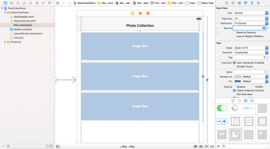
The spacing option allows you to set the space between views. Change its value to 10 to add extra space between the image views.
Setting the Images
Next, let’s assign the image views with the corresponding image. Select the first image view and go to the Attributes inspector. Change the image to “nature-1” and set the mode to “Aspect Fill”. Also enable the “Clip Subviews” option. Repeat the same steps for the rest of the image view, but set the image to “nature-2” and “nature-3”. Your layout should look like this:
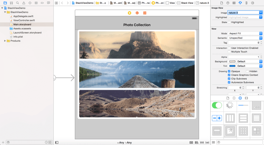
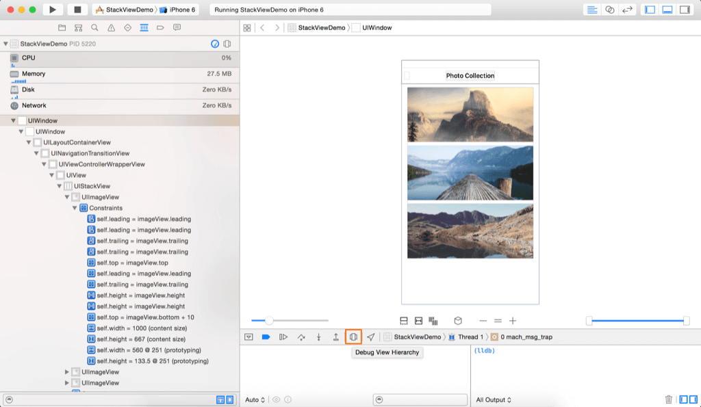
Now you can run the project to have a quick look. Try to test the app on different simulators, the UI should fit perfectly on all kinds of devices. The stack view has automatically defined the layout constraints for you. Actually you can launch the view debugging option (while running your app) to reveal the layout constraints added for the image views.
Layout Labels and Buttons Using Nested Stack Views
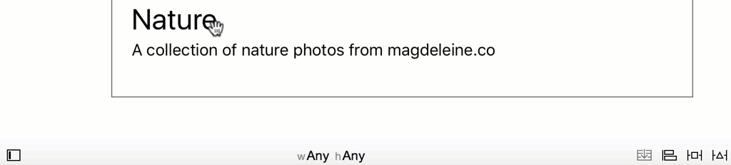
We haven’t finished yet. There are a few labels and buttons to add to the user interface. Now drag a label from the object library to the view. Name the label “Nature” and position it right below the stack view. Make the label a bit larger by changing its font size to 30 points. Next, drag another label to the view and name the label “A collection of nature photos from magdeleine.co”. Place it under the Nature label.
Again, you do not need to set the layout constraints for these labels. Let the stack view to do the magic for you. At the very beginning of this tutorial, I mentioned that there are two ways to use stack views. Earlier, you added a stack view from the object library. Now I will show you another approach.
Hold the command key to select both labels, and then click the Stack button in the layout bar. Interface Builder automatically embeds the labels in a vertical stack view.
Next, add two buttons to the view. Name one button to “Like” and the other one to “Share”. Again, we don’t want to deal with auto layout. So, select both buttons and click the Stack button in the layout bar to embed both buttons in a horizontal stack view. You can add space between the buttons by setting the spacing value of the stack view to 5 points.
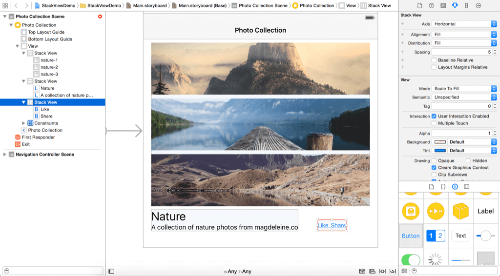
If you look at the final layout, both buttons should be placed next to the Nature label. How can you achieve that? What’s great about stack views is that you can use multiple stack views nested together to build the exact layout you want. Now drag the stack view with the buttons to the Nature label. Once you release the button, the stack view will be embed in another stack view. To layout Nature label and the buttons, select both views and add them into another stack view using the Stack option. By default, the axis of the new stack view is set to vertical. In the Attributes inspector, change it to horizontal, so the Like and Share buttons are placed right next to the Nature label.
The buttons are also required to align with the baseline of the Nature label. Select the stack view and change its alignment from Fill to First Baseline. Also, change the spacing option to 20 to add space between the Naturel label and the buttons.
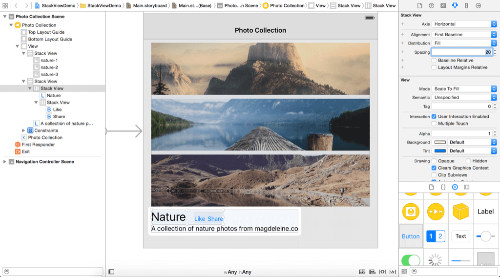
As you can see, we only need to use nested stack view to build the exact layout you’re looking for.
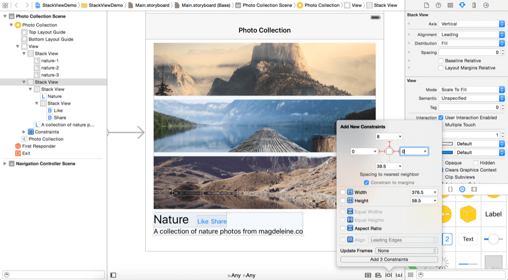
Lastly, we provide the layout constraints between the stack view containg the image views and the stack view holding the buttons & labels. Select the stack view with buttons and labels and click the Pin button in the layout button. Set the value of the top, left and right side to 0, 8 and 0 respectively.
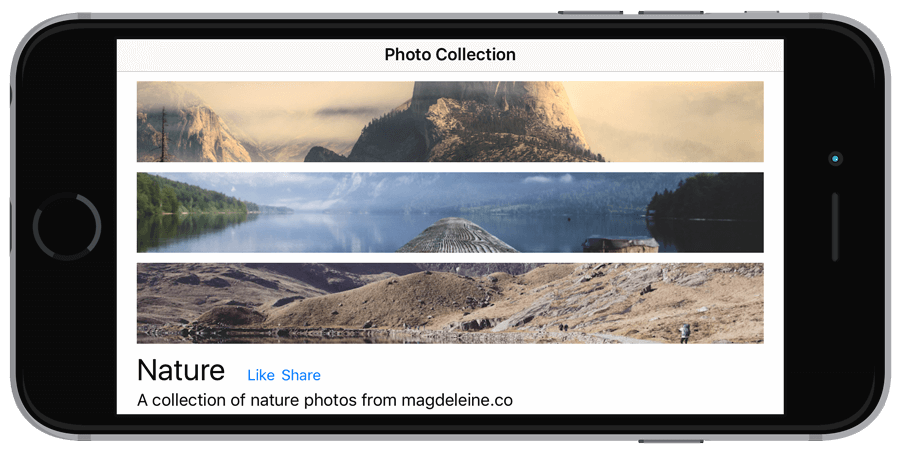
To ensure the description label is automatically resized, change the Lines option to 0 and Line Breaks option to Word Wrap. Great! You’ve completed the UI design. Now run the project to take a look at the result. If you have everything configured correctly, your UI should look like this:
If you view the layout on iPhone in landscape orientation, the UI becomes this:
It looks okay, but wouldn’t it be great if the images are arranged horizontally like this?
Adapting Stack Views Using Size Classes
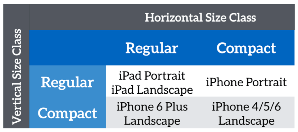
In order to achieve a different layout for iPhone in landscape orientation, we have to make the stack view adaptive. In iOS 8, it introduces the concept of size classes. The table below shows the iOS devices and their corresponding size classes.:
You can use size classes to provide layout specializations which override some of the design in the base layout. In this case, we want to change the axis of the stack view (holding the image views) from vertical to horizontal for these two size classes:
- Compact width-Compact height
- Regular width-Compact height
Now select the stack view and go to the Attributes inspector. Click the + button next to the Axis option. Select Any Width > Compact height, and then set the axis of this size class to Horizontal. Here, any width includes both compact and regular width.
By doing that, the stack view will layout its arranged views horizontally when your iPhone is turned sideway. Run the project on various iOS devices and see the result.
Summary
In this tutorial, I have given you an introduction to stack view and a demo on how to layout your UI using this new component. Stack views streamline the way you build user interfaces on iOS, with very minimal constraints. One question you may have is that when should you use stack views? Apple’s engineers recommended developers to adopt stack views first, and then only when you need to actually use raw constraints. So start designing your user interfaces using stack views! I believe you will love it.
For reference, you can download the Xcode project here.
What do you think about stack views? Leave me comment and share your thought.