

A common feature of almost all apps is the fact that they provide multiple view controllers to users to navigate and work with. Those view controllers can be used in many ways, such as to simply display some kind of information on-screen, or to gather complex data from user input. Creating new view controllers for different functionalities of an app is often mandatory, and several times a little bit daunting task. However, sometimes it’s possible to avoid creating new view controllers (and their respective scenes in storyboard) if you just make use of expandable tableviews.
As the term suggests, an expandable tableview is a tableview that “allows” its cells to expand and collapse, showing and hiding that way other cells that in any other case would be always visible. Creating expandable tableviews is a nice alternative when it’s required to gather simple data, or to display on-demand information to users. With them, it’s not necessary to create new view controllers just to ask users for data that in any case should exist in one, default view controller. For example, with expandable cells you can show and hide options of a form that collects data without having to leave that view controller at all.

Whether you should use an expandable tableview or not always depends on the nature of the app you develop. However, as the UI of the cells can be customized by subclassing the UITableViewCell class and creating extra xib files, the look and feel of the app should normally not be a problem. So, at the end, it’s just a matter of requirements.
In this tutorial I’m going to show you a simple but efficient way to create expandable tableviews. Note that what you’ll see here does not consist of a unique method for implementing such a feature. Pretty much the implementation is based on the app needs, but my goal here is to present a quite general way that can be reused in most cases. So, by having said that, move to the next part to get a taste of what we’re about to deal with in this tutorial.
About the Demo App
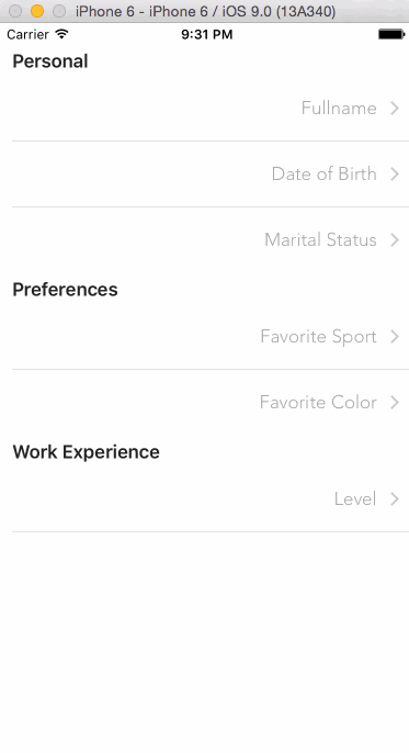
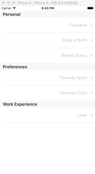
We are going to see how an expandable tableview is created and works by implementing an app with one view controller, which in turn will contain the tableview. We are going to make a fake form to let user enter data, and for that reason the tableview will contain the following three sections:
- Personal
- Preferences
- Work Experience
Each section is going to contain expandable cells that will trigger the display or hiding of other, additional cells inside the section. Specifically, the top-level cells (those that will expand and collapse) for each section are:
For the “Personal” section:
- Full name: It displays the full name of the user, and when it is expanded two sub-cells are available for typing the first and last name.
- Date of birth: It displays the date of birth of the user. When it’s expanded, a date picker view is provided for selecting a date, and a button to set it as the selected one to the respective top-level cell.
- Marital status: This cell displays whether the user is married or single. When expanded, a switch control is provided for setting the marital status.
For the “Preferences” section:
- Favorite sport: Our fake form is supposed to ask for the favorite sport of the user, which is displayed here when selected. When this cell is expanded, four options with sport names become available, and when a sub-option is tapped the cell will “automatically” collapse.
- Favorite color: Pretty much same as above, this time though we’ll display three different colors to let the user select from.
For the “Work Experience” section:
Level: When this top-level cell is tapped and expanded, another cell with a slider appears to let user specify a hypothetic work experience level. The allowed values are within the 0…10 range, and we’ll keep only integer values.
The following animated graphic will make clear what we’re about to do:
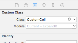
You notice above that there are various types of cells when expanding the tableview. All of them can be found in the starter project that’s available for you to download, among some other pre-made stuff. All custom cells have been designed in separate xib files, while a custom subclass of the UITableViewCell class (named CustomCell) has been assigned as their custom class:
Inside the project you’ll find the following cell xib files:
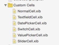
Their names suggest what each cell is for, but you can get the starter project and explore deeper on your own.
Besides the cells, you’ll also find some code already been implemented. Even though it’s important and completes the functionality of the demo app, that code does not consist of core part in this tutorial, so I just skip to go through it and provide it as already made. All the missing code we’re interested about in this tutorial will be added step by step as we move through the following parts.
So, now you know what our final goal is, therefore we are ready to learn how to create an expandable tableview.
Describing the Cells
All the implementation and the techniques that I’m going to present in this tutorial regarding the expandable tableview lies to a single and simple idea: To describe the details of each cell to the app. That way is possible to let it know which cells are expandable or not, which are visible or not, what’s the value for the text label of each cell, and so on. Actually, the whole idea is based on grouping a bunch of properties that either describe attributes or contain certain values for each cell, and then making them available to the app so it properly displays them.
For this demo app I created and used the properties shown in the next list. Note that new properties can be added in a real app, or the existing ones could be modified as per demand. In any case, the important is you manage to get the big picture here. Then you’ll be able to perform all the changes you desire. The properties list now:
- isExpandable: It’s a bool value that indicates whether a cell can expand or not. It’s one of the most important properties for us in this tutorial.
- isExpanded: A bool value again, indicating whether an expandable cell is expanded or collapsed. The top-level cells will be collapsed by default, so initially this value will be set to NO for all of them.
- isVisible: As the name suggests, indicates whether a cell is visible or not. It’s going to play a significant role a little bit later, as we’ll be based on that property so we display the proper cells in the tableview.
- value: This property is useful for keeping the value of UI controls (for example, the value of the marital status switch control). Not all cells have such controls, so for most of them this property will remain empty.
- primaryTitle: It’s the text displayed in the main title label of the cells, and several times contains the actual value that should be displayed on a cell.
- secondaryTitle: It’s the text displayed either in the subtitle label of a cell, or in secondary labels.
- cellIdentifier: It’s the identifier of the custom cell matching to the current description. It won’t be used by the app just to dequeue the proper cell, but also to determine the proper actions that should be taken depending on the displayed cell, and to specify the height of each cell.
- additionalRows: It contains the total number of additional rows that should be displayed when an expandable cell is expanded.
The above collection of properties will be used to describe each single cell that we’re about to have in the tableview. In app-level terms, we’re going to do that easily simply by making use of a property list (plist) file. In this plist file, we’ll properly fill the values of the above properties for all cells, and that way we’ll end up having a full technical description of them that can be used both from us and the app. And all that without writing a single line of code. Isn’t that great?
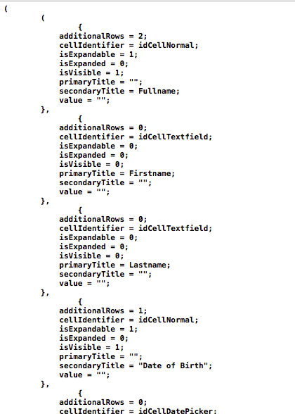
At this point we would normally create a new property list file in our project, and then we would start populating it with the proper data. But there’s no reason to do that, as you can just download the .plist file. So, get it and add it to the starter project. Setting the properties for all cells here would take a lot of space, it would be meaningless, and it would be also tiring and boring for you to copy-paste or type all the missing values. However, let’s discuss about it a little bit:
First of all, the file you (hopefully) downloaded is called CellDescriptor.plist. The base structure (root) is an array, where each item in it represents a section in the tableview. That means that the base array in the plist file contains three items, as many as the sections we want to exist in the tableview are.
The above items that represent the sections are also arrays, and their own items describe the cells of each section. Actually, the properties presented above are grouped as dictionaries, and each dictionary matches to a single cell representation. Here’s a sample of the property list file:
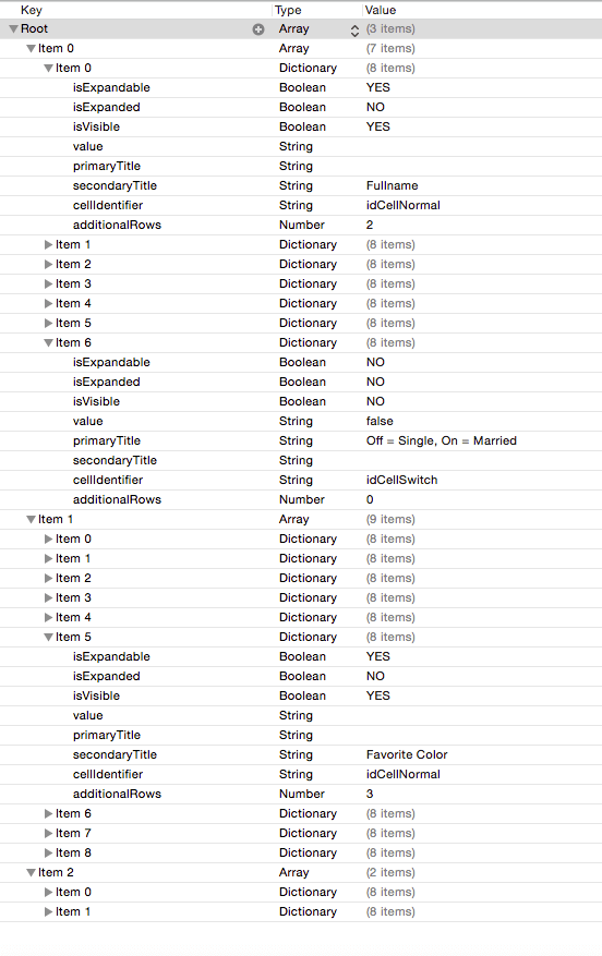
Now it’s the best time to take your time and see a bit more thoroughly the properties and their values for all those cells that we’re going to display in the tableview. It’s easy to understand that by having that cell description at our disposal the required code we need to write for creating and managing expandable cells is significantly decreased, and that we won’t have to dictate the app about the various states of the cells (for example, which cells are expandable, whether it should allow the expansion of a specific cell or not, determine in code if a cell is visible or not, and so on). All that information exists in the property list file you just downloaded.
Loading the Cell Descriptions
It’s time finally to write some code, as even though we save a lot of it by using the cell description technique, there’s still code needed to be added to the project. Now that the cell description property list file exists, the first thing we must programmatically do is to load its contents into an array. That array will be used in the next part as the datasource for the tableview.
For starters, open the ViewController.swift file in the project, and at the top of the class declare the following property:
var cellDescriptors: NSMutableArray!
This array will contain all the cell description dictionaries that will be loaded from the property list file.
Next, let’s implement a new custom function that’s responsible for loading the file contents into the array. We’ll call that function loadCellDescriptors():
func loadCellDescriptors() {
    if let path = NSBundle.mainBundle().pathForResource("CellDescriptor", ofType: "plist") {
        cellDescriptors = NSMutableArray(contentsOfFile: path)
    }
}
What we do here is quite simple: We first make sure that the path to the property list file in the bundle is valid, and then we initialize the cellDescriptors array by loading the file contents.
Calling the above function is the next step, and we’ll do that right before the view gets appeared and after the tableview has been configured (we want the tableview already set up before we display any data on it):
override func viewWillAppear(animated: Bool) {
    super.viewWillAppear(animated)
    configureTableView()

    loadCellDescriptors()
}
If you type the print(cellDescriptors) command right after the last line in the above snippet and run the app, you’ll see all the plist file contents getting listed in the console. That means that they’ve been successfully loaded in memory.
Normally, our work in this section should finish now, but we won’t do that; we’ll make one more addition that will be proved vital in the next part. As you’ve found out so far (especially if you’ve examined the CellDescriptor.plist file), not all cells are going to be visible at app launch. Actually, we can’t just know if they’ll ever be visible all together simultaneously, because they can be expanded or collapsed as per user demand.
In the programming world, that means that the row index of each cell cannot be constant (what we programmatically write as indexPath.row when handling cells), therefore we can’t just go through our datasource array using the cell row and display each cell. It’s mandatory to work that out and come up with a solution that will provide the row index of the visible cells only. Any attempt to display cells that have been marked in the description as not visible would lead to a faulty implementation, and of course, to abnormal app behavior.
So, for that reason we’re going to implement a new function called getIndicesOfVisibleRows(). Its name states clearly its purpose: It’s going to get the row index values for the cells that have been marked as visible only. Before we proceed to that implementation, please go once again at the top of the class to make the following declaration:
var visibleRowsPerSection = [[Int]]()
This two-dimensional array will store the index of the visible cells for each section (one dimension for the sections, one for the rows).
Let’s focus now on the implementation of the new function. As you probably guess, we’ll go through all cell descriptors and we’ll add in the above 2D array the index of the cells that their “isVisible” property is set to YES. Obviously we have to deal with a nested loop, but it’s not difficult to handle it. Here’s the function implementation:
func getIndicesOfVisibleRows() {
    visibleRowsPerSection.removeAll()

    for currentSectionCells in cellDescriptors {
        var visibleRows = [Int]()

        for row in 0...((currentSectionCells as! [[String: AnyObject]]).count - 1) {
            if currentSectionCells[row]["isVisible"] as! Bool == true {
                visibleRows.append(row)
            }
        }

        visibleRowsPerSection.append(visibleRows)
    }
}
Note that at the beginning it’s required to remove any previous contents from the visibleRowsPerSection array, otherwise we’ll end up having wrong data in it after subsequent calls of this function. Further than that, the implementation is straightforward, so I avoid commenting anything further.
The first time that the above function should be called is right after the cell descriptors get loaded from the file (we’ll call it again later too). So, revisiting the first function we implemented in this part, we modify it as follows:
func loadCellDescriptors() {
    if let path = NSBundle.mainBundle().pathForResource("CellDescriptor", ofType: "plist") {
        cellDescriptors = NSMutableArray(contentsOfFile: path)
        getIndicesOfVisibleRows()
        tblExpandable.reloadData()
    }
}
Even though the tableview isn’t working yet, we trigger a reload action in advance so we make sure that the proper cells will be displayed after launching the app.
Displaying the Cells
Knowing that the cell descriptions are loaded every time the app gets launched, we’re ready to proceed and display the cells in the tableview. We are going to begin in this part by creating another new function that will locate and return the proper cell descriptor from the cellDescriptors array. As you will see in the following code snippet, having populated data in the visibleRowsPerSection array is a prerequisite for this new function to work.
func getCellDescriptorForIndexPath(indexPath: NSIndexPath) -> [String: AnyObject] {
    let indexOfVisibleRow = visibleRowsPerSection[indexPath.section][indexPath.row]
    let cellDescriptor = cellDescriptors[indexPath.section][indexOfVisibleRow] as! [String: AnyObject]
    return cellDescriptor
}
The parameter that the above function accepts is the index path value (NSIndexPath) of the cell that is currently being processed by the tableview, and it returns a dictionary containing all the properties matching to that cell. The first task in its body is to find the index of the visible row that matches to the given index path, and that’s easy to do as all we need is the section and row of the cell. At the moment you don’t have the full picture as we haven’t dealt at all so far with the tableview delegate methods, so I must say in advance that the total number of rows per section will match to the number of visible cells in every section. That means that any indexPath.row value in the above implementation matches to the proper visible cell index in the visibleRowsPerSection.
By having the index of the row for each cell, we can proceed and “extract” the cell description dictionary from the cellDescriptors array. Note that the value specified as the index of the second dimension of that array is the indexOfVisibleRow, and not the indexPath.row. Using the second would lead to return false data.
Once again we built a useful tool that will be proved pretty handy right next, so let’s get going by fixing the existing tableview methods in the ViewController class. Initially, let’s specify the number of sections in the tableview:
func numberOfSectionsInTableView(tableView: UITableView) -> Int {
    if cellDescriptors != nil {
        return cellDescriptors.count
    }
    else {
        return 0
    }
}
You understand that we could not just overlook the case where the cellDescriptor array would be nil. We return the number of its sub-arrays if only it has been initialized and filled with the cell description values.
Then, let’s specify the number of rows per section. As I said before, that number is always equal to the number of visible cells, and we can return that information in just one line:
func tableView(tableView: UITableView, numberOfRowsInSection section: Int) -> Int {
    return visibleRowsPerSection[section].count
}
After that, let’s determine the titles for the sections of the tableview:
func tableView(tableView: UITableView, titleForHeaderInSection section: Int) -> String? {
    switch section {
    case 0:
        return "Personal"

    case 1:
        return "Preferences"

    default:
        return "Work Experience"
    }
}
Next, it’s time to specify the height of each row:
func tableView(tableView: UITableView, heightForRowAtIndexPath indexPath: NSIndexPath) -> CGFloat {
    let currentCellDescriptor = getCellDescriptorForIndexPath(indexPath)

    switch currentCellDescriptor["cellIdentifier"] as! String {
    case "idCellNormal":
        return 60.0

    case "idCellDatePicker":
        return 270.0

    default:
        return 44.0
    }
}
There’s something that I’d like to underline here: For first time we make use of the getCellDescriptorForIndexPath: function that was implemented earlier in this part. We need to get the proper cell descriptor, because right next it’s necessary to fetch the “cellIdentifier” property, and depending on its value to specify the row height. You can verify the height values for each type of cell in the respective xib files (or just take them as granted as shown here).
Lastly, the actual cell display. Initially each cell must be dequeued:
func tableView(tableView: UITableView, cellForRowAtIndexPath indexPath: NSIndexPath) -> UITableViewCell {
    let currentCellDescriptor = getCellDescriptorForIndexPath(indexPath)

    let cell = tableView.dequeueReusableCellWithIdentifier(currentCellDescriptor["cellIdentifier"] as! String, forIndexPath: indexPath) as! CustomCell

    return cell
}
Once again we begin by getting the proper cell descriptor based on the current index path value. By using the “cellIdentifier” property the correct cell is being dequeued, so we can dive deep down to the special treatment of each cell:
func tableView(tableView: UITableView, cellForRowAtIndexPath indexPath: NSIndexPath) -> UITableViewCell {
    let currentCellDescriptor = getCellDescriptorForIndexPath(indexPath)
    let cell = tableView.dequeueReusableCellWithIdentifier(currentCellDescriptor["cellIdentifier"] as! String, forIndexPath: indexPath) as! CustomCell

    if currentCellDescriptor["cellIdentifier"] as! String == "idCellNormal" {
        if let primaryTitle = currentCellDescriptor["primaryTitle"] {
            cell.textLabel?.text = primaryTitle as? String
        }

        if let secondaryTitle = currentCellDescriptor["secondaryTitle"] {
            cell.detailTextLabel?.text = secondaryTitle as? String
        }
    }
    else if currentCellDescriptor["cellIdentifier"] as! String == "idCellTextfield" {
        cell.textField.placeholder = currentCellDescriptor["primaryTitle"] as? String
    }
    else if currentCellDescriptor["cellIdentifier"] as! String == "idCellSwitch" {
        cell.lblSwitchLabel.text = currentCellDescriptor["primaryTitle"] as? String

        let value = currentCellDescriptor["value"] as? String
        cell.swMaritalStatus.on = (value == "true") ? true : false
    }
    else if currentCellDescriptor["cellIdentifier"] as! String == "idCellValuePicker" {
        cell.textLabel?.text = currentCellDescriptor["primaryTitle"] as? String
    }
    else if currentCellDescriptor["cellIdentifier"] as! String == "idCellSlider" {
        let value = currentCellDescriptor["value"] as! String
        cell.slExperienceLevel.value = (value as NSString).floatValue
    }

    return cell
}
For normal cells, we just set the primaryTitle and secondaryTitle text values to the textLabel and detailTextLabel labels respectively. In our demo app, the cells with the idCellNormal identifier are actually the top-level cells that get expanded and collapsed.
For cells containing a textfield, we just set the placeholder value that is specified by the primaryTitle property of the cell descriptor.
Regarding the cell that contains a switch control, there are two things we do here: We firstly specify the displayed text before the switch (this is constant in our case and can be changed in the CellDescriptor.plist file), and then we set the proper state of the switch, depending on whether it’s been set as “on” or not in the descriptor. Note that later we’ll be able to change that value.
There are also the cells having the “idCellValuePicker” identifier. Those cells are meant to provide a list of options, and when an option is selected the parent cell will automatically collapse. The cell’s text label is specified in the case shown above.
Lastly, there’s the case of the cell containing a slider. Here we just get the current value from the currentCellDescriptor dictionary, we convert it into a float number, and we assign it to the slider control so it shows the proper value all the time (when it’s visible). Later on we’ll change that value and we’ll update the respective cell descriptor.
For the cells for which the identifiers wasn’t explicitly added as a case in the above statement there’s nothing to do in this demo app. However, if you want to handle them in a different way, feel free to modify the code and add any missing parts.
Now you can run the app and see some results for first time. Don’t expect to see much, as what you’ll get is the top-level cells. Don’t forget that we still haven’t enabled the expanding feature, so nothing will happen if you tap on them. However, don’t get discouraged, because what you’ll see means that what we’ve done so far it’s working perfectly.
Expanding and Collapsing
I assume that this part is probably what you’ve been expecting the most, as the actual goal of this tutorial will be achieved here. For first time we’ll manage to make our top-level cells expand and collapse every time they get tapped, and the proper sub-cells appear or hide on demand.
For starters we need to know the index of the tapped row (remember, not the actual indexPath.row but the row index in visible cells only), so we’ll begin by assigning it to a local variable in the following tableview delegate function:
func tableView(tableView: UITableView, didSelectRowAtIndexPath indexPath: NSIndexPath) {
    let indexOfTappedRow = visibleRowsPerSection[indexPath.section][indexPath.row]
}
Even though no much code is required to make our cells expanding and collapsing, we’ll go step by step so I’m thorough enough and you get the proper meaning of our actions. Now that we have the actual index of the tapped row, we must check in the cellDescriptors array if the specific cell is expandable or not. In case it is expandable, but not expanded yet, then we’ll indicate (we’ll use a flag value) that the cell must expand, otherwise we’ll indicate that it must collapse:
func tableView(tableView: UITableView, didSelectRowAtIndexPath indexPath: NSIndexPath) {
    let indexOfTappedRow = visibleRowsPerSection[indexPath.section][indexPath.row]

    if cellDescriptors[indexPath.section][indexOfTappedRow]["isExpandable"] as! Bool == true {
        var shouldExpandAndShowSubRows = false
        if cellDescriptors[indexPath.section][indexOfTappedRow]["isExpanded"] as! Bool == false {
            // In this case the cell should expand.
            shouldExpandAndShowSubRows = true
        }
    }
}
Once the above flag gets its value and properly indicates whether the cell should expand or not, it’s our duty to save that value to the cell descriptors collection, or in other words, to update the cellDescriptors array. We want to update the “isExpanded” property of the selected cell, so it will behave correctly in subsequent tapping (to collapse if it’s expanded, and to expand if it’s collapsed).
func tableView(tableView: UITableView, didSelectRowAtIndexPath indexPath: NSIndexPath) {
    let indexOfTappedRow = visibleRowsPerSection[indexPath.section][indexPath.row]

    if cellDescriptors[indexPath.section][indexOfTappedRow]["isExpandable"] as! Bool == true {
        var shouldExpandAndShowSubRows = false
        if cellDescriptors[indexPath.section][indexOfTappedRow]["isExpanded"] as! Bool == false {
            shouldExpandAndShowSubRows = true
        }

        cellDescriptors[indexPath.section][indexOfTappedRow].setValue(shouldExpandAndShowSubRows, forKey: "isExpanded")
    }
}
There’s one really important detail we should not forget at this point: If you recall, there’s one property that specifies whether a cell should be displayed or not, named “isVisible” and exists in the description of each cell. This property must be changed in accordance to the above flag, so the additional invisible rows to become visible when the cell is expanded, and to become hidden again when the cell collapse. Actually, by changing the value of that property we actually achieve to produce the effect of the expansion (and back). So, let’s modify the snippet above by updating the additional cells that follow the top-level one that was just tapped:
func tableView(tableView: UITableView, didSelectRowAtIndexPath indexPath: NSIndexPath) {
    let indexOfTappedRow = visibleRowsPerSection[indexPath.section][indexPath.row]

    if cellDescriptors[indexPath.section][indexOfTappedRow]["isExpandable"] as! Bool == true {
        var shouldExpandAndShowSubRows = false
        if cellDescriptors[indexPath.section][indexOfTappedRow]["isExpanded"] as! Bool == false {
            shouldExpandAndShowSubRows = true
        }

        cellDescriptors[indexPath.section][indexOfTappedRow].setValue(shouldExpandAndShowSubRows, forKey: "isExpanded")

        for i in (indexOfTappedRow + 1)...(indexOfTappedRow + (cellDescriptors[indexPath.section][indexOfTappedRow]["additionalRows"] as! Int)) {
            cellDescriptors[indexPath.section][i].setValue(shouldExpandAndShowSubRows, forKey: "isVisible")
        }
    }
}
We’re just a breath away from seeing in action the functionality we’re looking for, but first we must take care of one more important thing: In the code snippet right above we just changed the “isVisible” value of some cells, and that means that the total number of visible rows have changed as well. So, before we reload the tableview, we must ask the app to find the index values of the visible rows from scratch:
func tableView(tableView: UITableView, didSelectRowAtIndexPath indexPath: NSIndexPath) {
    let indexOfTappedRow = visibleRowsPerSection[indexPath.section][indexPath.row]

    if cellDescriptors[indexPath.section][indexOfTappedRow]["isExpandable"] as! Bool == true {
        var shouldExpandAndShowSubRows = false
        if cellDescriptors[indexPath.section][indexOfTappedRow]["isExpanded"] as! Bool == false {
            shouldExpandAndShowSubRows = true
        }

        cellDescriptors[indexPath.section][indexOfTappedRow].setValue(shouldExpandAndShowSubRows, forKey: "isExpanded")

        for i in (indexOfTappedRow + 1)...(indexOfTappedRow + (cellDescriptors[indexPath.section][indexOfTappedRow]["additionalRows"] as! Int)) {
            cellDescriptors[indexPath.section][i].setValue(shouldExpandAndShowSubRows, forKey: "isVisible")
        }
    }

    getIndicesOfVisibleRows()
    tblExpandable.reloadSections(NSIndexSet(index: indexPath.section), withRowAnimation: UITableViewRowAnimation.Fade)
}
As you see I use an animated way to reload the section that the tapped cell belongs to, but you can change that if you don’t like the way it is.
Go and try the app now. The top-level cells expand and collapse on subsequent tappings, and even though nothing happens yet when interacting with the sub-cells, the result looks quite impressive!
Picking Values
From now on we can totally focus on handling the data input and user interaction with the controls of the sub-cells. We’ll begin doing so by implementing the logic that must be put in action when a cell with the “idCellValuePicker” identifier is tapped. In our demo app, those are the cells that list the favorite sports and colors in the “Preferences” section of the tableview. Even though I’ve mentioned about it already, I think that it would be a good idea to refresh our memory and say once again that when such a cell is tapped, we want the respective top-level cell to collapse (and hide the options), and the value shown to the selected cell to be displayed to the top-level cell as well.
The actual reason for which I chose to start dealing with this type of cells is the fact that we’ll continue working in the tableview delegate function of the last part. In it, we’ll add an else clause to handle the case of non-expandable cells, and then we’ll check the identifier value of the tapped cell. If the identifier equals to the “idCellValuePicker” then we have a cell we actually interested in.
func tableView(tableView: UITableView, didSelectRowAtIndexPath indexPath: NSIndexPath) {
    let indexOfTappedRow = visibleRowsPerSection[indexPath.section][indexPath.row]

    if cellDescriptors[indexPath.section][indexOfTappedRow]["isExpandable"] as! Bool == true {
        ...
    }
    else {
        if cellDescriptors[indexPath.section][indexOfTappedRow]["cellIdentifier"] as! String == "idCellValuePicker" {

        }
    }

    getIndicesOfVisibleRows()
    tblExpandable.reloadSections(NSIndexSet(index: indexPath.section), withRowAnimation: UITableViewRowAnimation.Fade)
}
Inside the inner if case we’ll perform four distinct tasks:
- We’ll find the row index of the top-level cell that is supposed to be the “parent” cell of the tapped one. In truth, we’ll perform a search towards the beginning of the cell descriptors and the first top-level cell that is spotted (the first cell that is expandable) is the one we want.
- We’ll set the displayed value of the selected cell as the text of the textLabel label of the top-level cell.
- We’ll mark the top-level cell as not expanded.
- We’ll mark all the sub-cells of the found top-level one as not visible.
Let’s everything in code now:
func tableView(tableView: UITableView, didSelectRowAtIndexPath indexPath: NSIndexPath) {
    let indexOfTappedRow = visibleRowsPerSection[indexPath.section][indexPath.row]

    if cellDescriptors[indexPath.section][indexOfTappedRow]["isExpandable"] as! Bool == true {
        ...
    }
    else {
        if cellDescriptors[indexPath.section][indexOfTappedRow]["cellIdentifier"] as! String == "idCellValuePicker" {
            var indexOfParentCell: Int!

            for var i=indexOfTappedRow - 1; i>=0; --i {
                if cellDescriptors[indexPath.section][i]["isExpandable"] as! Bool == true {
                    indexOfParentCell = i
                    break
                }
            }

            cellDescriptors[indexPath.section][indexOfParentCell].setValue((tblExpandable.cellForRowAtIndexPath(indexPath) as! CustomCell).textLabel?.text, forKey: "primaryTitle")
            cellDescriptors[indexPath.section][indexOfParentCell].setValue(false, forKey: "isExpanded")

            for i in (indexOfParentCell + 1)...(indexOfParentCell + (cellDescriptors[indexPath.section][indexOfParentCell]["additionalRows"] as! Int)) {
                cellDescriptors[indexPath.section][i].setValue(false, forKey: "isVisible")
            }
        }
    }

    getIndicesOfVisibleRows()
    tblExpandable.reloadSections(NSIndexSet(index: indexPath.section), withRowAnimation: UITableViewRowAnimation.Fade)
}
Once again we modify the “isVisible” property of certain cells, therefore the number of the visible rows gets changed. Obviously the call to the last two functions at the end is required.
If you run the app now, you’ll see how the app reacts when selecting a favorite sport or color.

Responding to Other User Actions
In the CustomCell.swift file you can find the CustomCellDelegate protocol with all the required delegate methods already been declared. By implementing them in the ViewController class we’ll manage to make the app responding in all the other missing user actions.
Let’s turn to the ViewController.swift file again, and initially let’s adopt the above protocol. Go to the top of the class, and add it to the class header line:
class ViewController: UIViewController, UITableViewDelegate, UITableViewDataSource, CustomCellDelegate
Next, in the tableView:cellForRowAtIndexPath: function we must make the ViewController class the delegate of each custom cell. Go there, and right before the function body closing add the line shown below:
func tableView(tableView: UITableView, cellForRowAtIndexPath indexPath: NSIndexPath) -> UITableViewCell {
    ...

    cell.delegate = self

    return cell
}
Great, now we can start implementing the delegate functions. We’ll begin by displaying the selected date in the date picker view to the respective top-level cell:
func dateWasSelected(selectedDateString: String) {
    let dateCellSection = 0
    let dateCellRow = 3

    cellDescriptors[dateCellSection][dateCellRow].setValue(selectedDateString, forKey: "primaryTitle")
    tblExpandable.reloadData()
}
Once we specify the number of the proper section and row, we directly set the selected date as a string. Note that this string is a parameter in the delegate method.
Next, let’s handle the cell with the switch control. There are two things we need to do when changing the switch value: First, to set the proper value (“Single” or “Married”) to the respective top-level cell, and to update the switch’s value to the cellDescriptors array, so it has the proper state when the tableview gets refreshed. In the next code snippet, you’ll notice that we first determine the proper values based on the switch state, and then we assign them to the respective properties:
func maritalStatusSwitchChangedState(isOn: Bool) {
    let maritalSwitchCellSection = 0
    let maritalSwitchCellRow = 6

    let valueToStore = (isOn) ? "true" : "false"
    let valueToDisplay = (isOn) ? "Married" : "Single"

    cellDescriptors[maritalSwitchCellSection][maritalSwitchCellRow].setValue(valueToStore, forKey: "value")
    cellDescriptors[maritalSwitchCellSection][maritalSwitchCellRow - 1].setValue(valueToDisplay, forKey: "primaryTitle")
    tblExpandable.reloadData()
}
The textfield cells come next. Here we’ll compose the full name dynamically, once the first or last name has been typed in. For our needs, we’ll need to specify the row index of the cell that contains the textfield, and based on that to add the given value to the full name (first name comes first, last name comes second). At the end we update the displayed text (full name) of the top-level cell and we refresh the tableview so as to reflect all changes:
func textfieldTextWasChanged(newText: String, parentCell: CustomCell) {
    let parentCellIndexPath = tblExpandable.indexPathForCell(parentCell)

    let currentFullname = cellDescriptors[0][0]["primaryTitle"] as! String
    let fullnameParts = currentFullname.componentsSeparatedByString(" ")

    var newFullname = ""

    if parentCellIndexPath?.row == 1 {
        if fullnameParts.count == 2 {
            newFullname = "\(newText) \(fullnameParts[1])"
        }
        else {
            newFullname = newText
        }
    }
    else {
        newFullname = "\(fullnameParts[0]) \(newText)"
    }

    cellDescriptors[0][0].setValue(newFullname, forKey: "primaryTitle")
    tblExpandable.reloadData()
}
Lastly, there is the cell with the slider control under the “Work Experience” section that we have to take care of. When the user changes the slider value, we want two things to happen at the same time: To update the top-level cell’s text label with the new slider value (“experience level” in our app), and to store the slider’s value to the respective cell descriptor so it remains up to date even after having refreshed the tableview.
func sliderDidChangeValue(newSliderValue: String) {
    cellDescriptors[2][0].setValue(newSliderValue, forKey: "primaryTitle")
    cellDescriptors[2][1].setValue(newSliderValue, forKey: "value")

    tblExpandable.reloadSections(NSIndexSet(index: 2), withRowAnimation: UITableViewRowAnimation.None)
}
The final missing piece of the puzzle was just added, so go ahead and give the app a last try.
Summary
As I said in the beginning, creating expandable tableviews can be sometimes really helpful, as it saves you from the trouble to create new view controllers for app parts that could be handled in such kind of tableviews. In the previous parts of this tutorial I presented you an approach for making expandable tableviews where the main characteristic of it is the description of all cells using specific properties in a property list file (plist). I showed how you can handle this cell description list in code when displaying, expanding and selecting cells; additionally I gave you a way to directly update it with the data entered by the user. Even though a form like the fake one in our demo app could exist in a real app, there are still things needed to be done before it stands as a complete component (for example, save the cell description list back to file). However, that’s out of our goal here; what we initially wanted was to implement an expandable tableview with cells that appear or hide on demand, and that’s what we eventually did. I’d like to believe that you’ll find all the information in this tutorial useful. Definitely you’ll discover ways to improve the given code, or adapt it according to your needs. With that it’s time to leave you; have fun, and never stop experimenting!
For reference, you can download the complete Xcode project at GitHub.