

Hello there! Welcome to the second tutorial of our Flutter series. In the last tutorial, you learned the basics of building a Flutter app. So if you have not gone through it, please take a pit stop here, visit it first before proceeding with this tutorial.
What will you learn?
In today’s tutorial, we will build an app with complex UI with the Flutter framework. We will explore quite a lot of components. By going through the tutorial, you will learn to implement:
- Textfields with Validation
- Centralized App Theme
- Carousel Slider
- List View
- Complex List View
- Basic Form
- Scoped Model
If any of the above raises your eyebrow, then you are here at the right place! Tighten your seatbelt as this tutorial will take you on a ride to learn all these concepts, by building an app called Moments.
Moments App
Moments App is a simple app that has the following screens:
- Login Screen
- Gallery Screen
- Menu Screen
- Form Screen
- List Screen
- Rich List Screen
You will build the screens sequentially, learn the different ways of wiring up views. And, this is how the final app will look like:
Let’s get started!
Getting Started
Please proceed to download the starter project and spend about 10-15 minutes to look through the code. The app has 4 main folders:
- Model
- Pages
- Scoped Models
- Utils
With 2 additional files main.dart and app.dart. Most of the functions are marked with // TODO, so you can implement its logic to build the components.
Login Screen
Let’s first take a look at how the completed Login Screen is:
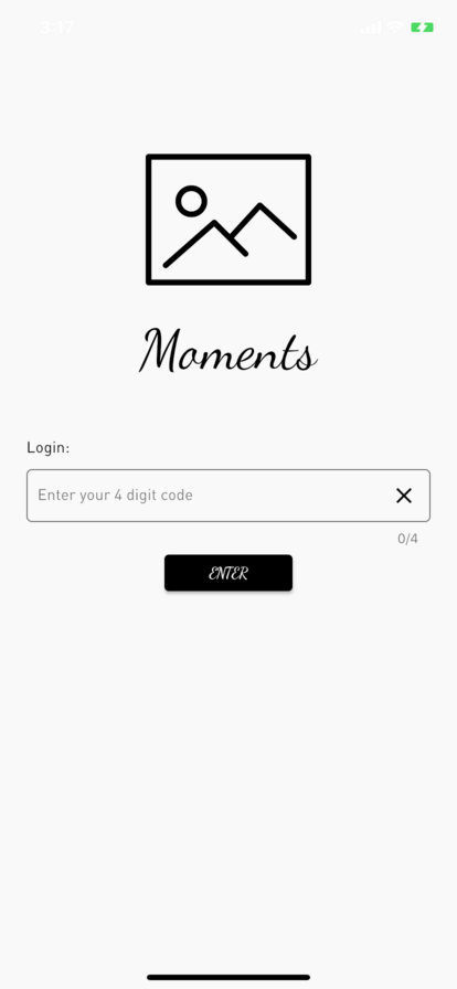
It has the following UI components:
- Image
- Title Text
- TextField Title Text
- TextField
- Button
Proceed to login.dart. Here you will first implement the login textfield, start by adding this ladder of codes:
Widget _buildLoginTextField() {
  // TODO #1: Implement Login Text Field
  return Theme(
    data: ThemeData(
      primaryColor: kRegistrationBlack,
      primaryColorDark: kRegistrationBlack,
    ),
    child: TextFormField(
      style: Theme.of(context).textTheme.subtitle,
      controller: _mobileNumberController,
      maxLength: 4,
      enableInteractiveSelection: false,
      keyboardType: TextInputType.number,
      textInputAction: TextInputAction.next,
      onFieldSubmitted: (value) {
        loginUser();
      },
      decoration: InputDecoration(
        fillColor: kRegistrationBlack,
        border: OutlineInputBorder(
          borderRadius: BorderRadius.circular(5.0),
        ),
        contentPadding:
            EdgeInsets.symmetric(vertical: 10.0, horizontal: 10.0),
        labelText: LOGIN_LABEL_TEXT,
        suffixIcon: IconButton(
          icon: Icon(
            Icons.clear,
            color: kRegistrationBlack,
          ),
          onPressed: () {
            _mobileNumberController.clear();
            _mobileNumber = '';
          },
        ),
      ),
      validator: (String value) {
        if (value.isEmpty || value.length != 4) {
          return 'Please enter a valid 4 digit code.';
        }
      },
      onSaved: (String value) {
        _mobileNumber = value;
      },
    ),
  );
}
In this code, you returned a Theme Widget with a child of TextFormField. You should take a look at theme.dart to see how the theme data is set before proceeding further. Using a centralised theme, any view that requires a text style can easily reference by calling Theme.of(context).textTheme.[styleType].
You should take a look at these codes to understand how this view is built as they will be repeatedly used in this tutorial. This is how the TextField is created:
- Theme
- ThemeData
- TextFormField
- InputDecoration
- OutlineInputBorder
- IconButton
- InputDecoration
The TextFormField has an OutlineInputBorder and a Clear IconButton, wrapped in Theme. It has a mobileNumberController which handles input text, and a validator for validation checks. onFieldSubmitted is triggered when the textInputAction is activated. To find out more about TextFormField, read the documentation here.
Moving on to the Enter button, a custom button has been created for you in buttons.dart. Here, you will just need to initialise a MomentsButton like this and since the button needs to be centered, wrap it with Center:
  Widget _buildEnterButton(BuildContext context) {
    // TODO #2: Implement Enter Button
    return Center(
        child:
            MomentsButton(text: ENTER, action: loginUser).getButton(context));
  }
The final step to complete this page is to layer everything into the body properties in build function:
  @override
  Widget build(BuildContext context) {
    return Scaffold(
      backgroundColor: Color(0xFFF9F9F9),
      // TODO #3: Implement Login View
      body: SafeArea(
        child: ListView(
          padding: EdgeInsets.symmetric(horizontal: 24.0),
          children: <Widget>[
            SizedBox(height: 80.0),
            Column(
              children: <Widget>[
                Image.asset(
                  'assets/LOGO.png',
                  height: 150.0,
                ),
                SizedBox(height: 12.0),
                Text('Moments', style: Theme.of(context).textTheme.caption),
              ],
            ),
            SizedBox(height: 50.0),
            Text('Login:', style: Theme.of(context).textTheme.subtitle),
            SizedBox(height: 10.0),
            AccentColorOverride(
              color: kRegistrationBlack,
              child: Form(
                key: _formKey,
                child: _buildLoginTextField(),
              ),
            ),
            _buildEnterButton(context)
          ],
        ),
      ),
    );
}- Scaffold
- SafeArea
- ListView
- Column
- Image
- Text
- Text
- Login TextField
- Enter Button
- Column
- ListView
- SafeArea
You are starting to see that the best way to arrange views vertically is to use Column. SafeArea here is used to handle any view changes caused by the keyboard.
ListView automatically helps you handle any overflowing views and it includes a scrolling mechanism. SizedBox is used to specify fixed spaces between views.
With the Login Screen completed, many classes of views and components were introduced, and you will see them in action more as you build the next few pages.
Now let’s run the app, try to key in a wrong code 1111 and then a correct code 1234, and then move on to the Gallery Screen!
You will not dive deep into how
Scoped Modelswork in this app. You can openuser.dartto see the login logic, and explore this crash course. In a nutshell,Scoped Modelis used to manage variables that will live in the lifetime of the app.
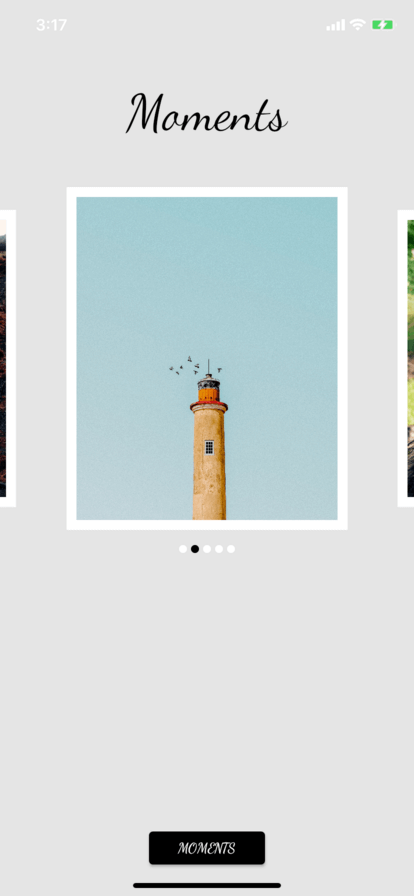
Gallery Screen
Next, we will build the Gallery screen. You will use Carousel Slider to build an image slider, and again, add a button to move to the next screen. Proceed to gallery.dart to get started.
Firstly, if you look at our assets folder, you notice there are already pre-loaded images labelled pic1.jpg etc. These are also declared in an array of strings call imgList.
Using the pre-created map function, you map them each into a Container so the output result is actually a List of Containers:
List _getChildren(MainModel model) {
  // TODO #4: Implement List
  final List<String> images = imgList;
  return map<Widget>(
    images,
    (int index, String url) {
      return Container(
        decoration:
            BoxDecoration(border: Border.all(width: 10.0, color: Colors.white)),
        margin: EdgeInsets.all(5.0),
        child: Image.asset(
          url,
          fit: BoxFit.cover,
          width: 261.0,
          height: 353.0,
        ),
      );
    },
  ).toList();
}
With the List of Containers ready, you can now load them into the Carousel like this in _CarouselWithIndicatorState class:
  @override
  Widget build(BuildContext context) {
    final List<String> images = imgList;
    // TODO #5: Implement Carousel
    return Column(children: [
      CarouselSlider(
        items: _getChildren(),
        autoPlay: true,
        height: 353,
        enlargeCenterPage: true,
        onPageChanged: (index) {
          setState(() {
            _current = index;
          });
        },
      ),
      Row(
        mainAxisAlignment: MainAxisAlignment.center,
        children: map<Widget>(
          images,
          (int index, String url) {
            return Container(
                width: 8.0,
                height: 24.0,
                margin: EdgeInsets.symmetric(vertical: 2.0, horizontal: 2.0),
                decoration: BoxDecoration(
                    shape: BoxShape.circle,
                    color:
                        _current == index ? kRegistrationBlack : Colors.white));
          },
        ),
      ),
    ]);
  }
Again, Column is used to layout 2 views vertically:
- View #1 – Carousel
- View #2 – Row of Carousel Indicators
If you can using Visual Studio Code and using a MAC machine, you can whole
CMDand hover onCarouselSliderto view more information about this class.
The MomentsButton can be created just like the previous one you have built:
    Widget _buildMomentsButton(BuildContext context) {
      // TODO #6: Implement Button
      return Center(
        child: MomentsButton(text: 'MOMENTS', action: _goToHomePage)
            .getButton(context),
      );
    }
Having a custom class helps minimise repeated codes.
The last step for this page is to link everything up in build, add these codes after _buildMomentsButton:
    return Scaffold(
      appBar: PreferredSize(
        preferredSize: Size.fromHeight(30.0), // here the desired height
        child: AppBar(backgroundColor: kPlatinum, elevation: 0.0),
      ),
      backgroundColor: kPlatinum,
      // TODO #7: Implement Gallery
      body: Column(
        mainAxisAlignment: MainAxisAlignment.start,
        children: <Widget>[
          Padding(
            padding: EdgeInsets.only(top: 8.0, bottom: 24.0),
            child: Text('Moments', style: Theme.of(context).textTheme.caption),
          ),
          Expanded(
            child: SizedBox(
              height: 200.0,
              child: ListView(children: <Widget>[
                Padding(
                  padding: EdgeInsets.symmetric(vertical: 15.0),
                  child: Column(
                    children: [
                      CarouselWithIndicator(),
                    ],
                  ),
                ),
              ]),
            ),
          ),
          Padding(
              padding: EdgeInsets.only(bottom: 24.0),
              child: _buildMomentsButton(context))
        ],
      ),
    );
PreferredSize is used to give AppBar a fixed size. Using MainAxisAlignment.start positions its children views in a top-down approach.
Run the app and you should see a nice carousel slide show :-).
Menu Screen
You are now down to just 3 more main screens to build, with a Menu Container Screen. In gallery.dart, you ended with a MomentsButton which navigates user to MainPage.
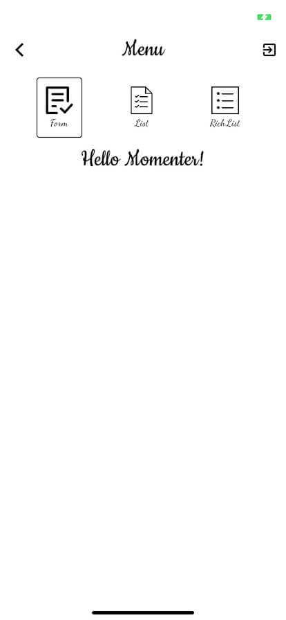
Open up main.dart in pages folder, and in this page, there will be 3 menu buttons at the top, which when each one is being tapped, it will switch the child view to its respective view.
Let’s start by implementing buildMenuItems:
  List<Widget> buildMenuItems(MainModel model) {
    // TODO #8: Implement Building of Menu Items
    final List<String> images = [
      'assets/menu_form.png',
      'assets/menu_list.png',
      'assets/menu_richList.png'
    ];

    final List<String> menuTitles = ['Form', 'List', 'RichList'];

    final List<MenuItem> menuItems = [
      MenuItem.form,
      MenuItem.list,
      MenuItem.richList
    ];

    final List<Widget> columnItems = List<Widget>();

    for (var i = 0; i < menuTitles.length; i++) {
      bool isSelectedMenuItem = selectedMenuItem == menuItems[i];
      columnItems.add(
        Container(
          decoration: BoxDecoration(
              borderRadius: BorderRadius.all(Radius.circular(4.0)),
              border: Border.all(
                  color:
                      isSelectedMenuItem ? kRegistrationBlack : Colors.white)),
          child: InkWell(
            onTap: () {
              setState(() {
                selectedMenuItem = menuItems[i];
              });
            },
            child: Padding(
              padding: EdgeInsets.all(12.0),
              child: Column(
                mainAxisSize: MainAxisSize.min,
                mainAxisAlignment: MainAxisAlignment.center,
                children: <Widget>[
                  Image(
                    image: AssetImage(images[i]),
                    height: 40,
                    width: 40,
                    color: kRegistrationBlack,
                  ),
                  Container(
                    margin: EdgeInsets.only(top: 4),
                    child: Text(menuTitles[i],
                        style: Theme.of(context).textTheme.display1),
                  )
                ],
              ),
            ),
          ),
        ),
      );
    }

    return columnItems;
  }
Wow! That’s really a lot of code. It does look intimidating, but actually, they are really simple. Logically, every MenuButton is made up of:
- Image
- Title
- MenuItem Type (Enum)
At the end, you get the complete view likes this:
- Container
- InkWell (Allows Tap)
- Column
- Image
- Text
- Column
- InkWell (Allows Tap)
This is one way you actually build a customised button. InkWell brings in the ability to implement onTap event. The function also uses isSelectedMenuItem to render a bordered or non-bordered view. At the end of this function, it returns the columns as a List.
Next, implement getPage which returns the selected page object:
  Widget getPage(MainModel model) {
    // TODO #9: Implement Menu Items Population
    switch (selectedMenuItem) {
      case MenuItem.form:
        return FormPage();
      case MenuItem.list:
        return ItemListPage(model);
      case MenuItem.richList:
        return RichListPage();
        break;
    }
  }
And, finally, implement the Column view which has a Row that contains all the customised buttons:
  @override
  Widget build(BuildContext context) {
    final MainModel _model = ScopedModel.of(context);

    return Scaffold(
      backgroundColor: kMomentsWhite,
      appBar: AppBar(
        centerTitle: true,
        title: Text('Menu', style: Theme.of(context).textTheme.headline),
        backgroundColor: Colors.white,
        elevation: 0.0,
        actions: <Widget>[
          IconButton(
            icon: Icon(Icons.exit_to_app),
            onPressed: () {
              _model.logout();
              Navigator.of(context).pushReplacementNamed('/login');
            },
          ),
        ],
      ),
      // TODO #10: Implement Child View
      body: Column(
        children: <Widget>[
          Padding(
            padding: EdgeInsets.only(top: 12.0, bottom: 12.0),
            child: Container(
              color: Colors.white,
              child: Row(
                  mainAxisAlignment: MainAxisAlignment.spaceEvenly,
                  children: buildMenuItems(_model)),
            ),
          ),
          Padding(
            padding: EdgeInsets.only(bottom: 8),
            child: Text("Hello ${_model.user.name}!",
                style: Theme.of(context).textTheme.headline),
          ),
          Expanded(child: getPage(_model))
        ],
      ),
    );
  }
In the Row here, MainAxisAlignment.spaceEvenly helps to spread the views evenly as the screen size changes. In the next layer, a simple Welcome message is shown. Followed by the child view which is rendered by getPage.
Run the app now and you should be able to tap on each of the button, see them being selected! Nothing much happens at the child view yet as they are not implemented. That is up next!
Form Screen
Next, we’ll implement the form screen. Open form.dart. In most of the apps you are using now, it’s common to implement a page with a form to submit information. Here’s a quick way to implement a form with radio buttons, checkbox and also a counter.
Name Text Field
The textfield is completely similar to the one you have implemented in the login screen, with the exception that here a ListTile is used with leading and title used to specify the location of the views:
  ListTile getNameInputListTile() {
    // TODO #12: Implement Name Section
    return ListTile(
      leading: Padding(
        padding: EdgeInsets.only(left: 8.0, top: 16.0),
        child: Text('Your Name:', style: Theme.of(context).textTheme.subtitle),
      ),
      title: Padding(
        padding: EdgeInsets.only(top: 10.0),
        child: Theme(
          data: ThemeData(
            primaryColor: kRegistrationBlack,
            primaryColorDark: kRegistrationBlack,
          ),
          child: Container(
            height: 40.0,
            child: TextField(
              style: Theme.of(context).textTheme.subtitle,
              controller: _nameTextController,
              textCapitalization: TextCapitalization.words,
              decoration: InputDecoration(
                fillColor: kRegistrationBlack,
                border: OutlineInputBorder(
                  borderRadius: BorderRadius.circular(5.0),
                ),
                contentPadding:
                    EdgeInsets.symmetric(vertical: 10.0, horizontal: 10.0),
                suffixIcon: IconButton(
                  icon: Icon(
                    Icons.clear,
                    color: kRegistrationBlack,
                  ),
                  onPressed: () {
                    _nameTextController.clear();
                  },
                ),
                hintText: NAME_HINT_TEXT,
                labelText: NAME_LABEL_TEXT,
              ),
            ),
          ),
        ),
      ),
    );
  }
I will not go into further explanation here as bulks of the code are the same. You could challenge yourself by placing them in a centralised class like how I did it for MomentsButton, give it a custom initiliser and call it to reduce code.
Guests Counter
The counter section contains a label text, a - button, a counter text and a + button:
  Widget getGuestsCounter() {
    // TODO #13: Add Guest Counter
    return ListTile(
      leading: Padding(
        padding: EdgeInsets.only(left: 8.0, top: 8.0),
        child: Text('No. of Guests (Including yourself):',
            style: Theme.of(context).textTheme.subtitle),
      ),
      title: Row(
        mainAxisAlignment: MainAxisAlignment.end,
        children: <Widget>[
          IconButton(
            color: kRegistrationBlack,
            icon: Icon(Icons.remove),
            onPressed: () {
              if (_guestsCounter > 0) {
                setState(() => _guestsCounter--);
                _formData['guests'] = _guestsCounter;
              }
            },
          ),
          Text(
            _guestsCounter.toString(),
            style: Theme.of(context).textTheme.title,
          ),
          IconButton(
            color: kRegistrationBlack,
            icon: Icon(Icons.add),
            onPressed: () {
              if (_guestsCounter < 9) {
                setState(() => _guestsCounter++);
                _formData['guests'] = _guestsCounter;
              }
            },
          ),
        ],
      ),
    );
  }
As you have understood how a ListTile works, the leading view is the label, where as the title view contains a Rowwhich contains:
- IconButton (-)
- Text
- IconButton (+)
Section Header
In every section, we are also giving it a nice header:
  Widget getSectionHeader(String title) {
    // TODO #14: Add Section Header
    return Column(
      crossAxisAlignment: CrossAxisAlignment.start,
      children: <Widget>[
        Padding(
          padding: EdgeInsets.only(top: 18, left: 22.0),
          child: Text(
            title,
            style: Theme.of(context).textTheme.headline,
          ),
        ),
        Padding(
          padding: EdgeInsets.only(left: 18, right: 18),
          child: Divider(
            color: kYankeesBlue,
          ),
        )
      ],
    );
  }
Gender Radio Option
This is radio button type option, so go ahead and add this:
  Widget getGenderOptions() {
    // TODO #15: Add Gender Options
    return ListTile(
      leading: Padding(
        padding: EdgeInsets.only(left: 8.0, top: 4.0),
        child: Text('Gender:', style: Theme.of(context).textTheme.subtitle),
      ),
      title: Row(
        mainAxisAlignment: MainAxisAlignment.start,
        children: <Widget>[
          Radio(
            activeColor: kRegistrationBlack,
            value: 0,
            groupValue: _formData['gender'] as int,
            onChanged: _handleGenderChange,
          ),
          Text(
            GENDER_CHOICES[0],
            style: Theme.of(context).textTheme.subtitle,
          ),
          Radio(
            value: 1,
            activeColor: kRegistrationBlack,
            groupValue: _formData['gender'] as int,
            onChanged: _handleGenderChange,
          ),
          Text(
            GENDER_CHOICES[1],
            style: Theme.of(context).textTheme.subtitle,
          ),
        ],
      ),
    );
  }
In Visual Studio Code, you can actually use OPTION+SHIFT+F to perform an auto-indentation.
Up to this point, I believe you are already a ListTile expert. Here we introduced Radio.
Transport Checkbox Option
The last option type is Checkbox:
  Widget getBusServiceOption() {
    // TODO #16: Add Transport Options
        return Padding(
      padding: EdgeInsets.only(bottom: 12),
      child: ListTile(
        leading: Checkbox(
          activeColor: kRegistrationBlack,
          onChanged: _handleTransportOption,
          value: _formData['bus'] as bool,
        ),
        title: InkWell(
          onTap: () {
            setState(() {
              _formData['bus'] = !_formData['bus'];
            });
          },
          child: Text(
            'I need transport',
            style: Theme.of(context).textTheme.subtitle,
          ),
        ),
      ),
    );
  }
Nothing really special here, we used InkWell to improve the tap area of the Checkbox.
Alert Dialog
For the alert dialog, you may have already seen how an AlertDialog is created. Here’s a simple dialog you should add to validate user’s input:
  void _showDialog(String title, String content) {
    // TODO #11: Implement Dialog
    showDialog<AlertDialog>(
      context: context,
      builder: (BuildContext context) {
        return AlertDialog(
          title: Text(title),
          content: Text(content),
          actions: <Widget>[
            FlatButton(
              child: Text(ALERT_OK),
              onPressed: () {
                Navigator.of(context).pop();
              },
            ),
          ],
        );
      },
    );
  }
Lastly, the Submit Button which you are implemented it for the third time:
  Widget getSubmitButton() {
    // TODO #17: Add Submit Button
    return Padding(
      child: Center(
        child:
            MomentsButton(text: SUBMIT, action: _submitForm).getButton(context),
      ),
      padding: EdgeInsets.only(bottom: 16),
    );
  }
Let the views assemble! Take a look at renderForm and you can see how we can render the form and order of each section easily! Here, the build function is completed for you so go ahead and run the app!
Try submitting the form without a name, you should be prompted with the AlertDialog you added.
If you are unable to see your page rendered, try to delete the app and perform a fresh installation. Sometimes, flutter may unknowingly cache it.
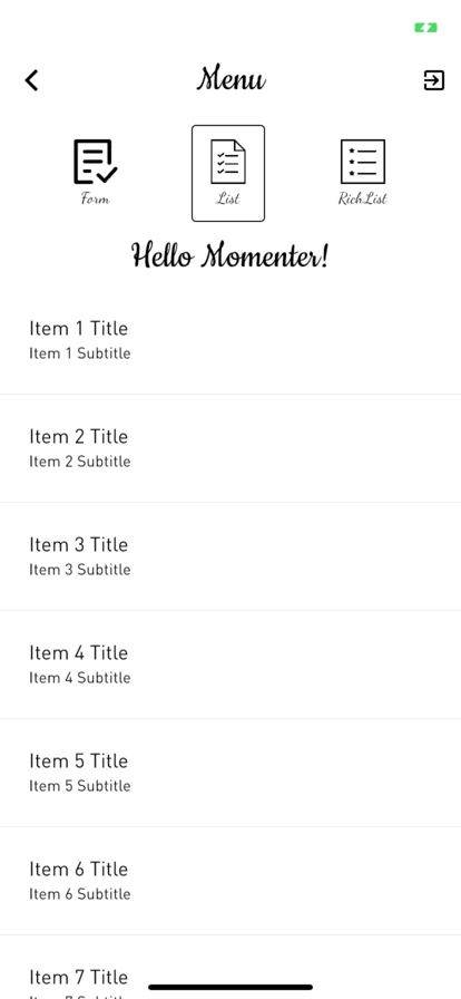
List Screen
Displaying a List of items is also a common feature of every app that we use. Headover to item_list.dart and here, you will use ListView to build a list of data:
  Widget _buildItemList() {
    // TODO #18: Implement Item List
    return ListView.builder(
      itemBuilder: (BuildContext context, int index) {
        return Column(
          children: <Widget>[
            Padding(
              child: ListTile(
                title: Text(
                  _itemList[index].title,
                  style: Theme.of(context).textTheme.title,
                ),
                subtitle: Text(_itemList[index].subtitle,
                    style: Theme.of(context).textTheme.subtitle),
              ),
              padding: EdgeInsets.all(10.0),
            ),
            Divider(
              height: 5.0,
            )
          ],
        );
      },
      itemCount: _itemList.length,
    );
  }
The data has been pre-loaded from scoped-models/item_list.dart. The builder method in ListView automatically helps you iterate through the data List, so you can implement the rendering logic in itemBuilder. The build function has been implemented for you. Go ahead and run the app, you should see a nice scrolling view in List tab 🙂
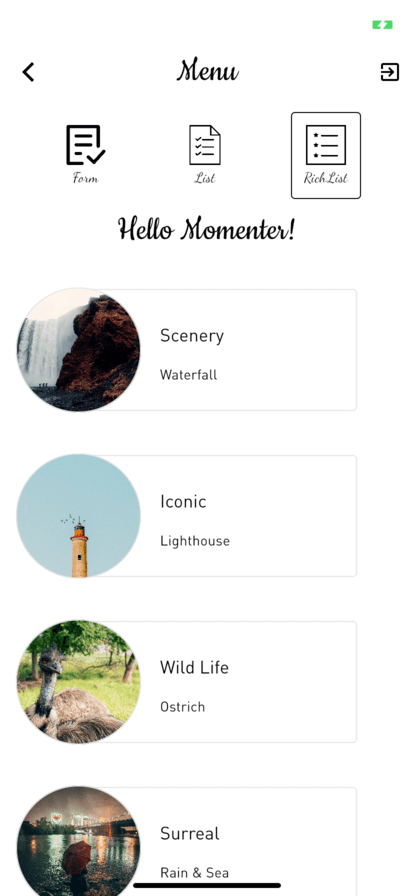
Rich List Screen
The last and final screen is the RichList screen. I personally named it as RichList because it has an image and a customised look. Headover to rich_list.dart and you should already see everything implemented for you. But, you are seeing an empty screen because each card view is not implemented yet.
Now go to rich_list_item_card.dart and here is where all the wires are missing. You will be giving each image a circular frame, so go ahead and add these in itemImage:
  Widget get itemImage {
    // TODO #19: Implement List Item Image View
    return Container(
      width: 125.0,
      height: 125.0,
      decoration: BoxDecoration(
        border: Border.all(color: kPlatinum),
        shape: BoxShape.circle,
        image: DecorationImage(
          fit: BoxFit.cover,
          image: AssetImage(item.imagePath),
        ),
      ),
    );
  }
Every image is also accompanied by a Card with description on the right:
  Widget get listItemCard {
    // TODO #20: Implement List Item Card View
    return Padding(
      padding: EdgeInsets.only(top: 18, bottom: 16),
      child: Container(
        constraints: BoxConstraints(minWidth: 300),
        height: 130.0,
        child: Card(
          elevation: 0.0,
          shape: RoundedRectangleBorder(
            side: BorderSide(color: kPlatinum, width: 1.0),
            borderRadius: BorderRadius.circular(4.0),
          ),
          color: Colors.white,
          child: Padding(
            padding: EdgeInsets.only(
              top: 10.0,
              bottom: 8.0,
              left: 95.0,
            ),
            child: Padding(
              padding: EdgeInsets.only(top: 8),
              child: Column(
                crossAxisAlignment: CrossAxisAlignment.start,
                mainAxisAlignment: MainAxisAlignment.spaceEvenly,
                children: <Widget>[
                  Text(widget.item.name,
                      style: Theme.of(context).textTheme.title),
                  Text(widget.item.description,
                      style: Theme.of(context).textTheme.subtitle),
                ],
              ),
            ),
          ),
        ),
      ),
    );
  }
And finally, let’s combine both into build function:
  @override
  Widget build(BuildContext context) {
    return Padding(
      padding: EdgeInsets.symmetric(horizontal: 16.0, vertical: 8.0),
      // TODO #21: Implement List Item Image Card View
      child: Container(
        height: 150.0,
        child: Stack(
          children: <Widget>[
            Positioned(
              left: 45.0,
              child: listItemCard,
            ),
            Positioned(top: 20.5, child: itemImage),
          ],
        ),
      ),
    );
  }
While Column and Row help you to layer the views vertically down and horizontally across, Stack helps you to layer your views on top of each other. Here, the image overlaps the Card View by putting it in the second postion.
Run the app and you should see the completed RichList!
Moving Forward
You can download the finished project here. You have learnt a lot about creating more complex UIs in this tutorial using Flutter. Flutter is natively developed by Google so it will generally have better performance on Android devices. However, given its natively-compiled capability, it actually runs smoothly on most iOS devices as well.
Flutter is still at its infant stage, and it surely has a very bright future. It can help you create beautiful and complex UIs with lesser code. I encourage you to use its documentation diligently to build your own flavor of apps.
Thank you for following through this tutorial!