
Before the introduction of iOS 8 and specifically, Adaptive UI, whenever you wanted to display presentation sheets in a universal app, you had to make platform checks to verify whether the device the app was running on was an iPhone or an iPad to decide whether to present the sheet as a popover or to push a view onto the screen.
iOS 8 introduces presentation controllers which make the above unnecessary. Now you can write a single code path for your presentation, that works on all devices, adapting itself to the device size and orientation. You do this by specifying a preferred presentation style when presenting a view controller, for example a popover, and then according to the size class of your device, the OS will either present the view controller in that style or switch to an alternative style, for example a popover being presented as full screen on compact-width sizes.
In this article we’ll start off by looking at UIAlertController which replaces UIAlertView and UIActionSheet to present information to the user. We’ll then look at UIPopoverPresentationController which enables us to create adaptive presentation controllers without writing platform specific code. We’ll finish off by looking at how you can create your own custom presentation controllers. We have covered UIAlertController here on Appcoda before, so feel free to skip that part if you wish to.
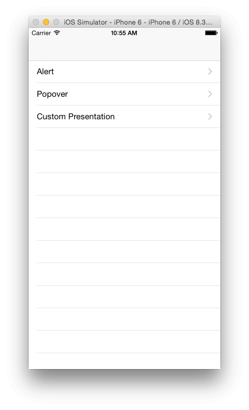
To follow along, download the starter project. If you run it, you will be presented with a table view with a list of items that correspond with the various stages of this tutorial.
UIAlertController
In iOS 8, UIAlertController replaced UIAlertView and UIActionSheet as a way of presenting brief information to the user. UIAlertController is an improvement over the previous two classes in that: it is adaptive (on an iPad, an action sheet style alert will present itself in a popover), you can easily switch between an action sheet style and alert view style and you can easily respond to button taps by using closures (previously you had to implement delegate methods). Alert views are presented modally in the center of their presenting view controller while action sheets are anchored to the bottom of the screen. Alerts support both buttons and text fields, while action sheets only support buttons.
Unlike the previous two classes, UIAlertController is a subclass of UIViewController. This means that alerts now have the configurable functionality provided with view controller presentations.
To see UIAlertController in action, open AlertViewController.swift and modify the showAlertWasTapped() function with the following.
@IBAction func showAlertWasTapped(sender: UIButton) {

    let alertController = UIAlertController(title: "Appcoda", message: "Message in alert dialog", preferredStyle: UIAlertControllerStyle.Alert)

    let deleteAction = UIAlertAction(title: "Delete", style: UIAlertActionStyle.Destructive, handler: {(alert :UIAlertAction!) in
        println("Delete button tapped")
    })
    alertController.addAction(deleteAction)

    let okAction = UIAlertAction(title: "OK", style: UIAlertActionStyle.Default, handler: {(alert :UIAlertAction!) in
        println("OK button tapped")
    })
    alertController.addAction(okAction)

    presentViewController(alertController, animated: true, completion: nil)

}
The above instantiates an alert controller with a title, message, and specifies Alert as the style of how the controller will appear. And then creates two actions and adds them to the alert controller. Both actions have a handler which gets called when the respective buttons are tapped.
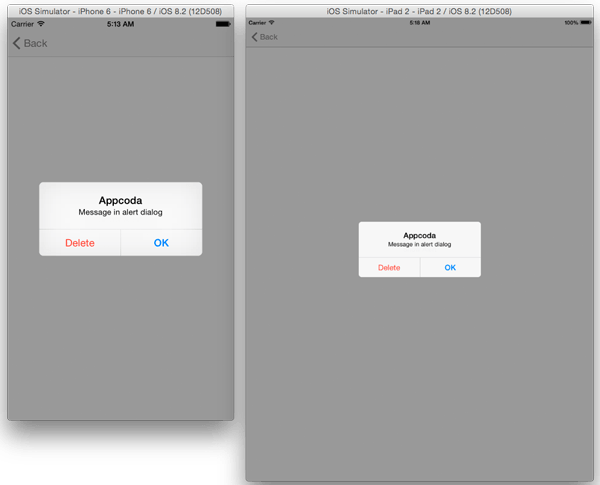
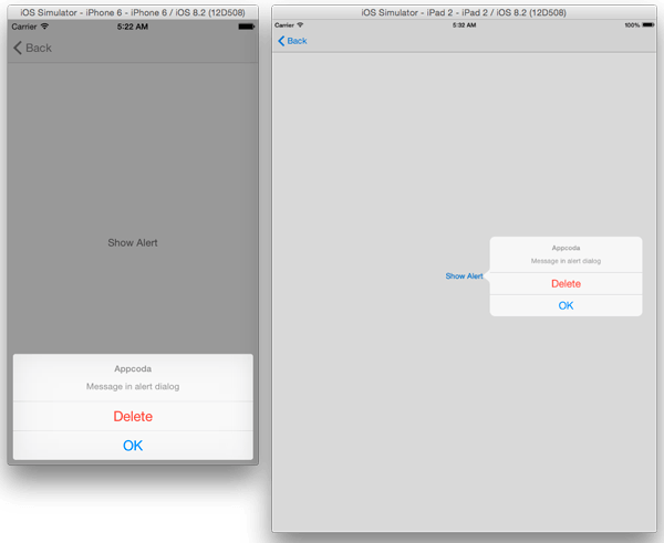
Run the app and select the first row on the table view (named Alert). Tap the Show Alert button on the detail view and you should see an alert box. It looks the same on iPhone and iPad.
Before UIAlertController, changing from an alert to an action sheet required a lot of code rewriting, but now you only have to change the enumerated type from UIAlertControllerStyle.Alert to UIAlertControllerStyle.ActionSheet when initializing the alert controller. Make the below changes.
let alertController = UIAlertController(title: "Appcoda", message: "Message in alert dialog", preferredStyle: UIAlertControllerStyle.ActionSheet)
Run the app. On an iPhone, the alert will now appear as an action sheet at the bottom of the screen. Running on an iPad presents a problem though. The app crashes when you tap the Show Alert button.
To fix this, add the following to showAlertWasTapped() right before the call to presentViewController().
alertController.popoverPresentationController?.sourceView = view
alertController.popoverPresentationController?.sourceRect = sender.frame
On an iPad, the alert controller presents itself inside a popover controller therefore you need to instruct the alert controller on where to point the popover arrow. You direct the popover where to point by setting the sourceView to the view containing the popover and the sourceRect to the rectangle inside the sourceView where the popover should point. The above two statements direct the popover to point to the button tapped. Now the alert should work fine on the iPad.
UIPopoverPresentationController
Alerts are great for displaying brief information to the user, but aren’t the best when you have a lot of data to present. For this, a popover presentation controller will be more suitable.
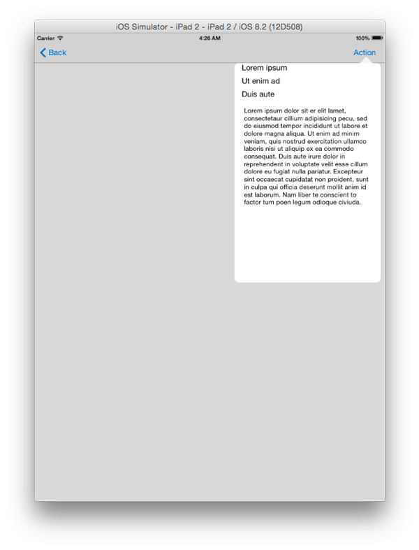
If you look at the storyboard file you will see a view controller in the View Controller Scene that has its storyboard ID set to PopoverViewController. We’ll present this view controller as a modal view controller on compact-width screens and as a popover on regular-width screens.
To do this, open PopoverViewController.swift and modify actionWasTapped() function as shown. This method is called when the bar button item in the view controller is tapped.
@IBAction func actionWasTapped(sender: UIBarButtonItem) {
    let storyboard : UIStoryboard = UIStoryboard(name: "Main", bundle: nil)
    let vc = storyboard.instantiateViewControllerWithIdentifier("PopoverViewController") as! UIViewController
    vc.modalPresentationStyle = UIModalPresentationStyle.Popover
    let popover: UIPopoverPresentationController = vc.popoverPresentationController!
    popover.barButtonItem = sender
    presentViewController(vc, animated: true, completion:nil)
    }
The above code first loads the view controller from the storyboard, then sets its modal presentation style to Popover – this will make the view controller appear as a popover on regular-width screens. Next we get the view controller’s popoverPresentationController property and set its barButtonItem property. This specifies the bar button item on which to anchor the popover. When presented, the popover’s arrow points to the specified item. Alternatively, you may specify the anchor location for the popover using the sourceView and sourceRect properties like we did in the previous example. You can also configure other properties such as permittedArrowDirections, which configures the directions the popover can point to. During presentation, the popover presentation controller tries to respect your preferences but may use a different arrow direction if it cannot otherwise lay out the popover. The default value of this property is UIPopoverArrowDirection.Any. Here we’ll leave it at its default, so there is no need to set the property.
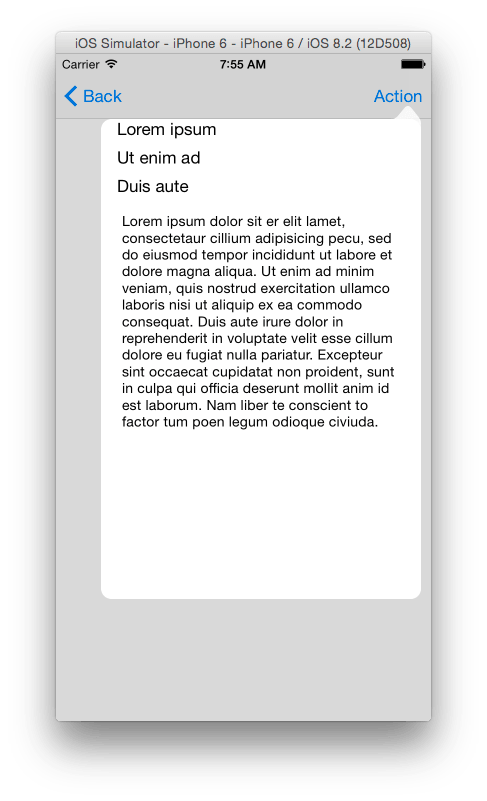
Run the app in the iPad simulator; you’ll see the view controller displayed in a popover.
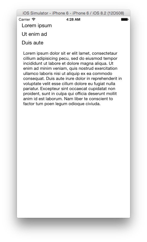
Run it on the iPhone and the view controller will be presented modally.
You’ll notice that there is no way of dismissing the view controller on compact-width devices. To enable this, we’ll display the view controller in a navigation controller on compact-width devices. To do this, we’ll set the view controller as the delegate of the UIPopoverPresentationController, and implement two delegate methods – adaptivePresentationStyleForPresentationController() and presentationController(_:viewControllerForAdaptivePresentationStyle).
Change the class definition of PopoverViewController as shown.
class PopoverViewController: UIViewController, UIPopoverPresentationControllerDelegate {
Add the following to actionWasTapped() before the call to presentViewController().
popover.delegate = self
Add the following functions to the class.
func adaptivePresentationStyleForPresentationController(controller: UIPresentationController) -> UIModalPresentationStyle {
    return UIModalPresentationStyle.FullScreen
}

func presentationController(controller: UIPresentationController, viewControllerForAdaptivePresentationStyle style: UIModalPresentationStyle) -> UIViewController? {
    let navigationController = UINavigationController(rootViewController: controller.presentedViewController)
    let btnDone = UIBarButtonItem(title: "Done", style: .Done, target: self, action: "dismiss")
    navigationController.topViewController.navigationItem.rightBarButtonItem = btnDone
    return navigationController
}

func dismiss() {
    self.dismissViewControllerAnimated(true, completion: nil)
}
adaptivePresentationStyleForPresentationController() is called when the app presents a view controller on a compact-width device. We implement this to let the OS know the presentation style to use. Here we tell the OS to present the view controller as a full screen view controller on compact-width devices.
presentationController(_:viewControllerForAdaptivePresentationStyle) is called when a view controller is presented in a different presentation style than originally configured. We set our view controller to have a Popover presentation style, but we have just specified that on compact-width devices, it should be presented in full screen style. In this function, you can return a modified view controller to use when the style switch occurs. Here we wrap the view controller in a navigation controller and add a Done button to the navigation bar. The last method is the handler for the button taps. It simply dismisses the view controller.
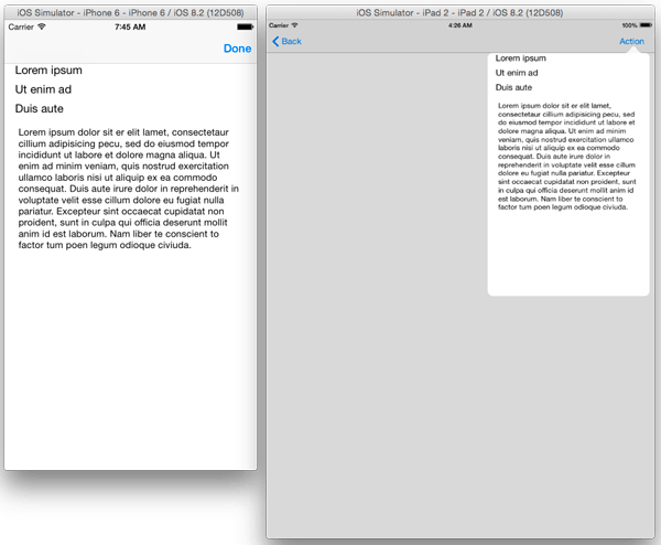
Run the app. On the iPhone, you will see the modified view controller that now has a navigation bar with a button to dismiss the view. On the iPad, the view controller displays without the navigation controller since it doesn’t use the full screen display.
If you want the iPhone to display a Popover just like the iPad, then it’s simply a matter of changing the return statement in adaptivePresentationStyleForPresentationController() to the following.
return UIModalPresentationStyle.None
Running on the iPhone should give you the following.
Custom Presentations
We’ve looked at ways to display information to the user using the alerts and popover presentation controllers. These are great, but you might want to present your view controllers with a custom look and animation. We’ll look how to do this next by creating a custom presentation that is similar to the example that Apple presented during last year’s WWDC. You can watch the video here to learn more about presentation controllers.
Before we get started, lets look at some concepts on presentation controllers which we’ll use.
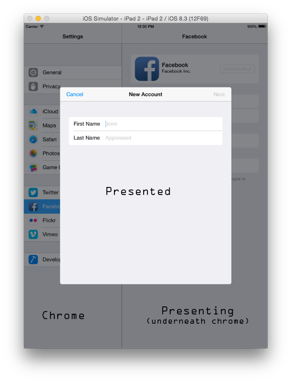
We’ll subclass UIPresentationController (which was introduced in iOS 8) to provide view and transition management for presented view controllers. Presentations usually consist of three major parts: the presented view controller, presenting view controller and the chrome. Looking at a typical presentation below, you can see these views. For apps shipped by Apple, the chrome is usually a grey semi-transparent view, but you have the freedom to style it however you want.
UIPresentationController holds references to the presented and presenting view controllers and it can manage various aspects of how the view controller is presented onscreen like the animations used, chrome customization, response to trait changes, e.t.c.
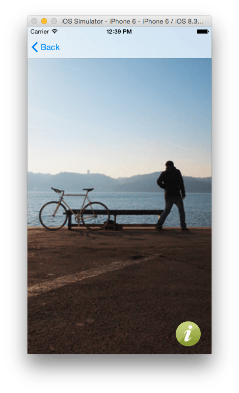
If you run the app and select Custom Presentation from the table, you will be presented with a view with an image and a button at the bottom right corner of the screen. We are going to create a presentation that will show the user some information when that button is tapped.
The button is already wired to an action method in the class CustomPresentationViewController. The action is named infoButtonWasTapped(). Also, if you look at the code files in the Project Navigator, you will notice a file named ExampleViewController. The view controller will be used to create the presentation view. It is a typical view controller and so there will be no need to cover creating it in this tutorial.
To get started, create a class named ExamplePresentationController. Make it a subclass of UIPresentationController. Change the class declaration as shown so that it adopts the UIAdaptivePresentationControllerDelegate protocol.
class ExamplePresentationController: UIPresentationController, UIAdaptivePresentationControllerDelegate {
UIAdaptivePresentationControllerDelegate protocol will allows us to specify the adaptive presentation style to use when presenting this controller.
Add the following to the class.
var chromeView: UIView = UIView()

override init(presentedViewController: UIViewController!, presentingViewController: UIViewController!) {
    super.init(presentedViewController:presentedViewController, presentingViewController:presentingViewController)
    chromeView.backgroundColor = UIColor(white:0.0, alpha:0.4)
    chromeView.alpha = 0.0

    let tap = UITapGestureRecognizer(target: self, action: "chromeViewTapped:")
    chromeView.addGestureRecognizer(tap)
    }

func chromeViewTapped(gesture: UIGestureRecognizer) {
    if (gesture.state == UIGestureRecognizerState.Ended) {
        presentingViewController.dismissViewControllerAnimated(true, completion: nil)
    }
}
We create a dark view – chromeView – and set its alpha to 0 so it won’t be initially visible. We then add a gesture recognizer to the chromeView that will dismiss the presented view controller when the chrome is tapped.
Next add the following to the class.
override func frameOfPresentedViewInContainerView() -> CGRect {
    var presentedViewFrame = CGRectZero
    let containerBounds = containerView.bounds
    presentedViewFrame.size = sizeForChildContentContainer(presentedViewController, withParentContainerSize: containerBounds.size)
    presentedViewFrame.origin.x = containerBounds.size.width - presentedViewFrame.size.width

    return presentedViewFrame
}

override func sizeForChildContentContainer(container: UIContentContainer, withParentContainerSize parentSize: CGSize) -> CGSize {
    return CGSizeMake(CGFloat((floorf(Float(parentSize.width / 3.0)))), parentSize.height)
}
The above creates the frame rectangle that will be assigned to the presented view. sizeForChildContentContainer() returns the size of the specified child view controller’s content. Here we set it to be a third of the screen.
Next add the following to the class.
override func presentationTransitionWillBegin() {
    chromeView.frame = self.containerView.bounds
    chromeView.alpha = 0.0
    containerView.insertSubview(chromeView, atIndex:0)
    let coordinator = presentedViewController.transitionCoordinator()
    if (coordinator != nil) {
        coordinator!.animateAlongsideTransition({
            (context:UIViewControllerTransitionCoordinatorContext!) -> Void in
                self.chromeView.alpha = 1.0
        }, completion:nil)
    } else {
        chromeView.alpha = 1.0
    }
}
We override presentationTransitionWillBegin() above in which we set the chrome’s frame and add it to the container view. We then check the value of the presented view controller’s transition coordinator. The transition coordinator is responsible for animating the presentation and dismissal of the content. If the coordinator isn’t nil, we use animateAlongsideTransition() to specify additional animations to be used alongside the presentation animation. In our case, we animate the alpha to 1.0.
Next add the following to the class.
override func dismissalTransitionWillBegin() {
    let coordinator = presentedViewController.transitionCoordinator()
    if (coordinator != nil) {
        coordinator!.animateAlongsideTransition({
            (context:UIViewControllerTransitionCoordinatorContext!) -> Void in
                self.chromeView.alpha = 0.0
        }, completion:nil)
    } else {
        chromeView.alpha = 0.0
    }
}
In the above code, we do the opposite of what we did in presentationTransitionWillBegin() i.e. we animate the alpha of the chrome back to 0.
Add the following to the file.
override func containerViewWillLayoutSubviews() {
    chromeView.frame = containerView.bounds
    presentedView().frame = frameOfPresentedViewInContainerView()
}
This sets the frames of the chrome and presented views to the bounds of the container view. If this isn’t done then they won’t resize if the device is rotated.
Next add the following to the file.
override func shouldPresentInFullscreen() -> Bool {
    return true
}
This determines whether the presentation will cover the full screen.
Add the following to the class.
override func adaptivePresentationStyle() -> UIModalPresentationStyle {
    return UIModalPresentationStyle.FullScreen
}
The above indicates that the presented view should cover the full screen. We can either return .OverFullScreen or .FullScreen. The difference between the two is that with .OverFullScreen if the presented view controller’s view doesn’t cover the underlying content, then the views under the presented view controller will be visible.
That’s it for the presentation controller. Now to create the controller which will perform custom animated transitions between view controllers.
Create a class called ExampleAnimatedTransitioning. Make it a subclass of NSObject. Change its declaration as shown.
class ExampleAnimatedTransitioning: NSObject, UIViewControllerAnimatedTransitioning {
UIViewControllerAnimatedTransitioning protocol performs the custom animations for transitioning between view controllers.
Add the following to the class.
var isPresentation : Bool = false

func transitionDuration(transitionContext: UIViewControllerContextTransitioning) -> NSTimeInterval {
    return 0.5
}
isPresentation will be used to determine if the presentation animation is presenting (as opposed to dismissing). transitionDuration() returns the duration in seconds of the transition animation.
Add the following to the class.
func animateTransition(transitionContext: UIViewControllerContextTransitioning) {
    let fromVC = transitionContext.viewControllerForKey(UITransitionContextFromViewControllerKey)
    let toVC = transitionContext.viewControllerForKey(UITransitionContextToViewControllerKey)
    let fromView = fromVC?.view
    let toView = toVC?.view
    let containerView = transitionContext.containerView()

    if isPresentation {
        containerView.addSubview(toView!)
    }

    let animatingVC = isPresentation ? toVC : fromVC
    let animatingView = animatingVC?.view

    let finalFrameForVC = transitionContext.finalFrameForViewController(animatingVC!)
    var initialFrameForVC = finalFrameForVC
    initialFrameForVC.origin.x += initialFrameForVC.size.width;

    let initialFrame = isPresentation ? initialFrameForVC : finalFrameForVC
    let finalFrame = isPresentation ? finalFrameForVC : initialFrameForVC

    animatingView?.frame = initialFrame

    UIView.animateWithDuration(transitionDuration(transitionContext), delay:0, usingSpringWithDamping:300.0, initialSpringVelocity:5.0, options:UIViewAnimationOptions.AllowUserInteraction, animations:{
        animatingView?.frame = finalFrame
        }, completion:{ (value: Bool) in
            if !self.isPresentation {
                fromView?.removeFromSuperview()
            }
            transitionContext.completeTransition(true)
    })
}
In the above code, we get the from and to view controllers from the UIViewControllerContextTransitioning object. We then get the respective views of these view controllers. Next we get the container view and if the presentation animation is presenting, we add the to view to the container view.
We then decide on which view controller to animate based on whether the transition is a presentation or dismissal. We then determine the start and end positions of the view. Then in the animation, we move the view to the final position. This will animate the view from right to left during a presentation and vice versa during dismissal. If the transition is a dismissal, we remove the view. Then we complete the transition by calling transitionContext.completeTransition().
Now for the final class.
Add another class and name it ExampleTransitioningDelegate. Make it a subclass of NSObject. Change its declaration as shown.
class ExampleTransitioningDelegate: NSObject, UIViewControllerTransitioningDelegate {
Add the following functions to the class.
func presentationControllerForPresentedViewController(presented: UIViewController, presentingViewController presenting: UIViewController!, sourceViewController source: UIViewController) -> UIPresentationController? {
    let presentationController = ExamplePresentationController(presentedViewController:presented, presentingViewController:presenting)

    return presentationController
}

func animationControllerForPresentedController(presented: UIViewController, presentingController presenting: UIViewController, sourceController source: UIViewController) -> UIViewControllerAnimatedTransitioning? {
    var animationController = ExampleAnimatedTransitioning()
    animationController.isPresentation = true
    return animationController
}

func animationControllerForDismissedController(dismissed: UIViewController) -> UIViewControllerAnimatedTransitioning? {
    var animationController = ExampleAnimatedTransitioning()
    animationController.isPresentation = false
    return animationController
}
The first function returns a presentation controller that manages the presentation of a view controller. We return an instance of the ExamplePresentationController we created. The second function returns an animator object that will be used when a view controller is being presented, and the third function returns the animation controller to be used in dismissing the view controller.
The final step before we can run the app and see the presentation is wiring up the button in CustomPresentationViewController. Open the CustomPresentationViewController.swift file and add the following to the class.
let exampleTransitionDelegate = ExampleTransitioningDelegate()
Next modify infoButtonWasTapped() as shown.
@IBAction func infoButtonWasTapped(sender: UIButton) {
    transitioningDelegate = exampleTransitionDelegate
    var vc = ExampleViewController()
    vc.transitioningDelegate = exampleTransitionDelegate
    presentViewController(vc, animated: true, completion: nil)
}
The above assigns ExampleTransitioningDelegate as the view controller’s transitioning delegate. Then we create an instance of ExampleViewController which will provide the content to display. We then present this view controller.
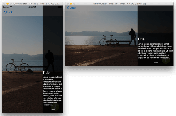
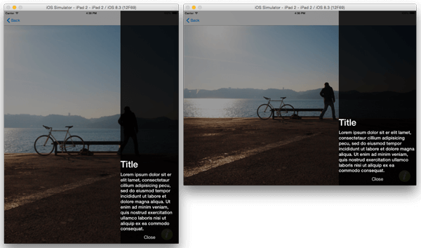
You can finally run the app to test all the code added. You should see the following when the info button at the bottom of the screen is pressed.
That brings us to the end of this tutorial. To learn more about changes made to presentation controllers in iOS8 be sure to watch this WWDC video.
For reference, you can download the complete Xcode project here.