

Progress bars or other kinds of indicators play a vital role in apps that execute time-consuming tasks or operations. It enriches the user experience by displaying a progress indicator, which enables the user to track the progress of the operation and get an idea of how long it will take to complete.
In SwiftUI, it comes with a built-in component called ProgressView for developers to present a progress bar or a circular indicator to display the progress of a long-running operation, such as downloading a file or uploading data to a server.
The default appearance of ProgressView is simple and minimalistic, and it might not match the design and theme of your app. This is where the ProgressViewStyle protocol comes into play. You can use the ProgressViewStyle protocol to create custom styles for the ProgressView component that match the design and theme of your app.
In this tutorial, I’ll walk you through the basics of ProgressView and show you how to customize the look & feel of the progress view using ProgressViewStyle.
The Basic Implementation of ProgressView
The ProgressView component is very easily to use. In your SwiftUI apps, you can create a progress indicator by writing the following line of code:
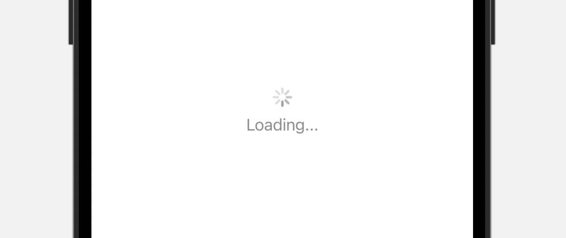
ProgressView()Optionally, you can add a label to display the status message like this:
ProgressView() {
    Text("Loading...")
}
On iOS, the progress view is displayed as a circular indicator.
Indeterminate Progress vs Determineate Progress
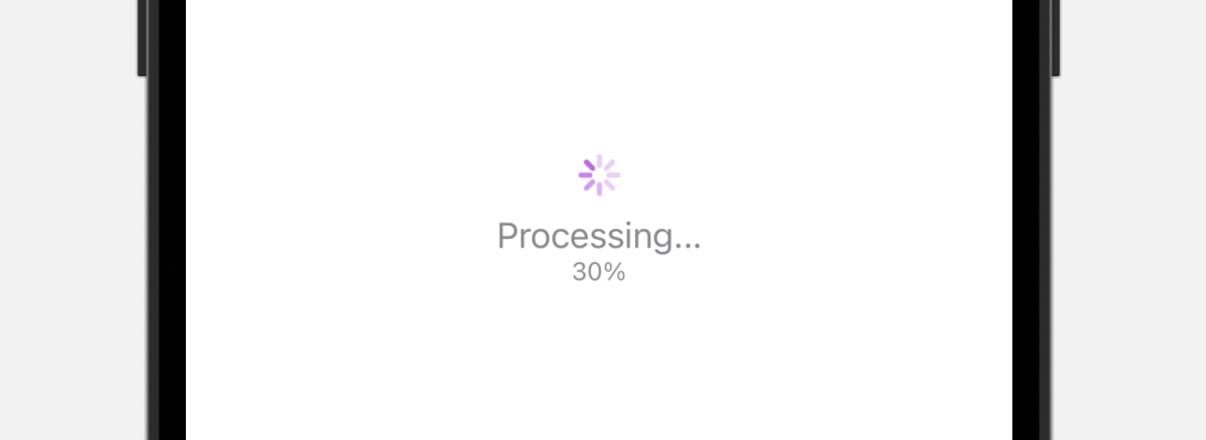
The ProgressView component provides two types of progress indicator to indicate indeterminate progress and determineate progress. What we just demonstrated in the previous section is an indeterminate progress indicator. For tasks that have an unknown duration, such as loading or syncing complex data, we use indeterminate progress indicators, which is displayed as a circular activity indicator.
When possible, use a determinate progress indicator. An indeterminate progress indicator shows that a process is occurring, but it doesn’t help people estimate how long a task will take. A determinate progress indicator can help people decide whether to do something else while waiting for the task to complete, restart the task at a different time, or abandon the task.
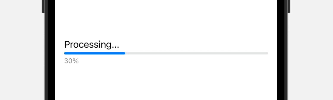
For a determinate progress indicator, it’s used for tasks with a well-defined duration such as file downloads. On iOS, a determinate progress indicator is presented in the form of a progress bar. To implement it, you just need to instantiate a ProgressView with the current value of the progress. Here is an example:
ProgressView(value: 0.3)By default, the total value is 1.0. You can provide a value between 0.0 and 1.0 where 1.0 means 100% complete. If you have to use a different range with a different total, you can write the code by using another initializer:
ProgressView(value: 30, total: 100)Both lines of the codes present the same progress indicator that shows 30% complete.
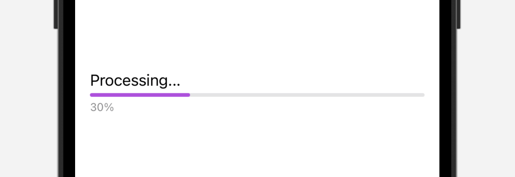
Optionally, you can add some labels to display the status message and current progress by using the label and currentValueLabel parameters:
ProgressView(value: 0.3,
             label: { Text("Processing...") },
             currentValueLabel: { Text("30%") })
In order to update the value of the progress, you usually create a state variable to hold the current value of the progress. Here is a sample code snippet:
struct ContentView: View {

    @State private var progress = 0.1

    var body: some View {
        ProgressView(value: progress,
                     label: { Text("Processing...") },
                     currentValueLabel: { Text(progress.formatted(.percent.precision(.fractionLength(0)))) })
            .padding()
            .task {
                Timer.scheduledTimer(withTimeInterval: 1, repeats: true) { _ in

                    self.progress += 0.1

                    if self.progress > 1.0 {
                        self.progress = 0.0
                    }
                }
            }
    }
}
Changing the Progress View’s Color and Style
The default progress indicator has a simple design with limited customization options. However, it is possible to modify the color of the progress bar by applying the tint modifier:
ProgressView(value: 0.3)
    .tint(.purple)
A determinate progress indicator is typically displayed as a progress bar. If you wish to modify its appearance, you can use the progressViewStyle modifier. For instance, you can switch from the default linear style to a circular style, like so:
ProgressView(value: 0.3, label: { Text("Processing...") }, currentValueLabel: { Text("30%") })
    .progressViewStyle(.circular)
This transforms the progress bar into a circular indicator.
Using ProgressViewStyle for Advanced Customizations
Although the default style of the progress view is sufficient for most applications, you may want to create unique and visually appealing progress bars that match their app’s design and theme. If you want to create a customized progress bar that aligns with your app’s aesthetic, you can use the ProgressViewStyle protocol in SwiftUI.
ProgressViewStyle is a powerful tool for creating customized progress indicators in SwiftUI. With ProgressViewStyle, you can create unique and visually appealing progress bars that perfectly match the design and theme of your app. There are several built-in styles available, such as CircularProgressViewStyle and LinearProgressViewStyle. By conforming to the ProgressViewStyle protocol, you can create your own styles and apply them to the ProgressView component. This allows for advanced customizations that go beyond changing the color of the progress bar.
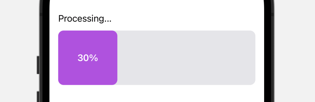
To give you a better idea about ProgressViewStyle, let’s build a custom progress bar like the one shown above. What you need to do is to create a new struct that conforms to the ProgressViewStyle protocol and implement the following required method:
@ViewBuilder func makeBody(configuration: Self.Configuration) -> Self.BodyIf you have experience with ButtonStyle, the implementation of ProgressViewStyle is very similar as it follows the same pattern.
Let’s create a new style named BarProgressStyle like this:
struct BarProgressStyle: ProgressViewStyle {

    var color: Color = .purple
    var height: Double = 20.0
    var labelFontStyle: Font = .body

    func makeBody(configuration: Configuration) -> some View {

        let progress = configuration.fractionCompleted ?? 0.0

        GeometryReader { geometry in

            VStack(alignment: .leading) {

                configuration.label
                    .font(labelFontStyle)

                RoundedRectangle(cornerRadius: 10.0)
                    .fill(Color(uiColor: .systemGray5))
                    .frame(height: height)
                    .frame(width: geometry.size.width)
                    .overlay(alignment: .leading) {
                        RoundedRectangle(cornerRadius: 10.0)
                            .fill(color)
                            .frame(width: geometry.size.width * progress)
                            .overlay {
                                if let currentValueLabel = configuration.currentValueLabel {

                                    currentValueLabel
                                        .font(.headline)
                                        .foregroundColor(.white)
                                }
                            }
                    }

            }

        }
    }
}
This custom style takes in three parameters for configuring the bar color, height, and font style. I’m not going to explain the code in the makeBody method line by line. In brief, we implement our own progress bar style by overlaying a purple RoundedRectangle view on top of another RoundedRectangle view in light gray.
The configuration parameter provides you with the common properties of a progress view including:
fractionCompleted– The completed fraction of the task represented by the progress view, from0.0(not yet started) to1.0(fully complete).label– The status label.currentValueLabel– the label that shows the current progress.
Now that we’ve created our own style, you can apply it by attaching the progressViewStyle modifier to the progress view:
ProgressView(value: 0.3, label: { Text("Processing...") }, currentValueLabel: { Text("30%") })
    .progressViewStyle(BarProgressStyle(height: 100.0))
Exercise
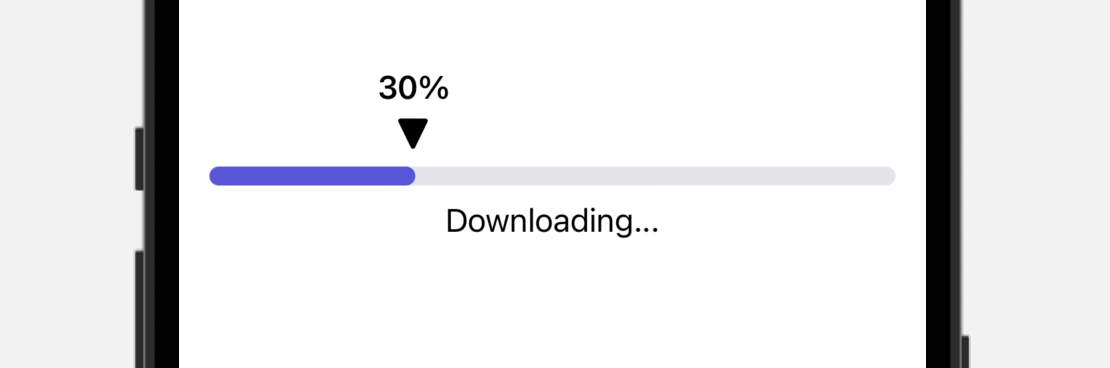
After gaining an understanding of ProgressViewStyle, it’s time to put that knowledge into practice and create a new custom style. You can challenge yourself by attempting to build a style that resembles the one shown in the image below. This will not only help you reinforce what you have learned but also push you to think creatively about how to achieve your desired look and feel. Don’t be afraid to experiment and have fun with it!
Summary
Throughout this tutorial, we have covered the fundamentals of using ProgressView to display the progress of time-consuming tasks or operations in your app. It is recommended to use a determinate progress indicator whenever possible, as it provides users with a more accurate understanding of the progress being made.
While the default progress view is adequate for most applications, we have also explored how to create a customized progress view using the ProgressViewStyle protocol. By following the steps outlined in this tutorial, you should now have a solid understanding of how to create your own unique style of progress view that aligns with the design and theme of your app.