

In iOS 16, SwiftUI introduces a new view called Gauge for displaying progress. You can actually use it to show values within a range. In this tutorial, let’s see how to use the Gauge view and work with different gauge styles.
A gauge is a view that shows a current level of a value in relation to a specified finite capacity, very much like a fuel gauge in an automobile. Gauge displays are configurable; they can show any combination of the gauge’s current value, the range the gauge can display, and a label describing the purpose of the gauge itself.
– Apple’s official documentation
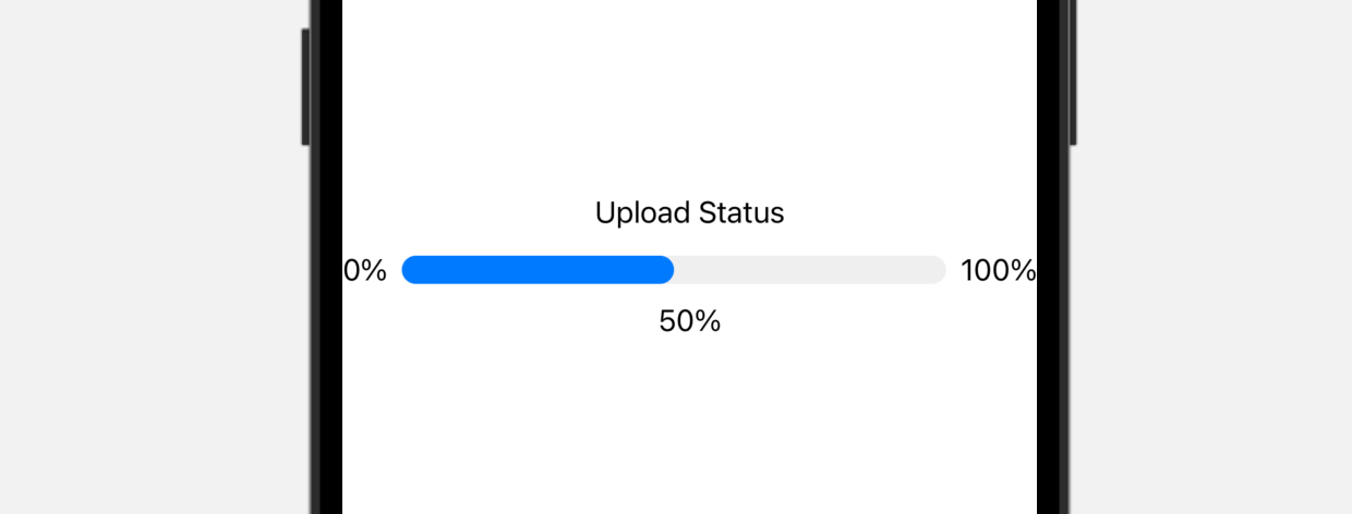
The simplest way to use Gauge is like this:
struct ContentView: View {
    @State private var progress = 0.5

    var body: some View {
        Gauge(value: progress) {
            Text("Upload Status")
        }
    }
}
In the most basic form, a gauge has a default range from 0 to 1. If we set the value parameter to 0.5, SwiftUI renders a progress bar indicating the task is 50% complete.
Optionally, you can provide labels for the current, minimum, and maximum values:
Gauge(value: progress) {
    Text("Upload Status")
} currentValueLabel: {
    Text(progress.formatted(.percent))
} minimumValueLabel: {
    Text(0.formatted(.percent))
} maximumValueLabel: {
    Text(100.formatted(.percent))
}
Using Custom Range
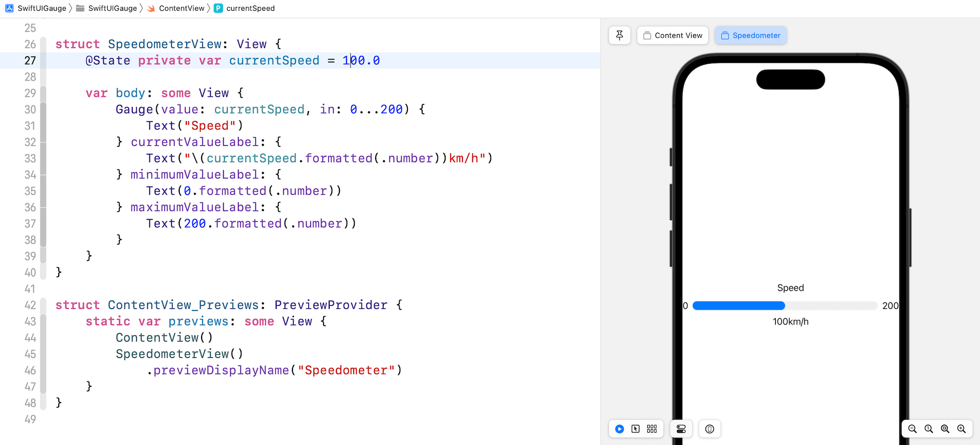
The default range is set to 0 and 1. That said, you can provide your custom range. For example, you are building a speedometer with the maximum speed of 200km/h. You can specify the range in the in parameter:
struct SpeedometerView: View {
    @State private var currentSpeed = 100.0

    var body: some View {
        Gauge(value: currentSpeed, in: 0...200) {
            Text("Speed")
        } currentValueLabel: {
            Text("\(currentSpeed.formatted(.number))km/h")
        } minimumValueLabel: {
            Text(0.formatted(.number))
        } maximumValueLabel: {
            Text(200.formatted(.number))
        }
    }
}
In the code above, we set the range to 0...200. If you already add the SpeedometerView in the preview struct. Your preview should fill half of the progress bar as we set the current speed to 100km/h.
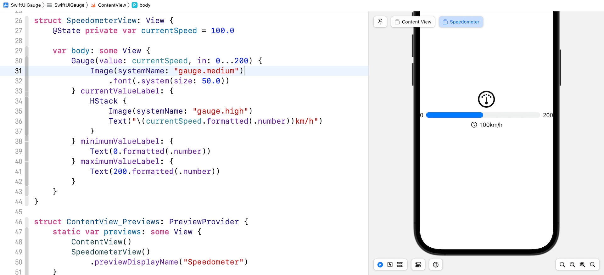
Using Image Labels
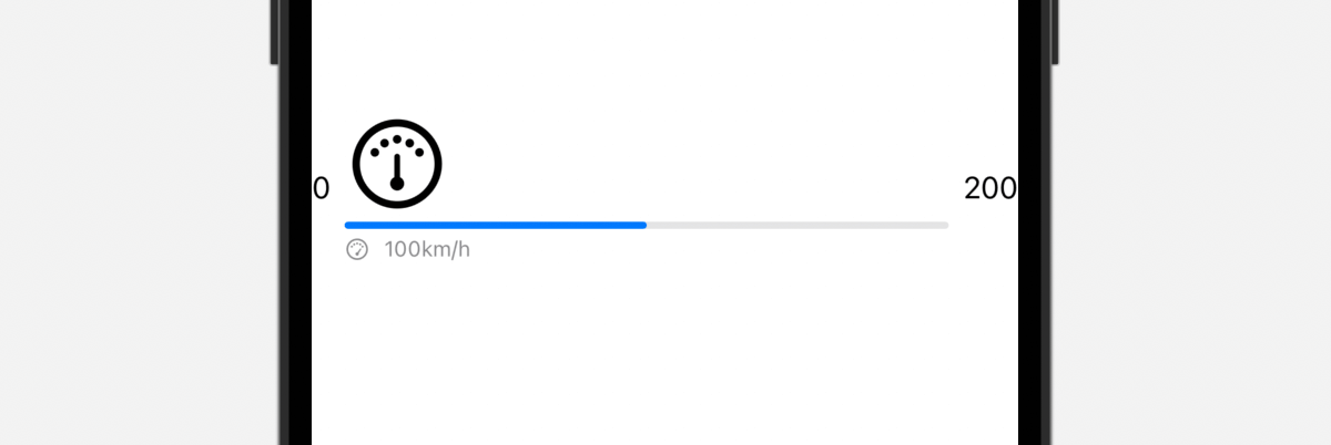
You are not limited to use text labels for displaying ranges and current value. Here is an example:
Gauge(value: currentSpeed, in: 0...200) {
    Image(systemName: "gauge.medium")
        .font(.system(size: 50.0))
} currentValueLabel: {
    HStack {
        Image(systemName: "gauge.high")
        Text("\(currentSpeed.formatted(.number))km/h")
    }
} minimumValueLabel: {
    Text(0.formatted(.number))
} maximumValueLabel: {
    Text(200.formatted(.number))
}
We change the text label of the gauge to a system image. And, for the current value label, we create a stack to arrange the image and text. Your preview should display the gauge like that shown in figure 3.
Customizing the Gauge Style

The default color of the Gauge view is blue. To customize its color, attach the tint modifier and set the value to your preferred color like this:
Gauge(value: currentSpeed, in: 0...200) {
    Image(systemName: "gauge.medium")
        .font(.system(size: 50.0))
} currentValueLabel: {
    HStack {
        Image(systemName: "gauge.high")
        Text("\(currentSpeed.formatted(.number))km/h")
    }
} minimumValueLabel: {
    Text(0.formatted(.number))
} maximumValueLabel: {
    Text(200.formatted(.number))
}
.tint(.purple)
The look & feel of the Gauge view is very similar to that of ProgressView. Optionally, you can customize the Gauge view using the gaugeStyle modifier. The modifier supports several built-in styles.
linearCapacity
This is the default style that displays a bar that fills from leading to trailing edges. Figure 4 shows a sample gauge in this style.
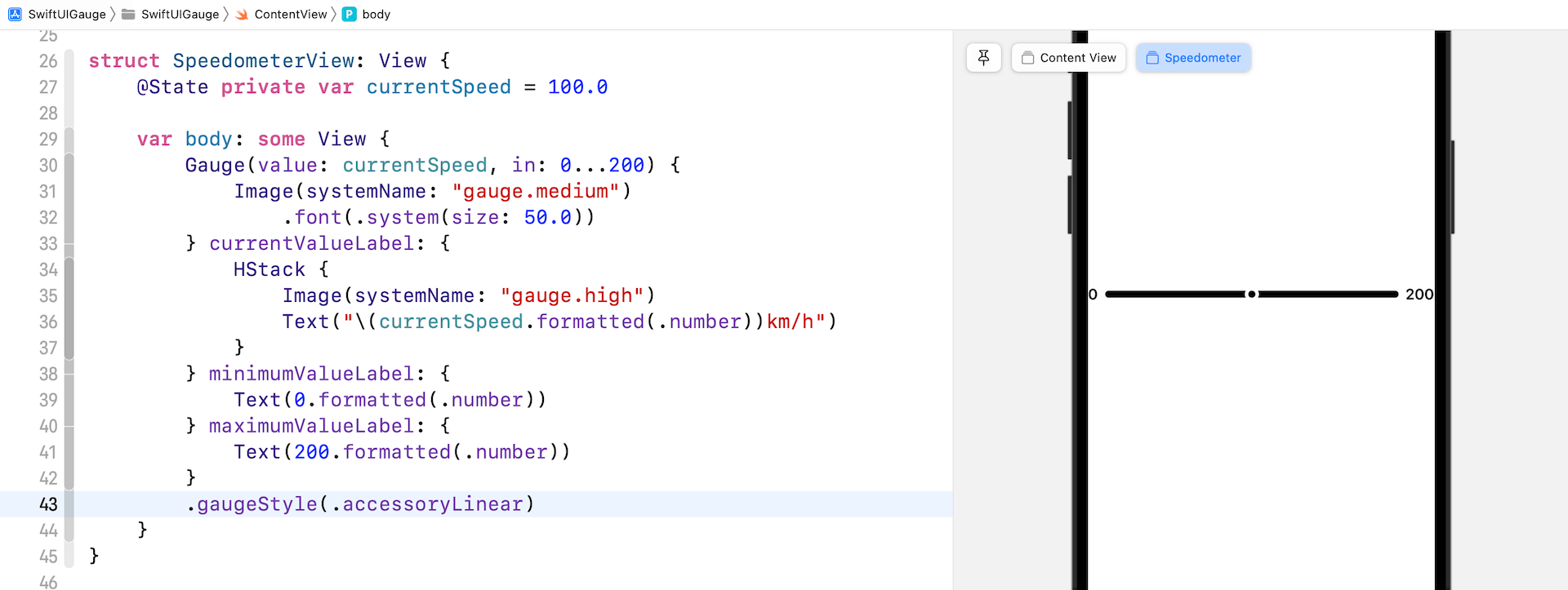
accessoryLinear
This style displays a bar with a point marker to indicate the current value.
accessoryLinearCapacity
For this style, the gauge is still displayed as a progress bar but it’s more compact.
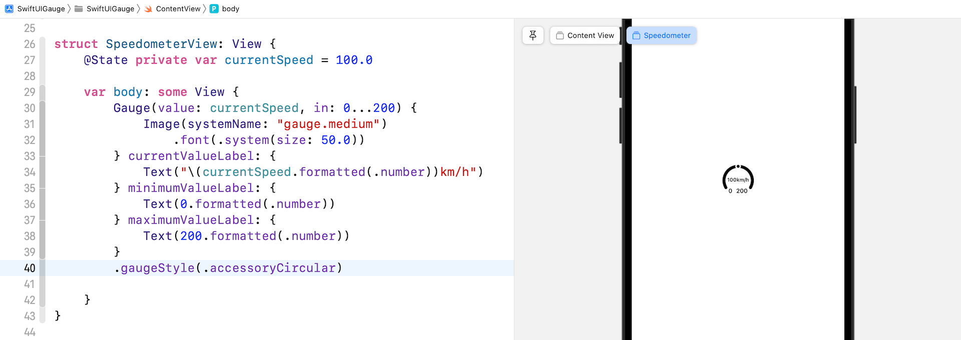
accessoryCircular
Instead of displaying a bar, this style displays an open ring with a point marker to indicate the current value.
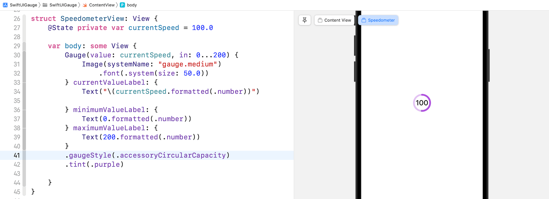
accessoryCircularCapacity
This style displays a closed ring that’s partially filled in to indicate the gauge’s current value. The current value is also displayed at the center of the gauge.
Creating a Custom Gauge Style
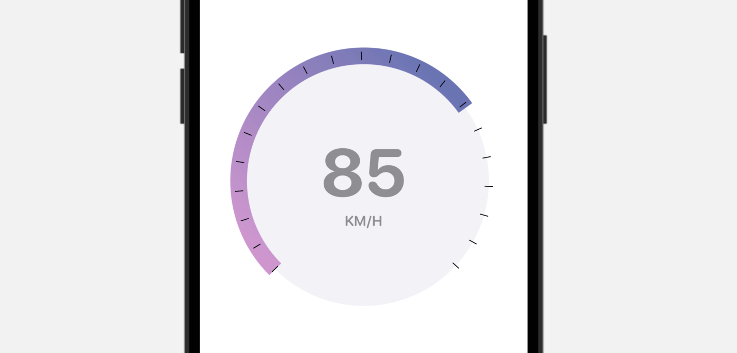
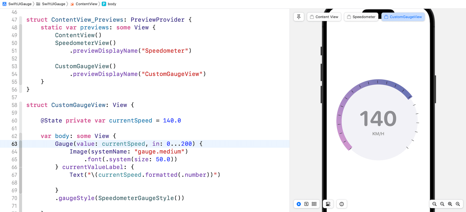
The built-in gauge styles are limited but SwiftUI allows you to create your own gauge style. Let me show you a quick demo to build a gauge style like the one displayed in figure 9.
To create a custom gauge style, you have to adopt the GaugeStyle protocol and provide your own implementation. Here is our implementation of the custom style:
struct SpeedometerGaugeStyle: GaugeStyle {
    private var purpleGradient = LinearGradient(gradient: Gradient(colors: [ Color(red: 207/255, green: 150/255, blue: 207/255), Color(red: 107/255, green: 116/255, blue: 179/255) ]), startPoint: .trailing, endPoint: .leading)

    func makeBody(configuration: Configuration) -> some View {
        ZStack {

            Circle()
                .foregroundColor(Color(.systemGray6))

            Circle()
                .trim(from: 0, to: 0.75 * configuration.value)
                .stroke(purpleGradient, lineWidth: 20)
                .rotationEffect(.degrees(135))

            Circle()
                .trim(from: 0, to: 0.75)
                .stroke(Color.black, style: StrokeStyle(lineWidth: 10, lineCap: .butt, lineJoin: .round, dash: [1, 34], dashPhase: 0.0))
                .rotationEffect(.degrees(135))

            VStack {
                configuration.currentValueLabel
                    .font(.system(size: 80, weight: .bold, design: .rounded))
                    .foregroundColor(.gray)
                Text("KM/H")
                    .font(.system(.body, design: .rounded))
                    .bold()
                    .foregroundColor(.gray)
            }

        }
        .frame(width: 300, height: 300)

    }

}
In order to conform the protocol, we have to implement the makeBody method to present our own gauge style. The configuration bundles the current value and value label of the gauge. In the code above, we use these two values to display the current speed and compute the arc length.
Once we implement our custom gauge style, we can apply it by attaching the gaugeStyle modifier like this:
struct CustomGaugeView: View {

    @State private var currentSpeed = 140.0

    var body: some View {
        Gauge(value: currentSpeed, in: 0...200) {
            Image(systemName: "gauge.medium")
                .font(.system(size: 50.0))
        } currentValueLabel: {
            Text("\(currentSpeed.formatted(.number))")

        }
        .gaugeStyle(SpeedometerGaugeStyle())

    }
}
I created a separate view for the demo. To preview the CustomGaugeView, you need to update the ContentView_Previews struct to include the CustomGaugeView:
struct ContentView_Previews: PreviewProvider {
    static var previews: some View {
        ContentView()
        SpeedometerView()
            .previewDisplayName("Speedometer")

        CustomGaugeView()
            .previewDisplayName("CustomGaugeView")
    }
}
That’s it. If you’ve made the changes, your preview should show a custom gauge.