
The initial release of SwiftUI didn’t come with a native collection view. You can either build your own solution or use third party libraries. In this year’s WWDC, Apple introduced tons of new features for the SwiftUI framework. One of them is to address the need of implementing grid views. SwiftUI now provides developers two new UI components called LazyVGrid and LazyHGrid. One is for creating vertical grid and the other is for horizontal grid. The word Lazy, as mentioned by Apple, means that the grid view does not create items until they are needed.
In this tutorial, I will walk you through how to create both horizontal and vertical views. Both LazyVGrid and LazyHGrid are designed to be flexible, so that developers can easily create various types of grid layout. We will also look into that and see how to vary the size of grid items to achieve different layouts.
The Essential of Grid Layout in SwiftUI
To create a grid layout, whether it’s horizontal or vertical, here are the steps you can follow:
- Prepare the raw data to present in the grid. For example, here is an array of SF symbols that we are going to present in the demo app:
private var symbols = ["keyboard", "hifispeaker.fill", "printer.fill", "tv.fill", "desktopcomputer", "headphones", "tv.music.note", "mic", "plus.bubble", "video"]- Create an array of
GridItemthat describes how the grid looks like. Say, how many columns should the grid have? Here is a sample code snippet for describing a 3-column grid:
private var threeColumnGrid = [GridItem(.flexible()), GridItem(.flexible()), GridItem(.flexible())]- Layout the grid by using
LazyVGridandScrollView. Here is the code snippet:
  ScrollView {
      LazyVGrid(columns: threeColumnGrid) {
          // Display the item
      }
}- Alternatively, if you want to build a horizontal grid, you use
LazyHGridlike this:
   ScrollView(.horizontal) {
       LazyHGrid(rows: threeColumnGrid) {
           // Display the item
       }
   }
Using LazyVGrid to Create Vertical Grids
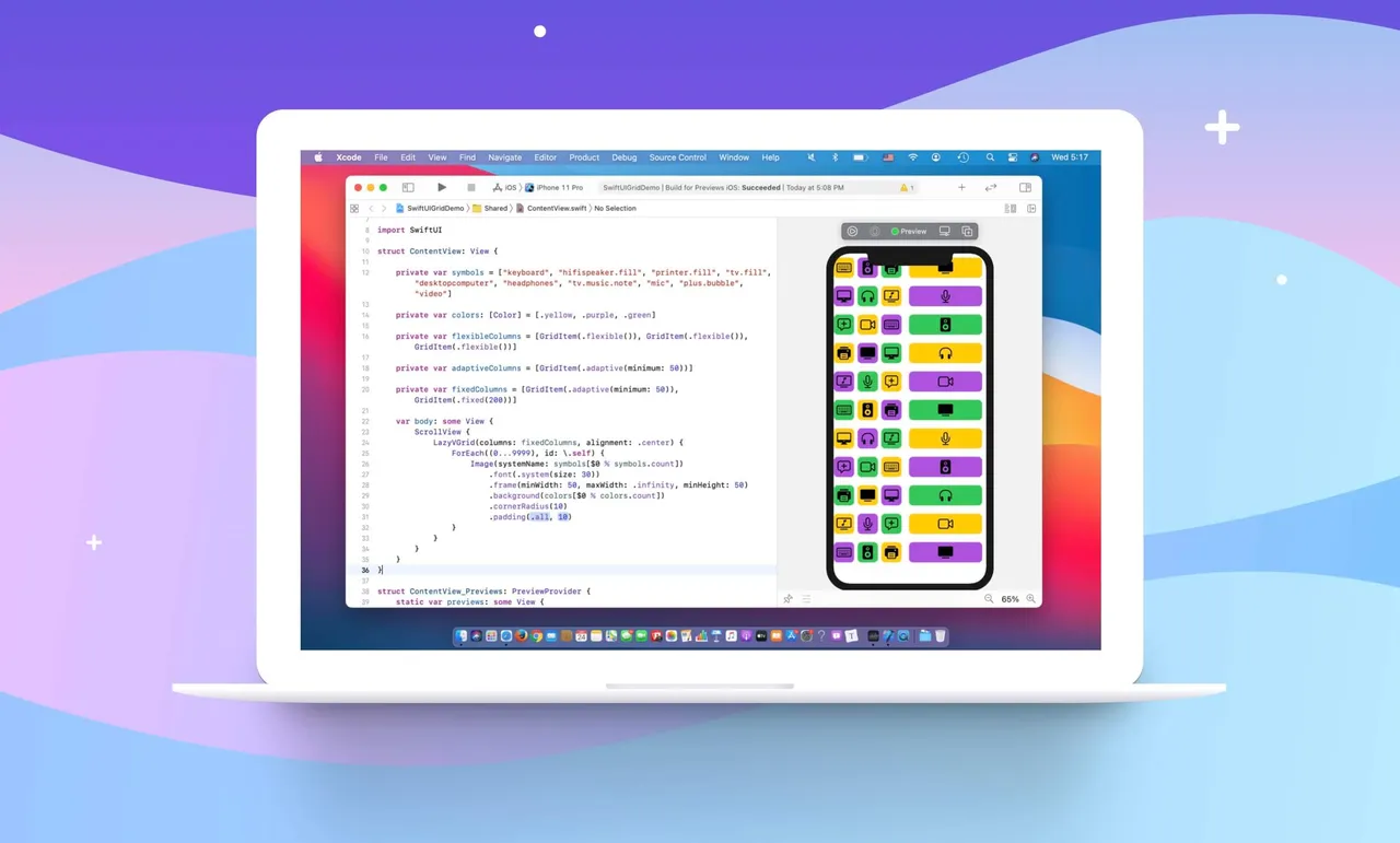
With some basic understanding of the grid layout, let’s put the code to work. Assuming you’ve installed Xcode 12 beta, create a new project with the new App template.
In ContentView.swift, declare the following variables:
private var symbols = ["keyboard", "hifispeaker.fill", "printer.fill", "tv.fill", "desktopcomputer", "headphones", "tv.music.note", "mic", "plus.bubble", "video"]

private var colors: [Color] = [.yellow, .purple, .green]

private var gridItemLayout = [GridItem(.flexible()), GridItem(.flexible()), GridItem(.flexible())]
We are going to display a set of SF symbols in a three-column grid. To present the grid, update the body variable like this:
var body: some View {
    ScrollView {
        LazyVGrid(columns: gridItemLayout, spacing: 20) {
            ForEach((0...9999), id: \.self) {
                Image(systemName: symbols[$0 % symbols.count])
                    .font(.system(size: 30))
                    .frame(width: 50, height: 50)
                    .background(colors[$0 % colors.count])
                    .cornerRadius(10)
            }
        }
    }
}
We use LazyVGrid and tell the vertical grid to use a 3-column layout. We also specify that there is a 20 point space between rows. In the code block, we have a ForEach loop to present a total of 10,000 image views. If you’ve made the change correctly, you should see a three column grid in the preview.
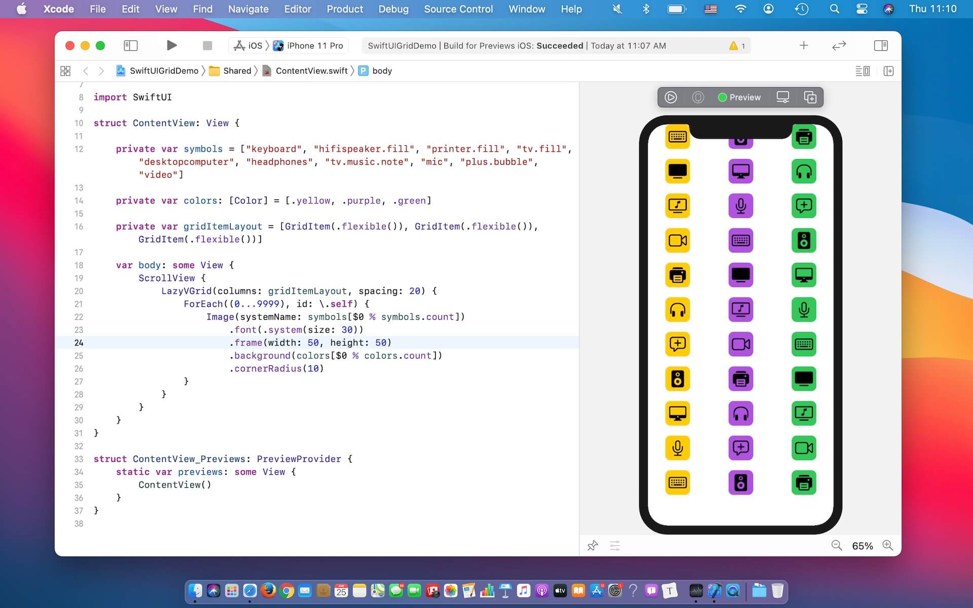
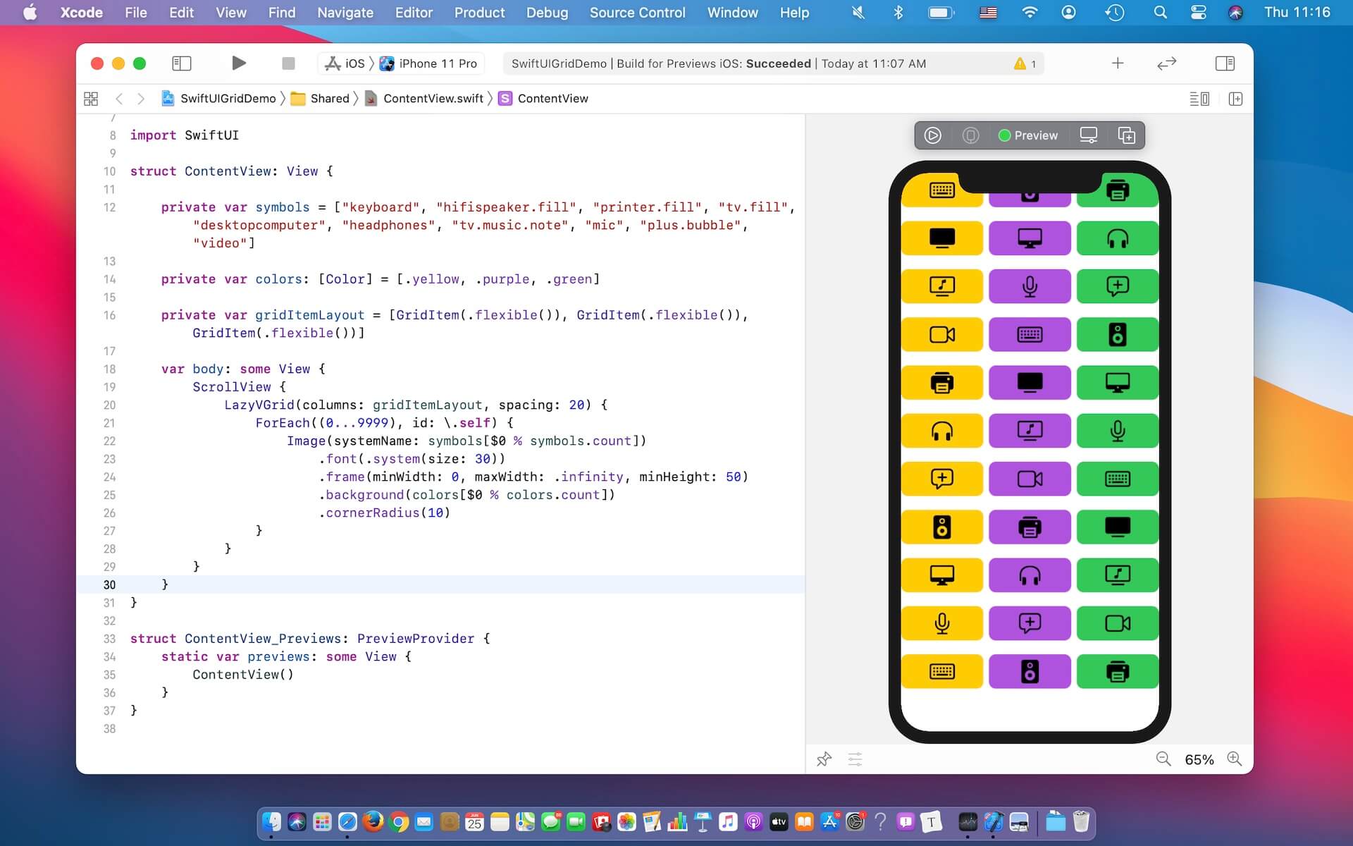
This is how we can create a vertical grid with three columns. Now the frame size of the image is fixed to 50 by 50 points. You may alter the frame modifier like this:
.frame(minWidth: 0, maxWidth: .infinity, minHeight: 50)And, the image’s width will expand to take up the column’s width.
Using GridItem to Vary the Grid Layout (Flexible/Fixed/Adaptive)
Let’s take a further look at GridItem. You use GridItem instances to configure the layout of items in LazyHGrid and LazyVGrid views. Earlier, we define an array of three GridItem instances and each of which uses the size type .flexible(). The flexible size type enables you to create three columns with equal size. If you want to describe a 6-column grid, you can create the array of GridItem like this:
private var sixColumnGrid: [GridItem] = Array(repeating: .init(.flexible()), count: 6).flexible() is just one of the size types for controlling the grid layout. If you want to place as many items as possible in a row, you can use the adaptive size type like this:
private var gridItemLayout = [GridItem(.adaptive(minimum: 50))]The adaptive size type requires you to specify the minimize size of the item. In the code above, each grid item has a minimum size of 50. If you modify the gridItemLayout variable like above, you should achieve a grid layout like below:
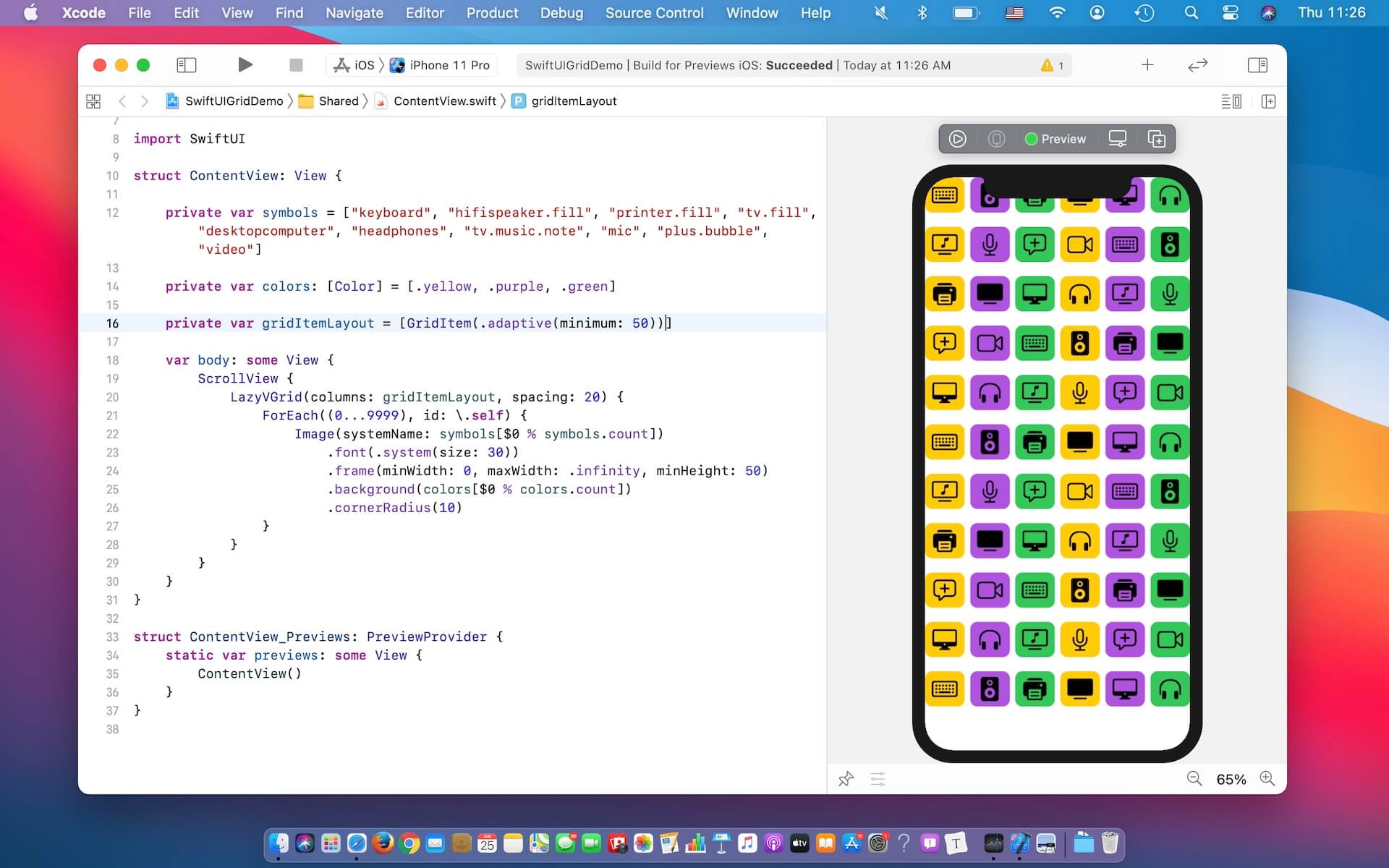
By using .adaptive(minimum: 50), this instructs LazyVGrid to fill as many images as possible in a row such that each item has a minimum size of 50 points.
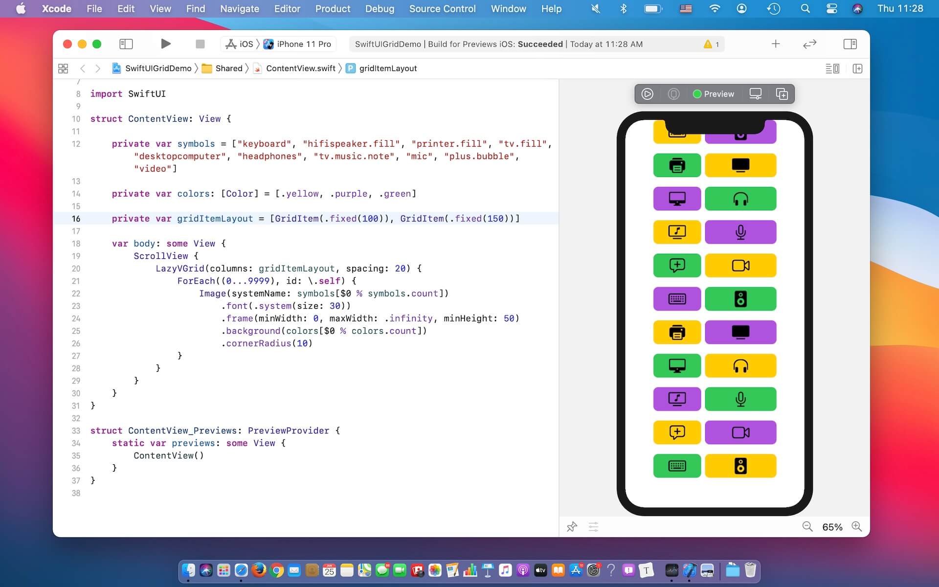
On top of .flexible and .adaptive, you can also use .fixed if you want to create fixed width columns. For example, you want to layout the image in two columns such that the first column has a width of 100 points and the second one has a width of 150 points. You write the code like this:
private var gridItemLayout = [GridItem(.fixed(100)), GridItem(.fixed(150))]Again, if you update the gridItemLayout variable like above, this will result a two-column grid with different size.
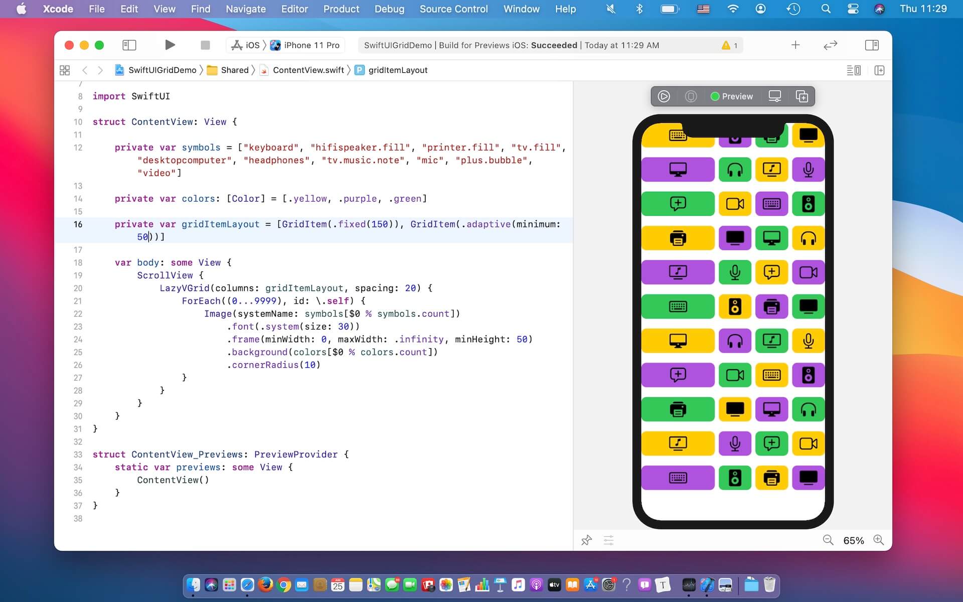
You are allowed to mix different size types to create more complex grid layout. For example, you can define a fixed size GridItem, followed by a GridItem with adaptive size like this:
private var gridItemLayout = [GridItem(.fixed(150)), GridItem(.adaptive(minimum: 50))]In this case, LazyVGrid creates a fixed size column with 100 point width. And then, it tries to fill as many items as possible for the remaining space.
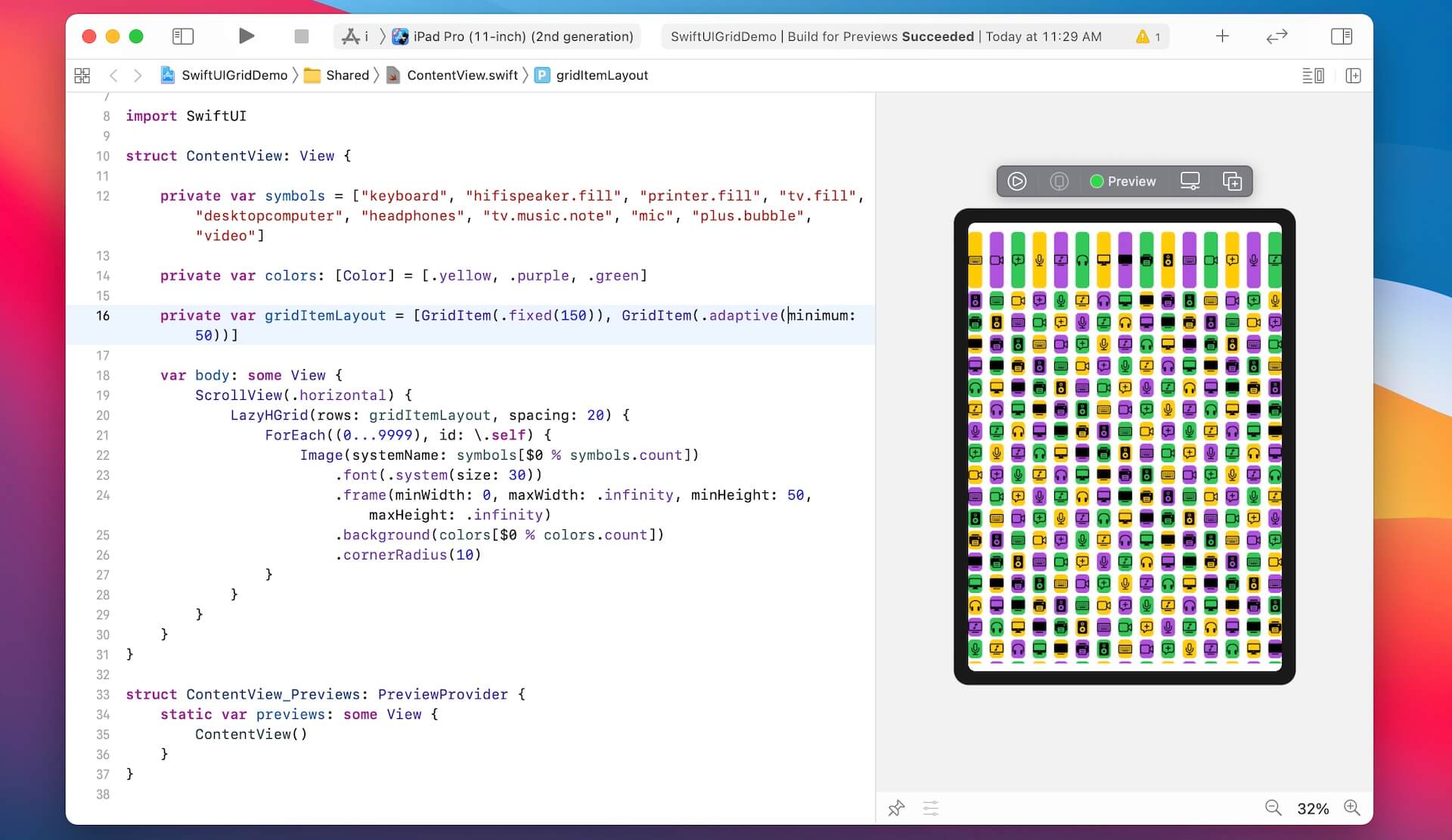
Using LazyHGrid to Create Horizontal Grids
Now that you’ve created a vertical grid, LazyHGrid has made it so easy to convert a vertical grid to a horizontal one. The usage of horizontal grid is nearly the same as LazyVGrid except that you embed it in a horizontal scroll view. Further, LazyHGrid takes in a parameter named rows instead of columns.
Therefore, you can rewrite a couple lines of code to transform a grid view from vertical orientation to horizontal:
ScrollView(.horizontal) {
    LazyHGrid(rows: gridItemLayout, spacing: 20) {
        ForEach((0...9999), id: \.self) {
            Image(systemName: symbols[$0 % symbols.count])
                .font(.system(size: 30))
                .frame(minWidth: 0, maxWidth: .infinity, minHeight: 50, maxHeight: .infinity)
                .background(colors[$0 % colors.count])
                .cornerRadius(10)
        }
    }
}
Run the demo in the preview or test it on a simulator. You should see a horizontal grid. Best of all, this grid view automatically supports both iPhone and iPad.
Summary
The missing collection view in the first release of SwiftUI is now here. The introduction of LazyVGrid and LazyHGrid in SwiftUI lets developers create different types of grid layout with a few lines of code. This tutorial is just a quick overview of these two new UI components. I encourage to try out different configurations of GridItem and see what grid layout you can achieve.