

It’s always important to make your app as intuitive as possible. However, for some features, it may be helpful to provide extra information to teach users how to use them effectively. That’s where TipKit comes in. Introduced in iOS 17, TipKit is a framework for displaying tips in your app, allowing developers to offer additional guidance and ensuring users to make the most of your app’s features.
In this tutorial, we will explore the TipKit framework and see how to create tips for a demo app using SwiftUI.
Using the TipKit Framework
To use the TipKit framework, you have to first import it into your project:
import TipKitUnderstanding the Tip Protocol
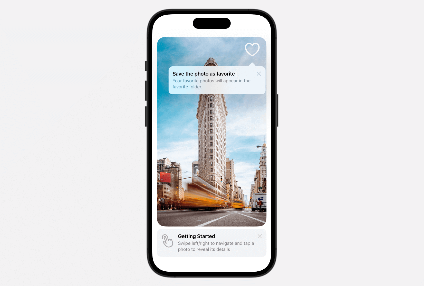
To create a tip using the TipKit framework, you need to adopt the Tip protocol to configure the content of the tip. Tips consist of a title and a short description. Optionally, you can include an image to associate with the tip.

For example, to setup the “Save as favorite” tip, you can create a struct that conforms to the Tip protocol like this:
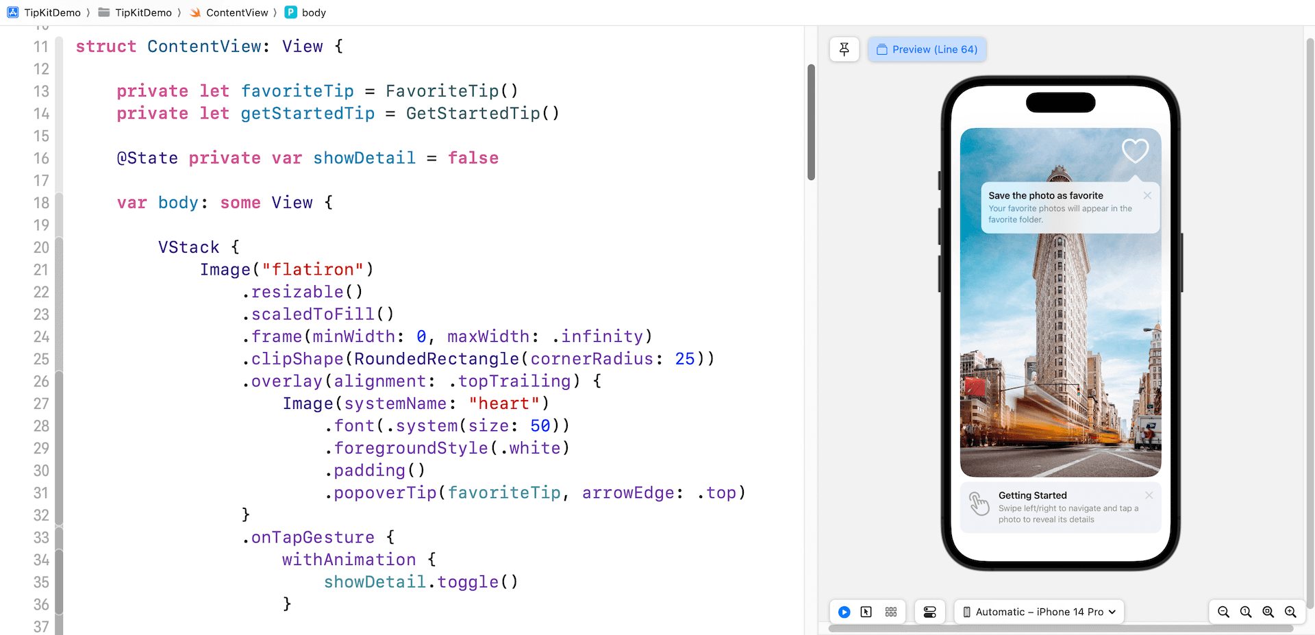
struct FavoriteTip: Tip {
    var title: Text {
        Text("Save the photo as favorite")
    }

    var message: Text? {
        Text("Your favorite photos will appear in the favorite folder.")
    }
}
If you want to add an image to the tip, you can define the image property:
struct FavoriteTip: Tip {
    var title: Text {
        Text("Save the photo as favorite")
    }

    var message: Text? {
        Text("Your favorite photos will appear in the favorite folder.")
    }

        var image: Image? {
        Image(systemName: "heart")
    }
}
Displaying Tips Using Popover and TipView
The TipKit framework provides the flexibility to display tips either as a popover or an inline view. In the popover view, it appears over your app’s UI, which could be a button, an image, or other UI elements. On the other hand, the inline view behaves like other standard UI elements, adjusting its position to fit around other views, ensuring that no UI elements are blocked.
To show the tip as an inline view, you can create an instance of TipView and pass it the tip to display. Here is an example:
private let getStartedTip = GetStartedTip()

var body: some View {
    .
    .
    .

        TipView(getStartedTip)

    .
    .
    .
}
If you want to display a tip as a popover view, you can attach the modifier popoverTip to the button or other UI elements:
private let favoriteTip = FavoriteTip()

Image(systemName: "heart")
    .font(.system(size: 50))
    .foregroundStyle(.white)
    .padding()
    .popoverTip(favoriteTip, arrowEdge: .top)
To enable the appearance of tips within your apps, the final step is to configure the Tips center. Assuming your Xcode project is named TipKitDemo, you can switch over to TipKitDemoApp and update the struct like this:
@main
struct TipKitDemoApp: App {
    var body: some Scene {
        WindowGroup {
            ContentView()
                .task {
                    try? Tips.configure([
                        .displayFrequency(.immediate),
                        .datastoreLocation(.applicationDefault)
                    ])
                }
        }
    }
}
We can customize the display frequency and the data store location by utilizing the configure method of the Tips center. In the code snippet above, the display frequency is set to immediate, which means the tips will be shown right away. If you prefer the tips to appear once every 24 hours, you can use the .daily option. Moreover, you have the flexibility to customize the display frequency to any desired time interval, as demonstrated in the following example:
let threeDays: TimeInterval = 3 * 24 * 60 * 60

Tips.configure([
    .displayFrequency(threeDays),
    .dataStoreLocation(.applicationDefault)
])
With the Tips center configured, you should be able to see the tips when running the app in the simulator.
Previewing the Tips
If you want to preview the tips in the preview canvas, you also need to set up the Tips center in the #Preview block. Here is an example:
#Preview {
    ContentView()
        .task {
            try? Tips.resetDatastore()

            try? Tips.configure([
                .displayFrequency(.immediate),
                .datastoreLocation(.applicationDefault)
            ])
        }
}
An important point to note is the inclusion of an extra line of code for resetting the data store. Once a tip is dismissed, it won’t be displayed again in the app. However, when it comes to previewing the app and ensuring that the tips are consistently shown, it is recommended to reset the data store.
Dismissing the Tips
Users have the option to dismiss a tip by tapping the X symbol. If there is a need to dismiss the tip view programmatically, you can utilize the invalidate method and provide a specific reason as demonstrated below:
getStartedTip.invalidate(reason: .actionPerformed)The reason actionPerformed means that the user performed the action that the tip describes.
Specifying Display Rules
The Tip protocol has an optional property for you to set tup the display rules of the tip. It supports two types of rules: parameter-based and event-based. Parameter-based rules are ideal for displaying tips based on specific Swift value types. On the other hand, event-based rules enable you to define actions that need to be fulfilled before a user becomes eligible to receive a tip.
For instance, the favorite tip should only be displayed after the “Getting Started” tip. We can set up the parameter-based rule like this:
struct FavoriteTip: Tip {

    var title: Text {
        Text("Save the photo as favorite")
    }

    var message: Text? {
        Text("Your favorite photos will appear in the favorite folder.")
    }

    var rules: [Rule] {
        #Rule(Self.$hasViewedGetStartedTip) { $0 == true }
    }

    @Parameter
    static var hasViewedGetStartedTip: Bool = false
}
In the code above, we introduce a parameter called hasViewedGetStartedTip using the @Parameter macro, initially set to false. The rules property incorporates a rule that validates the value of the hasViewedGetStartedTip variable, indicating that the tip should be displayed when the value is true.
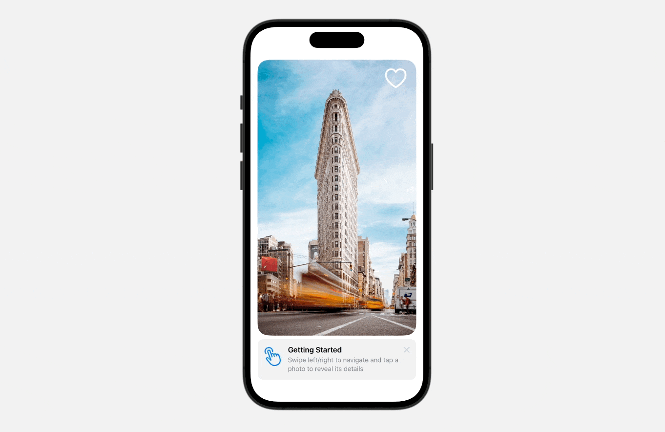
When the image is tapped, the “Getting Started” tip is dismissed. In the same closure, we can set the value of hasViewedGetStartedTip to true.
.onTapGesture {
    withAnimation {
        showDetail.toggle()
    }

    getStartedTip.invalidate(reason: .actionPerformed)

    FavoriteTip.hasViewedGetStartedTip = true
}
Upon launching the app, only the “Getting Started” tip is displayed. However, once you tap the image to dismiss the tip, the app then presents the “Favorite” tip.
Summary
In this tutorial, we covered the TipKit framework available on iOS 17. It’s a handy tool for showcasing hidden app features and teaching users how to effectively utilize them. With TipKit, you can effortlessly create and display tips to enhance the user experience. If you find TipKit useful, consider integrating it into your next app update for added benefits.
To learn more about other SwiftUI tips, you can check out our Mastering SwiftUI book.