In part 1, I walked you through all the metrics in the App Analytics report. Following the first article on iTunes Connect App Analytics, part 2 of the series will show you how to analyze data from different sources that contribute to the app marketing performance (i.e. customer acquisition), and the closeness with which users engage with your app (i.e. customer retention).
Why are they important? Say, for customer acquisition, by understanding where your potential users come to your app product page will help you fine tune your marketing strategy, planning, and that will further give you an insight on how each marketing channels/ campaigns perform. Thus, you can allocate appropriate effort and budget over time.
On the other hand, by analyzing the data related to customer retention will help you to understand how new app updates would affect customer engagement, and provide you with some concrete data to review how customers engage with our app.
“You circulate the music and then it will sell.”
This is a golden rule in the digital age as according to famous singer Steve Aoki. Success is not only measured by how many music CDs (App Units) we sell, but also how much the music (our app) circulates and is listened over and over (use our app often).
Now let’s check out the Sources tab for reviewing customer acquisition.
Sources: Where Your Potential Customers Come From?
If you haven’t logged into iTunes Connect, please log in and access the App Analytics feature. Go to Sources tab:
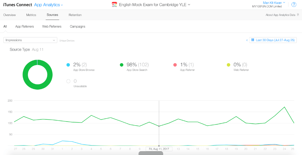
In All Page, you see the number of impressions plotted on the line chart, as well as the percentage of impressions from various sources in comparison to the others. Sources here includes four types:
- App Store Browse: Users viewed your app or tapped to download it for the first time while browsing the Featured, Categories, or Top Charts sections of the App Store.
- App Store Search: Customers viewed your app or tapped to download it for the first time from Search on the App Store, includes Search Ads in App Store search.
- App Referrer: Customers tapped a link in an app that brought them to your App Store product page, includes apps that load your product page with StoreKit API.
- Web Referrer: Customers tapped a link from a website that brought them to your App Store product page. Based on websites visited in Safari app.
All the above data based on devices running iOS 8 or tvOS 9, or later.
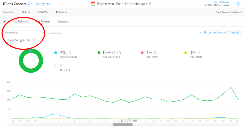
The red circle in the screenshot above shows us various metrics including “Impressions”, “Product Page Views”, “App Units”, “In-App Purchases”, “Sales”, “Paying Users”, “Installations”, “Sessions”, “Active Devices” and “Active Last 30 Days”. Most people probably focus on impressions. Knowing the source type distribution on “Impressions”, however, is not good enough for us to plan our marketing strategy. Analyzing various metrics would amaze you on how different channels perform.
Let me give you an example so you will better understand what I mean. My company has put quite a huge marketing budget on drawing traffic from affiliate websites/app review blogs before. In this case, “Impressions” was very high during the campaign period, yet if we just analyzed the impression metric, we won’t know how many people have downloaded our app. By checking “App Units” we will be able to see if people from Web Referrers actually download our app (to know whether they are our targeted customers). By checking “Sessions”, we understand if users really use our app.
Note that it is easy to see a large impressions on specific source type as that can be achieved by allocating a higher proportion of marketing budget, yet what’s more important is whether people from the source type are more active (check “Active Last 30 Days”), and if they are paying us (check “In-App Purchases” & “Sales”).
Furthermore, we can read different campaign performance under App Referrers and Web Referrers. Let’s take a look of App/ Web Referrers Page:
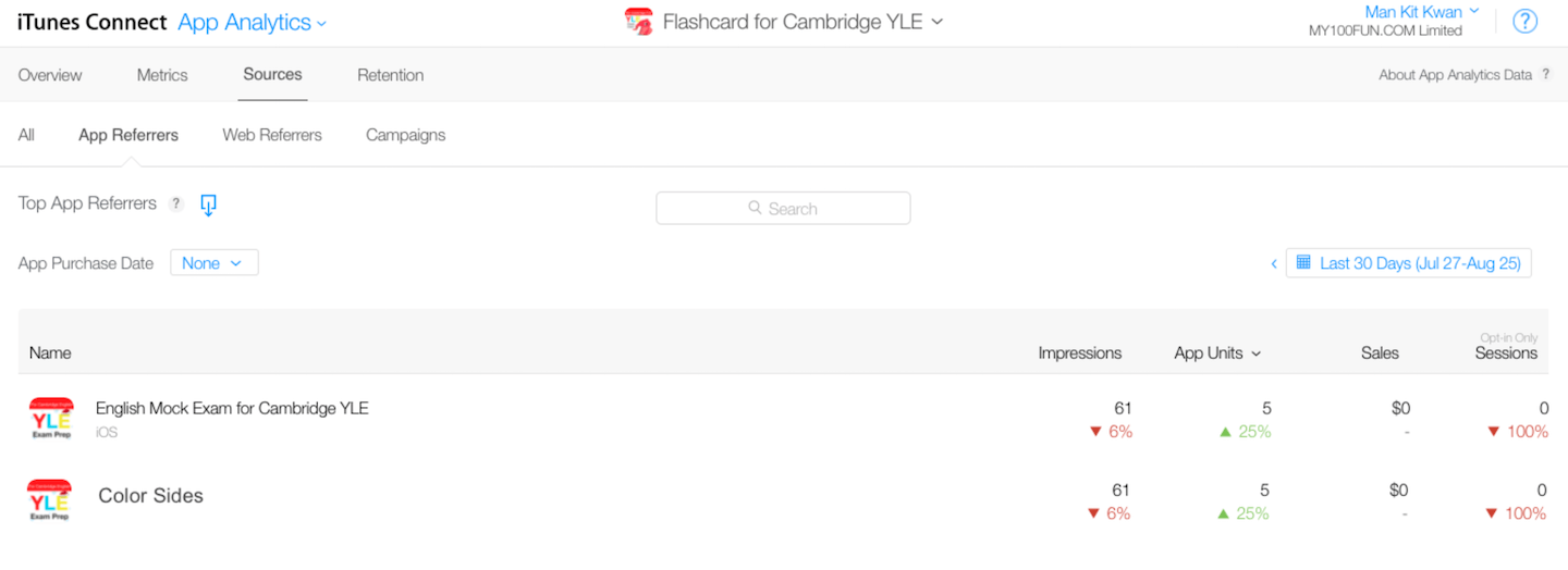
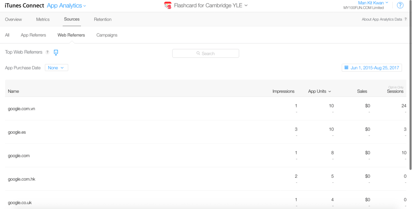
In App/Web Referrers page, we can see how different App/ Web Referrers perform. In the normal case, we launch multiple marketing campaigns one by one but this page enables us to launch them all at the same time and lets us review their performance separately.
Next, let’s check out the Campaigns Page:
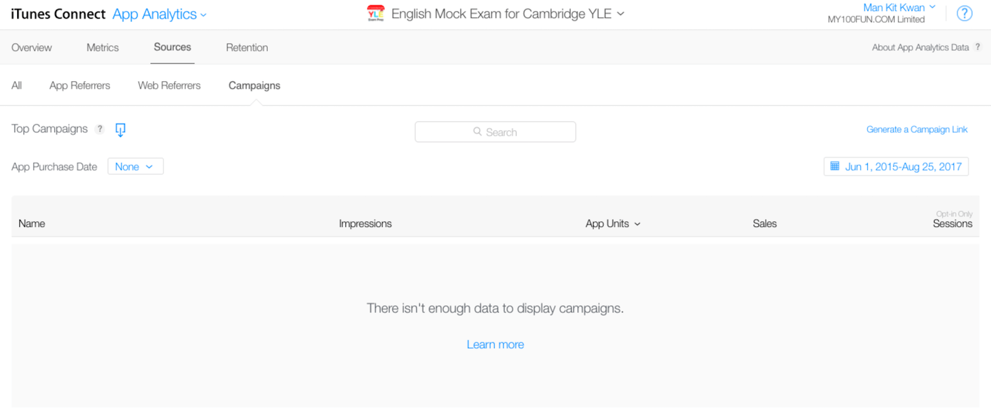
In Campaigns Page, we can view marketing campaigns according to the links we generated. To start using Campaign Page, let’s click “Generate a Campaign Link” button on the right upper corner:
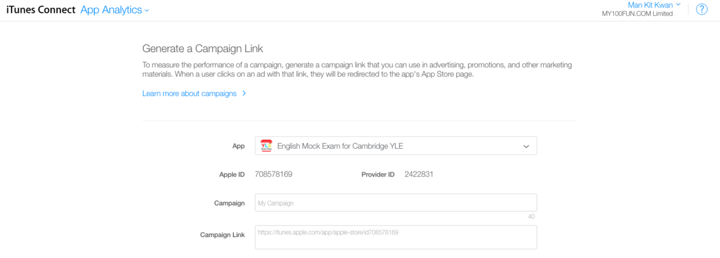
In this page, simply type your campaign name on the Campaign dialog box. Then copy the Campaign Link and deliver it to marketing partners or use it for Facebook/ Google ad campaign. Once the app is installed by at least 5 individual Apple IDs, the campaign will show up on Campaign Page.
As a side note, meanwhile, you may be wondering why it showed there is not enough data? Is that necessary to generate campaign links? The answer is yes. Let me give you an example. We planned to launch a Christmas In-App Purchase Discount Promotion. Our strategy was to display our ads on various platforms, through Facebook ads, multiple Google display network campaigns, a few Google Adwords, and we partnered with several affiliate app publishers to launch in-app ads on their apps. If we didn’t generate the campaign link, to review the marketing performance, we have to navigate and browse separate campaigns under App/Web Referrers Page, which is also not convenient for us to look at the general performance of this campaign.
That’s all for Sources Page, it’s a simple yet powerful tool to review customer acquisition channels, as well as to understand how quality users are coming from different sources. Next, let’s have a look on Retention Page:
Retention: Do Your Users Use Your App Over and Over Again?
The Retention Page shows us how many users were returning every day within 30 days period. During Facebook early days, it was tracking user retention metrics, specifically how many users were returning within 7 days or 30 days. As Dustin Moskovitz mentioned, they knew, for example, that people were sitting on practically dead MySpace accounts, so simply counting registered users (App Units data) wasn’t enough.
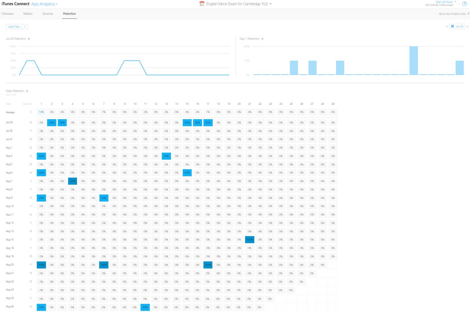
There are three charts on this page. The first chart named July 29 Retention shows the percentage of users that first installed our app on July 29 and used it on the following days. The second chart named Day 1 Retention shows the percentage of users that used the app on the 1st day after the first installation. By plotting data on consecutive days, the third chart (Retention Chart) is then produced.
Retention Chart shows data on consecutive days, the vertical axis (y-axis) is the day on which the users first installed our app, and the horizontal axis(x-axis) denotes the users who used it in the following days.
When we launch new app features, one of the things we want to keep track on is the retention data. It shows some useful insights on how people are enjoying our new app updates — indicated by action (using our app more often). In this page, we always want to focus on the Average percentage, which reveals the number of users is engaging with our app in general.
The Retention page provides us some indicators to review our marketing campaign. Some campaigns might indeed draw a lot of users to download our app, but the users don’t use our app after they downloaded it; Some campaigns might have less amount of users under the same budget, but the users keep using the app for a very very long time, which means the campaign targets the right customers. For us, it is always better to see a pool of customers with high engagement than a larger pool of customers who don’t use our app twice. To check individual campaign performances by iTunes App Analytics tool, we can add a filter.
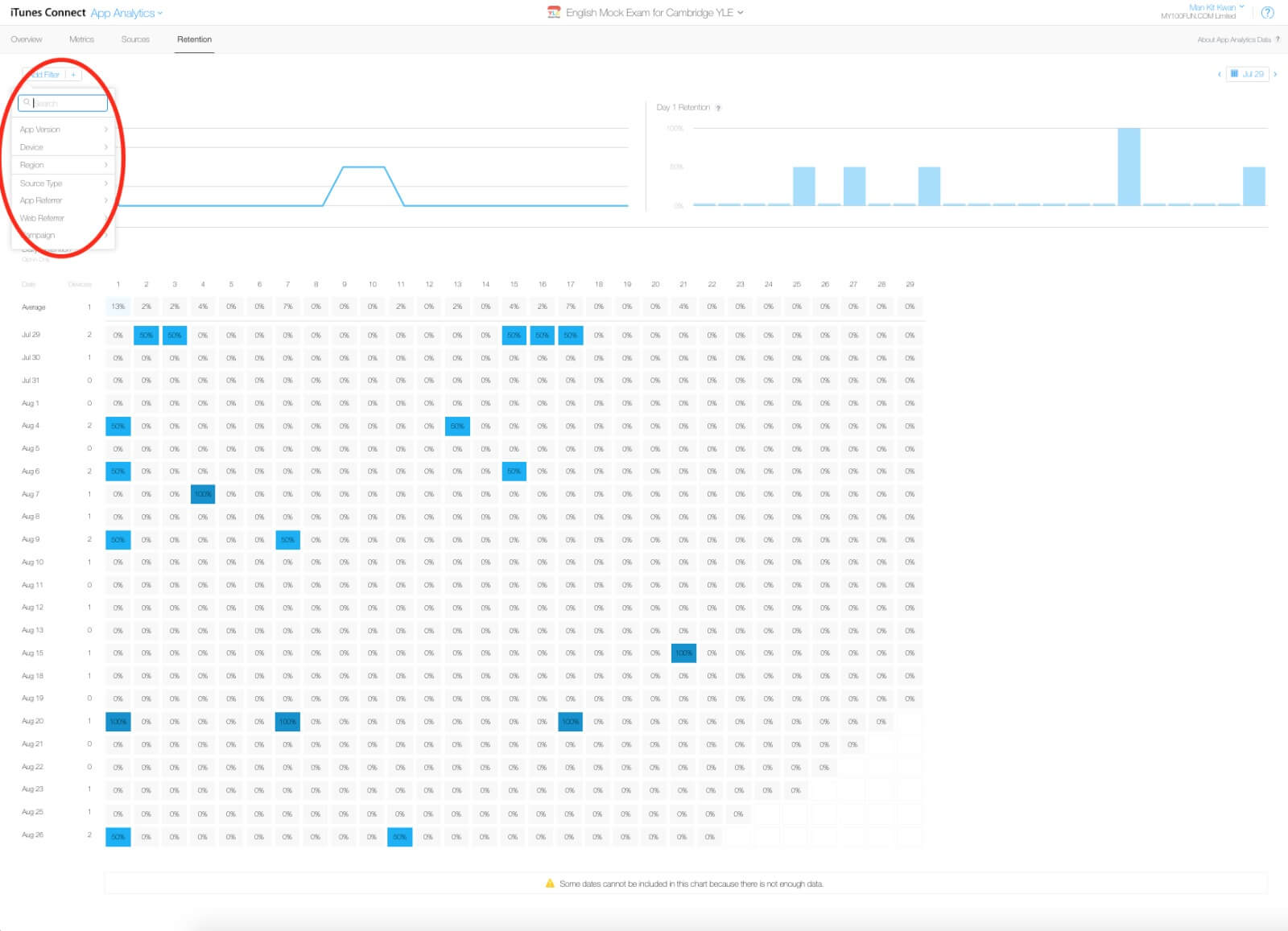
The Add Filter also provides options including App Version, Device, Region, Source Type, App Referrer, and Web Referrer. By adding a suitable filter, we will understand our users more and allocate budget more efficiently on areas that provide positive results.
That’s all for iTunes Connect App Analytics Part 2 tutorials! To recap, we have discussed how to review the performance of incoming traffic from different sources, as well as, retention.
If you have used other App Analytics tools, you might find that the data shown on iTunes Connect App Analytics would be slightly different. It is because App Analytics of iTunes Connect only provides data which users agree to opt-in for developers so as to respect their privacy. If you want to know more about other powerful App Analytics Tools such as Mixpanel and Flurry, we will discuss them in some advanced tutorials later on. As a beginner of app marketing, iTunes Connect’s App Analytics is good enough for you to understand more about your customers. From now on, maintain a habit of reviewing data. This will help you build an audience-driven successful app.