

Welcome to another tutorial where we’ll keep exploring fundamental stuff on macOS programming world. Today we are going to focus on a commonly used family of controls which are vital to every application. Their primary purpose is to gather user input as well as to display certain message types to users. We are going to talk about text controls.
I don’t think there’s ever existed a meaningful application without using any kind of text control. Labels, text fields and text views are types of UI controls that are met in every application, even if not all of them are present. Due to their purpose and their intended use, text controls are usually of the first ones developers use into an app. And even though there’s not any kind of mystery or magic hidden and using them is relatively straightforward, a post dedicated to text controls is necessary so we have the chance to walk through their specific details and clear a few things out.
If you haven’t read the previous posts on macOS programming yet I invite you to do so. I’m pretty sure that you’ll find topics and stuff that will attract your interest. With that said, let’s dive in to our today topic.
Demo app
On the contrary of the previous macOS programming tutorials, today we’re not going to build a small, fully working app focusing on the topic we have to explore. Instead, we’ll just be “throwing” text controls into a view controller and we’ll be discussing about their properties. Still, there is a starter project for you to download with a few things already configured for you (such as a few IBOutlet properties). Note that we won’t go through an exhaustive presentation of all available properties that text controls provide. That would be totally pointless as there are so many of them, and usually not all properties need to be configured. Instead we’ll focus only on the most important ones, those that are being usually set or are the most probable to be set.
Text Fields
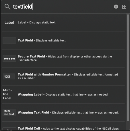
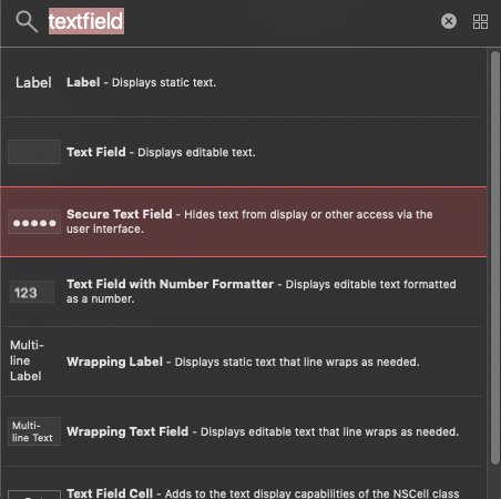
In the starter Xcode project open the Main.storyboard file to reveal the Interface Builder. At the time being there’s no content in the view controller, so let’s add a text field. Click on the Objects Library button in Xcode’s toolbar and search for a text field. You’ll get a few text field variations as results, but what we’re after here is a single Text Field control. So, select it and drag it into the view controller. Place it anywhere you want in the view.
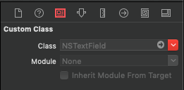
A text field is a NSTextField object, and you can see that by opening the Identity inspector after you select the text field you just added to the view controller. NSTextField class can be subclassed for achieving advanced customization or adding new features to a text field; just remember to replace the default value in the Class field in the Identity inspector with the name of the custom class.
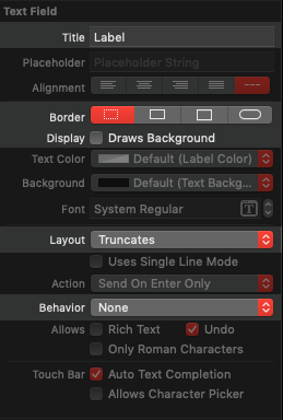
Let’s get to the most common properties now. Open the Attributes inspector in the inspectors pane while you keep the text field selected. Here’s what you should see:
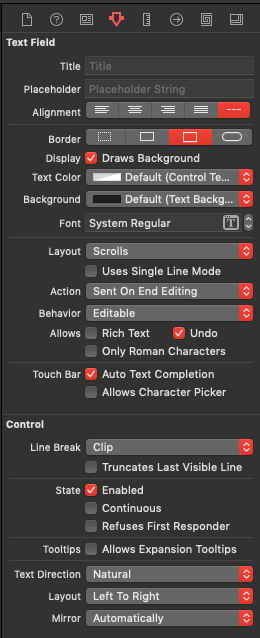
Starting from the top and moving to bottom, the first property you can specify here is the text field’s title. This is the text field’s content. It is not hardcoded usually but that’s not a rule; it depends on the purpose of the text field. Normally, users are those whoe type in the text field’s content.
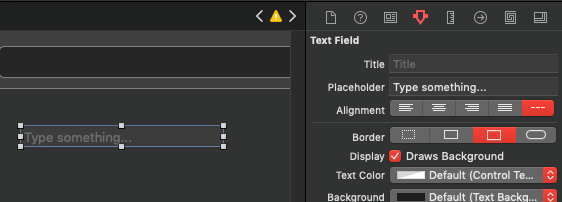
Next field, the placeholder, is what you will want to use more often. A placeholder is distinguished by the different formatting that is applied to the displayed text, and its purpose is to prompt or guide the user on what they have to type in on the specific text field. Placeholder text instantly disappears when users start typing on the text field. It’s not mandatory to specify it, it’s used to make the purpose of the text field more clear to users. Here’s an example of a text field with a placeholder:
Right next you can specify the text alignment. Choose whether you want the displayed text to be aligned to the left, center, right or to be justified to the text field. Justified alignment might not sound meaningful in single line text fields, but as you’ll see next you can have multi-line text fields and it has a meaning there.
The next group of properties regard the appearance of the text field. There are four border types to choose from: None, Line, Bezel & Round, with the bezel being the default selection. Click on any border style to see the result in the text field you have in your view controller.
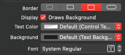
Right next, you can choose whether the text field will have its background drawn or not, and this background will use the color specified in the Background popup button right below. Drawing background is selected by default, but feel free to uncheck it if it makes the text field fits better to your app’s design. Also, use the Text Color popup for setting the text field’s text color.
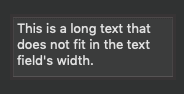
The above are the properties you’ll be changing the most. The properties following from there on have less chances of being modified, but let’s see the most important ones starting from the Layout field. Here you specify how the text field will handle text that’s long enough to fit in its width. By default, the predefined value is set to Scroll, which means that the text will be scrolled to left or right while the cursor moves towards the opposite direction. To see this default behaviour in action, just add some long text that won’t fit in the text field’s width:
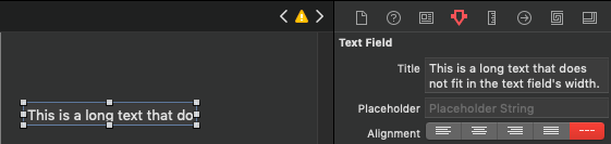
Make sure that the text field is short enough by setting its size to 160x22px through the Sizes inspector. In addition to that, and for the sake of the example, add one more text field in the view controller (that’s temporary, we’ll delete it in a while).
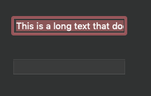
Now run the app and see how the text scrolls to left and right as the cursor moves to one or the other direction. Then, click on the second text field so the first one loses the focus and see that the non-visible text is simply clipped.
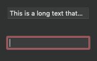
Switch to Xcode now and change the Layout value to Truncate. Run the app again and click on the second text field to see how the first one transforms the text. This time there are three dots appearing automatically indicating that there’s more text in the text field that’s not visible, but you can normally access it simply by clicking on the text field.
You can have additional control by specifying whether text will be truncated to the end (like what’s shown above), to the beginning or to the middle by going to the Control section in the Attributes inspector and choosing the proper truncate style from the Line Break popup button:
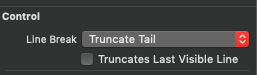
The Truncate Tail is applied by default, but you can change that by choosing a different truncate mode. Go ahead and pick another mode, and then run the app again. Remove the focus from the text field and you’ll see how text truncates using a different mode.
To try out the Wraps value in the Layout field, you need to change the height of the text field, so set it to 60px. Run the app and see that this time the text is spread to multiple lines! If you keep typing you’ll see that new lines will keep being added, while vertical scrolling is automatically enabled to make it possible to access text that has become invisible in the vertical axis. Even though this layout makes the text field look similar to a text view, it still remains a text field. The most significant difference is that by hitting Return on the keyboard the text field stops from being edited, while a new line would be the result in a text view.
Once again, open the Line Break popup to choose between two wrapping options: Word Wrap (which is the default value applied), and Character Wrap.
At this point feel free to revert the text field’s size and to delete the second text field from the view controller.
A text field is by default editable, and you can see that in the Behavior field. However there might be times where you’ll want to make it non-editable, or at least just selectable. Open the Behavior popup button to find all these options. Preventing a text field from being editable though has as a result to convert it into a… label as we’ll see next!
By default all text fields support Undo actions, meaning that users can un-type whatever they’ve typed in by simply pressing Cmd + Z on the keyboard or using the Edit > Undo command on the main menu. If this behaviour is not appropriate for your app then simply feel free to turn it off.
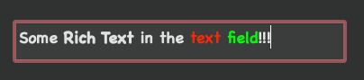
Typed in text in text fields is plain, but you can have rich text as well by enabling the Rich Text check box. By doing so, the entire text or part of it can be formatted as per demand:
The rest properties are left untouched in the 99.9% of the cases, so I won’t go into their details right now. If you are curious enough, try to play around with them and see how their value change affects the text field.
Handling Text Field In Code
What I showed above is about how to configure text field’s properties in Interface Builder. However, if you are more a code guy, then all you have to do is to go and play with properties. To get a taste, copy and paste the following method to the ViewController.swift file.
func configureTextField() {
    guard let textField = textField else { return }

    // Placeholder with plain text.
    textField.placeholderString = "Type something..."

    // It's possible to have a placeholder with an attributed string as well.
    textField.placeholderAttributedString = NSAttributedString(string: "Type something...", attributes: [NSAttributedString.Key.font: NSFont.systemFont(ofSize: 15.0, weight: .bold)])


    // Text alignment.
    textField.alignment = .center


    // Control the appearance of text field.
    textField.isBezeled =  true
    textField.bezelStyle = .squareBezel
    textField.isBordered = true

    // Text field's background and text color.
    textField.backgroundColor = .black
    textField.textColor = .green


    // Changing editable and selectable flags.
    textField.isEditable = true
    textField.isSelectable = true


    // Allow rich text in text field.
    textField.allowsEditingTextAttributes = true


    // Use the lineBreakMode property to truncate text.
    textField.lineBreakMode = .byTruncatingTail
    // You can also use .byTruncatingMiddle and .byTruncatingHead

    // To wrap text first enable wrapping through the
    // text field's cell:
    textField.cell?.wraps = true
    // Then choose the wrapping mode:
    textField.lineBreakMode = .byWordWrapping
}
Then call it in the viewDidLoad() method:
override func viewDidLoad() {
super.viewDidLoad()
configureTextField()
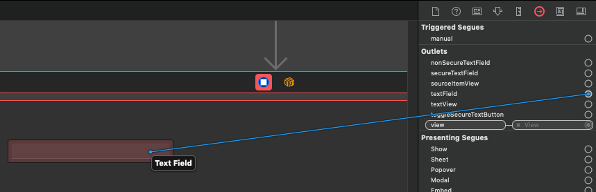
}That’s not enough however. The text field that you added to the Interface Builder must be connected to the textField IBOutlet property that’s already declared in the ViewController class. Back to Main.storyboard file, select the ViewController object in the Document Outline and then open the Connections inspector. Connect the textField IBOutlet property to the text field and you’re good to go. Run the app and see how the above properties affect the text field. Even more, change their values and run again to see the results.
Text Field Delegate
Setting the view controller as the text field’s delegate makes it possible to have access to methods that are being called when various actions are being performed on the text field. For example, using the NSTextFieldDelegate protocol you can make your app capable of “knowing” when a text field starts or stops from being edited and to therefore trigger further actions based on that information. It’s important to underline here that when conforming to NSTextFieldDelegate, you are also automatically conforming to NSControlTextEditingDelegate protocol, so additional delegate methods (common to all text controls) are becoming available to you.
Let’s see an example. Go to the viewDidLoad() method in the ViewController.swift file. Make sure that the textField IBOutlet property is actually connected to a text field object in the Interface Builder (it’s not nil), and then set self as its delegate:
override func viewDidLoad() {
    ...

    if let textField = textField {
        textField.delegate = self
    }
}
Right after the closing of the ViewController class add the following extension:
extension ViewController: NSTextFieldDelegate {

}
In it we’ll implement the following delegate method that will let us get the value typed in the text field when the Return button is pressed on the keyboard, or the text field loses the focus:
extension ViewController: NSTextFieldDelegate {
    func control(_ control: NSControl, textShouldEndEditing fieldEditor: NSText) -> Bool {

        if let textField = control as? NSTextField {
            print(textField.stringValue)
        }

        return true
    }
}
Since there’s nothing particular to do with the text field’s value, we just print it on the console. Casting to a NSTextField object above is necessary, as the control parameter is a NSControl and not a text field object. If you want to prevent text field from losing the focus and remaining the first responder even after the Return key is pressed, then return false from the above method.
Secure Text Field
There are cases where text typed in a text field should not be visible. For example, when users type in passwords, these passwords should remain hidden. For such cases, there is a variation of the normal text field provided, called Secure Text Field. Actually, a secure text field is an object of the NSSecureTextField class which inherits from the NSTextField, but it provides the additional features of showing bullets instead of the actual text, and prevents copy and cut of the typed text for security reasons.
Go to the Main.storyboard file, and then click to open the Objects Library. Once again search for a text field, and you will find it there.
Drag and drop it to the view controller’s view, and place it anywhere you want. By opening the Attributes inspector you’ll find out that the provided properties are the same to the text field’s, except one that’s shown first on a separate section called Secure Text Field; It’s supposed to control whether bullets or the actual text should be shown on the text field.
To see the secure text field in action, just run the app and start typing in it. Then, go back to Xcode, disable the Echos Bullets check box and run again. Unfortunately you’ll notice that there’s no difference in the text field’s behaviour even though it was expected so.
There’s a trick to do if you want to support visibility toggling of the secure text field’s text. That is to have a normal text field hidden, and make it visible when you want to reveal the typed text to the secure text field. Two rules should apply: The normal text field must have the exact same frame to the secure text field, and right before toggling the visibility of the one or the other, the text from the currently shown one should be set to the text field that will become visible.
Let’s see how to do the above. First of all, let’s add the following controls to the view controller:
- A secure text field. Use the Sizes inspector and set its frame to: X=20, Y=550, Width=230, Height=22.
- A normal text field. Same as above, set the exact same frame: X=20, Y=550, Width=230, Height=22.
- A button to toggle text visibility. In the Objects Library search for a “button”, and drag and drop a push button to the view controller. Use the frame X=258, Y=550, Width=60, Height=21.
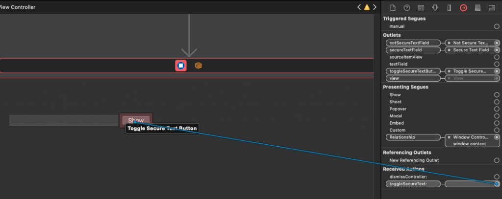
We must now connect IBOutlet properties to the above controls. Select the View Controller object in the Document Outline and open the Connections inspector. Connect the secureTextField outlet to the secure text field, the nonSecureTextField to the normal text field, and the toggleSecureTextButton to the button you added above. Before you leave the Connections inspector, there’s an IBAction method to connect to the button as well. It’s called toggleSecureText: and it’s the place where we’ll implement the logic to show and hide the text of the secure text field.
Switch to the ViewController.swift file, and go to the viewDidLoad() method. We’ll do two things there; we’ll hide the normal text field and we’ll set the title of the toggle button:
override func viewDidLoad() {
    ...

    if let nonSecureTextField = nonSecureTextField, let toggleSecureTextButton = toggleSecureTextButton {
        nonSecureTextField.isHidden = true
        toggleSecureTextButton.title = "Show"
    }
}
Next, let’s go to the toggleSecureText(_:) IBAction method. Depending on whether the secure text field is hidden or not, we’ll get the text from the currently visible text field and we’ll set it to the hidden one. Then, we’ll change the title of the toggle button and finally we’ll update the hidden state of the text fields. Here’s the implementation:
@IBAction func toggleSecureText(_ sender: Any) {
// If the secure text field is currently visible,
// then take its text and set it to the normal
// text field. Otherwise, do the opposite.
// In any case, don't forget to update the button's title.
if !secureTextField.isHidden {
nonSecureTextField.stringValue = secureTextField.stringValue
toggleSecureTextButton.title = "Hide"
} else {
secureTextField.stringValue = nonSecureTextField.stringValue
toggleSecureTextButton.title = "Show"
}
// Change the hidden state of the secure text field
// and of the normal text field.
secureTextField.isHidden = !secureTextField.isHidden
nonSecureTextField.isHidden = !nonSecureTextField.isHidden
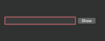
}Run the app now and click on the Show button to reveal the initially hidden text. Then click on it again to hide it:
Labels
A label in macOS is actually a text field, so almost everything we previously discussed applies to labels too. What makes a label… a label, is the fact that it’s not editable or selectable. It’s just a field showing text and users cannot interact with it.
Even though there’s nothing special to highlight regarding labels, let’s take a few minutes to see how they are differentiated from text fields. In the Main.storybard open the Objects Library and search for a “label”. Drag and drop the first result in the view controller’s view, and then open the Attributes inspector.
As you expected, the provided properties are the same to text field’s. However, labels come with different initial values. These are:
- The Title field has the text “Label” as its initial value.
- A label has no border and no background drawn.
- By default labels truncate text that’s longer than their width (see Layout field).
- Most importantly, the Behavior field is set to None, so labels cannot be edited or selected.
In case you need labels that can display text in multiple lines, then you should change the Layout field to Wraps, the Line Break to Word Wrap and increase the label’s height. But why to do that when you can have a multi-line label taken straight from the Objects Library?
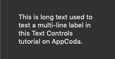
Indeed, Xcode provides such a label variation as a separate control in Objects Library. Open it and search once again for a label. This time pick the second object titled Wrapping Label and drop anywhere you want in the view controller. Then:
- Open the Sizes inspector and change its size to 150×80.
- In the Attributes inspector copy and paste the following text as its title (without the quotes):
“This is long text used to test a multi-line label in this Text Controls tutorial on AppCoda.”
Multi-line label will automatically break the text in multiple lines without any further configuration required on our part. That’s great, just keep one thing in mind: Make sure you give enough height to such a label so the text you plan to display on it can actually fit. No automatic vertical scrolling is being enabled in case text is longer than the label.
Text Views
When it’s necessary for users of your app to type in text that spans in multiple lines, then you have to forget about text fields and turn to text views. Text views can be configured to be as simple or complicated as it needs, so they’re good to create from simple text inputs to text editors, depending on the needs. Let’s focus here on some of the most important properties we can configure and calibrate the behaviour of a text view.
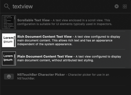
To get started, go to Main.storyboard file and open the Objects Library. Search for the term “textview” and drag into the view controller’s view the first object you’ll see; a Scrollable Text View.
A text view is contained into a scroll view, so it’s possible to scroll horizontally and vertically when text is longer than the text view’s size. By selecting the text view and going to Attributes inspector you’ll find a set of properties that can be configured. But watch out here! Unless you have used the Document Outline pane to drill down to the text view object, the properties you are currently seeing are the properties of the scroll view that contains the text view.
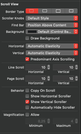
Before we go to the text view details, let’s have a glance to a couple of things that you might be interested in here. By default, the scroll view has no border drawn around it, but if you need one then just select the type of border that suits your app in the Border Type field. Also, by default a scroll view doesn’t draw its background, but if you want scroll view to have a background color then enable the Draw Background check box and choose the color you want in the Background popup button right above. Most probably you’ll need to make the text view’s background transparent for seeing the scroll view’s background, and we’ll get to that in a while.
In the Behavior section you can specify if scroll bars will be visible. As you can see from the text view you added in the view controller, the vertical scroll bar is visible by default. You can change that by unchecking the Show Vertical Scroller check box, as you can similarly turn on or off the horizontal scroll bar by checking or unchecking the Show Horizontal Scroller check box. To make scroll bars show and hide automatically based on the text length, just turn on the Automatically Hide Scroller check box.
The above are the properties you’ll most commonly want to change on a text view’s scroll view. I’d suggest to leave the rest as they are so users can find prior known experience to your apps too, as well as for being in accordance to system settings (such as the selected theme -dark, light-) defined by the user.
Go now to the Document Outline pane and expand the text view’s scroll view object. You’ll see that it contains a Clip View as a child item, and the clip view is the one that contains the actual text view object.
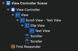
According to the official documentation, a clip view is “an object that clips a document view to a scroll view’s frame”, so in other words it’s necessary for binding the text view to the scroll view. We won’t stick to it since this is how Cocoa controls work. Also, there are not any particular properties to talk about; there’s only the option to draw or not its background, which by default is disabled. You are advised to keep it like that! For more information about the clip view, you can take a look at the official documentation from Apple.
So, let’s go into the text view details now. In the Document Outline pane make sure to select the Text View object, and then open the Attributes inspector. As you can see there are lots of properties you can configure here, and depending on what you’ll enable or disable it’s possible to have a variety of features available in your text view.
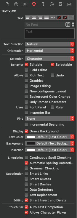
Starting from the basics, use the top fields for configuring the whatever has to do with the displayed text in the text view. Set the text alignment, text foreground and background color, paragraph settings, font and any predefined text you want to show. There’s something important to remember here though: These settings can be applied in Interface Builder if only there’s default text to display in the text view. For example:
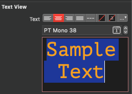
Otherwise, you will have to set these properties in code. It seems that IB doesn’t allow to change the default values of the top fields without having added some predefined text as shown above.
Text foreground is an exception, as it can be set a little bit lower in the Attributes inspector without the need to have a predefined text in the text view:
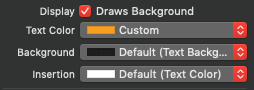
Notice in that group of settings that the Draws Background is enabled. This is what gives the background color to text view, so if you want to have a different color just open the Background popup and choose a different one. In case you want the background color to be drawn either by the scroll view or the clip view that contain the text view, then make sure to uncheck this check box here. Also, disable it in case you don’t want to have any background at all drawn for the text view and make it look that way as part of the view controller’s view. The Insertion color is the color of the cursor; even though the default white color is suitable when using the Dark mode (or black color in Light mode), you might need to change it too. Here’s the place where you can do so.
Let’s talk about the Behavior field now.
A text view is by default both editable and selectable, as these attributes define its normal behaviour. If you decide to make a text view non-editable, then you’ll end up with a variation of a multi-line label. There will be definitely times where you’ll need to change the value of these check boxes, and you can easily update them in code too:
textView.isEditable = false
textView.isSelectable = false
What’s interesting is the Field Editor check box. If you enable it, then instead of adding a new line, text view will just end from being edited as it would happen with a text field when you press the Return key. Maybe that doesn’t sound such a useful feature, however it’s useful to have it in certain cases. Think, for example, of a chat app where you are using a text view for composing the message, and by hitting Return you want the message to be sent. All you’ll need to do is to enable that check box.
Text view allows for typing plain text by default, but you can change that if you turn on the Rich Text check box in the Allows section of the Attributes inspector. In addition to that, most probably you’ll want to enable the Font Panel check box right below in the Uses section. By doing so you’ll be able to make text bold and italic, to change font and font size, to apply text color, and generally to perform other modifications like that either by using key combinations (such as Cmd + B), or by using the Format menu of the app at run time.
What you’ll find especially interesting is the Inspector Bar check box in the Uses section. If you enable it and you run the app you’ll notice that a formatting bar automatically appears on the app’s window, quite similar to the bar that the TextEdit app has.
If you are not doing lot of customization and you don’t mind to have these default controls appearing in your app, then they can be of a great help to your users for formatting text in the provided text view. Note that if you disable the Rich Text options but you keep the Inspector Bar on, then text view will keep supporting rich text. In addition to the rich text, if you enable the Graphics check box then you can insert or paste images and other graphics to the text view.
What is missing from the formatting bar is the options to align text, to set line and paragraph spacing, and the list and numbering options. In the Attributes inspector it’s not clear, nor straightforward how to enable them, yet it’s really simple. All you have to do is to check the Ruler check box in the Uses section. If you do so and you run the app, not only these additional features will be shown on the formatting bar, but you’ll be able to show the ruler by going in the Format > Text > Show Ruler menu.
As you can see, the bar now is exactly the same to the TextEdit app’s formatting bar!
If you run the app, start typing some text and you try to undo your actions by pressing Cmd + Z or by using the Edit > Undo menu, then nothing will happen. And even though this behaviour is pretty much expected, it’s not enabled by default. You can easily change that by checking the Undo check box in the Allows section of the Attributes inspector. If you do that and re-run the app, both undo and redo actions will be working just fine.
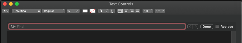
What you’ll also find interesting is the option to search and/or replace text in the text view. In the Attributes inspector go to the Find field where you’ll see that the option None is the selected one, meaning that no searching is enabled right now.
Click on the popup button to reveal the available options, and select the Uses Bar option. Run the app and hit the Cmd + F keys (or use the Edit > Find > Find… menu). You will see that the familiar Find bar will appear on the top side of the text view.
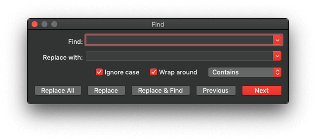
You can have the “Find” feature being displayed as a separate panel instead of showing up as a bar. Back in Attributes inspector open the Find popup button and select the Uses Panel options. Run again and press Cmd + F; this time you will see the following:
Finally, the Linguistics and Substitution sections are also interesting. Using the check boxes provided in the first one you can turn on or off the default behaviour of the text view regarding the spelling and grammar checking. Users will always be able to override any settings you’ll make there through the Edit > Spelling and Grammar menu options, unless you totally delete the menu in the Main.storyboard file.
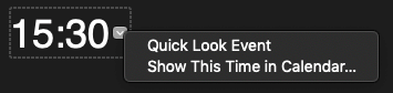
Regarding the Substitution fields, it seems that enabling or disabling them in the Interface Builder has no real effect, except for the Smart Links. When that option is enabled, then any link typed in the text view is automatically converted into a hyperlink and can be clicked. Also, even though none of the other Substitution fields is enabled, if you run the app you’ll see that Smart Quotes, Smart Dashes, and Text Replacement features are actually working. Instead of explaining what they’re all about, you’d better see it right below:
To see or change the list of the available text replacements, open the System Prefereces and open the Keyboard settings. Switch to the Text tab and you’ll find it there. That’s also the place where you can turn on and off the default Linguistics and Substitution settings that apply system wide.
To turn off all the above in your app only, all you need is to update the values of a few flags as shown next:
textView.isAutomaticQuoteSubstitutionEnabled = false
textView.isAutomaticDashSubstitutionEnabled = false
textView.isAutomaticDataDetectionEnabled = false
textView.isAutomaticTextReplacementEnabled = false
Data detectors are by default disabled, so if you enable them:
textView.isAutomaticDataDetectionEnabled = truethen dates, addresses and phone numbers are supposed to be detected automatically in the text view.
All these options can be turned on and off by users at runtime through the Edit > Substitutions menu of the app.
Rich & Plain Document Content Text Views
To avoid going through setting a bunch of attributes, Xcode provides two text view variations: One configured to support rich text and show the formatting bar exactly like the TextEdit app, and one configured to support plain text only. You can find them both in the Objects Library and you’re advised to add them in the starter project and check them out. If they can be of any use with none, or at least the bare minimum customization, then feel free to use them instead of trying to setup a text view from scratch. It’s up to you whether you’ll use them or not, now you know that they’re there.
Summary
Here we come to the end of this walk through the most important text controls in macOS and their most important properties. The general assumption is that it’s not hard to use and configure text fields, labels, and text views, however there are things that might not be obvious at first sight, or they should be done in code instead of the Interface Builder. What I showed to you today was meant to be an introduction to what’s available to use in your apps, so feel free to dig deeper and explore more features and possibilities. Thanks for reading, see you all in the next post!
For reference, please download the full Xcode project on GitHub.