

I don’t think I need to explain what a button is. It’s a very basic UI control that you can find in all apps and has the ability to handle users’ touch, and trigger a certain action. If you have learned iOS programming before, Button in SwiftUI is very similar to UIButton in UIKit. It’s just more flexible and customizable. You will understand what I mean in a while. In this tutorial, I will go through with you this SwiftUI control and you’re to learn the following techniques:
- How to create a simple button and handle the user’s selection
- How to customize the button’s background, padding and font
- How to add borders to a button
- How to create a button with both image and text
- How to create a button with a gradient background and shadows
- How to create a full-width button
Note: If you’re new to SwiftUI, please check out the introductory tutorial first.
Creating a New Project with SwiftUI enabled
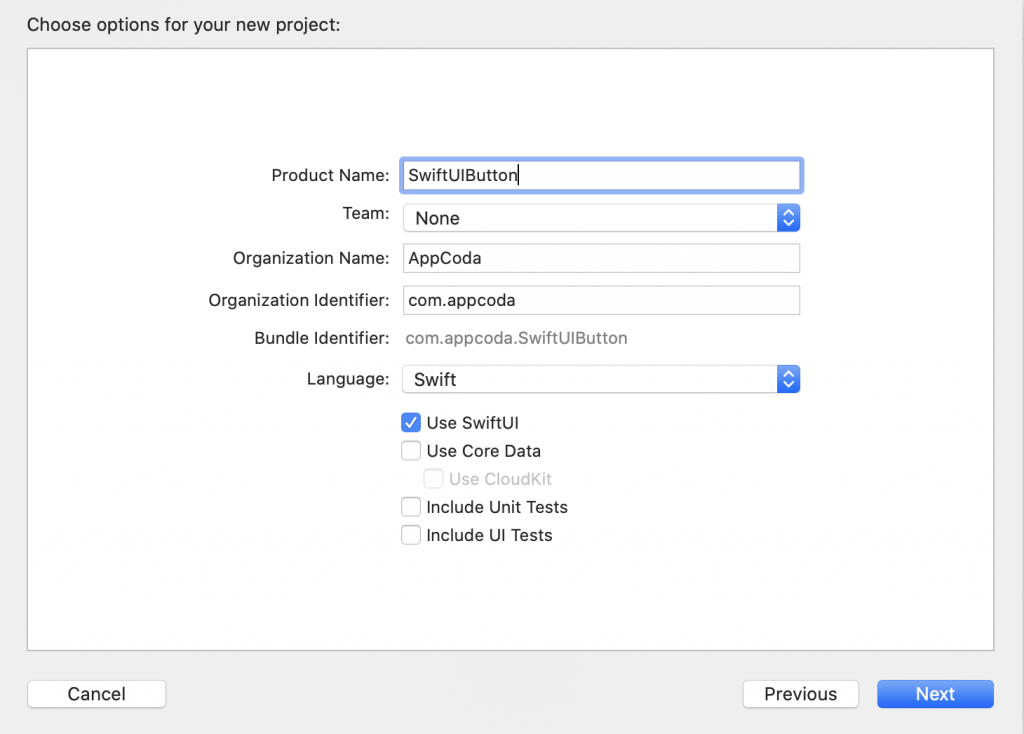
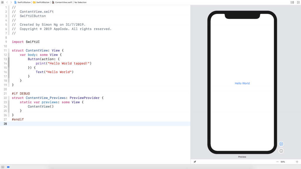
Okay, let’s start with the basics and create a simple button using SwiftUI. First, fire up Xcode and create a new project using the Single View Application template. Type the name of the project. I set it to SwiftUIButton but you’re free to use any other name. All you need to ensure is check the Use SwiftUI option.
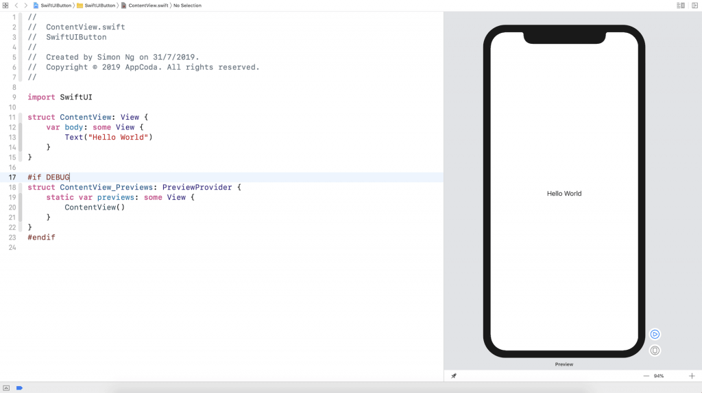
Once you save the project, Xcode should load the ContentView.swift file and display a preview in the design canvas. In case the preview is not displayed, you can click the Resume button in the canvas.
Creating a Simple Button with SwiftUI
It’s very easy to create a button using SwiftUI. Basically, you can use the code snippet below to create a button:
Button(action: {
    // What to perform
}) {
    // How the button looks like
}
When creating a button, you need to provide two code blocks:
- What to perform – the code to perform after the button is tapped or selected by the user.
- How the button looks like – the code block that describes the look & feel of the button.
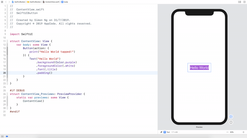
For example, if you just want to turn the Hello World label into a button, you can update the code like this:
struct ContentView: View {
   var body: some View {
       Button(action: {
           print("Hello World tapped!")
       }) {
           Text("Hello World")
       }
   }
}
Now the Hello World text becomes a tappable button as you can see it in the canvas.
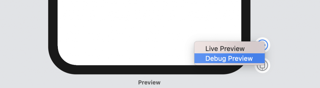
The button is now non-tappable in the design canvas. To test it, click the Play button to run the app. However, in order to view the Hello World tapped message, you have to right-click the Play button and then choose Debug Preview. You will see the message on the console when you tap the button.
Customizing the Button’s Font and Background
Now that you should know how to create a simple button, let’s see how to customize its look & feel with the built-in modifiers. Say, to change the background and text color, you can use the background and foregroundColor modifiers like this:
Text("Hello World")
.background(Color.purple)
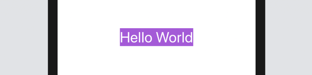
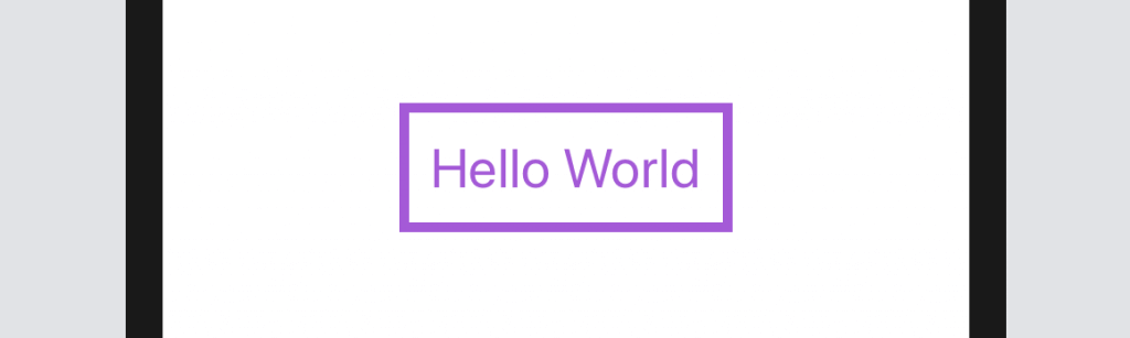
.foregroundColor(.white)If you want to change the font type, you further use the font modifier and specify the font type (e.g. .title) like this:
Text("Hello World")
    .background(Color.purple)
    .foregroundColor(.white)
    .font(.title)
After the change, your button should look like the figure below.
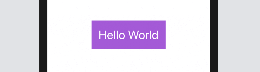
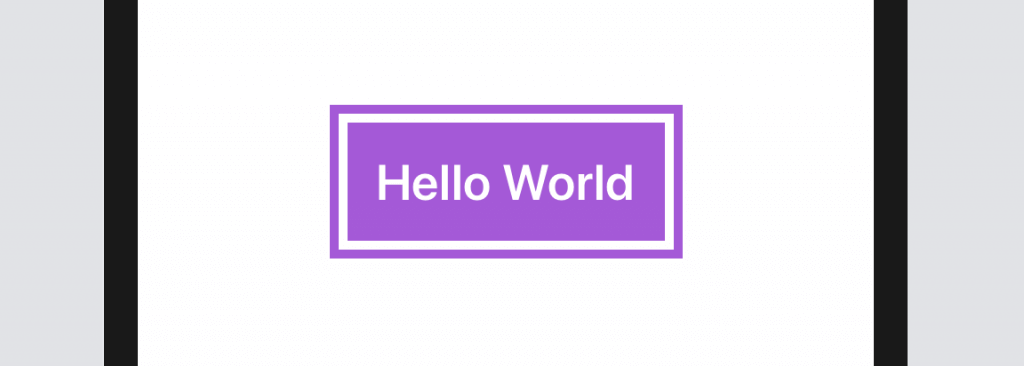
As you can see, the button doesn’t look very good. Wouldn’t it be great to add some space around the text? To do that, you can use the padding modifier like this:
Text("Hello World")
    .padding()
    .background(Color.purple)
    .foregroundColor(.white)
    .font(.title)
After you made the change, the canvas should update the button accordingly. The button should now look much better.
The Order of Modifiers is Important
One thing I want to highlight is that the padding modifier should be placed before the background modifier. If you write the code like below, the end result will be different.
If you place the padding modifier after the background modifier, you can still add some paddings to the button but without the preferred background color. If you wonder why, you can read the modifiers like this:
Text("Hello World")
    .background(Color.purple) // 1. Change the background color to purple
    .foregroundColor(.white)  // 2. Set the foreground/font color to white
    .font(.title)             // 3. Change the font type
    .padding()                // 4. Add the paddings with the primary color (i.e. white)
Conversely, the modifiers will work like this if the padding modifier is placed before the background modifier:
Text("Hello World")
    .padding()                // 1. Add the paddings
    .background(Color.purple) // 2. Change the background color to purple including the padding
    .foregroundColor(.white)  // 3. Set the foreground/font color to white
    .font(.title)             // 4. Change the font type
Adding Borders to the Button
It doesn’t mean the padding modifier should always place at the very beginning. It just depends on your button design. Let’s say, you want to create a button with borders like this:
You can change the code of the Text control like below:
Text("Hello World")
    .foregroundColor(.purple)
    .font(.title)
    .padding()
    .border(Color.purple, width: 5)
Here we set the foreground color to purple and then add some empty paddings around the text. The border modifier is used to define the border’s width and color. Please feel free to alter the value of the width parameter to see how it works.
Let me give you another example. Let’s say, a designer shows you the following button design. How are you going to implement it with what you’ve learned? Before you read the next paragraph, please give yourself a few minutes to figure out the solution.
Okay, here is the code you need:
Text("Hello World")
    .fontWeight(.bold)
    .font(.title)
    .padding()
    .background(Color.purple)
    .foregroundColor(.white)
    .padding(10)
    .border(Color.purple, width: 5)
We use two padding modifiers to create the button design. The first padding, together with the background modifier, is for creating a button with padding and purple background. The padding(10) modifier adds extra paddings around the button and the border modifier specifies to paint a rounded border in purple.
Let’s see a more complex example. What if you want to design the button with rounded borders like this?
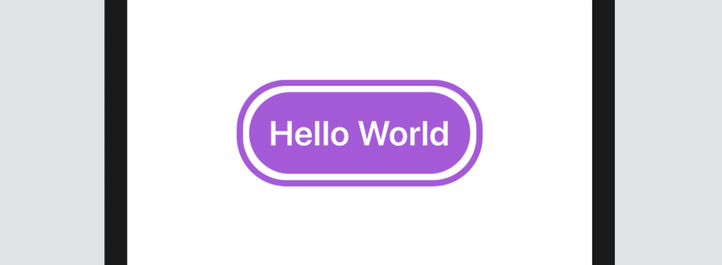
SwiftUI comes with a modifier named cornerRadius that lets you easily create rounded corners. To render the button’s background with rounded corners, you can simply use the modifier and specify the corner radius like this:
.cornerRadius(40)For the border with rounded corners, it’ll take a little bit of work since the border modifier doesn’t allow you to create rounded corners. So, what we need to do is to draw a border and overlay it on the button. Here is the final code:
Text("Hello World")
    .fontWeight(.bold)
    .font(.title)
    .padding()
    .background(Color.purple)
    .cornerRadius(40)
    .foregroundColor(.white)
    .padding(10)
    .overlay(
        RoundedRectangle(cornerRadius: 40)
            .stroke(Color.purple, lineWidth: 5)
    )
The overlay modifier lets you overlay another view on top of the current view. In the code, what we did was to draw a border with rounded corners using the stroke modifier of the RoundedRectangle object. The stroke modifier allows you to configure the color and line width of the stroke.
Creating a Button with Images and Text
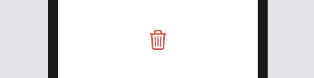
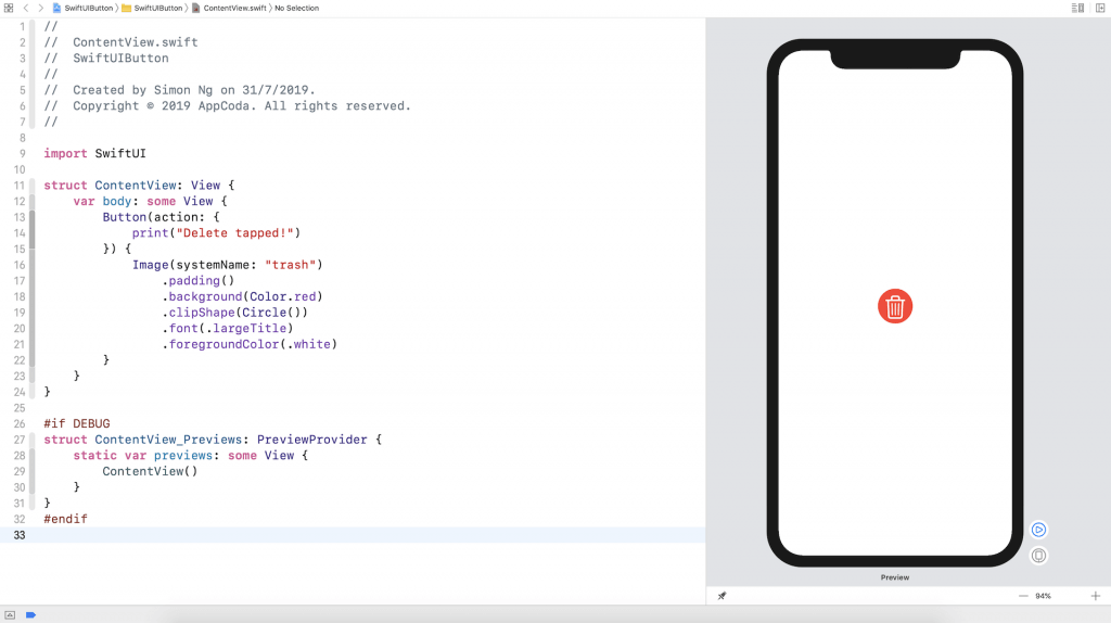
So far, we only work with text buttons. In a real world project, you or your designer may want to display a button with an image. The syntax of creating an image button is exactly the same except that you use the Image control instead of the Text control like this:
Button(action: {
    print("Delete button tapped!")
}) {
    Image(systemName: "trash")
        .font(.largeTitle)
        .foregroundColor(.red)
}
For convenience, we use the built-in SF Symbols (i.e. trash) to create the image button. We specify to use .largeTitle in the font modifier to make the image a bit larger. Your button should look like this:
Similarly, if you want to create a circular image button with a solid background color, you can apply the modifiers we discussed earlier. The figure below shows you an example.
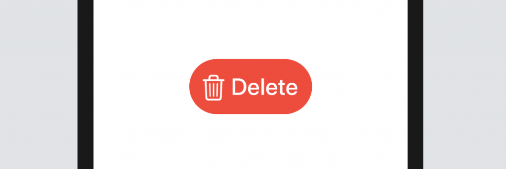
You can use both text and image to create a button. Say, you want to put the word “Delete” next to the icon. Replace the code like this:
Button(action: {
    print("Delete tapped!")
}) {
    HStack {
        Image(systemName: "trash")
            .font(.title)
        Text("Delete")
            .fontWeight(.semibold)
            .font(.title)
    }
    .padding()
    .foregroundColor(.white)
    .background(Color.red)
    .cornerRadius(40)
}
Here we embed both the image and the text control in a horizontal stack. This will lay out the trash icon and the Delete text side by side. The modifiers applied to the HStack set the background color, paddings, and round the button’s corners. The figure below shows the resulting button.
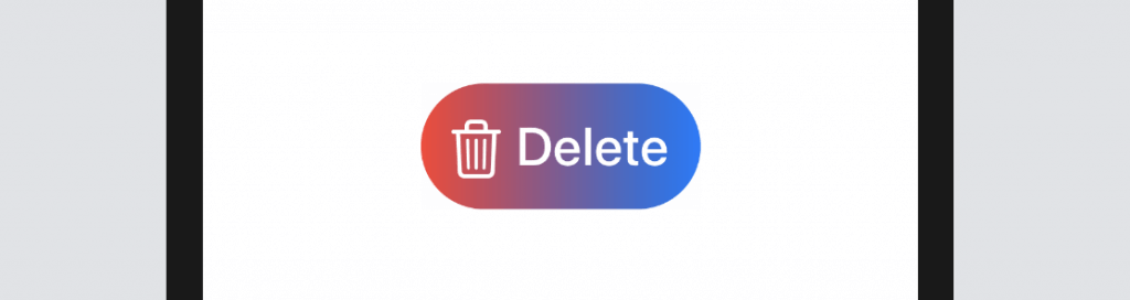
Creating a Button with Gradient Background and Shadow
With SwiftUI, you can easily style the button with gradient background. Not only can you a specific color to the background modifier, you can easily apply a gradient effect for any buttons. All you need to do is to replace the following line of code:
.background(Color.red)With:
.background(LinearGradient(gradient: Gradient(colors: [Color.red, Color.blue]), startPoint: .leading, endPoint: .trailing))The SwiftUI framework comes with several built-in gradient effect. The code above applies a linear gradient from left (.leading) to right (.trailing). It begins with red on the left and ends with blue on the right.
If you want to apply the gradient from top to bottom, you can change the line of code like this:
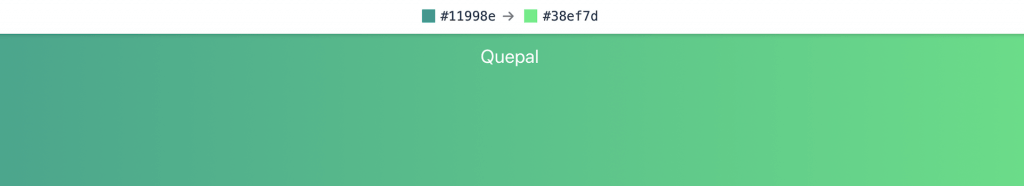
.background(LinearGradient(gradient: Gradient(colors: [Color.red, Color.blue]), startPoint: .top, endPoint: .bottom))You’re free to use your own colors to render the gradient effect. Let’s say, your designer tells you to use the following gradient (A sample gradient from uigradients.com):
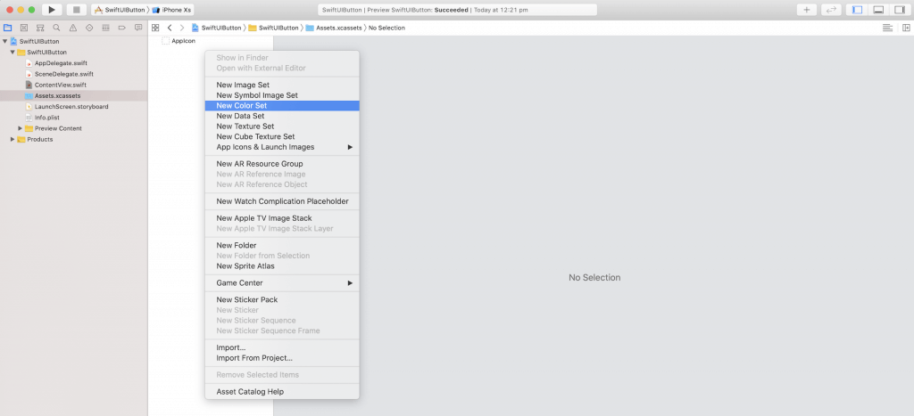
There are multiple ways to convert the color code from hex to the compatible format in Swift. Here I’m going to show one of the approaches. In the project navigator, choose the asset catalog (i.e. Assets.xcassets). Right click the blank area (under AppIcon) and select New Color Set.
Next, choose the color well and click the Show inspector button. Then click the Attributes inspector icon to reveal the attributes of a color set. In the name field, set the name to DarkGreen. In the Color section, change the input method to 8-bit Hexadecimal.
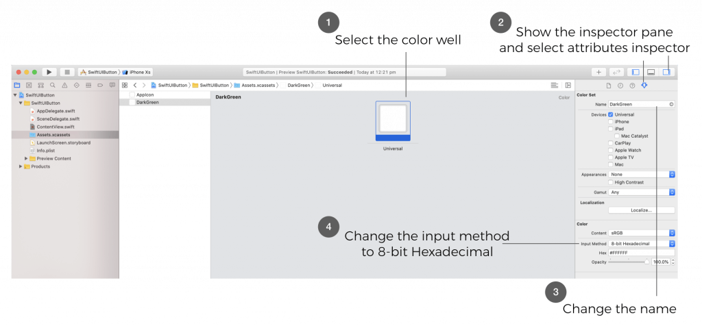
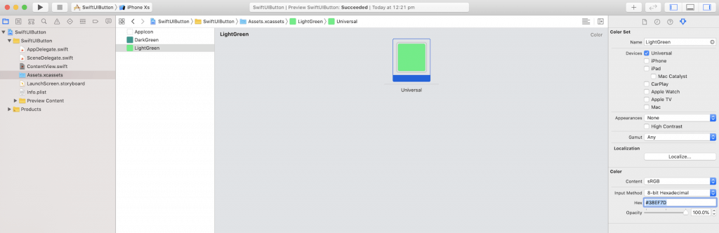
Now you can set the color code in the Hex field. For this demo, enter #11998e to define the color. Repeat the procedures to define another color set for #38ef7d. You can name the color set LightGreen.
Now that you’ve defined two color sets, let’s go back to ContentView.swift and update the code. To use the color set, you just need to specify the name of the color set like this:
Color("DarkGreen")
Color("LightGreen")
Therefore, to render the gradient with the DarkGreen and LightGreen color sets, all you need is update the background modifier like this:
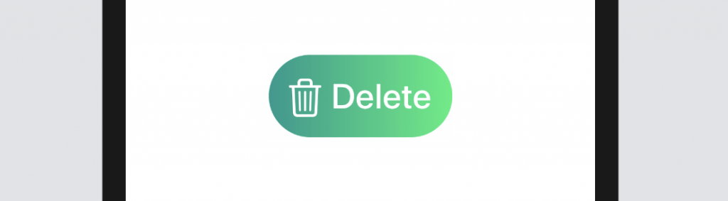
.background(LinearGradient(gradient: Gradient(colors: [Color("DarkGreen"), Color("LightGreen")]), startPoint: .leading, endPoint: .trailing))If you’ve made the change correctly, your button should have a nice gradient background as shown in figure below.
There is one more modifier I want to show in this section. The shadow modifier allows you to draw a shadow around the button (or any views). Just add this line of code after the cornerRadius modifier and see the result:
.shadow(radius: 5.0)Optionally, you can control the color, radius, and position of the shadow. Here is the sample code:
.shadow(color: .gray, radius: 20.0, x: 20, y: 10)Creating a Full-width Button
Bigger buttons usually grab user’s attention. Sometimes, you may need to create a full-width button that takes up the width of the screen. The frame modifier is designed to let you control the size of a view. Whether you want to create a fixed size button or a button with variable width, you can make use of this modifier. To create a full-width button, you can change the Button code like this:
Button(action: {
    print("Delete tapped!")
}) {
    HStack {
        Image(systemName: "trash")
            .font(.title)
        Text("Delete")
            .fontWeight(.semibold)
            .font(.title)
    }
    .frame(minWidth: 0, maxWidth: .infinity)
    .padding()
    .foregroundColor(.white)
    .background(LinearGradient(gradient: Gradient(colors: [Color("DarkGreen"), Color("LightGreen")]), startPoint: .leading, endPoint: .trailing))
    .cornerRadius(40)
}
The code is very similar to the one we just wrote, except that we added the frame modifier before padding. Here we define a flexible width for the button. We set the maxWidth parameter to .infinity. That means the button will fill the width of the container view. In the canvas, it should now show you a full-width button.
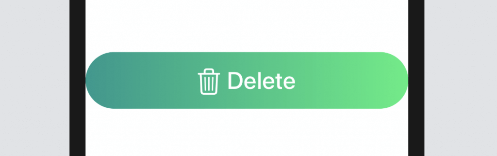
By defining maxWidth to .infinity, the width of the button will be adjusted automatically depending on the screen width of the device. If you want to give the button some more horizontal space, insert a padding modifier after .cornerRadius(40):
.padding(.horizontal, 20)What’s Coming Next
In this tutorial, I gave you an introduction to the Button control of SwiftUI. The power of this new framework allows developers to easily build flexible button controls with a few lines of code. In the next SwiftUI tutorial, we will dive deeper to animate a button tap and create a reusable button style.