

SwiftUI is a great framework in order to build user interfaces, as it speeds up and automates many tasks comparing to UIKit. However several features were missing during the original release. Thankfully, over the course of time SwiftUI gets better, enriched with more capabilities and provides more and more built-in tools to use.
One of those missing features in the first release was the toolbar; the control we all know from UIKit that allows to place navigation and action buttons at the top or the bottom of a view. That absence lasted for almost a year though, as toolbar has become natively available in SwiftUI starting with iOS 14.
Once one gets the grasp of the toolbars, using them in SwiftUI turns to be a piece of cake. There are a few small details to know of and keep in mind, but we are going to meet all that in this post using a demo app that I’m discussing about right next. There is a downside with toolbars in SwiftUI, and that is that it cannot be used in iOS versions less than 14. If you are planning to support both iOS 13 and 14+, then I’m afraid that you are a bit out of luck, but not entirely. You may use the view modifiers related to the navigation bar instead of a toolbar at the top. However, implementing a custom view seems to be unavoidable as a replacement for the bottom toolbar, at least for iOS 13.
Right next I’m presenting a simple application that I’m using to demonstrate how toolbars are implemented and work in SwiftUI. Summarizing what is about to come next, we are going to see how to place toolbar items both at the top and bottom, as well as at toolbars inside modal sheets. We’ll talk about their placement and how we can be as flexible as possible while laying out both the toolbars, and the toolbar items. In addition, you will also find out how to create reusable toolbars and save yourself from repeating similar code. All that are just about to unfold in this post, so read on to explore their details.
The Demo App
For the purposes of this tutorial, there is a demo app that we’ll be implementing gradually, and through that we’ll get to know how toolbars work in SwiftUI. Before you keep going, there is a starter project for you to download. Open it with Xcode after fetching it, and then keep reading to see what you will find there.
The concept of the project is the implementation of simple photo showing app, along with a few small features. In order to keep things simple, I have already included three stock photos in the project ready to use (from Pexels).
Here is what we’ll make possible in the app:
- To switch among images.
- To provide a short description in a modal sheet.
- To show and hide that description above the image on demand.
- To show a list of image filters, and apply any of them to each image.
- To show the system activity view in order to share the image.
All the above features will be functioning or triggered by using toolbar buttons. At the time being, there is nothing implemented regarding toolbars or their items, and that’s the main goal in this post; to go through their implementation and have a first-hand experience on them.
What exists already implemented is a basic model called ImageModel. It contains all necessary properties that hold a displayed image and a potential description, as well as the mechanism to load images and apply any selected filter to it. All that in a file called ImageModel.swift.
There is also the ImageFilters.swift file with a similarly named class that implements the few available image filters; sepia, monochrome and blur. We won’t deal with applying any selected filter to an image. That’s already been taken care of in the ImageModel type. We’ll simply select a filter and that will be instantly applied.
We are going to focus and work on the ContentView.swift file. Even though you will find a few @State properties already declared, the view’s body is currently empty, and we’ll change that in the following parts of the post. The purpose of each state property will become obvious slowly, after we start making use of them.
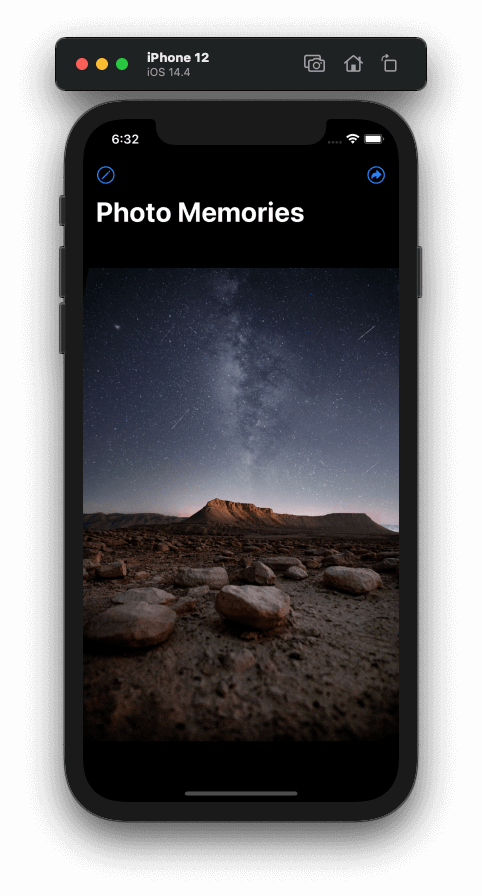
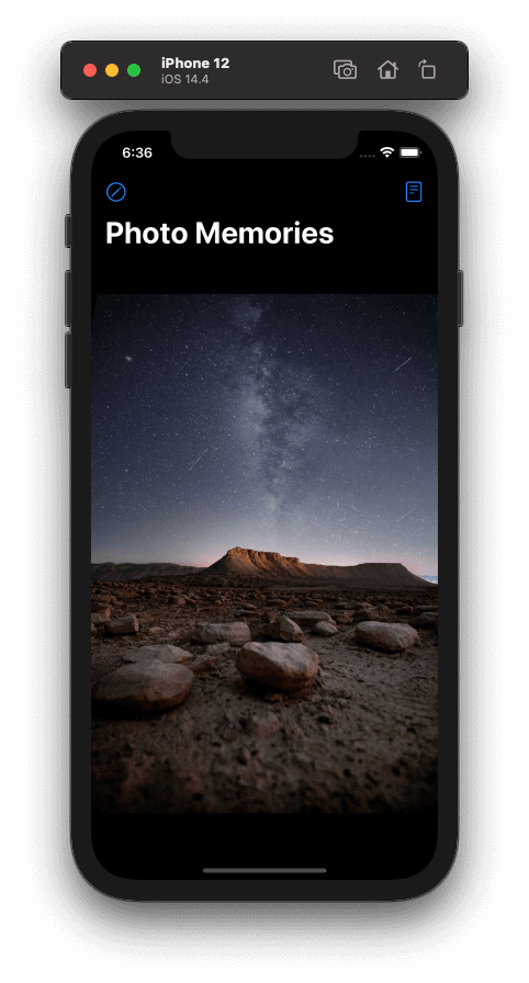
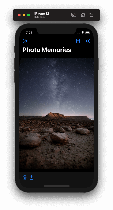
In the end, the app will be working like so:
Preparing The Main Content Of The App
Let’s get started by laying out the main content of the app; that is, the displayed image and a description text that will be optionally visible. To begin, open the starter project in Xcode and the ContentView.swift file then.
In the view’s body you will find an EmptyView at the moment. Replace that with a ZStack embedded into a NavigationView, exactly as shown right next:
NavigationView {
    ZStack(alignment: .bottom) {

    }
}
Even though we won’t have any navigation functionalities in the demo app, we need the navigation view in order to show the top toolbar there.
The ZStack will be containing two views; an Image view that will be displaying each image, and a Text view that will be showing a relative description, if that exists. We are going to place the text above image, and that’s why a ZStack is necessary here. The argument provided in the ZStack’s initialization indicates that contained views will be aligned on the bottom edge.
Having that brief description, let’s add the actual views that I just talked about. Inside the ZStack’s closure body add the following:
Image(uiImage: imageData[current].image)
    .resizable()
    .aspectRatio(contentMode: .fit)
The displayed image comes from the imageData collection, the simple data source in the demo app. The exact image that is being shown at any given moment is determined by the value of the current property. It points to the proper ImageModel object that contains the current displayable image in the imageData array.
The Image view has two modifiers applied to it. The first one allows the image to be resized, something that does not happen by default. The second view modifier specifies the content mode of the image view, or in other words how the image will appear in the image view. With the fit value we ensure that the image will fit in the image view respecting the original aspect ratio.
Time to add the Text view. We will do that conditionally, and based on the value of the showDescription property. Actually, description text will be visible on demand, and we’ll be toggling its appearance with a toolbar button.
With that on mind, let’s add the following condition right after the Image definition:
if showDescription {

}
Inside the if body we can now initialize a Text view. The actual text value will be fetched by the current ImageModel object in the imageData array. Besides that, we will also decorate it with a few view modifiers:
Text("\(imageData[current].description)")
    .padding()
    .background(Color.black.opacity(0.4))
    .foregroundColor(.white)
    .font(.title)
The background of the text is a semi-transparent black color, and in combination with the foreground color it ensures that description will be always readable on top of the image.
As an additional element, and given that we are using a navigation view, let’s add a title as well. Right after the ZStack’s closure add the next view modifier:
ZStack(alignment: .bottom) {
...
}
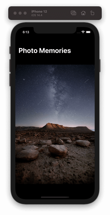
.navigationTitle("Photo Memories")The initial round of changes to the starter project ends here. Use either the Preview or run the app in the Simulator, and see what’s the result of the actions above.
At the time being there is no description to see for two reasons; firstly, false is the default one for the showDescription property. Secondly, even if you change that, the description for each image is simply an empty string. But we’ll fix all that pretty soon.
Although the first image is displayed properly, we have three images in total to display in the demo app. Currently, there is no way to move to the next one, and eventually rotate among them. We will make that work by using for first time a toolbar, and by adding a button that will be doing exactly that.
Before we proceed, here the entire code we added in the view’s body so far:
NavigationView {
    ZStack(alignment: .bottom) {
        Image(uiImage: imageData[current].image)
            .resizable()
            .aspectRatio(contentMode: .fit)

        if showDescription {
            Text("\(imageData[current].description)")
                .padding()
                .background(Color.black.opacity(0.4))
                .foregroundColor(.white)
                .font(.title)
        }
    }
    .navigationTitle("Photo Memories")
}
Switching Images With A Toolbar Button
It would be quite reasonable for someone to consider that a toolbar is a view in SwiftUI. However, no matter how logical that sounds, a toolbar is not a view; it’s a view modifier:
ZStack(alignment: .bottom) {
    ...
}
.toolbar {

}
See that it has no differences on how we use it compared to other view modifiers; the way we called the navigationTitle modifier earlier, the same way we call the toolbar modifier here too.
Even though the toolbar is a view modifier, its closure’s contents on the other hand should be views. And not any views, but specific views that allow to create toolbar items.
Most of the times toolbar items are going to be buttons serving two purposes; either they’ll be initiating some kind of navigation, or they will be performing certain actions. That statement, however, does not rule out the use of other views as well. For example, you may want to show a Text view in order to provide a short piece of information, probably updated on the fly, or another view that will have a different cause. In any case, in this post we are going to use buttons only as toolbar items.
Let’s begin with a button that will let us switch among all available images. Let’s also suppose that we want to place that button on the trailing edge of the top toolbar. To do so, it’s necessary to define a toolbar item, and for that purpose we use the ToolbarItem view:
.toolbar {
    ToolbarItem(placement: .primaryAction) {

    }
}
See the placement argument? This is where we specify the position of the toolbar item.
The primaryAction value provided above indicates a toolbar item connected to an action used quite often, and it has a predefined position by the system. On iOS that is the trailing edge of the toolbar, while on macOS that’s the leading edge.
There are other values to use as well, such as:
navigationBarLeading: It places the item on the leading edge of the toolbar.navigationBarTrailing: It places the item on the trailing edge of the toolbar.principal: It places the item in a prominent position, which is the center of the toolbar for iOS and macOS.navigation: It places the item where navigation actions should exist. That’s by default the leading edge, which is replaced by theprimaryActionplacement if a system item (such as a Back button) already exists on the leading side.
Note that all the above, including the primaryAction value, regard the navigation bar in iOS, not the bottom bar. For that, there is a different value to use, called bottomBar. We’ll talk about that in a while.
In addition, there are other values that indicate item position based on the purpose of the action. There are available to use placements like confirmationAction, cancellationAction, or destructiveAction. Any item that is given any of these placements, is positioned automatically by the system depending on the implied action. We are going to see them in action pretty soon too.
Let’s proceed with our demo app now, and let’s define a new button in the ToolbarItem’s closure:
ToolbarItem(placement: .primaryAction) {
    Button(action: {
        current = current + 1 == 3 ? 0 : current + 1
    }, label: {
        Image(systemName: "arrowshape.turn.up.right.circle")
    })
}
The button updates the current property’s value so it points to the proper item in the imageData array every time, and therefore to the next image to be displayed on each tap. Its label is an SF Symbol image.
You may run or preview the app again at this point, and see where the toolbar item is placed. Use it to show the next image.
More Navigation Bar Items
Just right in the previous part I mentioned the various placement options that are available for us to use with toolbar items. We created our first item, and we placed in the primary action position.
However, simply mentioning the other possible item positions has no actual educational result. And for that reason we are going to place a couple of items in the navigation bar, using each time a different placement.
I said earlier that we’ll make it possible to show and hide a short description about each image. However, there are two questions rising here; how are we going to provide that description, and how are we going to toggle its appearance?
The answer to both questions starts with the same sentence; we will use a toolbar item to trigger each action.
For the first one, we are going to show a modal sheet where we’ll allow to type in a short description text. For the second, we’ll be updating the showDescription property’s value on the tap of the respective item.
Starting with the first one, let’s place a new toolbar item to the leading edge of the navigation bar. On tap, it will be presenting a modal sheet:
.toolbar {
    ...

    ToolbarItem(placement: .navigationBarLeading) {
        Button(action: {
            description = imageData[current].description
            showSheet = true
        }, label: {
            Image(systemName: "pencil.circle")
        })
    }
}
Once again, we are initializing a ToolbarItem view where we provide the desired placement as argument. Its content is a Button that:
- Assigns the description of the current image to the
descriptionproperty; it will be needed next. - It updates the value of the
showSheetproperty to true. We will use that property to present a sheet in the next part.
The button’s label is also an SF Symbol used as image.
Let’s add the next toolbar item now. We’ll be using that in order to show and hide the description text. Let’s place it in the trailing edge:
.toolbar {
    ...

    ToolbarItem(placement: .navigationBarTrailing) {
        Button(action: {
            showDescription.toggle()
        }, label: {
            Image(systemName: "doc.plaintext")
        })
    }
}
The item is once again a button that simply toggles the showDescription value.
If you run the app now, you will find out that there is something wrong here; even though the leading item is properly shown, the last one to toggle the description appearance does not show up.
The reason of that is the primaryAction placement of the first item we added in the previous part! The system is doing a sort of prioritization based on the placement value, and that results to displaying the primary item, hiding anything else existing on the same side. Both primaryAction and navigationBarTrailing placements position items on the trailing edge, with the first one having a higher priority, so the second simply does not appear.
To fix that, we have to change a placement value. One thought would be to make both primary, so we can change the above code snippet to that:
ToolbarItem(placement: .primaryAction) {
    ...
}
You will soon find out that this has no effect at all as well! There can be only one primary item, not two. And why the first item is still visible, while both have been given the same placement value?
Well, like many other things in SwiftUI, the order we define toolbar items actually matters. The item to switch images has been defined first, and that’s why it’s the visible one. However, if you add the definition of the last item before that, then the item to toggle the description is what will be shown instead:
.toolbar {
    ToolbarItem(placement: .primaryAction) {
        Button(action: { showDescription.toggle() }, label: {
            ...
        })
    }

    ToolbarItem(placement: .primaryAction) {
        Button(action: { current = ... }, label: {
            ...
        })
    }

    ...
}
By changing the items’ order as demonstrated right above, we managed to show the latest item by defining it as the first one in the toolbar’s closure. However, we have now lost the original button in that position, and that’s because there can be one primary item only.
So, how can we have both items?
The answer to that is to avoid using the primaryAction placement at all. Instead, let’s use the navigationBarTrailing value. Note that order matters once again, so we keep it as it is:
.toolbar {
    ToolbarItem(placement: .navigationBarTrailing) {
        Button(action: { showDescription.toggle() }, label: {
            ...
        })
    }

    ToolbarItem(placement: .navigationBarTrailing) {
        Button(action: { current = ... }, label: {
            ...
        })
    }

    ...
}
We finally managed that way to have two items on the trailing edge:

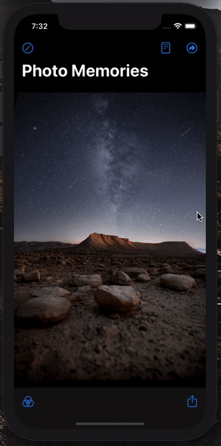
If there is one thing to conclude here, it would be this; use the primaryAction placement when there is one item to show on that side of the bar only. If not, then explicitly specify the trailing edge, and do not forget to take into consideration the order of the items.
Modal Sheet With Toolbar
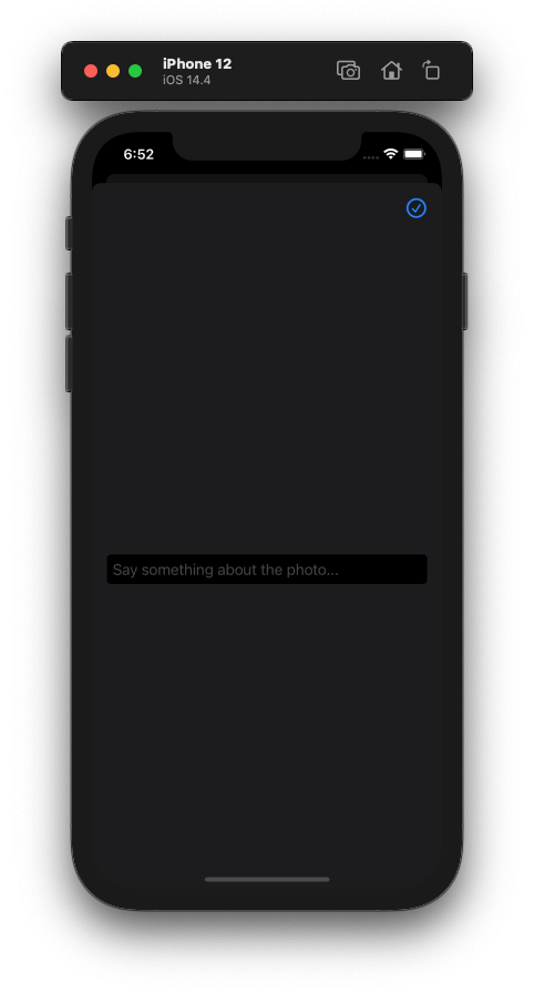
It’s time to implement the modal sheet of the demo app, which we’ll be using to enter a short description for each image. Since we are talking about short text, a text field is what we will use.
Before we get to that, let’s make it possible to present a sheet first. To do so, we are going to apply the sheet view modifier to the outermost view; the NavigationView.
As you will see in the next snippet, sheet accepts two arguments. The first is the binding value of a @State property that indicates whether the sheet should be visible or not. The second is a closure where we will add the sheet’s content.
NavigationView { ... }
.sheet(isPresented: $showSheet, content: {

})
The showSheet property is the one that manages the presented state of the sheet here. When its value is set to true, the sheet will be shown.
In the closure’s body now we’ll add the following contents; a navigation view to use a new toolbar view modifier with, and a TextField with a few modifiers to decorate it properly:
.sheet(isPresented: $showSheet, content: {
    NavigationView {
        TextField("Say something about the photo...", text: $description)
            .textFieldStyle(RoundedBorderTextFieldStyle())
            .padding(.horizontal)
    }
})
To accept the changes made to the text field, cancel editing, or even delete previously entered text we are going to use a toolbar with the navigation view. We will have three button items:
- One for storing the text and dismissing the sheet.
- One for cancelling the entire process and just dismissing the sheet.
- One for deleting the current description text.
The first and third item will exist together on the trailing edge of the navigation bar. The cancel item will be laid out to the leading edge.
Instead of using the placement values we met in the previous parts, we are going to use action-related placements values. By doing so, the system will automatically place all items to the proper positions.
To put that in motion, let’s apply the toolbar view modifier to the TextField, and let’s initialize a new ToolbarItem:
TextField(...)
    ...

    .toolbar {
        ToolbarItem(placement: .confirmationAction) {

        }
    }
The confirmationAction placement will automatically put that item to the primaryAction position; that is the trailing edge on iOS, or the leading edge on macOS.
Inside the above closure we’ll add a new button that will be assigning the typed description value to the current item of the imageData array, and toggling the showSheet value in order to dismiss the sheet:
ToolbarItem(placement: .confirmationAction) {
    Button(action: {
        imageData[current].description = description
        showSheet = false
    }, label: {
        Image(systemName: "checkmark.circle")
    })
}
So far our sheet looks like this:
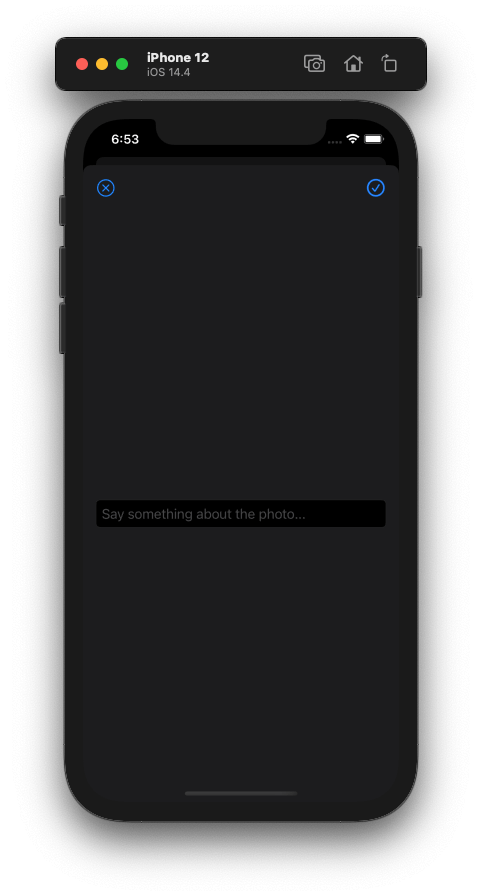
In a similar way we can add the cancel item; the way to simply dismiss the sheet without storing the current description. Right after the previous ToolbarItem we’ll add a new one:
ToolbarItem(placement: .cancellationAction) {
    Button(action: {
        showSheet = false
    }, label: {
        Image(systemName: "xmark.circle")
    })
}
The cancellationAction value will automatically place the item to the leading edge of the navigation bar.
In addition to the confirmationAction and cancellationAction placements, there is one more called destructiveAction. As its name suggests, this one is used to place a desctruction-related item to the proper position in the bar. In this case, such a desctructive action is to delete the currently entered description.
I mentioned earlier that the confirmationAction will place the item to the primaryAction position. However, there is a significant difference here. Although an item in that place cannot be shown along with another bar item, confirmationAction and destructiveAction can appear on the same side next to each other! iOS automatically places destructiveAction items to the trailing edge, next to the a confirmationAction item.
There is one last thing remaining to take care of here. For one more time the order of the toolbar items matters, so if we want the confirmation button to be on the outer side of the trailing edge, we have to define it after the destructive item.
With all that in mind, here’s the implementation of the destructive item along with its contained button. See that it’s the first item in the toolbar’s closure:
.toolbar {
    ToolbarItem(placement: .destructiveAction) {
        Button(action: {
            description = ""
            imageData[current].description = description
            showSheet = false
        }, label: {
            Image(systemName: "trash.circle")
        })
    }

    ToolbarItem(placement: .confirmationAction) {
        ...
    }


    ToolbarItem(placement: .cancellationAction) {
        ...
    }
}
Here’s the final result:
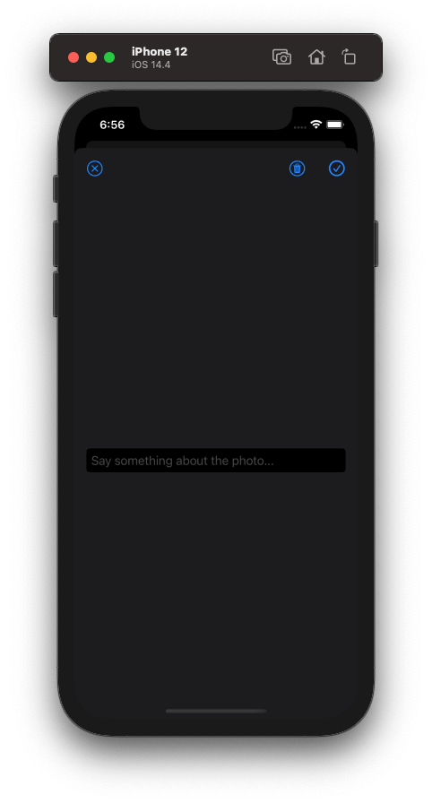
The buttons are working properly, so you can just go ahead and use them.
Creating Reusable Toolbar Items
Even though it’s not going to be necessary to reuse a toolbar in the app demonstrated in this post, it really worths the effort and the time to go through that. Without any doubt, nobody wants to recreate the same toolbar items when those must be used in more than one places.
So, in that logic, suppose that we want to reuse all toolbar items implemented in the previous part. We want to keep the confirmation, cancel and delete buttons, and to come up with a generic implementation which will allow us to use them out of the box. However, it should be possible at the same time to perform different actions, depending on the occasion they are used for.
In order to achieve something like that, it’s necessary to create a custom type that will be conforming to a specific protocol named ToolbarContent. In that custom type it’s mandatory to implement a body variable, just like we do in SwiftUI views. The content of that body will consist of one or more toolbar items, configured the way we want them.
To see that in action, go to the end of the ContentView.swift file, a few lines after the closing of all structures. You can create a new file if you want as well, but that’s faster to do here.
Now, let’s define the following type:
struct SheetToolbar: ToolbarContent {

}
You can give any name you like in the custom type. Here I name it SheetToolbar, indicating that it will be containing items for toolbars shown in sheets.
Before we implement the body with the ToolbarItems in the above type, we will declare three properties. Each property is going to be a closure, and will match to the action that should be performed by each item respectively.
So, continue by adding the next three lines:
struct SheetToolbar: ToolbarContent {
    var confirmAction: () -> Void
    var cancelAction: () -> Void
    var destructAction: () -> Void
}
Time for the body:
struct SheetToolbar: ToolbarContent {
    ...

    var body: some ToolbarContent {

    }
}
Here we are going to add the toolbar items we defined in the previous part. However, instead of performing the specific actions we met there, we will call the proper closure in each button:
ToolbarItem(placement: .destructiveAction) {
    Button(action: {
        destructAction()
    }, label: {
        Image(systemName: "trash.circle")
    })
}

ToolbarItem(placement: .confirmationAction) {
    Button(action: {
        confirmAction()
    }, label: {
        Image(systemName: "checkmark.circle")
    })
}

ToolbarItem(placement: .cancellationAction) {
    Button(action: {
        cancelAction()
    }, label: {
        Image(systemName: "xmark.circle")
    })
}
This is the SheetToolbar’s implementation. Before we make use of it, here is the full code:
struct SheetToolbar: ToolbarContent {
    var confirmAction: () -> Void
    var cancelAction: () -> Void
    var destructAction: () -> Void


    var body: some ToolbarContent {
        ToolbarItem(placement: .destructiveAction) {
            Button(action: {
                destructAction()
            }, label: {
                Image(systemName: "trash.circle")
            })
        }

        ToolbarItem(placement: .confirmationAction) {
            Button(action: {
                confirmAction()
            }, label: {
                Image(systemName: "checkmark.circle")
            })
        }

        ToolbarItem(placement: .cancellationAction) {
            Button(action: {
                cancelAction()
            }, label: {
                Image(systemName: "xmark.circle")
            })
        }
    }
}
Now, let’s head back to the sheet’s content, and more specifically, in the sheet’s toolbar content. You can delete or comment out the existing toolbar items, and then create a new instance of the SheetToolbar type:
.sheet(isPresented: $showSheet, content: {
    NavigationView {
        TextField(...)
            ...
            .toolbar {

                // Create a new instance of the SheetToolbar type.
                SheetToolbar {

                } cancelAction: {

                } destructAction: {

                }

            }
    }
})
See that there are three closure bodies to write code into. They match to the confirmation, cancellation, and destructive actions respectively. It becomes obvious that we can create as many instances of the SheetToolbar type as we need, but implement different logic per case. If we had a different place or another sheet to show the same toolbar items, we could trigger totally different actions than those here, without caring at all about the items themselves again. And that proves how important it is to create reusable toolbar items.
As a last step, let’s add the missing code from the closures above; the actions matching to each toolbar item:
SheetToolbar {
    imageData[current].description = description
    showSheet = false
} cancelAction: {
    showSheet = false
} destructAction: {
    description = ""
    imageData[current].description = description
    showSheet = false
}
The Bottom Toolbar
Time to see how we can create a toolbar that will show up in the bottom side of the screen. No matter how peculiar that sounds, we don’t really need another toolbar view modifier. We already have one where we define the toolbar items for the navigation bar of the app. In the exact same place we’ll create new toolbar items but with one difference only; the placement value! We will indicate that we want them to appear to the bottom, and for that reason the system will create a toolbar for us there.
Let’s see how all that works, and some further actions we can take after that. To get started, go inside the closure body of the toolbar view modifier applied to the ZStack; the place where we have defined the toolbar items for the navigation bar of the app.
Right after the last item existing there, add the next two items containing two buttons respectively:
.toolbar {
    ...


    ToolbarItem(placement: .bottomBar) {
        Button(action: {

        }, label: {
            Image(systemName: "camera.filters")
        })
    }

    ToolbarItem(placement: .bottomBar) {
        Button(action: {

        }, label: {
            Image(systemName: "square.and.arrow.up")
        })
    }
}
We will add the actions for both buttons later. For now, notice that we provide the bottomBar value as the placement argument to both items. The purpose of the two items is to show a list of filters to apply to the image, and to present the system activity controller in order to share an image respectively.
The above results to the following bottom toolbar:
See that both items are laid out on the leading edge. However, that’s not always a desirable appearance. What if we wanted to have one item to the leading and the other to the trailing edge? Or, if we had one item only but we wanted to make it appear on the trailing edge? A spacer is not allowed to be used between the two items, and if you try to do so you’ll get errors from Xcode.
Well, there is a slightly different approach to follow regarding the bottom items. Even though the above works fine and the default output might fits to your needs, being flexible is a situation that you will demand for sooner or later.
That flexibility comes by using a different view and not the ToolbarItem. It’s called ToolbarItemGroup.
A ToolbarItemGroup groups the content of separate toolbar items together. In the case of this demo app, it will group the two buttons defined in the two items previously. Even more, it allows to use a Spacer and therefore to layout its contents the way we desire.
Notice that with ToolbarItemGroup we no longer need to use the ToolbarItem. The placement value is given just once in the initialization of the ToolbarItemGroup, and then we only have to focus on the actual content.
Before we see how it works in code, please delete the last two toolbar items we implemented in the last code snippet. Then, add the following in their place:
ToolbarItemGroup(placement: .bottomBar) {

}
In the closure’s body we’ll add the two buttons as we met them earlier. However, this time we’ll add a Spacer between, and that way we’ll manage to spread them on the left and right side of the toolbar:
ToolbarItemGroup(placement: .bottomBar) {
    Button(action: {

    }, label: {
        Image(systemName: "camera.filters")
    })

    Spacer()

    Button(action: {

    }, label: {
        Image(systemName: "square.and.arrow.up")
    })
}
The above results to the following, which looks much better than before.
There is something missing here, and that is the actual actions that buttons should perform. Let’s fill these gaps first, and then we’ll add the remaining missing code that will make them work.
Right below is the same code as above, but this time buttons’ actions are not empty:
ToolbarItemGroup(placement: .bottomBar) {
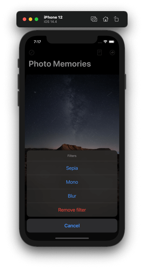
Button(action: {
showActionSheet = true
}, label: {
Image(systemName: "camera.filters")
})
Spacer()
Button(action: {
guard let data = imageData[current].image.jpegData(compressionQuality: 0.9) else { return }
presentActivityController(with: data)
}, label: {
Image(systemName: "square.and.arrow.up")
})
}The first button sets true to the showActionSheet @State property, which in turn will make an action sheet with a few image filters appear. The second button gets the JPEG data of the current image, and passes it as argument to a method that triggers the presentation of the system activity controller.
Both the action sheet and the presentActivityController(with:) method are missing, and now we are just about to add them. Let’s start with the action sheet, which is presented pretty much like the modal sheet we previously met.
Go right after the sheet view modifier’s closing, and add the actionSheet view modifier:
NavigationView { ... }
.sheet(isPresented: $showSheet, content: { ... })

.actionSheet(isPresented: $showActionSheet, content: {

})
In the content closure we’ll add the sheet’s buttons, and we’ll return a new ActionSheet instance that will be making use of them:
.actionSheet(isPresented: $showActionSheet, content: {
    let sepia = ActionSheet.Button.default(Text("Sepia")) {
        imageData[current].filter = .sepia
    }
    let mono = ActionSheet.Button.default(Text("Mono")) {
        imageData[current].filter = .mono
    }
    let blur = ActionSheet.Button.default(Text("Blur")) {
        imageData[current].filter = .blur
    }
    let remove = ActionSheet.Button.destructive(Text("Remove filter")) {
        imageData[current].filter = .none
    }
    let cancel = ActionSheet.Button.cancel(Text("Cancel")) {
        showActionSheet = false
    }

    return ActionSheet(title: Text("Filters"), message: nil, buttons: [sepia, mono, blur, remove, cancel])
})
The code that will apply the filters, as well as the actual filters’ implementation already exists in the starter project, so we won’t deal with that.
The bottom-left item is now working, so let’s take care of the next one.
Go right after the closing of the body variable in the ContentView structure, and add the next method:
func presentActivityController(with data: Data) {
    let controller = UIActivityViewController(activityItems: [data], applicationActivities: nil)
    UIApplication.shared.windows.first?.rootViewController?.present(controller, animated: true, completion: nil)
}
The only thing it does is to get the provided data and use it to initialize a UIActivityViewController instance. Then, it accesses the root view controller of the app’s window (a little bit of UIKit is necessary here), and presents the controller.
And that concludes our work with the bottom bar as well. Give it a try to make sure that you’ve done everything properly, and that all toolbar items are working as they were meant to.
Summary
Working with the toolbar in SwiftUI is generally an easy topic. There are a few details to know about in order to handle and place items properly, but there is nothing particularly difficult. What I personally find as a disadvantage is the lack of support for iOS 13, but soon enough that won’t be a concern. In any case, play around with the toolbar view modifier, the various item placement options, and all the other related stuff we talked about in this post so you have a first hand experience with it. I hope you enjoyed this tutorial and learnt something new and useful today. Stay safe, and thanks for reading!
For reference, you can download the complete project on GitHub.