

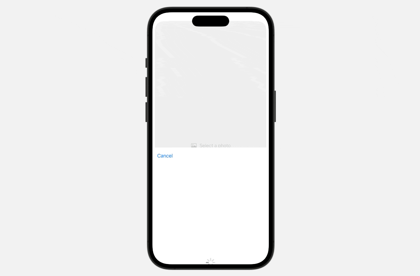
Starting with iOS 16, SwiftUI introduces a native photo picker view known as PhotosPicker. If your app requires access to users’ photo library, the PhotosPicker view seamlessly manages the photo selection process. This built-in view offers remarkable simplicity, allowing developers to present the picker and handle image selection with just a few lines of code.
When presenting the PhotosPicker view, it showcases the photo album in a separate sheet, rendered atop your app’s interface. In earlier versions of iOS, you couldn’t customize or change the appearance of the photos picker view to align with your app’s layout. However, Apple has introduced enhancements to the PhotosPicker view in iOS 17, enabling developers to seamlessly embed it inline within the app. Additionally, you have the option to modify its size and layout using standard SwiftUI modifiers such as .frame and .padding.
In this tutorial, I will show you how to implement an inline photo picker with the improved PhotosPicker view.
Revisiting Photo Pickers
To use the PhotosPicker view, you can first declare a state variable to store the photo selection and then instantiate a PhotosPicker view by passing the binding to the state variable. Here is an example:
import SwiftUI
import PhotosUI

struct ContentView: View {

    @State private var selectedItem: PhotosPickerItem?

    var body: some View {
        PhotosPicker(selection: $selectedItem,
                     matching: .images) {
            Label("Select a photo", systemImage: "photo")
        }
    }
}
The matching parameter allows you to specify the asset type to display. Here, we just choose to display images only. In the closure, we create a simple button with the Label view.
Upon selecting a photo, the photo picker automatically dismisses itself, and the chosen photo item is stored in the selectedItem variable, which is of type PhotosPickerItem. To load the image from the item, you can use loadTransferable(type:completionHandler:). You can attach the onChange modifier to listen to the update of the selectedItemvariable. Whenever there is a change, you call the loadTransferable method to load the asset data like this:
@State private var selectedImage: Image?

.
.
.

.onChange(of: selectedItem) { oldItem, newItem in
    Task {
        if let image = try? await newItem?.loadTransferable(type: Image.self) {
            selectedImage = image
        }
    }
}
When using loadTransferable, it is necessary to specify the asset type for retrieval. In this case, we employ the Image type to directly load the image. If the operation is successful, the method will return an Image view, which can be used to directly render the photo on the screen.
if let selectedImage {
    selectedImage
        .resizable()
        .scaledToFit()
        .padding(.horizontal, 10)
}
Implementing an Inline PhotosPicker
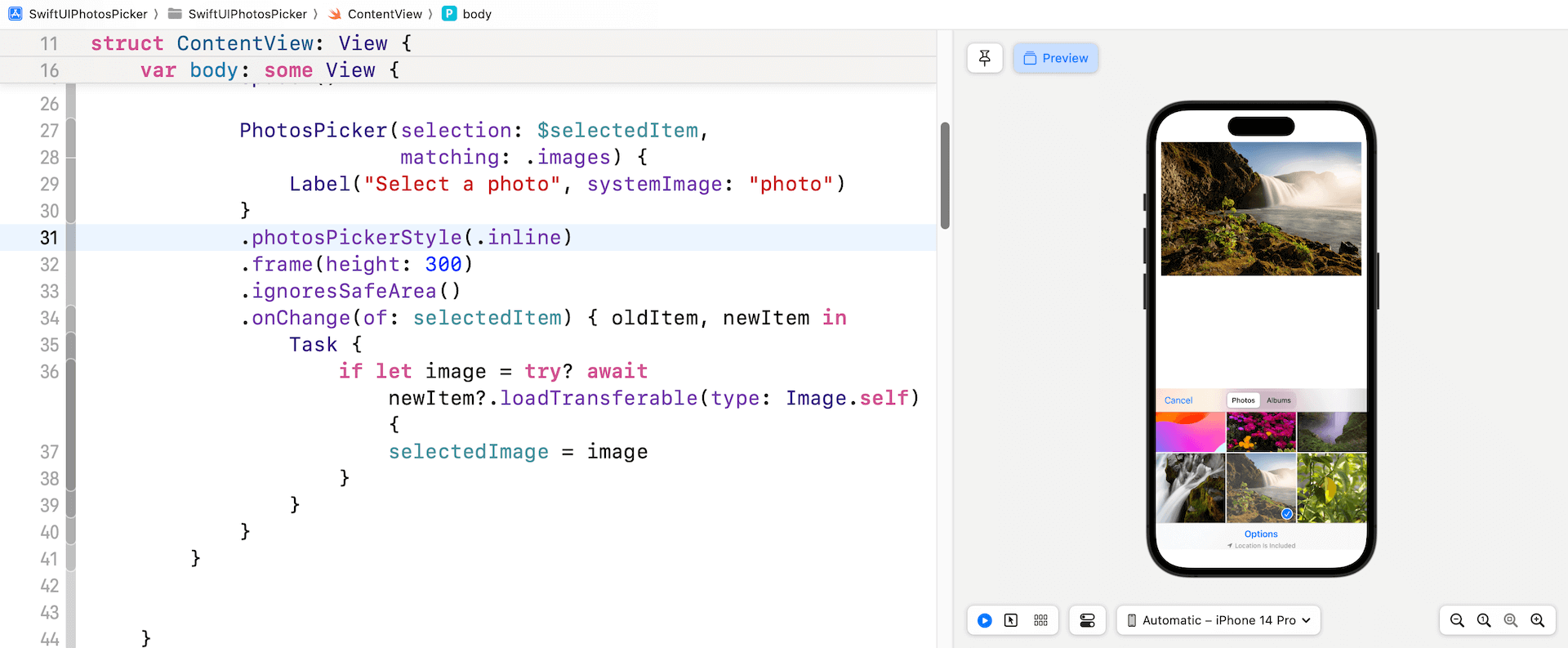
Now that you should understand how to work with a PhotosPicker, let’s see how to embed it in our demo app. What we are going to do is to replace the “Select a photo” button with an inline Photos picker. The updated version of PhotosPicker comes with a new modifier called photosPickerStyle. By specify a value of .inline, the Photos picker will be automatically embedded in the app:
.photosPickerStyle(.inline)You can also attach standard modifiers like .frame and .padding to adjust the size of the picker.
By default, the top accessory of the picker is the navigation bar and the bottom accessory is the toolbar. To disable both bars, you can apply the photosPickerAccessoryVisibility modifier:
.photosPickerAccessoryVisibility(.hidden)Optionally, you can hide either one of them:
.photosPickerAccessoryVisibility(.hidden, edges: .bottom)Handling Multiple Photo Selections
Presently, the Photos picker only allows users to select a single photo. To enable multiple selections, you can opt in the continuous selection behavior by setting the selectionBehavior to .continuous or .continuousAndOrdered:
PhotosPicker(selection: $selectedItems,
                         maxSelectionCount: 5,
             selectionBehavior: .continuousAndOrdered,
             matching: .images) {
    Label("Select a photo", systemImage: "photo")
}
If you wish to restrict the number of items available for selection, you can specify the maximum count using the maxSelectionCount parameter.

Once the user has selected a set of photos, they are stored in the selectedItems array. The selectedItems array has been modified to accommodate multiple items and is now of type PhotosPickerItem.
@State private var selectedItems: [PhotosPickerItem] = []To load the selected photos, you can update the onChange closure like this:
.onChange(of: selectedItems) { oldItems, newItems in

    selectedImages.removeAll()

    newItems.forEach { newItem in

        Task {
            if let image = try? await newItem.loadTransferable(type: Image.self) {
                selectedImages.append(image)
            }
        }

    }
}
I used an Image array to store the retrieved images.
@State private var selectedImages: [Image] = []To display the chosen images, you may use a horizontal scroll view. Here is the sample code that can be placed at the beginning of the VStack view:
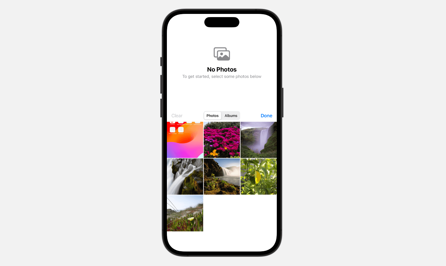
if selectedImages.isEmpty {
    ContentUnavailableView("No Photos", systemImage: "photo.on.rectangle", description: Text("To get started, select some photos below"))
        .frame(height: 300)
} else {

    ScrollView(.horizontal) {
        LazyHStack {
            ForEach(0..<selectedImages.count, id: \.self) { index in
                selectedImages[index]
                    .resizable()
                    .scaledToFill()
                    .frame(height: 250)
                    .clipShape(RoundedRectangle(cornerRadius: 25.0))
                    .padding(.horizontal, 20)
                    .containerRelativeFrame(.horizontal)
            }

        }
    }
    .frame(height: 300)
}
If you’d like to learn more about how to create image carousels, you can check out this tutorial. In iOS 17, a new view called ContentUnavailableView is introduced. This view is recommended for use in scenarios where the content of a view cannot be displayed. So, when no photo is selected, we use the ContentUnavailableView to present a concise and informative message.
Summary
In iOS 17, Apple made improvements to the native Photos picker. Now, you can easily include it within your app instead of using a separate sheet. This tutorial explains the new modifiers that come with the updated PhotosPicker view and shows you how to create an inline photo picker.
If you enjoy reading this tutorial and want to dive deeper into SwiftUI, you can check out our Mastering SwiftUI book.