

WWDC 2020 introduced several new features and improvements in the entire spectrum of develpment in Apple ecosystem, and definitely every developer found lots of things to get excited with. One of those features regard Xcode 12 and SwiftUI, and we briefly met it in this previous post about what’s new in Xcode 12 and SwiftUI. It is the ability given to developers to create reusable SwiftUI views and modifiers using LibraryContentProvider, and add them as new items to Xcode’s library.
One might wonder why this is such a big deal so it deserves a whole new tutorial to discuss about it. Well, it’s not just about how to provide a SwiftUI view as a library item, or the ease of access it offers to reusable code during the development process. It’s also the fact that this feature opens the way to reuse SwiftUI views and modifiers to other projects, even to share with other developers, simply in a plug-and-play fashion. Custom made items will merely exist in the library, ready to be dragged into SwiftUI implementations, just like any other default library item. Undeniably, that’s something that adds a lot of value to development process.
So, in this post we are going to see in more details how to make a SwiftUI view accessible and reusable through Xcode’s library, as well as how to achieve the same with view modifiers. However, that’s going to be just one of the topics we’ll talk about; we’ll go even further and learn how to reuse those items out of the project that they were initially defined with the assistance of a Swift package. There are certain particularities we’ll meet along the way and a few additional actions required to take in order to achieve full reusability, but at the end I’m pretty sure you will agree that it worths the trouble.
So, keep reading on a quite interesting topic that can undoubtedly speed up the whole development process and learn about brand new techniques introduced this year!
An Overview Of What’s Coming Up
For the demonstration purposes of this tutorial, we’ll start off with a simple project that you can download here, named ReusableViewsAndModifiers.
The most important element in that project is the implementation of a simple custom progress view, called MyProgressView, which is going to be the target view for our “experiments”. While we’ll keep moving forward to the various parts of this post, we’ll enrich the original implementation with new code. Later on, we’ll even move the containing file from the starter project to a Swift package.
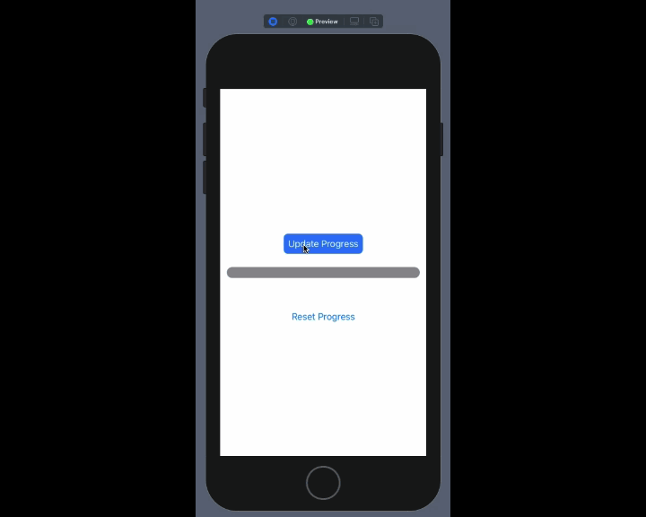
The first thing we’ll do starting from the next part, is to make use of the MyProgressView and put it in action to another SwiftUI view, the ContentView. In it, you’ll find just the implementation of two buttons in the starter project; one button for updating the progress that will be shown in the progress view, and one for resetting it. That simple functionality is more than sufficient enough in order to get to our goal.
After that we’ll start exploring the new, interesting stuff that this topic is all about. Initially, we’ll learn how to to create custom library items that will enable us to reuse the MyProgressView view easily within the project. Creating our own library items available in Xcode’s library is quite fascinating on its own. But having reusable views and library items just within the same project is not enough. For that purpose, we’ll make the leap and we’ll use a Swift package in order to move the MyProgressView implementation there and achieve reusability of our custom view in other projects too! There are some interesting details there that we’ll talk about, and certain actions that need to be taken, but we’ll see them all as we’ll be going more and more deeper into the tutorial.
Making a custom SwiftUI view reusable is not the only goal here. We’ll also learn how to do the same with view modifiers, and we’ll create our own custom modifier that encapsulates other default modifiers in order to alter the appearance of a button. Particularly, we’ll learn how to create a library item based on a custom modifier so we can use it all over the project, and then we’ll transfer everything to the Swift package so we can have everything accessible out of the starter project as well. Once again, there are a few new interesting details that we’ll meet in the modifiers parts too.
So, after that small introduction on what’s going to come in the next parts, take your time to explore the starter project, and once you’re ready just keep reading. The exploration begins!
The Custom Progress View
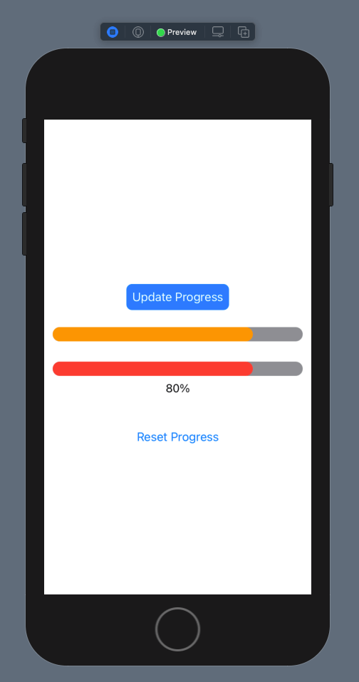
The custom progress view called MyProgressView implemented in the MyProgressView.swift file is the SwiftUI view that we’ll make reusable today, and we’ll be based on it in order to define a couple of custom library items. In truth, the progress view is nothing else than two RoundedRectangle objects with some modifiers so they appear properly, where one sits on top of the other using a ZStack.
The width of the second rectangle (the top rectangle) that shows the progress using a different color than the first one is specified dynamically based on the progress property that describes the progress of a task. Actually, the width depends on the value returned by the getProgress() method, which in turn is using the progress property. That simple method ensures that the given progress is within the range of [0, 100], and if any value out of that range is given, then it returns either 0 or 100 respectively. You can see a sample of that progress view in the Preview.
Before we start doing anything crucial, let’s get a taste of how this view can be used. So, go to the ContentView.swift file and find the following comment:
// Use the progress view hereReplace it with the following line that initializes a MyProgressView instance:
MyProgressView(progress: progress, progressColor: .orange)That line places a MyProgressView view between the two buttons, it passes the progress property as the progress value and it specifies the orange color as the one to visually indicate the progress.
To use it, go to the Canvas on the right side, and click on the Play button in the toolbar right above the iPhone preview in order to switch to Live Preview mode. Then, use the top button to increase the progress, and the bottom button to reset it. While you’ll be doing that, you’ll see that the progress view is being updated accordingly.
So, that progress view that we briefly talked about and that we just put in motion is the “lab rat” for us today. Now that we’ve seen the original behaviour of it, let’s dive in to new stuff, and let’s create a library item that will allow us to easily use the progress view anywhere we want within the project.
Note: Reusing the custom progress view in that specific demo project might look meaningless, but in projects with a large codebase being able to reuse items the way we’ll meet next is quite helpful!
Adding Progress View To Library
The first step towards creating a new item to Xcode’s library is to define a new custom type that conforms to LibraryContentProvider protocol. The name of the custom type can be anything you want, however it’s always good to give names that describe what the type is all about.
In MyProgressView.swift file, add the following at the end and after everything else existing in it:
struct MyProgressViewLibraryContent: LibraryContentProvider {

}
The above protocol has two requirements:
- A
viewsproperty that is used in order to add new view items to Xcode’s library. - A
modifiers(base:)function that is used in order to add new modifiers to Xcode’s library. We’ll talk about that later.
The common element between the two requirements above is that a collection of LibraryItem objects must be returned in both cases. In the case of custom views, such an object must be initialized with a new SwiftUI view instance. If there are variations of the same view that should match to multiple library items, then multiple LibraryItem objects should be created as needed (we’ll see that in the next part).
So, let’s get going and let’s define the views property here. Notice that the @LibraryContentBuilder attribute should prepend the property definition:
struct MyProgressViewLibraryContent: LibraryContentProvider {
    @LibraryContentBuilder
    var views: [LibraryItem] {

    }
}
The body of the getter method above is the place where SwiftUI view instances must be given to new LibraryItem objects so they become available in Xcode’s library.
A note about the @LibraryContentBuilder attribute:
@LibraryContentBuilder eliminates the need to return an array of LibraryItem objects from the views getter method. We can simply write a series of LibraryItem object initializations like this:
var views: [LibraryItem] {
    LibraryItem(...)
    LibraryItem(...)
    ...
    LibraryItem(...)
}
Without the @LibraryContentBuilder, we should initialize and return an array of LibraryItem objects explicitly:
var views: [LibraryItem] {
    var arr = [LibraryItem]()
    arr.append(LibraryItem(...))
    arr.append(LibraryItem(...))
    ...
    arr.append(LibraryItem(...))
    return arr
}
So, @LibraryContentBuilder allows to define LibraryItem objects in a much simpler fashion and focus only on what actually matters.
Back to our normal track in our demo case here, the simplest way to make MyProgressView reusable through Xcode’s library is to initialize a new LibraryItem object, and pass a new MyProgressView instance as an argument to it:
struct MyProgressViewLibraryContent: LibraryContentProvider {
    @LibraryContentBuilder
    var views: [LibraryItem] {
        LibraryItem(MyProgressView(progress: 25, progressColor: .blue))
    }
}
Default values given as arguments to the progress and progressColor above will be tokenized by Xcode, so it’ll be easy to replace them with meaningful values upon usage. At the same time, they provide an initial state for the view (progress at 25% and blue progress bar).
Xcode is constantly parsing our source code for LibraryContentProvider custom types, such as the MyProgressViewLibraryContent above, and it adds any properly specified LibraryItem objects to the library automatically. There’s no need to build the project, close and reopen Xcode, or perform any other action; the new item is in Xcode’s library instantly!
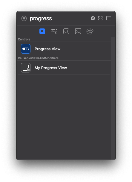
To verify that simply open and show the Views library. Then, either scroll down or type to search for our progress view:
You can switch to ContentView.swift file and delete the line that creates the MyProgressView instance (the one we added in the previous part). After that, open the library and drag and drop our new item. Our custom view’s initial state will be shown to the Preview; change the default values to what’s necessary, so the progress view will be working as expected.
You’ve definitely noticed that our custom item has its own category in the library:
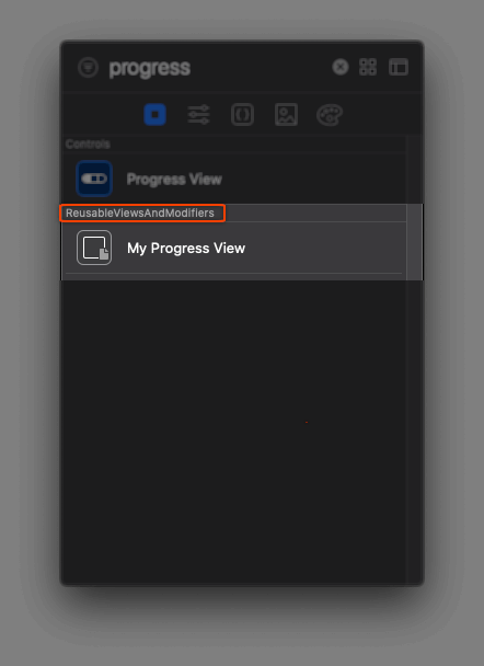
Category’s name is the name of the project that the item belongs to, or more precisely, the name of the module that the item belongs to (you’ll understand that later). Also, notice the color of the item that is gray.
Even though our custom item looks great, we can do better than that. We can actually make library indicate that the item refers to a control.
Switch back to the MyProgressView.swift file and update the LibraryItem as follows:
struct MyProgressViewLibraryContent: LibraryContentProvider {
    @LibraryContentBuilder
    var views: [LibraryItem] {
        LibraryItem(MyProgressView(progress: 25, progressColor: .blue),
                    category: .control)
    }
}
See that we provided the .control value to an optional parameter called category. There are four possible values that can be given to item’s category, depending on what the library item is supposed to represent:
controleffectlayoutother
Last value (other) is the one automatically used as the category for each new item, unless we specifically change it as we did in the previous snippet. By categorizing our custom item as a control, here’s how Views library updates its appearance, including icon color and category title:
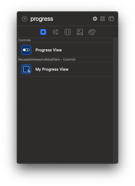
Specifying the category of a library item doesn’t affect how that item is used; it’s just a sort of an update that better describes the item’s kind.
In a similar way to the above we can add as many items matching to SwiftUI views as we want to Xcode’s library. Notice that we can create several LibraryContentProvider custom types spread to multiple source code files. Xcode will parse all of them, and it will add any library items found to the library.
Note: In the previous tutorial where this feature was shortly discussed, I showed a different approach; how to gather all library items in one single file. Refer to that post if you want to follow that way, otherwise implement custom LibraryContentProvider types to the source files where custom views exist. Both approaches are fine. By the end of this post the method we choose won’t really matter, as we’ll move everything to a Swift package so we have custom library items available to other projects as well.
Adding A Progress View Variation As A Library Item
Imagine now that we want occasionally to display the percentage of the progress as text right below the progress bar. This is a variation of the custom progress view, and our ultimate goal is to have it available as a library item too.
First, let’s make a couple of additions to the implementation of the MyProgressView view. In the MyProgressView.swift file, go to the beginning of the MyProgressView structure and add the following property right after the progress and progressColor properties:
struct MyProgressView: View {
    var progress: Double
    var progressColor: Color

    // Add this property.
    var showProgressText = false

    ...
}
It’s a flag that will control whether a Text control displaying the progress should be visible or not. By default that text will be hidden, since false is its initial value.
Next, inside the body implementation find the comment saying: // Progress text will be added here.
Replace it with the following few lines of code:
if showProgressText {
    Text("\(Int(getProgress()))%")
        .padding(.top, 20)
        .font(.callout)
}
That small code snippet simply initializes a Text control with the progress percentage as an integer number followed by the “%” sign, it adds a top padding of 20pt and specifies the callout font for the text. All that, if only showProgressText is true.
We should not forget to update the VStack height accordingly. Find the .frame(height: 20) modifier after the closing of the VStack and update it with this:
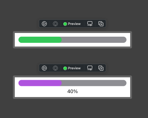
.frame(height: showProgressText ? 40 : 20)To preview the effect of the few modifications we just did in the MyProgressView view, go to the MyProgressView_Previews struct and update it so it displays a second preview that will be setting the showProgressText to true:
struct MyProgressView_Previews: PreviewProvider {
    static var previews: some View {
        Group {
            MyProgressView(progress: 40, progressColor: .green)
                .previewLayout(.sizeThatFits)
            MyProgressView(progress: 40, progressColor: .purple, showProgressText: true)
                .previewLayout(.sizeThatFits)
        }
    }
}
Here’s how both previews look together:
Let’s pass now to the most interesting part. Let’s make this progress view variation accessible through the Views library.
Still in the MyProgressView.swift file, move down to the implementation of the MyProgressViewLibraryContent custom type. So far there’s one library item we initialize here, and now we’re just about to initialize one more.
Right below the first LibraryItem add the one shown below; notice that this time the showProgressText parameter is included in the initialization and we pass true to it:
struct MyProgressViewLibraryContent: LibraryContentProvider {
    @LibraryContentBuilder var views: [LibraryItem] {
        ...

        LibraryItem(MyProgressView(progress: 25, progressColor: .blue, showProgressText: true),
                    category: .control)
    }
}
We can also provide custom titles to our library items. That way it’ll be easy to distinguish them, since the title will also work as a short description.
A title is given to an item in a similar way the category is given; by using another optional parameter called title. In it, we can provide any custom text we desire to be displayed as title. Keep in mind that the title argument comes first, and the category follows in the list of parameters when initializing a LibraryItem object.
Let’s update both of our library items by providing a proper title, so it’s easy for us to distinguish them. Right below you’re given the MyProgressViewLibraryContent implementation once again, but this time title is provided too:
struct MyProgressViewLibraryContent: LibraryContentProvider {
    @LibraryContentBuilder var views: [LibraryItem] {
        LibraryItem(MyProgressView(progress: 25, progressColor: .blue),
                    title: "My Progress View", // Title for the original progress view
                    category: .control)

        LibraryItem(MyProgressView(progress: 25, progressColor: .blue, showProgressText: true),
                    title: "My Progress View With Progress Text", // Title for the progress view with text
                    category: .control)
    }
}
We can now open the library and confirm that our new item is there:
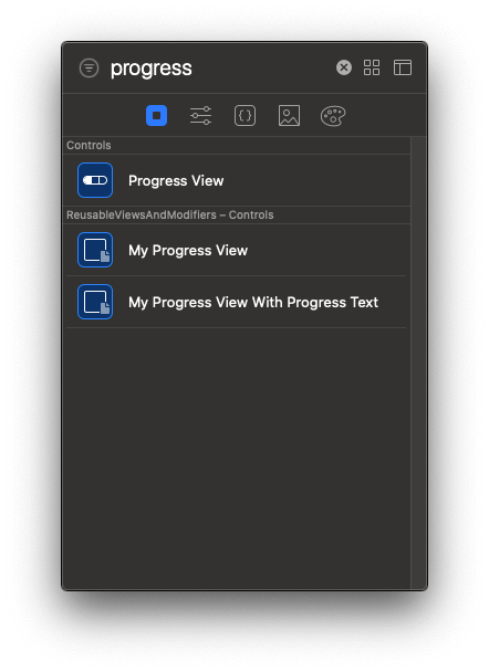
A small addition like the title was enough in order to make our library items matching to variations of the same custom view and to be distinguished easily.
Of course, you can go ahead and try out that item too in the ContentView. Update it properly so it shows the actual progress value, and try it out in the Live preview.
Using A Swift Package To Reuse And Share The Custom View
If at this moment you create a new project and you try to find the custom items created above by opening the Views library in that new project, then I’m afraid that you’ll be disappointed. Library items are not there for one simple reason: Xcode parses source code files looking for custom LibraryContentProvider types, and then adds to the library any LibraryItem objects found in them. New projects don’t contain such custom types, and obviously don’t implement the MyProgressViewLibraryContent type that makes the progress view items available to the library.
So, what we are left with here is the conclusion that reusable SwiftUI views, as well as custom library items, are meant to be available only within the same project. That might feel a bit disappointing, but don’t worry; Swift packages come to the rescue!
With a Swift package that contains custom view implementations and LibraryContentProvider types that define library items, reusing SwiftUI views in new projects is as easy as just adding that package to them. Xcode will parse source code in the package and will make any new items found available to its library. In addition to that, with Swift packages it’s really easy to share reusable SwiftUI code; given the fact that most probably a package will end up in a repository hosted by a service such as GitHub, other developers can get access to it and use our views in their own projects. Similarly, that’s how we can use reusable views made by other developers.
With the above said, let’s go step by step through the process of creating a new Swift package that will contain our custom progress view. In the next couple parts we’ll see how to make that available to our project and what additional actions are necessary to be taken in order to have full access to MyProgressView view.
Start by going to menu File > New > Swift Package…. Find a place to save it in your disk, but to be in align with what you’re reading here, make sure to name it ReusableUI. Click on the Create button to create the package.
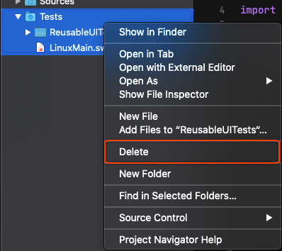
Once it’s ready and in front of you, start by deleting the Tests folder; we don’t need them here so just delete them:
Next, expand the Sources > ReusableUI folder. Click to open the ReusableUI.swift file and delete any content you’ll find there. We won’t use that file, but it has to exist in the package.
Lastly, and before we import the MyProgressView implementation, update the Package.swift file so there’s no reference to the tests target (we deleted tests), and most importantly, to specify the minimum required iOS version. Specific APIs, such as the LibraryItem and LibraryContentBuilder are available starting from iOS 14.
Here’s the entire Package.swift file contents updated as necessary. In it you’ll find the modifications mentioned above:
// swift-tools-version:5.3
// The swift-tools-version declares the minimum version of Swift required to build this package.

import PackageDescription

let package = Package(
    name: "ReusableUI",
    platforms: [.iOS(.v14)],
    products: [
        // Products define the executables and libraries a package produces, and make them visible to other packages.
        .library(
            name: "ReusableUI",
            targets: ["ReusableUI"]),
    ],
    dependencies: [
        // Dependencies declare other packages that this package depends on.
        // .package(url: /* package url */, from: "1.0.0"),
    ],
    targets: [
        // Targets are the basic building blocks of a package. A target can define a module or a test suite.
        // Targets can depend on other targets in this package, and on products in packages this package depends on.
        .target(
            name: "ReusableUI",
            dependencies: []),
    ]
)
Now, bring the ReusableViewsAndModifiers project and the ReusableUI package side by side. Select the MyProgressView.swift file in the project, and drag and drop it right below the ReusableUI.swift file in the package.
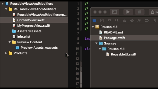
The source file will change folder and will be moved under the package’s folder structure. It no longer exists in the project, and you’ll notice that the MyProgressView.swift file will become red in the Project navigator of the ReusableViewsAndModifiers project. That’s okay and acceptable to happen, so to get rid of it simply right click on the red file and delete it.
The ReusableUI package now contains the view that we want to reuse or share, and of course we could have added more implementations like the MyProgressView to the same package. Later on we’ll add reusable modifiers as well. Right next, we’ll add that package to the demo project we’re working on, and we’ll do some bits of a mandatory configuration.
Adding The Package To Project
If you try to build the project now you’ll see that it will fail, because MyProgressView cannot be found; we moved it to the ReusableUI Swift package. However, that’s something we’ll fix in this and the next part.
The first step is to add the package to the project as a dependency. Since it resides locally, it’s fast to do that. If the package was existing on a remote repository, for example a GitHub repository, then we would have to use the File > Swift Packages > Add Package Dependency… and follow the necessary steps from there on.
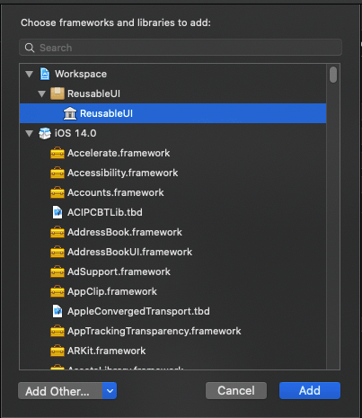
Before you even try to add the package to the project, make sure that you close it first. Next, find the package’s location in Finder, and drag and drop its containing folder to Project navigator in Xcode.
By doing so, the package shows up in the Project navigator having the package icon that distinguishes it.
Note: If for some reason the package doesn’t show up, or you meet an unexpected behaviour, other than what is described here all along the process, try to close and reopen Xcode. Unfortunately, that’s something that has to be done from time to time.
With the package added to the project, open the ReusableViewsAndModifiers target and go to General tab. There, find the section titled Frameworks, Libraries, and Embedded Content and click on the Plus button. In the window that appears select the ReusableUI library and click on the Add button. You should now be able to see the selected library in the list of embedded content.
Finally, it’s necessary to import ReusableUI wherever we want to use any of the code it contains. That’s because ReusableUI is a different module that we import to our codebase. So, open the ContentView.swift file and add the following import statement:
import ReusableUIBefore we move on please delete any instances of MyProgressView from the ContentView body, so we can add one or more of them from scratch to content view and make sure that our package actually works as expected.
Open the Views library now. Either scroll down to find the custom progress view items, or just type “progress” to let Xcode search for them. You should see this:
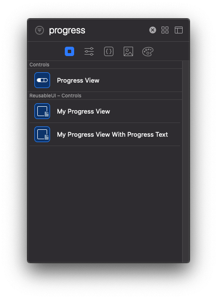
That’s great, as Xcode recognizes the module that our custom library items exist in (it’s written in the category), and with no additional effort we have them available in our project!
Drag and drop an item in code in order to add a custom progress view to the content view. An instance of the progress view will be added indeed, using the default parameter values we specified when we were initializing the LibraryItem objects. However, you’ll see Xcode throwing the following error (you might need to build the project first):
Cannot find
MyProgressViewin scope
Definitely that’s something we wouldn’t expect to see, so let’s find out why it happened and what we can do in order to fix it.
Fixing The Missing Progress View Error
The reason that makes Xcode throw the above error even though we know that the MyProgressView implementation exists in the ReusableUI package and even though we took all the necessary actions so ReusableUI is accessible from the project is the following:
ReusableUI is a different module, and any entity (such as the MyProgressView structure) that is not declared as public is by default not visible to other modules. The same rule applies to the properties of MyProgressView that we need to access; they have to be declared as public too. Actually, if no access specifier is explicitly assigned to entities and properties then by default they are marked as internal and they’re accessible only within the module they have been defined.
Note: Want to know more about access levels in Swift? Check out this older tutorial for a detailed discussion about the various access levels and visibility between modules.
Knowing now why that error occurred, let’s fix it. What we have to do is simple; we need to make public all those entities that must be visible out of the ReusableUI module.
In the Project navigator, expand the ReusableUI package until you expose the MyProgressView.swift file. Then, click to open it and see the source code. We’ll add the public access level specifier in a few places. We’ll start with the MyProgressView‘s header line:
public struct MyProgressView: View {
    ...
}
Next, we’ll do the same to the three properties we have declared in the structure:
public var progress: Double
public var progressColor: Color
public var showProgressText = false
And of course, we have to do the same to the header line of the body property:
public var body: some View {
    ...
}
At this point we are almost done. If you try to build the project by pressing Cmd+B, you’ll get a new error:
‘MyProgressView’ initializer is inaccessible due to ‘internal’ protection level
What does this mean?
Consider the following:
MyProgressView(progress: 25, progressColor: .blue)The above calls an initializer method (an init method) that creates a new MyProgressView instance. Even though we did not explicitly defined any init method in the MyProgressView struct, it was automatically defined behind the scenes for us. That’s something that always happens with structs; default init methods are defined implicitly every time. Additionally, that’s why we can create and use SwiftUI views without writing even one single line regarding initializers.
However, the default initializer here is not sufficient for us. It’s using the default internal access level and that’s not going to work. We want the initializer to be public so we can create MyProgressView instances out of the ReusableUI module. So, in that case, we have to explicitly define the init method marking it as public:
Add the following lines right after the properties declaration and before the implementation of the body in the MyProgressView struct:
public init(progress: Double, progressColor: Color, showProgressText: Bool = false) {
    self.progress = progress
    self.progressColor = progressColor
    self.showProgressText = showProgressText
}
Now, the init method is properly accessible from the project and if you build it, it will succeed.
Keep what you met here before you leave this part; always make sure to mark any entities, properties, methods and initializers that you need accessible out of your Swift packages as public.
Note: Read more about Swift packages in this post.
Adding Modifiers As Library Items
So far we went through the steps that were necessary to create new library items for a custom SwiftUI view, and then how to make that view reusable with the items being available to other projects as well by employing a Swift package.
However, SwiftUI views do not consist of the only part in a SwiftUI project that can be reused or for creating library items. The same can happen with modifiers, and this is where we’re going to focus on this and the next part of the post.
The first step is to decide what modifiers we would like to reuse in our project and make them easily accessible through the Xcode’s Modifiers library. Usually you’ll want to group together a set of modifiers and make them reusable as one custom modifier. In our project, there’s a set of modifiers that we can use to demonstrate our cause here. To get to them, open the ContentView.swift file.
At the beginning of the body implementation, there’s the first button’s implementation. Along with that button, you’ll find the following modifiers that modify its appearance:
.padding(8)
.background(Color.blue)
.foregroundColor(.white)
.cornerRadius(8)
The above modifiers:
- Add a padding of 8pts to the button.
- Set its background color to blue.
- Set its text color to white.
- Make the corners rounded by setting a radius of 8pt.
The results of the above modifiers are shown to the Update Progress button.

Let’s suppose at this point that we want to be able to reuse that set of modifiers instead of rewriting them again, and therefore style similarly any other button we want. So, let’s work towards that direction.
Initially, we have to extend the type of the control being modified by the modifiers, and to create a new method in it that will modify the control using those modifiers. In our case, the control being modified is a button, so go at the end of the ContentView.swift file and add the following extension:
extension Button {

}
In it, let’s define a new method that will modify the button’s instance using the set of modifiers we chose to reuse. Let’s name it roundedBlue():
extension Button {
    func roundedBlue() -> some View {

    }
}
Notice that we return some View from the method and not a Button object, so additional modifiers can be used after the method gets called. Additionally, Button conforms to View protocol, that’s why we can return some View from the method.
In the method’s body we’ll return the button’s instance after having applied the modifiers. Here it is:
extension Button {
    func roundedBlue() -> some View {
        return self
            .padding(8)
            .background(Color.blue)
            .foregroundColor(.white)
            .cornerRadius(8)
    }
}
The above can be written even simpler, since the only actual command is the return statement; we can omit the return keyword:
extension Button {
    func roundedBlue() -> some View {
        self
            .padding(8)
            .background(Color.blue)
            .foregroundColor(.white)
            .cornerRadius(8)
    }
}
The roundedBlue() method that we just implemented can be used like any other modifier and applied to any button object. Now, let’s make it available as a library item.
As we have already done, we’ll create a new custom type that conforms to LibraryContentProvider protocol here too in order to define a new LibraryItem object for our modifiers. We’ll name that new type ButtonMods. Go after the extension’s ending point inside the ContentView.swift file and add the following:
struct ButtonMods: LibraryContentProvider {

}
This time, instead of the views property, we’ll implement a method to initialize and return a collection of LibraryItem objects. The definition of that method in the LibraryContentProvider protocol is this:
func modifiers(base: Self.ModifierBase) -> [LibraryItem]The return type is an array of LibraryItem objects. However, what’s more interesting is the parameter value. This is the type of the control that is being modified by the modifiers for which new library items will be created in that method.
In our case, this is the Button type. However, we can’t just write: modifiers(base: Button) {...}. If you “jump” to the definition of the Button struct in Xcode, you’ll see that a View type must be provided as an argument to the generic Button type. That view here is the ContentView.
With that in mind, let’s define the modifiers(base:) method inside the ButtonMods struct:
struct ButtonMods: LibraryContentProvider {
    @LibraryContentBuilder
    func modifiers(base: Button<ContentView>) -> [LibraryItem] {

    }
}
See that the @LibraryContentBuilder attribute is necessary here too so we can simply initialize LibraryItem objects without having to return them as an array.
In the methods body we’ll initialize just one LibraryItem object, as that’s what we want. The item’s snippet parameter value will be a call to the roundedBlue() method, which is accessible through the base parameter value. On top of that, let’s give a title and a category to the item, so it looks nice in the library:
struct ButtonMods: LibraryContentProvider {
@LibraryContentBuilder
func modifiers(base: Button<ContentView>) -> [LibraryItem] {
LibraryItem(base.roundedBlue(),
title: "Rounded Blue Button",
category: .control)
}
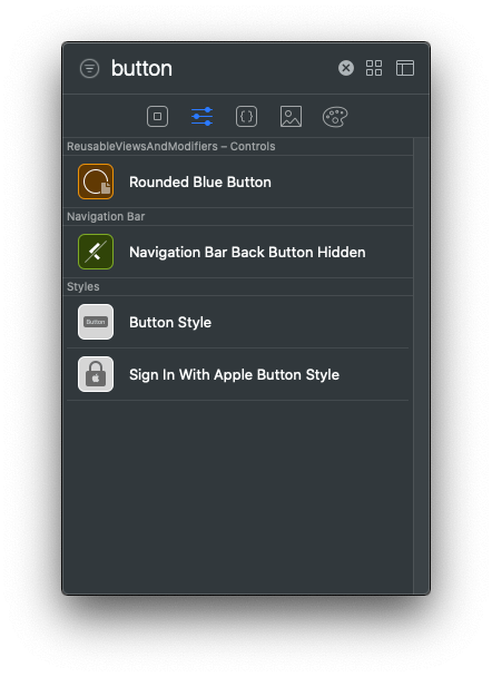
}Our custom modifier is now reusable through Xcode’s library! Open the Modifiers library, and either scroll or search for the “button” term:
Let’s see if it works by applying it to the Reset Progress button. Right before the .padding(top, 40) modifier call the .roundedBlue():
Button(action: {
    self.progress = 0
}, label: {
    Text("Reset Progress")
})
.roundedBlue()
.padding(.top, 40)
The reset button will be updated to this:
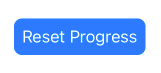
Also, you can now go and replace the four modifiers in the Update Progress button with the .roundedBlue() modifier. The result will remain the same, but instead of four, just one line is needed now.
Moving Modifiers Library Items To Swift Package
In order to reuse the roundedBlue() custom modifier in other projects too or to share it, we must embed it to a Swift package like we did with the MyProgressView view earlier. In the previous parts we already created the ReusableUI package and added it as a dependency to our demo project, so why not to use that instead of creating a new one?
We’ll start by adding a new file to the ReusableUI package. For that purpose, go to the Project navigator and fully expand the package so you can see the two files already exist under the Sources > ReusableUI folder. Then, right click on the ReusableUI folder and select the New File menu option.
Choose the Swift File from the window that appears and click on Next.
A new file will be added to the Project navigator next to the two previous source code files in the package. By default, that file is called “File.swift”. Click once on it so you can edit its name, and rename it to RoundedBlueButton.swift.
After that, select the default initial content inside the file and delete it. Once the file content is empty, add the next import statement:
import SwiftUIOur next step is to move the Button extension and the ButtonMods struct we implemented in the previous part in the RoundedBlueButton.swift file in the package. For that reason, go back to the ContentView.swift file, and select either to cut or to copy both the extension and the ButtonMods struct. If you choose to copy, then comment out or delete the initial implementations in the ContentView.swift file.
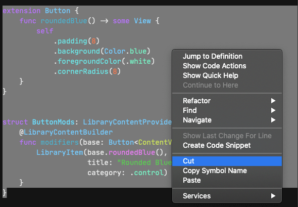
Switch to the RoundedBlueButton.swift file in the package, and paste the previously cut or copied code after the import statement.
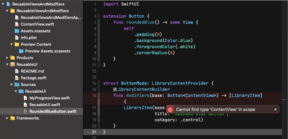
There’s a problem here now. The ContentView custom type that is given as an argument to the button type in the modifiers(base:) method is unknown to the compiler. Xcode throws the following error:
Cannot find type ‘ContentView’ in scope
That’s something we should expect to happen, as ContentView is defined in the ReusableViewsAndModifiers project, but the ReusableUI package is another module, therefore is not visible to it. Besides that, there’s no point in making the ContentView public so ReusableUI can “see” it; ContentView is meaningful in our demo project, but what about other projects where that view might not exist?
There is actually a solution that we can come up with here, so we get rid totally from that reference to ContentView in the RoundedBlueButton.swift file. We can create a new View type inside that file, and use that type as an argument to the button type in the modifiers(base:) method. In spite of doing that, as you’ll see next, we’ll still be able to use the roundedBlue() method as a custom modifier to any button in any view.
So, in the RoundedBlueButton.swift file add the following:
struct MyView: View {
    public var body: some View {
        EmptyView()
    }
}
MyView will work just as a placeholder; it doesn’t have to offer any functionality, so an EmptyView instance is good enough as its body.
Now go to the problematic point in the modifiers(base:) method and replace the ContentView with the MyView type:
func modifiers(base: Button<MyView>) -> [LibraryItem] {
    ...
}
Finally, there’s one last action left to be taken. Remember that ReusableUI is a separate module, so if we want to use roundedBlue() method as a custom modifier out of it we have to make it public. Fortunately, there is only one place that needs that modification, and that is the definition of the roundedBlue() method:
public func roundedBlue() -> some View {
    ...
}
That’s it! Now you can build in order to make changes in the ReusableUI package visible to the project, and if you followed all the above step by step up until here, you should see no error messages. The custom .roundedBlue modifier in the ContentView.swift file should be working as originally did.
Conclusion
Personally, I find this topic as one of the most interesting among all those I’ve written so far. I hope you find it interesting too, because it’s about techniques and methods that can lead to improvements to development process when making apps using SwiftUI.
To synopsize what we went through here, we learnt how to create reusable SwiftUI views and modifiers by having them available as custom items in the Xcode’s Views and Modifiers libraries respectively. On top of that, we went one step further, and we made available that reusable code along with the custom library items to other projects by embedding them in a Swift package.
The fact that a Swift package is the means to distribute reusable SwiftUI code and library items is exciting by itself, as that brings aboard all benefits a Swift package has; sharing and embedding to projects quite easily. So, enjoy creating your custom reusable SwiftUI views, modifiers and library items!