
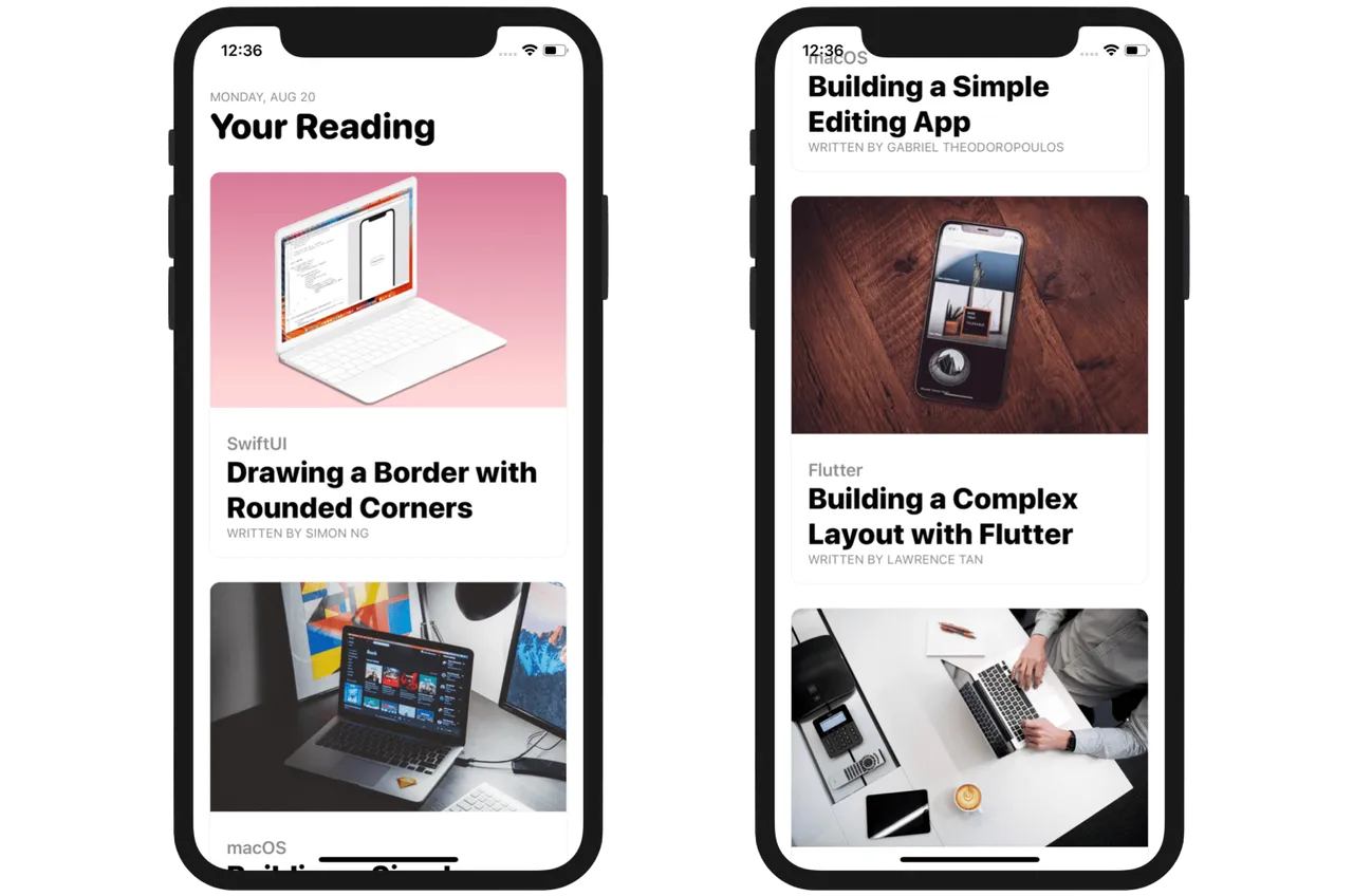
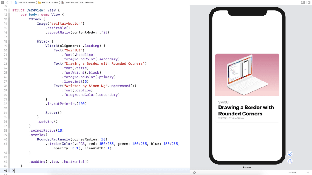
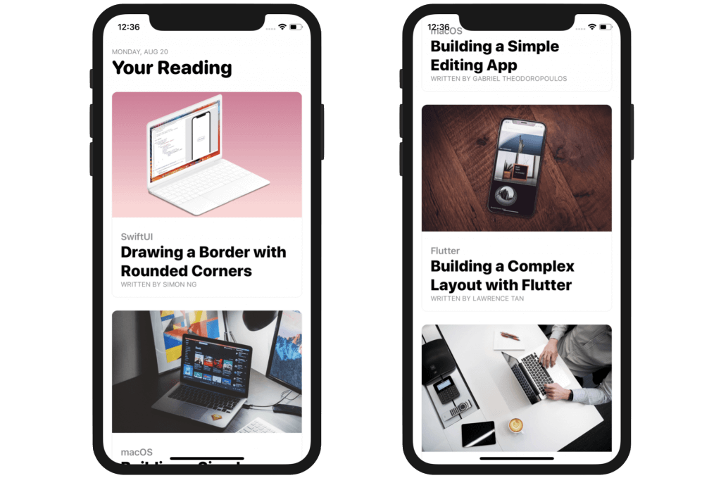
In this tutorial of our SwiftUI Tip series, we are going to implement a common mobile UI design usually known as Card UI. The SwiftUI framework has made building app UI a breeze. Later, you will see that by using stacks, image, and text views, you should be able to create a card view like the one shown below.
Please note that this tutorial requires you to have Xcode 11 running on macOS Catalina (v10.15).
Creating a New Project for Building the Card UI
If you haven’t opened Xcode, fire it up and create a new project using the Single View Application template. In the next screen, set the product name to CardUI (or whatever name you like) and fill in all the required values. Just make sure you select SwiftUI for the User Interface option.
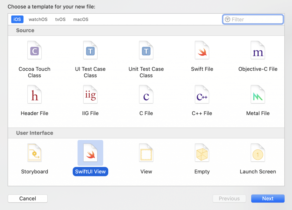
If you’re new to SwiftUI, you probably code the user interface in the ContentView.swift file. That’s completely fine, but I want to show you a better way to organize your code. For the implementation of the card view, let’s create a separate file for it. In the project navigator, right click SwiftUIScrollView and choose New File….
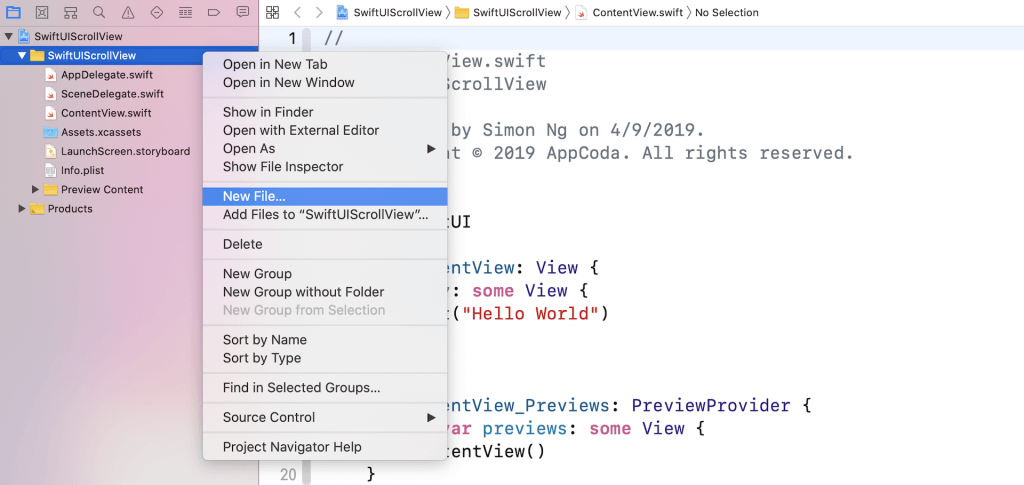
In the User Interface section, choose the SwiftUI View template and click Next to create the file. Name the file CardView and save it in the project folder.
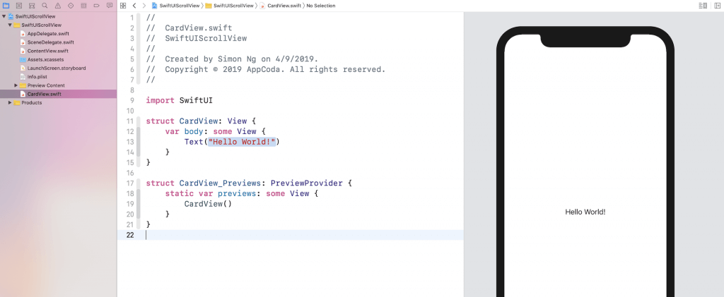
The code in CardView.swift looks very similar to that of ContentView.swift. Similarly, you can preview the UI in the canvas.
Preparing the Image Files
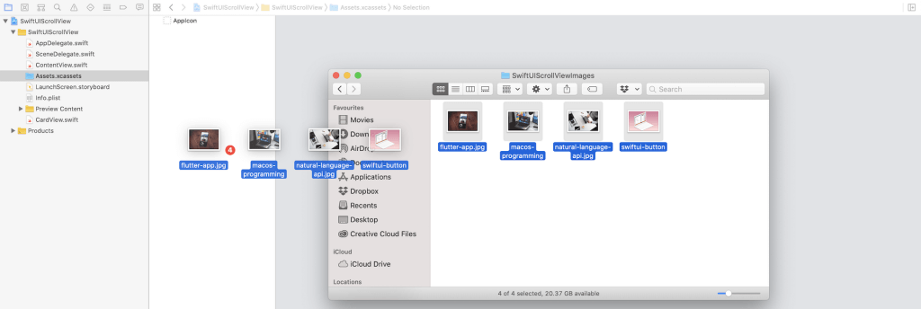
Now we’re ready to code the card view. But first, you need to prepare the image files and import them in the asset catalog. If you don’t want to prepare your own images, you can download the sample images from https://www.appcoda.com/resources/swiftui/SwiftUIScrollViewImages.zip. Once you unzip the image archive, select Assets.xcassets and drag all the images to the asset catalog.
Implementing the Card View
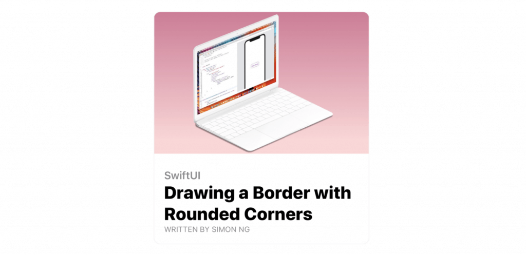
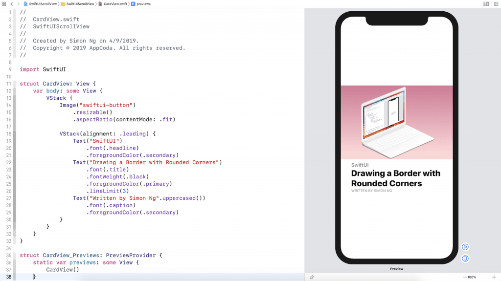
Now switch back to the CardView.swift file. If you look at card view UI again, the card view is composed of two parts: the upper part is the image and the lower part is the text description.
Let’s start with the image. I’ll make the image resizable and scale it to fit the screen but retain the aspect ratio. You can write the code like this:
struct CardView: View {
    var body: some View {
        Image("swiftui-button")
            .resizable()
            .aspectRatio(contentMode: .fit)
    }
}
If you forgot what these two modifiers are about, go back and read the chapter about the Image object. Next, let’s implement the text description. You may write the code like this:
VStack(alignment: .leading) {
    Text("SwiftUI")
        .font(.headline)
        .foregroundColor(.secondary)
    Text("Drawing a Border with Rounded Corners")
        .font(.title)
        .fontWeight(.black)
        .foregroundColor(.primary)
        .lineLimit(3)
    Text("Written by Simon Ng".uppercased())
        .font(.caption)
        .foregroundColor(.secondary)
}
Obviously, you need to use Text to create the text view. Since we actually have three text views in the description, that are vertically aligned, we use a VStack to embed them. For the VStack, we specify the alignment as .leading. This will align the text view to the left of the stack view.
The modifiers of Text have been discussed in our first SwiftUI tutorial and this tutorial. You can refer to it if you find any of the modifiers are confusing. But one thing about the .primary and .secondary colors should be highlighted.
While you can specify a standard color like .black and .purple in the foregroundColor modifier, iOS 13 introduces a set of system color that contains primary, secondary, and tertiary variants. By using this color variants, your app can easily support both light and dark modes. For example, the primary color of the text view is set to black in light mode by default. When the app is switched over to dark mode, the primary color will be adjusted to white. This is automatically arranged by iOS, so you don’t have to write extra code to support the dark mode.
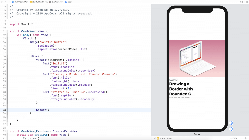
To arrange the image and these text views vertically, we use a VStack to embed them. The current layout is shown in the figure below.
It’s not done yet. There are still a couple of things we need to implement. First, if the text description block should be left aligned to the edge of the image.
How do you do that?
Base on what we’ve learned, we can embed the VStack of the text views in a HStack. And then, we will use a Spacer to push the VStack to the left. Let’s see if this works.
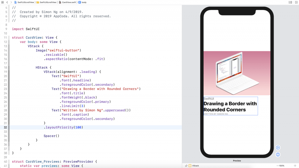
If you’ve changed the code to the one shown in the figure below, the VStack of the text views are aligned to the left of the screen. However, the heading is truncated.
Adjusting the Layout Priority
By default, both the text stack and the spacer occupy half of the parent view. This is why the heading couldn’t be fully displayed. To fix the issue, you will need to adjust the layout priority of the text stack using the layoutPriority modifier. The larger the value the higher is the priority. This means if we set the layout priority of the VStack of the text views to a larger value, iOS will offer more space to fully render the text views before allocating the space to the Spacer. The figure below shows you the result.
It would be better to add some paddings around the HStack. Insert the padding modifier like this:
HStack {
    VStack(alignment: .leading) {
        .
        .
        .
    }
    .layoutPriority(100)

    Spacer()
}
.padding()
Lastly, it’s the border. We have discussed how to draw a border with rounded corners in the earlier chapter. We can use the overlay modifier and draw the border using the RoundedRectangle. Here is the complete code:
struct CardView: View {
    var body: some View {
        VStack {
            Image("swiftui-button")
                .resizable()
                .aspectRatio(contentMode: .fit)

            HStack {
                VStack(alignment: .leading) {
                    Text("SwiftUI")
                        .font(.headline)
                        .foregroundColor(.secondary)
                    Text("Drawing a Border with Rounded Corners")
                        .font(.title)
                        .fontWeight(.black)
                        .foregroundColor(.primary)
                        .lineLimit(3)
                    Text("Written by Simon Ng".uppercased())
                        .font(.caption)
                        .foregroundColor(.secondary)
                }
                .layoutPriority(100)

                Spacer()
            }
            .padding()
        }
        .cornerRadius(10)
        .overlay(
            RoundedRectangle(cornerRadius: 10)
                .stroke(Color(.sRGB, red: 150/255, green: 150/255, blue: 150/255, opacity: 0.1), lineWidth: 1)
        )
        .padding([.top, .horizontal])
    }
}
In addition to the border, we also add some paddings for the top, left, and right sides. Now you should have built the card view layout.
Make the Card View more Flexible
While the card view works, we’ve hard-coded the image and text. To make it more flexible, let’s refactor the code. First, declare these variables for the image, category, heading, and author in CardView:
var image: String
var category: String
var heading: String
var author: String
Next, replace the values of the Image and Text views with these variables like this:
VStack {
    Image(image)
        .resizable()
        .aspectRatio(contentMode: .fit)

    HStack {
        VStack(alignment: .leading) {
            Text(category)
                .font(.headline)
                .foregroundColor(.secondary)
            Text(heading)
                .font(.title)
                .fontWeight(.black)
                .foregroundColor(.primary)
                .lineLimit(3)
            Text(author.uppercased())
                .font(.caption)
                .foregroundColor(.secondary)
        }
        .layoutPriority(100)

        Spacer()
    }
    .padding()
}
Once you made the changes, you will see an error in the CardView_Previews struct. This is because we’ve introduced some variables in CardView. We have to specify the parameters when using it.
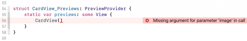
So replace the code like this:
struct CardView_Previews: PreviewProvider {
    static var previews: some View {
        CardView(image: "swiftui-button", category: "SwiftUI", heading: "Drawing a Border with Rounded Corners", author: "Simon Ng")
    }
}
This will fix the error. You now have built a flexible CardView which accepts different images and text. Base on what you’ve built, you can further apply this card view to build a slick list UI.
What do you think about this SwiftUI Tip series? If you enjoy reading the tutorial and find it helpful, please leave me a comment and let me know. Also, if you have any suggestions for our next tip, drop us a comment too.
Editor’s note: If you want to dive deeper and learn more about SwiftUI, you can check out our Mastering SwiftUI book.