

Another macOS programming tutorial is here, and today we’re going to talk about a really interesting topic: Menus. Every macOS developer has to know about how to deal with menus, as they consist of a fundamental part on every application. Menus is the place where users access the app’s features and functionalities, and be sure that they always expect to find and use them.
Menus are parted by menu items, where a menu item is the actual option that gets clicked. Menu items can have single keys or key combinations assigned to them, so users can have access to the underlying functionality by just using their keyboard. There’s also a special item, the separator, which is just a horizontal line separating other menu items. Besides all that, menus can contain submenus which make it easy to group similar functionalities.
By default, each application comes with the main menu shown on the top bar of the macOS. Most of the menus you’ll be creating are going to exist there. However, there are also special menus, called context menus. A context menu is showing up when a UI control that has been assigned with such a menu is right-clicked or Ctrl-clicked. Menu options displayed there can be either unique to the context menu, or to be common to those available on the main menu.
When talking about menus, there is always another UI control tightly connected to them. That is the toolbar. The purpose of a toolbar is to provide users with access to important features of the app through buttons that can be found in a predefined, familiar place. Toolbars are not mandatory to exist in macOS apps, and they’re related to menus for one simple reason: Actionable toolbar items must always have equivalent menu items. If users hide the toolbar (because that’s something that can be done), then there should be no functionalities out of their reach.
We are going to see all the above in details through the upcoming parts of this tutorial. You’ll learn how to create menus both in Interface Builder and programmatically, you’ll get to know some best practices, and you’ll see how to deal with the toolbar. We’re just about to explore some really interesting stuff!
A Glance at the Starter Project
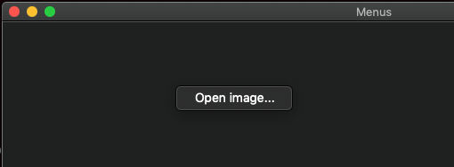
Before we dive into the details of menus, let’s have a quick look to the demo app we’ll be working on today. As usually, we won’t start a new app from scratch, there’s a starter project for you to download.
So, our demo app is going to be a super-light image editing app with just a few features available: Zoom options and filtering capabilities. Regarding the zoom, we’ll make it possible to zoom in, zoom out, zoom to fit the loaded image, as well as some more quick zoom options such as doubling the zoom in or zoom out level. We’ll group these options together into a submenu.
The filtering options we’ll support are the exact same to the filters we used in the demo app of a previous tutorial where we talked about alerts, sheets, and modal windows. Filters are already implemented in the ImageFilter.swift file of the starter project and they allow to apply the following effects to an image:
- Monochrome
- Sepia
- Blur
- Comic
Sepia and blur filters can take parameters which define the level of the effect. However, in this demo application we won’t allow the input of any parameters in order to keep things simple. Parameter values are hardcoded into an auxiliary class called ImageHelper which you can find in the respective file. For more information about filters, read about CIFilters on Apple documentations.
The predefined user interface you’ll find to the starter app contains a scroll view and an image view embedded on it. The necessary IBOutlet properties have been already connected, and anything that is not directly related to menus or the toolbar has also been implemented. I invite you to take a look to the configureScrollView() method in the ViewController class; it contains code which enables zooming (called magnification) on the scroll view, and it sets the current, minimum and maximum zoom values.
To save us some time, the Open and Save functionalities for opening and saving an image respectively already work on the main menu of the app. Our goal here is to implement all the rest regarding zooming and filtering. Lastly, some images we’ll need later already exist in the Assets catalog. With that said, after you explore the starter project in Xcode get ready to deal with the main menu of the app; it’s our starting point.
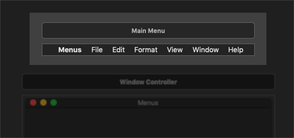
The Main Menu on macOS
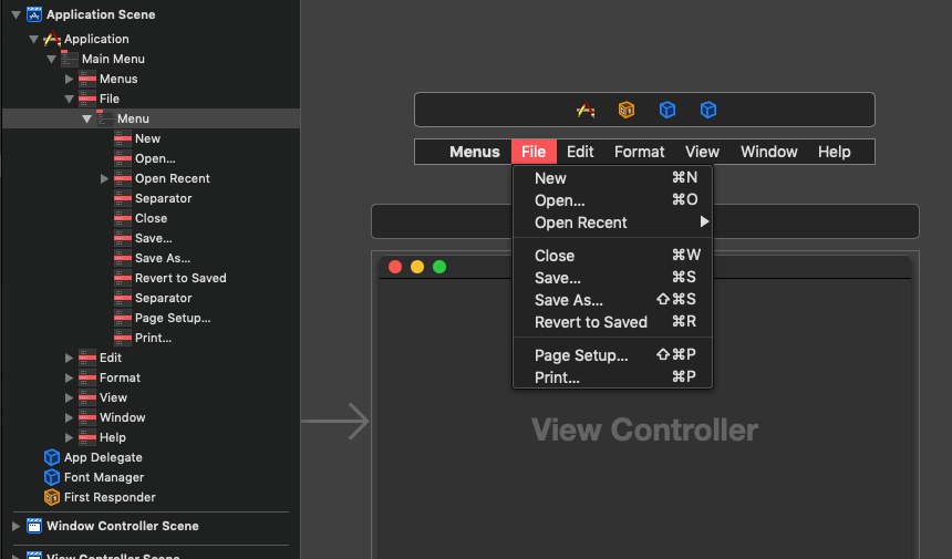
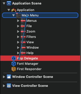
Getting access to the default, main menu of any window-based Cocoa application is really easy; all you have to do is to open the Main.storyboard file and you’ll find it there, right above the application’s window controller:
Each application comes with a standard collection of menus integrated which regard common functionalities that an app would most probably need. Such an example is the Find functionality under the Edit > Find menu, or the option to make a font bold using the Format > Font menu. However, not always all menus or menu items are needed by an app. In such cases, these menus and menu items can be just deleted.
When dealing with menus, always keep in mind that users expect to find common behaviour that meet in every macOS app. For example, options found under the first menu which uses the app’s name such as Hide [AppName], Hide Others, Quit [AppName], or the Window > Minimize are just some of those that users expect to find. And not only them, but also the key combinations that can be used as shortcuts (ex., Cmd+Q to quit the app). So, the recommendation here is to keep whatever is common and already works by default; only delete built-in menus that you just don’t need.
Note: [AppName] above represents the name of the app, in our case Menus.
Take your time to go through the default menu items in the main menu of the starter project. Keep the Document Outline visible while you’re clicking to various menus and submenus and see how they’re structured.
Here’s something important you should know about: Even though you see all menu items enabled in the storyboard file, if you run the app now you’ll realize that many of them are grayed out and disabled. This is happening because disabled menu items are not connected to an action (IBAction) method. Enabled items are already connected to built-in methods provided by Cocoa. You’ll have the chance to verify that pretty soon as we’re going to create our own menu items. You’ll find out that without connecting them to action methods they remain disabled.
Note: Of course, menu items can be disabled and enabled on demand either programmatically or through the storyboard in order to prevent access to certain functionalities, however that’s something totally different and not the case here.
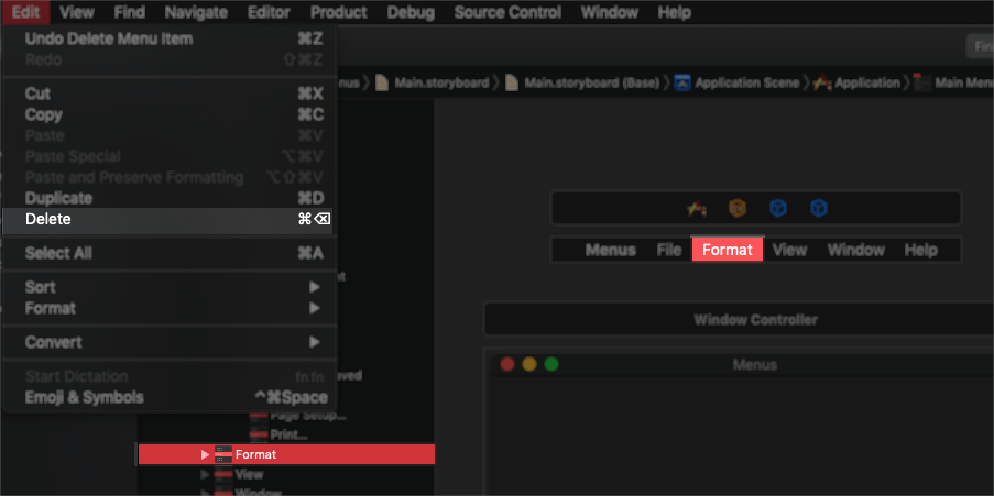
Once you’ve finished your (short I guess) tour to the default main menu items, it’s about time to start deleting some of them. Here’s what you should delete:
- Entire the Edit menu item.
- Entire the Format menu item.
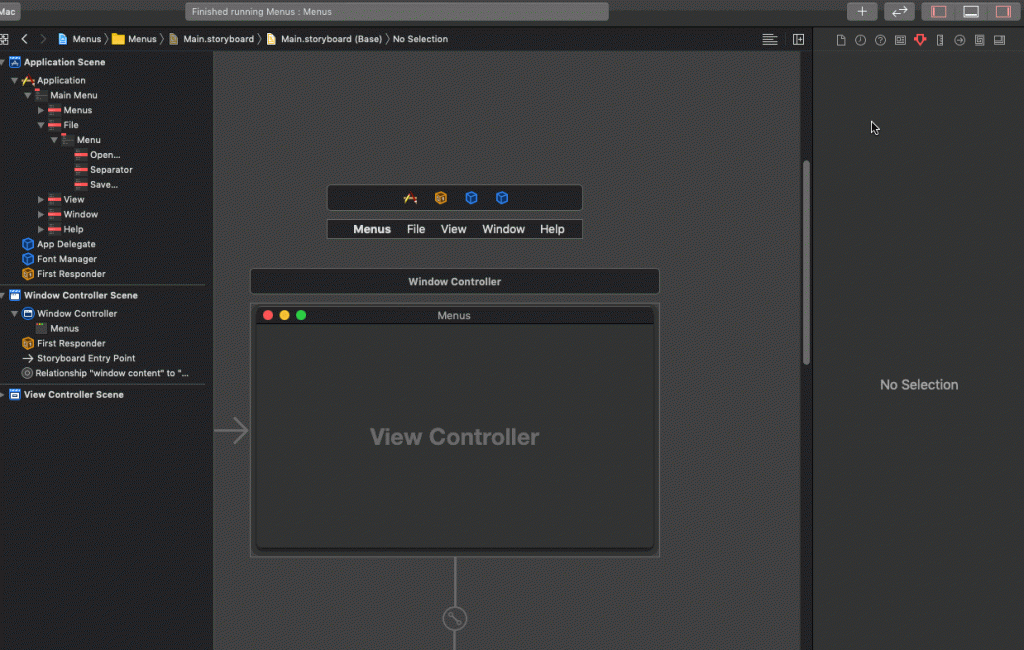
- Open File and keep only the Open… and Save… options; delete all the rest.
You’d better perform the deletions by selecting the proper items in the Document Outline. It’s possible to delete just the menu assigned to a top-level menu item, but the menu item itself to remain there.
Creating A New Menu
It’s now time to add a new menu in our shrunk main menu. We’ll call it Zoom and it’ll provide menu items that will allow us to do the following:
- Zoom in
- Zoom out
- Fit the loaded image to the current window size
Here are the steps in order to create a top-level menu item along with a new menu in Xcode:
- Click on the plus button to open the Library, and search for the term “menu” (without quotes).
- Select a Menu Item and drag and drop it to the position where you want it to be. Here it should be right after the File menu item. Place the new menu item either on the main menu, or in the Document Outline.
- The new menu item is currently empty. Open the Library again and this time drag and drop a Menu object on top of the menu item on the main menu. Alternatively, drop it as a child element of the menu item in the Document Outline.
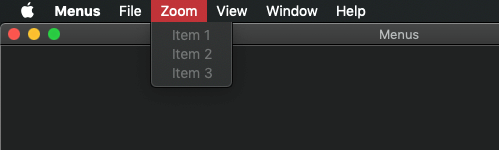
- With the new menu being selected, open the Attributes inspector and type Zoom as the value of the Title field.
And there you are! You have a brand new menu regardless of the fact that it still needs to be configured. Run the app to see it live:
Configuring Menu Items
As you can see, each new menu comes with three menu items by default. New menu items can be added or unneeded ones can be removed as per demand.
For our demo here, the by default provided three items are perfect for our needs. However, we cannot keep them the as they are right now. The first thing we need to change is their titles. The simplest way to do so is to double click on a menu item as you see it on the main menu.
A better way to do this is to select the menu item, and then show the Attributes inspector. There are more properties there to configure beyond title. Let’s go through the most common ones:
Right after the Title field, there’s the Key Equivalent. Assign any key or key combinations you would like to use as a shortcut for the menu item in this field. The key equivalent of a menu item is shown to the right side of the item when the menu is expanded.
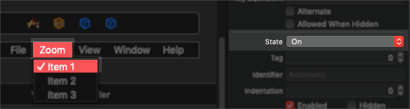
The next section is usually left as it is. In it you can assign a tag value to the menu item so you can access it programmatically, or even an identifier for the same reasons. Note that the identifier can be a string value, it doesn’t have to be a number like the tag. We’ll see how to use the identifier later for distinguishing the menu item that was clicked. With the Indentation field you can specify the indentation level of the menu item. This will add empty spaces to the left side of the item and push it towards right. The Enabled and Hidden checkboxes are quite obvious what they are for: By unchecking the Enabled checkbox you’ll end up having a menu item that always looks disabled, even when it’s connected to an action method. By turning on the Hidden checkbox, the menu item is simply not showing up in the menu when the app is running. Lastly, use the State popup button to specify whether a checkmark should be shown in front of the item or not. Usually this is a setting specified in code, where a flag describing a certain condition determines whether that condition is met and the checkmark should be visible or not.
A menu item can have an image displayed right next to it, and the next section of settings in the Attributes inspector is the place to deal with images. Leave all fields empty if you don’t want to have any image. Otherwise, provide one in the first field titled Image. In case you make use of the State attribute described above and you want different images for the on, off and mixed states, then use the next three fields to set the respective images. Usually, this detailed level of configuration regards items that have quite significant role in the app and it’s really crucial to visually indicate the current state of the condition, state, mode, and so on, that they represent.
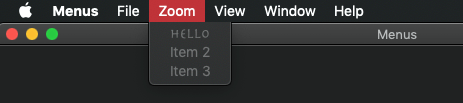
Finally, the last section of properties in the Attributes inspector has to do with the item’s title. Instead of the default text, use the settings available here to setup an attributed title for the menu item. Almost never (if not simply never) you’ll need to set an attributed menu item title. See the following example:
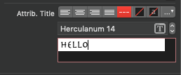
The result:
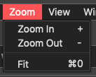
Let’s configure the three menu items for our demo app now:
Select the Item 1 menu item, and in the Attributes inspector set the following:
- Title: Zoom In
- Key Equivalent: +
- Image: zoom_in
Next, select the Item 2 menu item and set these values:
- Title: Zoom Out
- Key Equivalent: –
- Image: zoom_out
Lastly, select Item 3 and apply these:
- Title: Fit
- Key Equivalent: Command + 0
- Image: zoom_fit
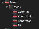
Besides the above, it would be visually nice to have a separator between the first two items (zoom in, zoom out) and the last one. To add a separator, open the Library and once again search for the Menu term. Then, drag and drop a Separator Menu Item right above the Fit menu item:
Our new menu item along with its menu is now ready, and this is what you should be seeing in the Document Outline:
Connecting Menu Items To Actions
A menu item is useless until it gets connected to an action method and therefore perform some action. Now that we have our new menu items in place and we have configured the way they’re going to be displayed, let’s do exactly this; let’s connect them to IBAction methods.
If you open the Assistant editor side by side to the Interface Builder in Xcode and you click on any of our brand new menu items, you’ll find out that the AppDelegate is the class that opens automatically in order to connect the item to an action method. ViewController class does not even exist as an automatic option to open in the Assistant editor when clicking on menu items, and even if you open it manually you’ll see that it’s not allowed to make a connection between a menu item and the class file. That’s because the main menu regards the entire app, and not a specific view controller in it.
It’s perfectly fine to have your IBAction methods implemented in the AppDelegate, even though you’re not encouraged to do so. One reason is because you’ll need to use either the NotificationCenter or other mechanisms to inform the various view controllers about any performed actions that regard them and trigger that way the real workflow. Another reason is that you’ll end up having your AppDelegate class full of methods that normally shouldn’t be there.
So, as you understand, this is not the approach we’ll follow here. We will avoid connecting menu items to actions in the AppDelegate class so just close the Assistant editor. Now, open the ViewController.swift file where we want to have the IBAction methods related to our menus.
We need to add three IBAction methods:
- One for zooming in, and in that case we’ll be increasing the magnification level by 0.25.
- One for zooming out, where we’ll be decreasing the magnification level by 0.25.
- One for fitting the image to the window.
Here they are all of them at once:
@IBAction func zoomIn(_ sender: Any) {
    scrollView.magnification += 0.25
}

@IBAction func zoomOut(_ sender: Any) {
    scrollView.magnification -= 0.25
}

@IBAction func zoomToFit(_ sender: Any) {
    scrollView.magnify(toFit: imageView.frame)
}
Notice that we’re using the magnification property of the scroll view to zoom in or out. For fitting the image, we’re using the magnify(toFit:) scroll view method and we’re passing the image view’s frame as the one that should be used to fit the content in.
With the above three in place, go back to the Main.storyboard file. Go either to the Zoom In menu item on the main menu or in the Document Outline, and by pressing the Ctrl key drag to the First Responder object:
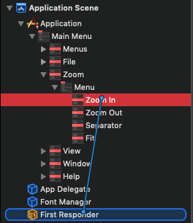
A popup with a huge list of available action methods will show up. Most of them are built-in methods, but the three ones we created right above exist there too! The list is ordered alphabetically, so scroll to bottom or type “z” to move faster. Once you spot it, click on the zoomIn: action method. That’s it! The menu item is now connected to the zoomIn(_:) IBAction method.
Repeat the exact same steps for the other two menu items. Connect the Zoom Out item to the zoomOut: action, and the Fit item to the zoomToFit: action.
An alternative way to perform the above would be to select the First Responder object, and then open the Connections inspector. There, locate the action you want at first (such as zoomIn:) and then drag and drop straight to the respective menu item.
Once you’re done, run the app. The menu items are now enabled. Open an image either by going to File > Open… or by pressing Cmd+O and then use the Zoom menu items to change its zoom level. Besides the menu items, also use the “+”, “-” and “Cmd + 0” keys to confirm that the key assignments are actually working.
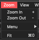
Submenus
Menus can have submenus in order to group functionalities or to provide access to not so important features. Obviously, whatever is important for users in an app should not be “buried” under submenus, but secondary or not so much used actions can perfectly fit in them.
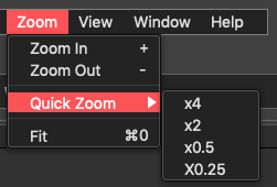
Creating submenus in macOS apps is easy. To see them, let’s add a submenu to the Zoom menu, let’s call it Quick Zoom and let’s add four items that will allow us to change zoom as shown here:
- x4: Zoom in by four times.
- x2: Zoom in by two times.
- x0.5: Zoom out by two times.
- x0.25: Zoom out by four times.
In the Main.storyboard file click to open the Zoom menu item on the main menu. Then, open the Library and once again search for Menu objects. Drag and drop a Submenu Menu Item object right above the separator of the Zoom menu.
Once you do so, take one more separator from the Library and add it above the submenu. You should end up with this:
Double click on the submenu and change its title from Menu to Quick Zoom. Then click once on it to expand it, and you’ll find a single menu item included in it. We need to add three more items so we have four in total.
Tip: Instead of going to Library to pick and drag a new menu item each time you want one, you can simply select the existing one (or generally any menu item existing in the menu) and press Cmd+D to duplicate it. You can then drag the duplicated item to reposition it, and to change its attributes through the Attributes inspector.
So, follow the above tip, and select the one and only item of the submenu titled Item. Then press three times the Cmd+D keys to create more menu items instantly.
Select one by one the items and make the following configuration in the Attributes inspector as described next:
First Item:
- Title: x4
- Identifier: zoomX4
Second Item:
- Title: x2
- Identifier: zoomX2
Third Item:
- Title: x0.5
- Identifier: zoomX0.5
Fourth Item:
- Title: x0.25
- Identifier: zoomX0.25
Here’s what you should have right now:
Besides the titles, we also set values to the Identifier fields for each menu item. The reason for doing this is because we’re going to have one action method for all four items, and we’ll use identifiers in order to determine the menu item that called it.
Speaking of that, let’s switch to the ViewController.swift for a few moments where we’ll implement the following IBAction method:
@IBAction func quickZoom(_ sender: Any) {

}
The first thing we need to know in this method is the menu item that was clicked and therefore triggered its execution. The menu item is actually the sender parameter value, but first we need to cast it to a NSMenuItem:
guard let menuItem = sender as? NSMenuItem else { return }Then, using the menuItem we can access the identifier:
guard let menuIdentifier = menuItem.identifier else { return }We can combine the above two guard statements into a single one:
guard let menuItem = sender as? NSMenuItem, let menuIdentifier = menuItem.identifier else { return }The menuIdentifier will contain the identifier value of the clicked menu item as it was set in the Interface Builder. Note that the identifier is not a String value; it’s a NSUserInterfaceItemIdentifier value and we can access the actual string using the rawValue property. Actually, this is what we’re doing in the following switch statement:
switch menuIdentifier.rawValue {

}
Now we have to examine all cases one by one, and change the scroll view’s magnification value accordingly. Easy stuff, so here it is:
switch menuIdentifier.rawValue {
    case "zoomX4": scrollView.magnification *= 4.0
    case "zoomX2": scrollView.magnification *= 2.0
    case "zoomX0.5": scrollView.magnification *= 0.5
    case "zoomX0.25": scrollView.magnification *= 0.25
    default: break
}
The quickZoom(_:) IBAction method is ready, and in it you can clearly see how we use the identifier value of the menu items to determine the one that was clicked.
Now, let’s head back to the Main.storyboard file. Go to the Document Outline, and click on the x4 menu item. Then, keep Ctrl key down and drag to the First Responder object as it was described previously in order to connect it to the quickZoom: action. Repeat this step for the remaining three menu items; make sure that you connect them all to the quickZoom: action.
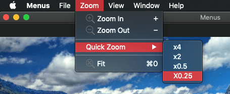
Time to run the app again. Load an image to the app and then go to the Zoom > Quick Zoom submenu. Click on its items and watch the image being zoomed in and out according to the menu item you click on.
Creating Menus In Both Interface Builder And Code
What we’ve seen so far is pretty much all we need for creating custom menu items and menus that will appear on the main menu of the app. However, the majority of the work must be done on the Interface Builder, and that might not be always desirable. For example, you might want to create reusable menu items which should be assigned not only to a submenu of the main menu, but also to a toolbar popup button or even to a context menu (actually, we’ll do that in this tutorial). Or you just want to do part of the job graphically, and part of it in code. Well, this is what exactly we’ll do in this part of the post.
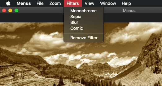
Being precise, we’ll add a new menu item to the main menu which we’ll call Filters. As we did before, we’ll assign a menu to this item which will present options to apply a few filters on the loaded image. However, the menu items of that menu will be created and configured in code, not in the Interface Builder.
The Graphical Part
So, let’s add the new menu item I just said about to the main menu for starters. Make sure you have Main.storyboard in front of you in Xcode. Open the Library, and search for a menu item object. Once you find it, drag and drop it on the main menu, right after the Zoom menu and before the View.
Next, open again the Library and search for a menu object. Drag and drop it on top of the menu item you just added. Set its title to Filters. You should have now this:

Before we start writing code to implement the menu items, we will connect our main menu to an IBOutlet property in the AppDelegate class. A property called mainMenu has already been declared in the AppDelegate.swift file. It’s necessary to take this step so we can access our menu in code right next.
In Interface Builder, click to select the App Delegate object in the Document Outline. Then, press and keep the Ctrl key down, and drag to the Main Menu object.
In the popup window select the mainMenu outlet.
The Code Part – Creating The Menu Items
Let’s write some code now. Open the ViewController.swift file, and add the following method definition:
func createFiltersMenuItems() -> [NSMenuItem] {

}
In this method we’ll only create the menu items that will be shown when the Filters menu is expanded. We won’t assign them to the menu itself, that’s why the method returns an array of NSMenuItem objects.
We’re going to have four filters available in our demo app. Based on appearance order, these are going to be:
- Monochrome
- Sepia
- Blur
- Comic (make the image look like a comic book)
All filter-related code is already provided in the starter project, just take a look at the ImageFilter.swift file. Also, you might want to see the ImageHelper class as well, as this is the one that makes use of the ImageFilter and accessed by the ViewController class.
So, creating our first menu item looks like this:
let mono = NSMenuItem(title: "Monochrome", action: #selector(applyImageFilter(_:)), keyEquivalent: "")
mono.identifier = NSUserInterfaceItemIdentifier(rawValue: "mono")
In the first line we are initializing a menu item, and as you can see the initializer accepts three arguments: The item’s title, the action to call when clicked, and the key equivalent for that item. It’s not necessary to assign key equivalents here, so we just pass an empty string value. Feel free to pass any value if you want to match filters to specific keys or key combinations. Regarding the action, we set the applyImageFilter(_:) method as the one to be called. This method is already defined in the ViewController class, but its implementation is still missing. We’ll add it quite soon.
In the second line we set an identifier value to the menu item. If you recall, we’ve already talked about it and said that it’s not a String but a NSUserInterfaceItemIdentifier value. So, specifying the identifier as shown above is the way to go.
We are going to create the remaining three menu items in the exact same fashion as above:
let sepia = NSMenuItem(title: "Sepia", action:  #selector(applyImageFilter(_:)), keyEquivalent: "")
sepia.identifier = NSUserInterfaceItemIdentifier(rawValue: "sepia")

let blur = NSMenuItem(title: "Blur", action:  #selector(applyImageFilter(_:)), keyEquivalent: "")
blur.identifier = NSUserInterfaceItemIdentifier(rawValue: "blur")

let comic = NSMenuItem(title: "Comic", action:  #selector(applyImageFilter(_:)), keyEquivalent: "")
comic.identifier = NSUserInterfaceItemIdentifier(rawValue: "comic")
Notice that the same action method has been assigned to all menu items.
Now, how about adding a separator and one more menu item after that for removing any applied filter? Starting with the separator, creating one is as easy:
let separator = NSMenuItem.separator()The separator is just a view, so there’s no need to assign an action method, key equivalent, identifier, and so on.
Next, let’s define the last item that will allow us to remove any filter applied:
let removeFilter = NSMenuItem(title: "Remove Filter", action: #selector(removeAppliedFilter), keyEquivalent: "")It’s not necessary to specify an identifier here, so we don’t do it. The removeAppliedFilter() action method is assigned to this menu item, and you can find it in the ViewController class not only defined but also implemented.
All the above six menu items must be returned by the method as a single collection. That’s easy, but be cautious: The order of the menu items in the following array matters!
return [mono, sepia, blur, comic, separator, removeFilter]Our method is now complete:
func createFiltersMenuItems() -> [NSMenuItem] {
    let mono = NSMenuItem(title: "Monochrome", action: #selector(applyImageFilter(_:)), keyEquivalent: "")
    mono.identifier = NSUserInterfaceItemIdentifier(rawValue: "mono")

    let sepia = NSMenuItem(title: "Sepia", action:  #selector(applyImageFilter(_:)), keyEquivalent: "")
    sepia.identifier = NSUserInterfaceItemIdentifier(rawValue: "sepia")

    let blur = NSMenuItem(title: "Blur", action:  #selector(applyImageFilter(_:)), keyEquivalent: "")
    blur.identifier = NSUserInterfaceItemIdentifier(rawValue: "blur")

    let comic = NSMenuItem(title: "Comic", action:  #selector(applyImageFilter(_:)), keyEquivalent: "")
    comic.identifier = NSUserInterfaceItemIdentifier(rawValue: "comic")

    let separator = NSMenuItem.separator()
    let removeFilter = NSMenuItem(title: "Remove Filter", action: #selector(removeAppliedFilter), keyEquivalent: "")

    return [mono, sepia, blur, comic, separator, removeFilter]
}
Implementing The Action Method
Going to the removeAppliedFilter(_:) action method now, let’s add its missing implementation. Here’s its definition:
@objc func applyImageFilter(_ sender: NSMenuItem) {

}
As you can see, the parameter value is a menu item object. Since all filter-related items we implemented above call this one, our job is to determine which menu item was clicked, and then to act accordingly. We’ll be based on the identifier value for that:
guard let menuIdentifier = sender.identifier else { return }The above is necessary as the identifier property is an optional. Now, depending on the identifier we’ll create the filtered image:
var filteredImage: NSImage?

switch menuIdentifier.rawValue {
case "mono": filteredImage = ImageHelper.shared.makeMonochrome()
case "sepia": filteredImage = ImageHelper.shared.makeSepia()
case "blur": filteredImage = ImageHelper.shared.makeBlurry()
case "comic": filteredImage = ImageHelper.shared.makeComic()
default: break
}
Note the condition in the switch statement: We don’t examine the value of the menuIdentifier itself. We access its rawValue in order to use the string values of the identifiers for the comparison. Also, see that we’re calling the proper method depending on the identifier value.
Finally, if the filteredImage has been actually rendered then we assign it to the image view:
guard let image = filteredImage else { return }
imageView.image = image
This method is now ready too:
@objc func applyImageFilter(_ sender: NSMenuItem) {
    guard let menuIdentifier = sender.identifier else { return }

    var filteredImage: NSImage?

    switch menuIdentifier.rawValue {
    case "mono": filteredImage = ImageHelper.shared.makeMonochrome()
    case "sepia": filteredImage = ImageHelper.shared.makeSepia()
    case "blur": filteredImage = ImageHelper.shared.makeBlurry()
    case "comic": filteredImage = ImageHelper.shared.makeComic()
    default: break
    }

    guard let image = filteredImage else { return }
    imageView.image = image
}
Assigning Menu Items To Menu
Now that the menu items exist and their action method has been implemented, we are able to proceed and create one more new method that will assign the items to the Filters menu. We’ll call it setupFiltersMenu():
func setupFiltersMenu() {

}
The first step is to get access to the Filters menu, and this is possible to happen through the mainMenu property of the AppDelegate which we previously connected to the main menu.
guard let mainMenu = (NSApp.delegate as? AppDelegate)?.mainMenu else { return }Note: Instead of having connected an IBOutlet property to the main menu, we could have connected one to the Filters submenu directly. However, connecting the main menu serves better the purposes of this tutorial.
With the main menu being handy, we access any item of it easily:
guard let filtersMenuItem = mainMenu.item(withTitle: "Filters") else { return }An item’s title is all we need in order to access a menu item of the main menu. However, there’s room for errors here (such as mistyping the title), so the above might return a nil value; the guard statement is necessary. Additional methods are also provided for accessing an item; you can use either the tag value, or even its position (index) on the main menu. Note that the above is not specific to the main menu only; it applies to any NSMenu object (such an object is the mainMenu).
By default, the Filters submenu we added to the Filters item in the Interface Builder has three items called “Item 1, Item2, Item 3”. These items have to be removed before we add our new ones:
filtersMenuItem.submenu?.removeAllItems()See that we’re accessing the Filters menu through the submenu property of the filtersMenuItem.
Now we can create and get the menu items regarding the filters:
let filterItems = createFiltersMenuItems()Finally, let’s add them to the Filters submenu:
filterItems.forEach { filtersMenuItem.submenu?.addItem($0) }The above is equivalent to:
for item in filterItems {
    filtersMenuItem.submenu?.addItem(item)
}
We’re now done. Here’s the entire method:
func setupFiltersMenu() {
    guard let mainMenu = (NSApp.delegate as? AppDelegate)?.mainMenu, let filtersMenuItem = mainMenu.item(withTitle: "Filters") else { return }
    filtersMenuItem.submenu?.removeAllItems()
    let filterItems = createFiltersMenuItems()
    filterItems.forEach { filtersMenuItem.submenu?.addItem($0) }
}
Before we run the app, we must call the setupFiltersMenu() method. Do so in the viewDidLoad():
override func viewDidLoad() {
    ...

    setupFiltersMenu()
}
Feel free to run the app now and to open the Filters menu after you load an image. Click on each menu item and see if it works as expected. Even though we didn’t create our menu items graphically in Interface Builder, we achieved the exact same results like if we had done so.
Creating A Context Menu
A context menu is a menu appearing when a control is right-clicked or Ctrl-clicked. Of course, such a menu has to be implemented in order to appear. For example, the menu that shows up when you right click on Xcode’s editor is a context menu.
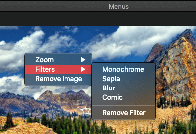
Providing context menus in your own apps is not difficult at all, as the work required is similar to what we’ve seen so far. In this part we’ll create a context menu that will appear when the image view in our demo app is right-clicked. To make things more spicy, our context menu will present two different set of options:
- When there’s no image set to the image view, then by right-clicking on it there will be the option to open an image.
- When an image has been set to the image view, then the options will be:
- A submenu with menu items regarding zooming (zoom in, zoom out, and zoom to fit).
- A submenu to apply filters to the image.
- A menu item to remove the image (dismiss it) from the image view.
Even though the actual menus can be created in Interface Builder and then to be assigned as context menus to the appropriate controls (such as the image view in this demo), we’ll avoid taking this route and we’ll do everything in code. Even if you’re uncomfortable creating UI in code, you’ll find out that this specific part of UI is really easy to implement and handle programmatically.
So, with that being said, go to the ViewController.swift file and search for a method called setupContextMenu():
func setupContextMenu() {

}
A context menu is a… menu, so let’s start with that:
let contextMenu = NSMenu()NSMenu class has another interesting initializer which accepts a title as its argument (NSMenu(title:)). Keep it in mind in case you create menus in code where the title will be visible (if, for example, you’re adding a menu as a submenu to an item of the main menu).
Next, we have to determine if the image view is displaying an image or not. That’s easy, all we have to do is to check if its image property is nil or not:
if imageView.image == nil {

} else {

}
In the first case where the image is nil, we’ll create a menu item that will prompt users to open an image and we’ll add it to the contextMenu:
let open = NSMenuItem(title: "Open image...", action: #selector(openImage(_:)), keyEquivalent: "")
contextMenu.addItem(open)
The above could be written in one line only:
contextMenu.addItem(NSMenuItem(title: "Open image...", action: #selector(openImage(_:)), keyEquivalent: ""))See that the openImage(_:) IBAction method is set as the one to be called when this item gets clicked.
Let’s leave the else case empty for a while, and let’s go after the point where the above condition ends. Let’s assign the contextMenu menu object as the context menu of the image view. To do that, we’ll access a property called menu (I guess you were expecting contextMenu):
imageView.menu = contextMenuWe can give a first try to our context menu at this point. Calling the setupContextMenu() method has already been taken care of so we’re good to go.
setupContextMenu() has three different callers: The viewDidLoad() method, the openImage(_:) IBAction method and the dismissImage() method (you’ll find the last one already implemented in the ViewController class).
Run the app and right click on the image view before you open an image. You should see the context menu with one option only. Use it to open an image.
Specifying The Menu Items
When there’s no image to the image view, then creating a single menu item is not such a big hassle. However, when there are more options to show it’s easy to find ourselves doing unnecessary work instead of just being smart and reuse already made stuff.
In order to highlight exactly that, we’re going to implement a new method where we’ll create all the menu items we need in case an image is being displayed on the image view when the context menu is showing up.
func createContextMenuItems() -> [NSMenuItem] {

}
Once again, this method returns a collection of menu items (check out createFiltersMenuItems() method we implemented earlier to refresh your memory).
Now, what we want is to create a menu item which will contain a submenu. This submenu will display three menu items regarding zoom operations (zoom in, out and fit). Even though those menu items already exist on the main menu, we have to define them again because we cannot reuse them. After all, we created them graphically in Interface Builder. That’s a bit of unnecessary work, but it’s a good example so we see what should be avoided.
So, here are the three menu items we want, and additionally a separator between the zoom out and zoom to fit items:
let zoomIn = NSMenuItem(title: "Zoom In", action: #selector(zoomIn(_:)), keyEquivalent: "")
let zooumOut = NSMenuItem(title: "Zoom Out", action: #selector(zoomOut(_:)), keyEquivalent: "")
let separator = NSMenuItem.separator()
let fit = NSMenuItem(title: "Fit", action: #selector(zoomToFit(_:)), keyEquivalent: "")
Now, let’s create a new NSMenu object and let’s add the above as its items:
let zoomSubmenu = NSMenu()
zoomSubmenu.addItem(zoomIn)
zoomSubmenu.addItem(zooumOut)
zoomSubmenu.addItem(separator)
zoomSubmenu.addItem(fit)
We can finally create a menu item and assign the zoomSubmenu menu as its submenu:
let zoomItem = NSMenuItem(title: "Zoom", action: nil, keyEquivalent: "")
zoomItem.submenu = zoomSubmenu
Watch at the steps again: First we created the menu items, then the menu that contains them, and then the menu item that contains the menu as its submenu.
Several of the above lines would have been avoided and we would have reduced amount of code to write if we could reuse the menu items somehow. This becomes clear right next where we’re doing the exact same work but for the filters. This time we don’t have to define the menu items; we just take them from the createFiltersMenuItems() method:
let filtersSubmenu = NSMenu()
let filterItems = createFiltersMenuItems()
filterItems.forEach { filtersSubmenu.addItem($0) }
let filtersItem = NSMenuItem(title: "Filters", action: nil, keyEquivalent: "")
filtersItem.submenu = filtersSubmenu
First we create the menu object, then we get the filter menu items and we assign them to the menu, and lastly we create a menu item which uses the filtersSubmenu menu as its submenu. Significantly less lines to write, and it’s becoming now clear why we implemented the createFiltersMenuItems() method in the first place.
Finally, let’s create a single menu item without a submenu for removing the image:
let dismiss = NSMenuItem(title: "Remove Image", action: #selector(dismissImage), keyEquivalent: "")The above menu items must be returned by the method:
return [zoomItem, filtersItem, dismiss]Here’s the createContextMenuItems() complete:
func createContextMenuItems() -> [NSMenuItem] {
    let zoomIn = NSMenuItem(title: "Zoom In", action: #selector(zoomIn(_:)), keyEquivalent: "")
    let zooumOut = NSMenuItem(title: "Zoom Out", action: #selector(zoomOut(_:)), keyEquivalent: "")
    let separator = NSMenuItem.separator()
    let fit = NSMenuItem(title: "Fit", action: #selector(zoomToFit(_:)), keyEquivalent: "")

    let zoomSubmenu = NSMenu()
    zoomSubmenu.addItem(zoomIn)
    zoomSubmenu.addItem(zooumOut)
    zoomSubmenu.addItem(separator)
    zoomSubmenu.addItem(fit)

    let zoomItem = NSMenuItem(title: "Zoom", action: nil, keyEquivalent: "")
    zoomItem.submenu = zoomSubmenu

    let filtersSubmenu = NSMenu()
    let filterItems = createFiltersMenuItems()
    filterItems.forEach { filtersSubmenu.addItem($0) }
    let filtersItem = NSMenuItem(title: "Filters", action: nil, keyEquivalent: "")
    filtersItem.submenu = filtersSubmenu

    let dismiss = NSMenuItem(title: "Remove Image", action: #selector(dismissImage), keyEquivalent: "")

    return [zoomItem, filtersItem, dismiss]
}
Back to the setupContextMenu() now where there’s an else case empty. It regards the case where the image view has an image. What we’ll simply do is to call the createContextMenuItems() method for getting the items that will be displayed on the context menu, and then add them to the contextMenu menu object:
let items = createContextMenuItems()
items.forEach { contextMenu.addItem($0) }
The above also concludes our work in this method and on the creation of the context menu in general. Here’s the setupContextMenu() as one piece:
func setupContextMenu() {
    let contextMenu = NSMenu()

    if imageView.image == nil {
        contextMenu.addItem(NSMenuItem(title: "Open image...", action: #selector(openImage(_:)), keyEquivalent: ""))
    } else {
        let items = createContextMenuItems()
        items.forEach { contextMenu.addItem($0) }
    }

    imageView.menu = contextMenu
}
Run the app now and open an image. Then right click on the image view and enjoy our brand new context menu.
The Toolbar
Any macOS application can optionally provide menu shortcuts immediately accessible to users on a toolbar. That toolbar always appears on the top side of the window. For example, a toolbar can be found in Xcode, in Safari, and a lot of other applications you’re using every day.
Before we add a toolbar to our demo application, there a couple of things you should keep in mind:
- First, users are always able of hiding the toolbar using the View > Hide Toolbar menu item on the main menu of the app. That’s one of the default features that I wouldn’t recommend to remove from your app; users expect to find it, and most probably Apple won’t like that decision if your app takes the way to the App Store.
- Second, and based on the above, make sure that buttons or other toolbar controls that trigger actions have their menu equivalents. Even if users hide the toolbar, they still can access features that were being displayed on it. That’s why I mentioned the term “menu shortcuts” right above. This is a rule, unless you’re displaying a control that has informative purposes and users can work with the app even without it.
I encourage you to read the Human Interface Guidelines regarding toolbars here and here.
Adding A Toolbar
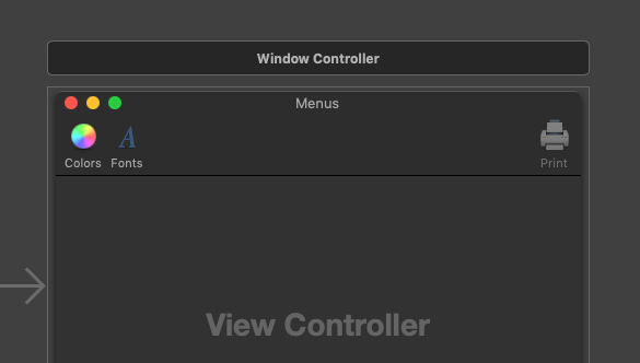
In our demo project now, open the Main.storyboard file. Open the Library and search for a Toolbar object. When you spot it, drag and drop it onto the Window Controller.
A toolbar has three actionable toolbar items by default:
- An item to open the Colors panel.
- An item to open the Fonts panel.
- An item to initiate printing if such a functionality has been implemented to the app.
There’s also a fourth item, the flexible space item. This, along with its sibling, the space item, is used to layout other items on a toolbar and assign spacing between them. Single space item creates a fixed width spacing, while the flexible space item adds the maximum possible space between two items.
Before we customize the toolbar, let me highlight two configuration related facts. The first is that even though items display both an image and a label by default, this can change and have items display only an image or only a label. To do so, click to select the toolbar, and then open the Attributes inspector. You’ll find the Display popup button with the item Icon and Label set as the predefined one. Open the popup and select Icon only and Image only in turn to see how the toolbar will change.
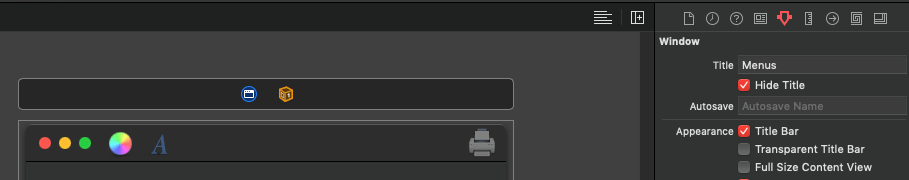
The second small configuration you can do is to have the toolbar shown right after of the window buttons and in place of the title, instead of being below of them. To do that, click inside the window controller’s area and in the window’s settings in the Attributes inspector, click to enable the Hide Title check box. In that case, there’s no title, and also the icons of the toolbar items are being displayed automatically.
Customizing The Toolbar
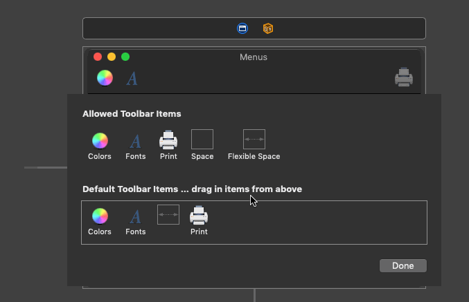
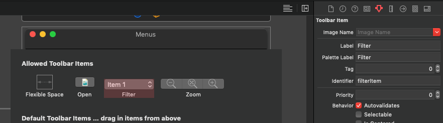
Time to add our own items to the toolbar, so click on it to expand it. You should be seeing this:
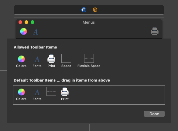
Notice that there are two sets of menu items available. The first one on the top shows all the available items that can be displayed on the toolbar. This is the palette. The second set in the boxed area shows the currently displayed items on the toolbar.
Important: Even though it doesn’t happen often, users can change the displayed items on a toolbar by using the View > Customize Toolbar menu item. What they see when they do that is a quite similar window to the one we have right now in the Interface Builder. They can see and access both the available and currently displayed items, and they can choose whether items will display icons, labels, or both. So, make sure that you don’t forget unneeded items in the palette. Keep only those that you really need in the toolbar.
Let’s get rid now of the default toolbar content. To remove existing items either from the palette, or from the boxed area right below, simply drag them out of the window area:
Removing default items shouldn’t make you worry, you can find them again in the Library. I’d suggest to keep the flexible space item though, as we’re going to need it.
Items shown on a toolbar can be of two different kinds: Either image items like the ones you just removed, or certain Cocoa controls such as buttons and popups. However, these two kinds of items should never exist together. According to the Human Interface Guidelines, you should never have image toolbar items along with Cocoa controls at the same time.
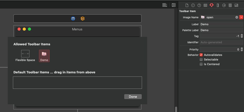
Even though in this tutorial we’re going to see how to add and configure system controls to the toolbar, let’s have a moment and a quick look at how to add an image toolbar item. So, in order to include such an item in the toolbar, open the Library and search for the toolbar term. Drag and drop an Image Toolbar Item to the toolbar’s palette. Repeat this process as many times as necessary so you have the desired number of image items on your toolbar.
To configure an item, click on it and then open the Attributes inspector. What you’ll be providing values mostly for are:
- The image name. Either select or type the name of an image that should be displayed on the item.
- The label and palette label. The first one is the text shown right below the image on the toolbar. The palette label is the text describing the item on the palette.
The remaining fields on the inspector are pretty much self explanatory. What you might find interesting is the last checkbox titled Is Centered. By turning it on, the item gets centered on the toolbar.
Adding and configuring image toolbar items is relatively easy, so let’s proceed by adding other Cocoa controls as items. First, remove any image toolbar item that you might have added.
We are going to add the following system controls to the toolbar:
- A push button for opening an image. We’ll position it to the left side of the toolbar.
- A segmented control for managing the zoom in, zoom out and zoom to fit options. We’ll place it on the right side of the toolbar.
- A pull down (a dropdown) button for applying filters on the loaded image. It will be centered on the toolbar.
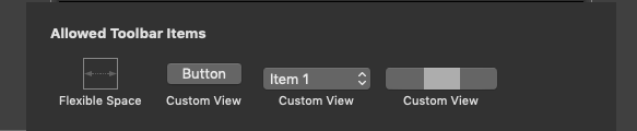
Open the Library, and search for a button item. Drag a Push Button object to the toolbar’s palette. Repeat the process but this time drag a Pop Up Button object to the palette. Finally, search for and drag a Segmented Control. By finishing these steps this is what you should have on your toolbar:
If you look at the Document Outline you will see that a toolbar item has been created automatically for each control we just added. Controls are actually children elements of those toolbar items.
The Push Button
Let’s start with the push button. At first, select its item in the Document Outline and go to the Attributes inspector. Set the value Open to both the Label and Palette Label fields.
Then, expand the item on the Document Outline and click on the Button object to reveal its properties in the Attributes inspector. Set or change the following properties:
- Image: Select the “open” image to be displayed on the button.
- Position: Image Only
- Title: Delete and keep it empty.
- Optionally uncheck the Bordered checkbox in the Visual section at the top to hide the button’s border.
Now, open the Size inspector and change the button’s width from 70 to 40. The button is ready.
Before we move on, let’s connect it to the proper action. Select the Open item either on the palette or in the Document Outline, and by holding the Ctrl key down, drag to the First Responder object. In the popup window choose the openImage: action.
The Segmented Control
Let’s continue with the segmented control, so in the toolbar’s palette click to select its custom view. In the Attributes inspector set the Zoom value to both the Label and Palette Label fields, and then expand the item in the Document Outline to reveal the actual segmented control. Click on it to show its properties in the Attributes inspector.
- Make sure that the number of segments is set to 3 in the Segments field.
- In the Segment popup make sure that the Segment 0 is selected.
- Set the zoom_out image to the Image field.
- Open the Segment popup and select Segment 1.
- Set the zoom_fit image to the Image field.
- Uncheck the Selected checkbox.
- Open the Segment popup again and select Segment 2.
- Set the zoom_in image to the Image field.
- Open the Mode popup at the top and select the Momentary value.
- Optionally, change the Style to Separated.
Also, open the Size inspector and by selecting each segment in the Segment popup, set its width to 40.
We have to connect the item containing the segmented control to the proper action so the zoom options actually work when we’ll run the app. Repeat the process described many times here to do so; Ctrl-drag to the First Responder object, and select the handleZoomItem: action.
The handleZoomItem(_:) IBAction method is defined in the ViewController but it’s not implemented yet. Open the ViewController.swift file to add the implementation now. The logic we’ll apply is pretty simple: Depending on the clicked segment of the segmented control, we’ll call the proper (previously implemented IBAction) method to zoom in, zoom out, or zoom to fit:
@IBAction func handleZoomItem(_ sender: Any) {
    guard let segmentedControl = sender as? NSSegmentedControl else { return }

    switch segmentedControl.selectedSegment {
    case 0: zoomOut(self)
    case 1: zoomToFit(self)
    case 2: zoomIn(self)
    default: break
    }
}
The Pull Down Button
Time to configure the last system control in the toolbar. Select the item that contains the popup either on the toolbar’s palette or in the Document Outline, and go to the Attributes inspector to set the Filters value to both label fields (exactly as you did twice above). Also, set the filterItem value as its Identifier.
Expand the item in the Document Outline now and select the Item 1 object, or double click the popup right into the palette. Go to the Attributes inspector to do the necessary configuration. For starters, a popup button can be left as a popup to the toolbar, or to be changed to a pull down button. We’ll do the second here. In the Attributes inspector:
- Open the Type popup and select the Pull Down option.
- Keep the Title field empty by deleting the predefined text.
- Set the filters image to the Image field.
- Open the Position popup and select the Image Only option.
- You can optionally remove the border by unchecking the Bordered checkbox in the Visual field. Do so if only all other controls have no border as well, so you keep the same look to all controls displayed on the toolbar.
Open the Size inspector and change the width to 40. The pull down button is now configured, but not its items. We’ll fix that soon.
Laying Out And Running
We can now layout the controls on the toolbar. Start with the Open item. Drag and drop it to the boxed area right below the palette. Do the same for the Filters and Zoom items. Then add twice the flexible space item. Drag the first one after the Open Item and before the Filters, and drag the second one to after the Filters and before the Zoom item. You should end up with this:
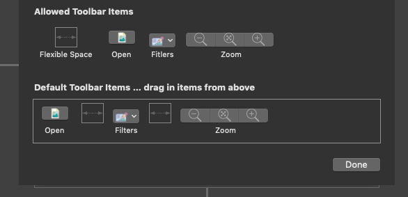
You can now run the app and have a first look at the toolbar live. You will find out that the Open and Zoom items are working fine since we have connected actions to them. When you open the Filters pull down button though, you’ll notice that the first item is not listed among the three items the button comes with by default. Only the second and third items are shown. This is happening because the first item is the one the configuration we just did applies to, so we can say that it’s now “reserved” for the appearance of the pull down control.
Configuring The Pull Down Button Items
Let’s configure the pull down butotn items now, and let’s do it programmatically. Open the ViewController.swift file. We’re going to implement one last method which will be responsible for removing the two default unneeded items from the pull down button, and for assigning the filter menu options to it. Our new method will be called setFilterItemOptions():
func setFilterItemOptions() {

}
The first step is to get access to the filters item in the toolbar. This can be done by accessing the toolbar through the window object, which we access in turn through the view object of the view controller. Then, we’ll use the identifier we set earlier to the filters item (called filterItem) to find the correct one. The short way to do all that is shown next:
let filterItem = self.view.window?.toolbar?.items.filter { $0.itemIdentifier.rawValue == "filterItem" }.firstThe filterItem above is a NSToolbarItem object. It has a view property which is the pull down button we want:
guard let popup = filterItem?.view as? NSPopUpButton else { return }Now, before assigning the desired menu items, let’s remove the existing two items:
popup.removeItem(at: 2)
popup.removeItem(at: 1)
It’s important to remove respecting the order shown above. If you remove the item at index 1 first and then the item at index 2, the app will crash because index 2 will be out of bounds; the number of items in the popup will be already decreased by having removed the item at index 1.
Let’s get the filter menu items now. That’s something already familiar to us:
let filterMenuItems = createFiltersMenuItems()Finally, let’s populate those menu items to the popup button. Notice that we do that through the menu property of the popup:
filterMenuItems.forEach { popup.menu?.addItem($0) }That’s all. Here’s our method assembled:
func setFilterItemOptions() {
    let filterItem = self.view.window?.toolbar?.items.filter { $0.itemIdentifier.rawValue == "filterItem" }.first

    guard let popup = filterItem?.view as? NSPopUpButton else { return }
    popup.removeItem(at: 2)
    popup.removeItem(at: 1)

    let filterMenuItems = createFiltersMenuItems()
    filterMenuItems.forEach { popup.menu?.addItem($0) }
}
Time to call it. We won’t do it in the viewDidLoad() method because the toolbar is not initialized yet when it’s called. We’ll do it in the viewDidAppear(_:), but here’s a detail to take care about: viewDidAppear(_:) can be called multiple times during the lifetime of a view controller, and so our method eventually. Our demo application is quite simple and this won’t happen here, but it’s something to consider in a real application.
To work around this, declare the following property in the ViewController class:
var didSetFilterItemOptions = falseThen, implement the viewDidAppear(_:) as follows:
override func viewDidAppear() {
    super.viewDidAppear()

    if !didSetFilterItemOptions {
        setFilterItemOptions()
        didSetFilterItemOptions = true
    }
}
The above ensures that the setFilterItemOptions() won’t be called more than one time. Besides that, note that once again we called the createFiltersMenuItems() method in order to create the menu items regarding the filters, and it’s proved one more time how important it is to reuse code when working with menus, menu items and the toolbar. It can save you from unnecessary work and reduces the amount of code.
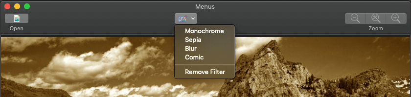
The demo app is now ready, so run the app and use the Filters item this time to apply filters to a loaded image.
Summary
It’s really rare to find an app that makes no use of the main menu or context menus, so knowing how to deal with them is mandatory for every macOS developer. When creating menus try to remember to keep relevant functionalities together, and make the important ones easily accessible even by assigning key equivalents. I believe it’s obvious through the previous parts that making part of (or entire) the menu related stuff in code can save time by reusing implemented functionalities. Take your time to play around with the menus and the toolbar, and you’ll realize that working with them is one of the most pleasant things when developing macOS applications. Thanks for reading!
For reference, you can download the complete project on GitHub.
Credits: Images by icons8