

Have you ever used the magic move animation in Keynote? With magic move, you can easily create slick animation between slides. Keynote automatically analyzes the objects between slides and renders the animations automatically. To me, SwiftUI has brought Magic Move to app development. Animations using the framework are automatic and magical. You define two states of a view and SwiftUI will figure out the rest, animating the changes between these two states.
SwiftUI empowers you to animate changes for individual views and transitions between views. The framework already comes with a number of built-in animations to create different effects.
In this tutorial, you will learn how to animate views using implicit and explicit animations, provided by SwiftUI. And, we will build a couple of loading indicator and learn SwiftUI animation along the way.
Implicit and Explicit Animations
SwiftUI provides two types of animations: implicit and explicit. Both approaches allow you to animate views and view transitions. For implementing implicit animations, the framework provides a modifier called animation. You attach this modifier to the views you want to animate and specify your preferred animation type. Optionally, you can define the animation duration and delay. SwiftUI will then automatically render the animation based on the state changes of the views.
Explicity animations offer a more finite control over the animations you want to present. Instead of attaching a modifier to the view, you tell SwiftUI what state changes you want to animate inside the withAnimation() block.
A bit confused? That’s fine. You will have a better idea after going a couple of the examples.
Implicit Animations
Let’s begin with implicit animations. I suggest you to create a new project to see the animations in action. You can name the project to whatever name you like. For me, I name it SwiftUIAnimation.
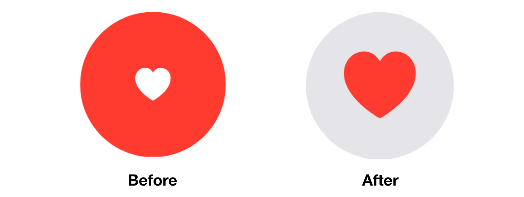
Take a look at the figure above. It’s a simple tappable view that is composed of a red circle and a heart. When a user taps the heart or circle, the circle’s color will be changed to light gray and the heart’s color to red. At the same time, the size of the heart icon grows bigger. So, we have various state changes here:
- The color of the circle changes from red to light gray.
- The color of the heart icon changes from white to red.
- The heart icon doubles its original size.
If you implement the tappable circle using SwiftUI, this is what the code looks like:
struct ContentView: View {
    @State private var circleColorChanged = false
    @State private var heartColorChanged = false
    @State private var heartSizeChanged = false

    var body: some View {

        ZStack {
            Circle()
                .frame(width: 200, height: 200)
                .foregroundColor(circleColorChanged ? Color(.systemGray5) : .red)

            Image(systemName: "heart.fill")
                .foregroundColor(heartColorChanged ? .red : .white)
                .font(.system(size: 100))
                .scaleEffect(heartSizeChanged ? 1.0 : 0.5)
        }
        .onTapGesture {
            self.circleColorChanged.toggle()
            self.heartColorChanged.toggle()
            self.heartSizeChanged.toggle()
        }

    }
}
We define three state variables to model the states with the inital value set to false. To create the circle and heart, we use ZStack to overlay the heart image on top of the circle. SwiftUI comes with the onTapGesture modifier to detect the tap gesture. You can attach it to any views to make it tappable. In the onTapGesture closure, we toggle the states to change the view’s appearance.
If you run the app in the canvas, the color of the circle and heart icon change when you tap the view. However, these changes are not animated.
To animate the changes, all you need to do is attach the animation modifier to the Circle and Image views:
Circle()
    .frame(width: 200, height: 200)
    .foregroundColor(circleColorChanged ? Color(.systemGray5) : .red)
    .animation(.default)

Image(systemName: "heart.fill")
    .foregroundColor(heartColorChanged ? .red : .white)
    .font(.system(size: 100))
    .scaleEffect(heartSizeChanged ? 1.0 : 0.5)
    .animation(.default)
SwiftUI automatically computes and renders the animation that allows the views to go smoothly from one state to another state. Tap the heart again and you should see a slick animation.
Not only can you apply the animation modifier to a single view, it is applicable to a group of views. For example, you can rewrite the code above by attaching the animation modifier to ZStack like this:
ZStack {
    Circle()
        .frame(width: 200, height: 200)
        .foregroundColor(circleColorChanged ? Color(.systemGray5) : .red)

    Image(systemName: "heart.fill")
        .foregroundColor(heartColorChanged ? .red : .white)
        .font(.system(size: 100))
        .scaleEffect(heartSizeChanged ? 1.0 : 0.5)
}
.animation(.default)
.onTapGesture {
    self.circleColorChanged.toggle()
    self.heartColorChanged.toggle()
    self.heartSizeChanged.toggle()
}
It works exactly same. SwiftUI looks for all the state changes embedded in ZStack and creates the animations.
In the example, we use the default animation. SwiftUI provides a number of built-in animations for you to choose including linear, easeIn, easeOut, easeInOut, and spring. The linear animation animates the changes in linear speed, while other easing animations have various speed. For details, you can check out www.easings.net to see the difference between each of the easing functions.
To use an alternate animation, you just need to set the specific animation in the animation modifier. Let’s say, you want to use the spring animation, you can change .default to the following:
.animation(.spring(response: 0.3, dampingFraction: 0.3, blendDuration: 0.3))This renders a spring-based animation that gives the heart a bumpy effect. You can adjust the damping and blend values to achieve a different effect.
Explicit Animations
That’s how you animate views using implicit animation. Let’s see how we can achieve the same result using explicit animation. As explained before, you need to wrap the state changes in the withAnimation block. To create the same animated effect, you can write the code like this:
ZStack {
    Circle()
        .frame(width: 200, height: 200)
        .foregroundColor(circleColorChanged ? Color(.systemGray5) : .red)

    Image(systemName: "heart.fill")
        .foregroundColor(heartColorChanged ? .red : .white)
        .font(.system(size: 100))
        .scaleEffect(heartSizeChanged ? 1.0 : 0.5)
}
.onTapGesture {
    withAnimation(.default) {
        self.circleColorChanged.toggle()
        self.heartColorChanged.toggle()
        self.heartSizeChanged.toggle()
    }
}
We no longer use the animation modifier, instead we wrap the code in onTapGesture with withAnimation. The withAnimation call takes in an animation parameter. Here we specify to use the default animation.
Of course, you can change it to spring animation by updating withAnimation like this:
withAnimation(.spring(response: 0.3, dampingFraction: 0.3, blendDuration: 0.3)) {
    self.circleColorChanged.toggle()
    self.heartColorChanged.toggle()
    self.heartSizeChanged.toggle()
}
With explicit animation, you can easily control which state you want to animation. For example, if you don’t want to animate the size change of the heart icon, you can exclude that line of code from withAnimation like this:
.onTapGesture {
    withAnimation(.spring(response: 0.3, dampingFraction: 0.3, blendDuration: 0.3)) {
        self.circleColorChanged.toggle()
        self.heartColorChanged.toggle()
    }

    self.heartSizeChanged.toggle()
}
In this case, SwiftUI will only animate the color change of both circle and heart. You will no longer see the animated growing effect of the heart icon.
You may wonder if we can disable the scale animation by using implicit animation. Well, you can still do that. You can attach the animation(nil) modifier to the view to prevent SwiftUI from animating a certain state change. Here is the code that achieves the same effect:
ZStack {
    Circle()
        .frame(width: 200, height: 200)
        .foregroundColor(circleColorChanged ? Color(.systemGray5) : .red)
        .animation(.spring(response: 0.3, dampingFraction: 0.3, blendDuration: 0.3))

    Image(systemName: "heart.fill")
        .foregroundColor(heartColorChanged ? .red : .white)
        .font(.system(size: 100))
        .animation(nil) // Cancel the animation from here
        .scaleEffect(heartSizeChanged ? 1.0 : 0.5)
        .animation(.spring(response: 0.3, dampingFraction: 0.3, blendDuration: 0.3))
}
.onTapGesture {
    self.circleColorChanged.toggle()
    self.heartColorChanged.toggle()
    self.heartSizeChanged.toggle()
}
We insert the animation(nil) modifier right before scaleEffect. This will cancel the animation. The state change of the scaleEffect modifier will not be animated.
While you can create the same animation using implicit animation, in my opinion, it’s more convenient to use explicit animation in this case.
Creating a Loading Indicator Using RotationEffect
The power of SwiftUI animation is that you don’t need to take care how the views are animated. All you need is to provide the start and end state. SwiftUI will then figure out the rest. If you understand this concept, you can create various types of animation.
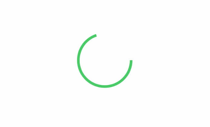
For example, let’s create a simple loading indicator that you can commonly find in some real-world application such as Medium. To create a loading indicator like that shown in the figure above, we can start with an open ended circle like this:
Circle()
    .trim(from: 0, to: 0.7)
    .stroke(Color.green, lineWidth: 5)
    .frame(width: 100, height: 100)
So, how can we keep rotating the circle? We can make use of the rotationEffect and animation modifiers. The trick is to keep rotating the circle by 360 degrees. Here is the code:
struct ContentView: View {
    @State private var isLoading = false

    var body: some View {
        Circle()
            .trim(from: 0, to: 0.7)
            .stroke(Color.green, lineWidth: 5)
            .frame(width: 100, height: 100)
            .rotationEffect(Angle(degrees: isLoading ? 360 : 0))
            .animation(Animation.default.repeatForever(autoreverses: false))
            .onAppear() {
                self.isLoading = true
            }
    }
}
The rotationEffect modifier takes in the rotation degree. In the code above, we have a state variable to control the loading status. When it’s set to true, the rotation degree will be set to 360 to rotate the circle. In the animation modifier, we specify to use the default animation, but there is something difference. We tell SwiftUI to repeat the same animation again and again. This is the trick to create the loading animation.
If you want to change the speed of the animation, you can use the linear animation and specify a duration like this:
Animation.linear(duration: 1).repeatForever(autoreverses: false)The great the duration the slower is the animation.
The onAppear modifier may be new to you. If you have some knowledge of UIKit, this modifier is very similar to viewDidAppear. It’s automatically called when the view appears on screen. In the code, we change the loading status to true in order to start the animation when the view is loaded up.
Once you manage this technique, you can tweak the design and develop various versions of loading indicator. Say, for example, you can overlay an arc on a circle to create a fancy loading indicator.

And, here is the code snippet:
struct ContentView: View {

    @State private var isLoading = false

    var body: some View {
        ZStack {

            Circle()
                .stroke(Color(.systemGray5), lineWidth: 14)
                .frame(width: 100, height: 100)

            Circle()
                .trim(from: 0, to: 0.2)
                .stroke(Color.green, lineWidth: 7)
                .frame(width: 100, height: 100)
                .rotationEffect(Angle(degrees: isLoading ? 360 : 0))
                .animation(Animation.linear(duration: 1).repeatForever(autoreverses: false))
                .onAppear() {
                    self.isLoading = true
            }
        }
    }
}
The loading indicator doesn’t need to be circular. You can also use Rectangle or RoundedRectangle to create the indicator. But instead of changing the rotation angle, you can modify the value of the offset to create an animation like this.
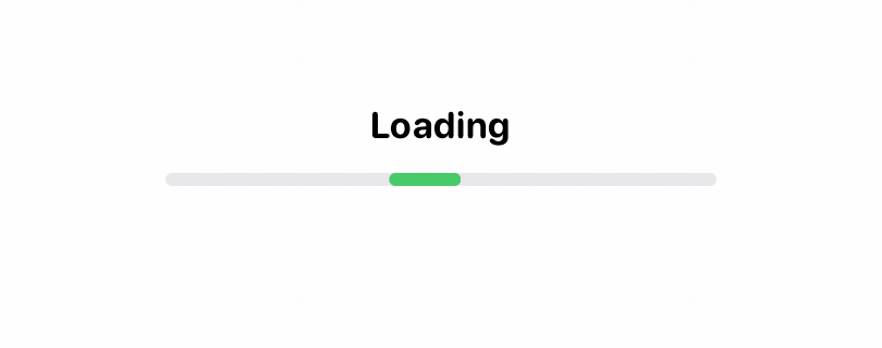
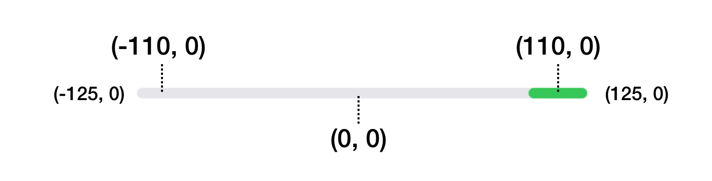
To create the animation, we overlay two rounded rectangles together. The rectangle on top is much shorter than the one below. When the loading begins, we update its offset value from -110 to 110.
struct ContentView: View {

    @State private var isLoading = false

    var body: some View {
        ZStack {

            Text("Loading")
                .font(.system(.body, design: .rounded))
                .bold()
                .offset(x: 0, y: -25)

            RoundedRectangle(cornerRadius: 3)
                .stroke(Color(.systemGray5), lineWidth: 3)
                .frame(width: 250, height: 3)

            RoundedRectangle(cornerRadius: 3)
                .stroke(Color.green, lineWidth: 3)
                .frame(width: 30, height: 3)
                .offset(x: isLoading ? 110 : -110, y: 0)
                .animation(Animation.linear(duration: 1).repeatForever(autoreverses: false))
        }
        .onAppear() {
            self.isLoading = true
        }
    }
}
This moves the green rectangle along the line. And, when you repeat the same animation over and over again, it becomes a loading animation. The figure below illustrates the offset values.
Summary
The SwiftUI framework has simplified the development of UI animation and transition. You tell the framework how the view should look like at the beginning and the end. SwiftUI figures out the rest, rendering a smooth and nice animation.
In this tutorial, I’ve just walked you through the basics. But as you can see, you’ve already built some delightful animations and transitions. Most importantly, it just need a few lines of code.