

If you’ve worked with UIKit before, the Text control in SwiftUI is very similar to UILabel in UIKit. It’s a view for you to display one or multiple lines of text. This Text control is non-editable but is useful for presenting read-only information on screen. For example, you want to present an on-screen message, you can use Text to implement it.
SwiftUI, Apple’s new declarative UI framework, has been officially released for around two months. If you still haven’t explored the framework, this tutorial is written for you. In this tutorial, I’ll show you how to work with Text to present information, customize it with your preferred color, and apply rotation effects to create perspective text.
Creating a New Project for Playing with SwiftUI
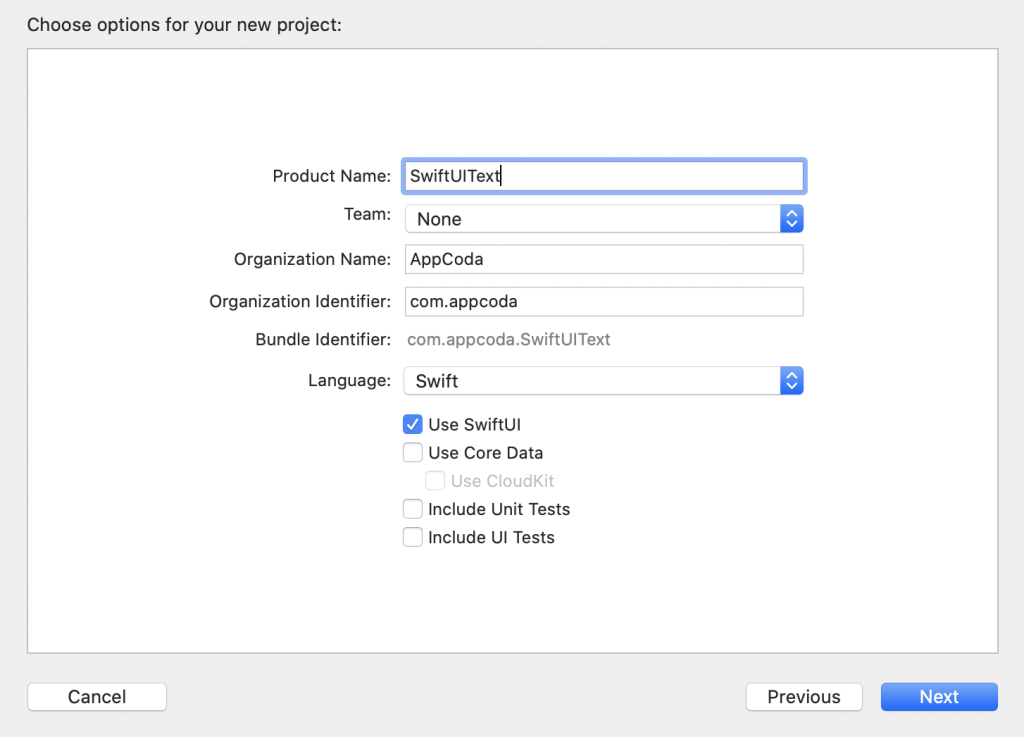
First, fire up Xcode and create a new project using the Single View App template. Type the name of the project. I set it to SwiftUIText but you’re free to use any other name. For the organization name, you can set it to your company or organization. The organization identifier is a unique identifier of your app. Here I use com.appcoda but you should set to your own value. If you have a website, set it to your domain in reverse domain name notation. To use SwiftUI, you have to explicitly check the Use SwiftUI checkbox. Click Next and choose a folder to create the project.
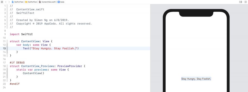
Once you save the project, Xcode should load the ContentView.swift file and display a design/preview canvas. If you can’t see the design canvas, you can go up to the Xcode menu and choose Editor > Canvas to enable it.
Displaying a Simple Text
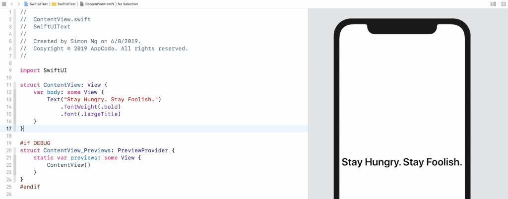
The sample code generated in ContentView already shows you how to display a single line of text. You initialize a Text and pass it with the text (e.g. Hello World) to display like this:
Text("Hello World")The preview canvas should display Hello World on screen. This is the basic syntax for creating a text view. You’re free to change the text to whatever value you want and the canvas should show you the change instantaneously.
Changing the Font Type and Color
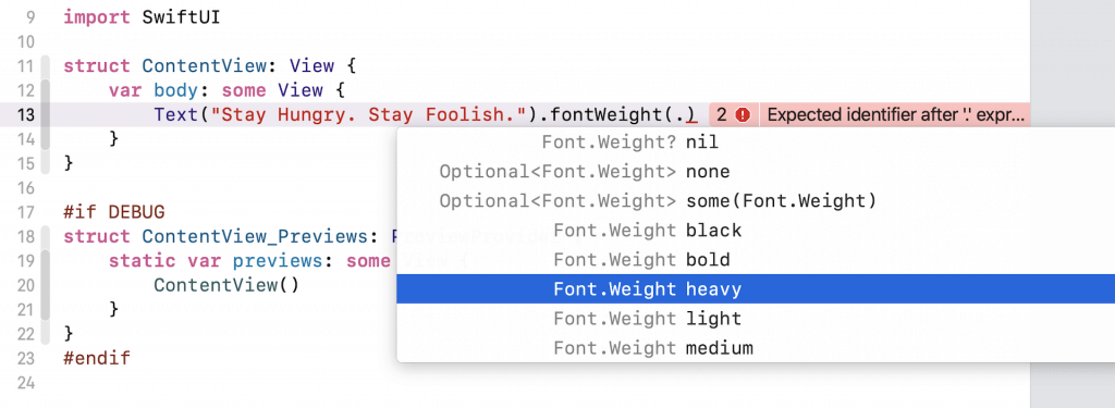
In SwiftUI, you can change the properties (e.g. color) of a control by calling methods that are known as Modifiers. Let’s say, you want to bold the text. You can use the modifier named fontWeight and specify your preferred font weight (e.g. .bold) like this:
Text("Stay Hungry. Stay Foolish.").fontWeight(.bold)You access the modifier by using the dot syntax. Whenever you type a dot, Xcode will show you the possible modifiers or values you can use. For example, you will see various font weight options when you type a dot in the fontWeight modifier. You can choose bold to bold the text. If you want to make it even bolder, use heavy or black.
By calling fontWeight with the value .bold, it actually returns you with a new view that has the bolded text. What’s interesting in SwiftUI is that you can further chain this new view with other modifiers. Say, you want to make the bolded text a little bit bigger, you can write the code like this:
Text("Stay Hungry. Stay Foolish.").fontWeight(.bold).font(.title)Since we may chain multiple modifiers together, we usually write the code above in the following format:
Text("Stay Hungry. Stay Foolish.")
    .fontWeight(.bold)
    .font(.title)
The functionality is the same but I believe you’ll find the code above more easy to read. We will continue to use this coding convention for the rest of this book.
The font modifier lets you change the font properties. In the code above, we specify to use the title font type in order to enlarge the text. SwiftUI comes with several built-in text styles including title, largeTitle, body, etc. If you want to further increase the font size, replace .title with .largeTitle.
Note: You can always to refer the documentation to find out all the supported values of the font modifier.
You can also use the font modifier to specify the font design. Let’s say, you want the font to be rounded. You can write the font modifier like this:
.font(.system(.largeTitle, design: .rounded))Here you specify to use the system font with largeTitle text style and rounded design. The preview canvas should immediately respond to the change and show you the rounded text.
Dynamic Type is a feature of iOS that automatically adjusts the font size in reference to the user’s setting (Settings > Display & Brightness > Text Size). In other words, when you use text styles (e.g. .title), the font size will be varied and your app will scale the text automatically, depending on the user’s preference.
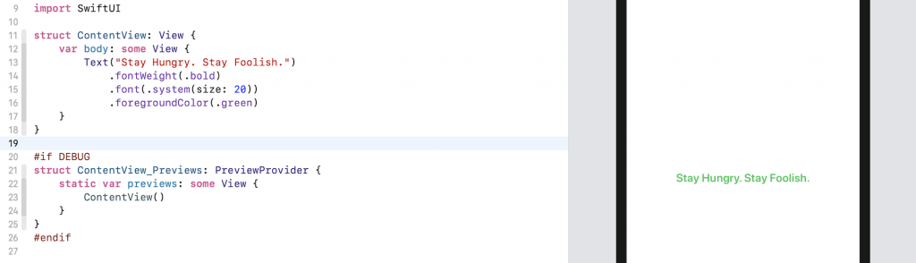
In case you want to use a fixed-size font, you can write the line of code like this:
.font(.system(size: 20))This tells the system to use a fixed font size of 20 points.
As said, you can continue to chain other modifiers to customize the text. Now let’s change the font color. To do that, you can use the foregroundColor modifier like this:
.foregroundColor(.green)The foregroundColor modifier accepts a value of Color. Here we specify to use .green, which is a built-in color. You may use other built-in values like .red, .purple, etc.
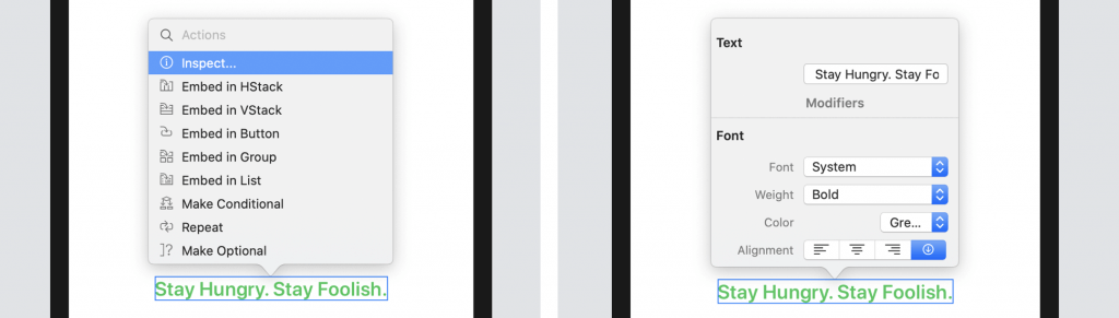
While I prefer to customize the properties of a control using code, you can also use the design canvas to edit them. Hold the command key and click the text to bring up a pop-over menu. Choose Inspect… and then you can edit the text/font properties.
Using Custom Fonts
By default, all text are displayed using the system font. If you want to use other fonts, you can replace the following line of code:
.font(.system(size: 20))With:
.font(.custom("Helvetica Neue", size: 25))Instead of using .system, the code above use .custom and specify the preferred font name. The name of the font can be found in Font Book. You can open Finder > Application and click Font Book to launch the app.
Working with Multiline Text
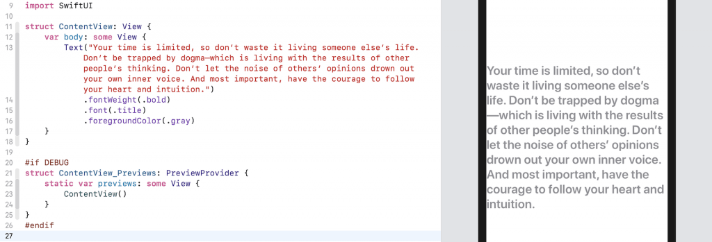
Text supports multiple lines by default, so it can display a paragraph of text without using any additional modifiers. Replace the code with the following:
Text("Your time is limited, so don’t waste it living someone else’s life. Don’t be trapped by dogma—which is living with the results of other people’s thinking. Don’t let the noise of others’ opinions drown out your own inner voice. And most important, have the courage to follow your heart and intuition.")
    .fontWeight(.bold)
    .font(.title)
    .foregroundColor(.gray)
You’re free to replace the paragraph of text with your own value. Just make sure it’s long enough. Once you made the change, the design canvas should render a multiline text label.
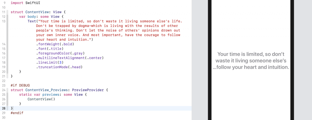
To align the text in centre, insert the multilineTextAlignment modifier and set the value to .center like this:
.multilineTextAlignment(.center)In some cases, you may want to limit the number of lines to a certain number. You can use the lineLimit modifier to control it. Here is an example:
.lineLimit(3)By default, the system is set to use tail truncation. To modify the truncation mode of the text, you can use the truncationMode modifier and set its value to .head or .middle like this:
.truncationMode(.head)After the change, your text should look like the figure below.
Earlier, I mentioned that the Text control displays multiple lines by default. The reason is that the SwiftUI framework has set a default value of nil for the lineLimit modifier. You can change the value of .lineLimit to nil and see the result:
.lineLimit(nil)Setting the Padding and Line Spacing
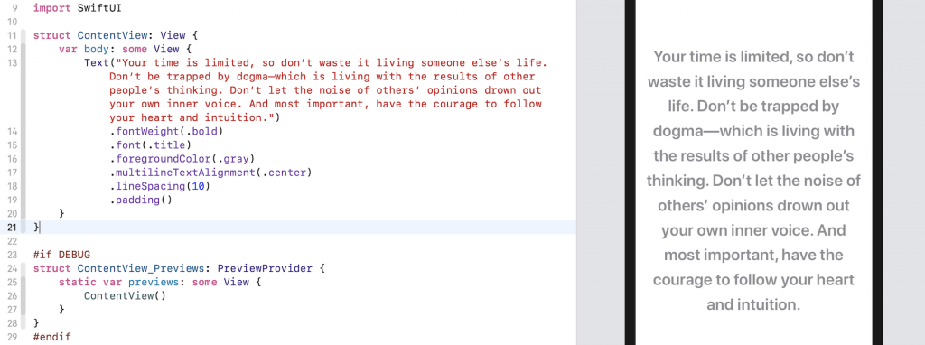
Normally the default line spacing is good enough for most situations. In case you want to alter the default setting, you can adjust the line spacing by using the lineSpacing modifier.
.lineSpacing(10)As you see, the text is too close to the left and right side of the edges. To give it some more space, you can use the padding modifier, which adds some extra space for each side of the text. Insert the following line of code after the lineSpacing modifier:
.padding()Your design canvas should now show the result like this:
Applying Rotation Effect to Create Perspective Text
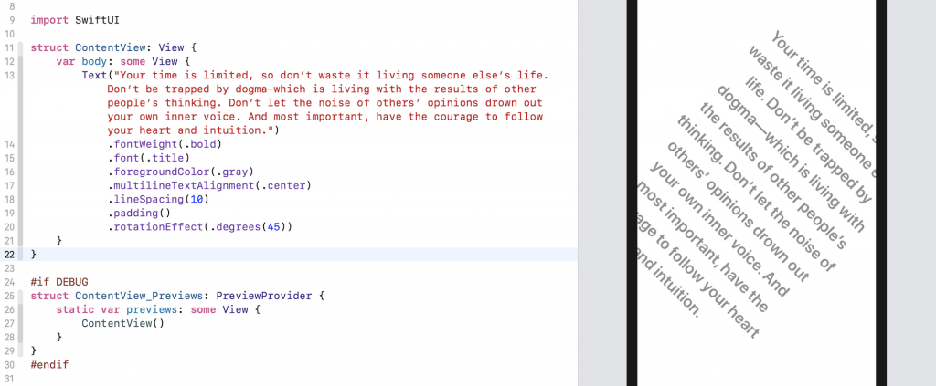
The SwiftUI framework provides API to let you easily rotate the text. You can use the rotateEffect modifier and pass the rotation degree like this:
.rotationEffect(.degrees(45))If you insert the above line of code after padding(), you will see the text is rotated by 45 degrees.
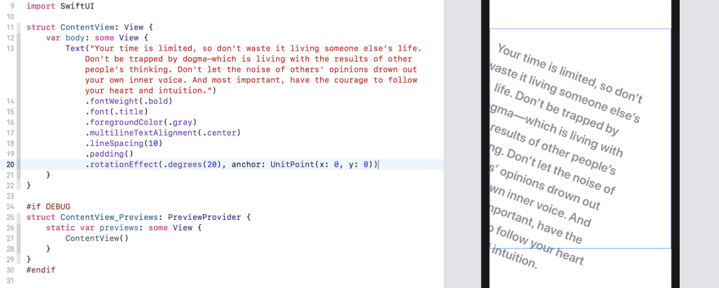
By default, the rotation happens around the center of the text view. If you want to rotate the text around a specific point (say, the top-left corner), you can write the code like this:
.rotationEffect(.degrees(20), anchor: UnitPoint(x: 0, y: 0))We pass an extra parameter anchor to specify the point of the rotation.
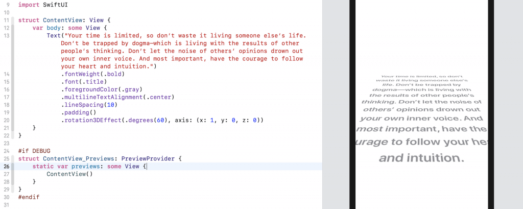
Not only can you rotate thee text in 2D, SwiftUI provides a modifier called rotation3DEffect that allows you to create some amazing 3D effect. The modifier takes in two parameters: rotation angle and the axis of the rotation. Say, you want to create a perspective text effect, you can write the code like this:
.rotation3DEffect(.degrees(60), axis: (x: 1, y: 0, z: 0))With just a line of code, you already re-create the Star Wars perspective text.
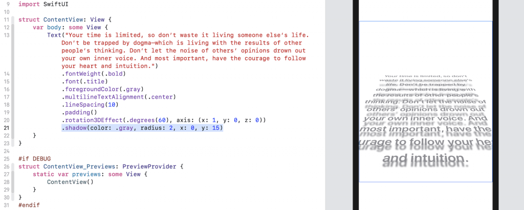
You can further insert the following line of code to create a drop shadow effect for the perspective text:
.shadow(color: .gray, radius: 2, x: 0, y: 15)The shadow modifier will apply the shadow effect to the text. All you need to do is specify the color and radius of the shadow. Optionally, you can tell the system the position of the shadow by specifying the x and y values.
Summary
Do you enjoy creating user interface with SwiftUI? I hope so. The declarative syntax of SwiftUI made the code more readable and easier to understand. As you can see, it only takes a few lines of code in SwiftUI to create fancy text in 3D style.
If you want to learn more about SwiftUI, please check out our new book – Mastering SwiftUI.
Editor’s note: We’ve added a new tutorial to show you how to animate the perspective text like that in Star Wars.