Chapter 2
Getting Started with SwiftUI and Working with Text
If you've worked with UIKit before, you'll find that the Text control in SwiftUI is very similar to the UILabel in UIKit. It's a view that allows you to display one or multiple lines of text. This Text control is non-editable but is useful for presenting read-only information on the screen. For example, if you want to present an on-screen message, you can use Text to implement it.
In this chapter, we'll show you how to work with Text to present information. You'll also learn how to customize the text with different colors, fonts, backgrounds, and apply rotation effects.
Creating a New Project for Playing with SwiftUI
To get started, open Xcode and create a new project using the App template under the iOS category.
Select Next to proceed to the next screen and type a name for your project. I've named it SwiftUIText, but you're free to choose any name you like. For the organization name, you can use your company or organization's name. The organization identifier is a unique identifier for your app. Here, I've used com.appcoda, but you should set it to your own value. If you have a website, use your domain in reverse domain name notation.
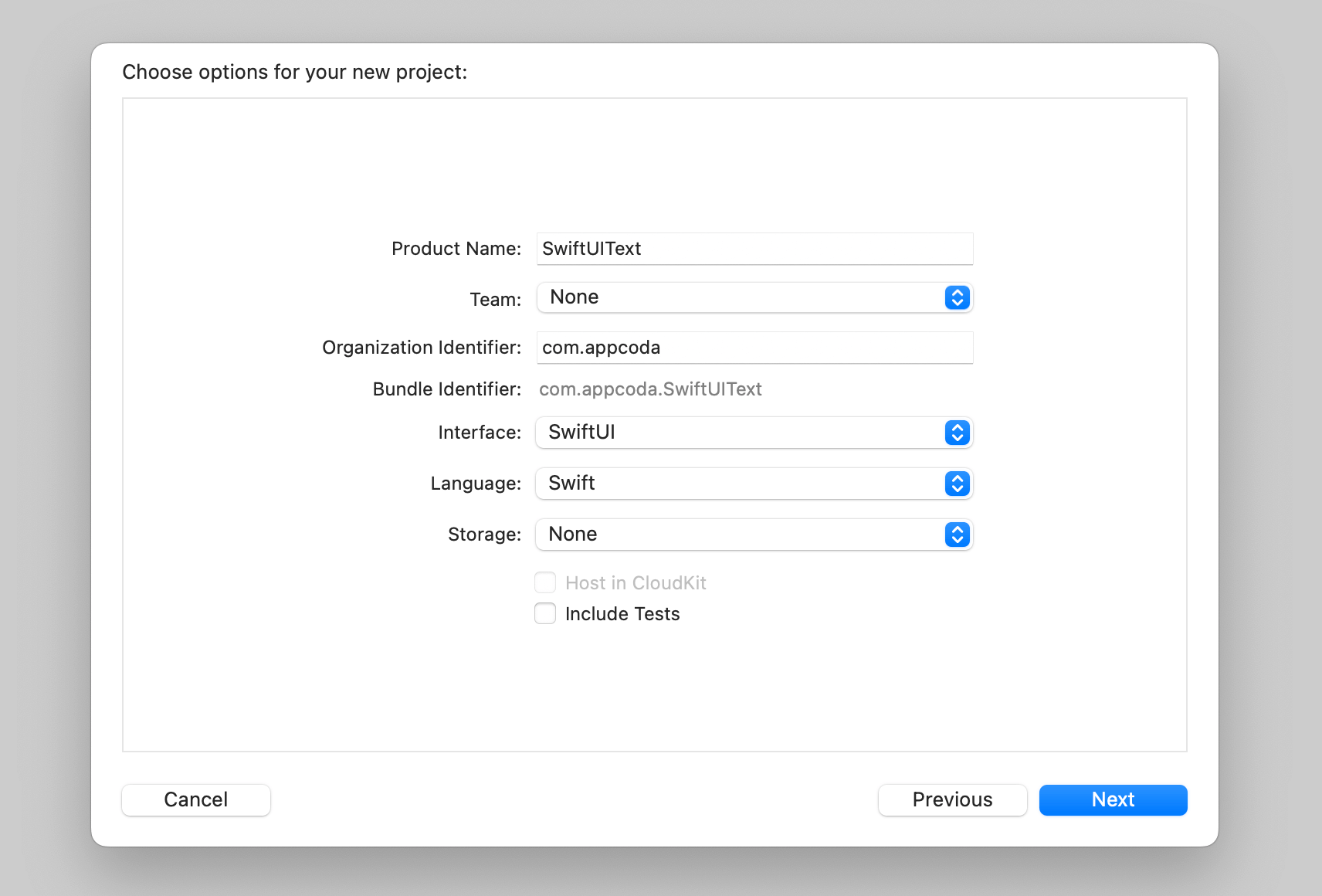
To use SwiftUI, you have to choose SwiftUI in the Interface option. The language should be set to Swift. Click Next and choose a folder to create the project.
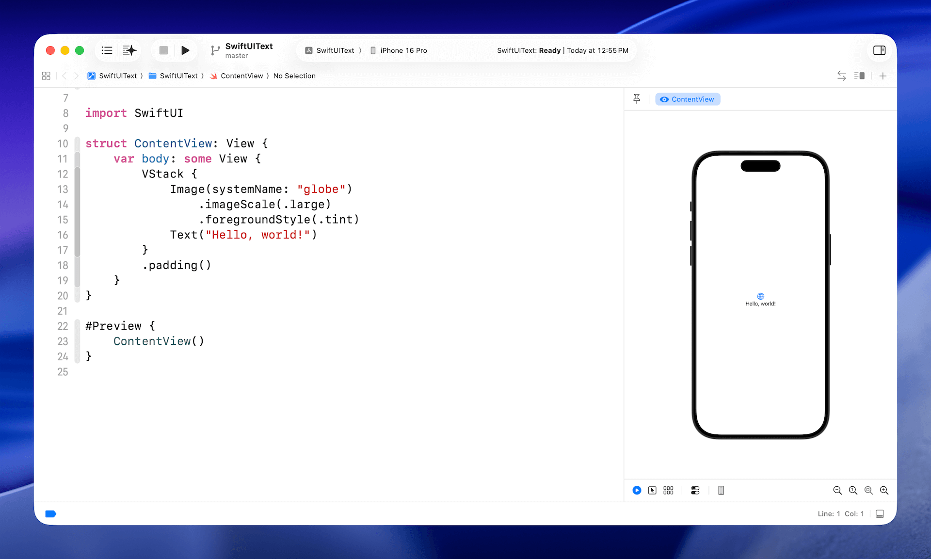
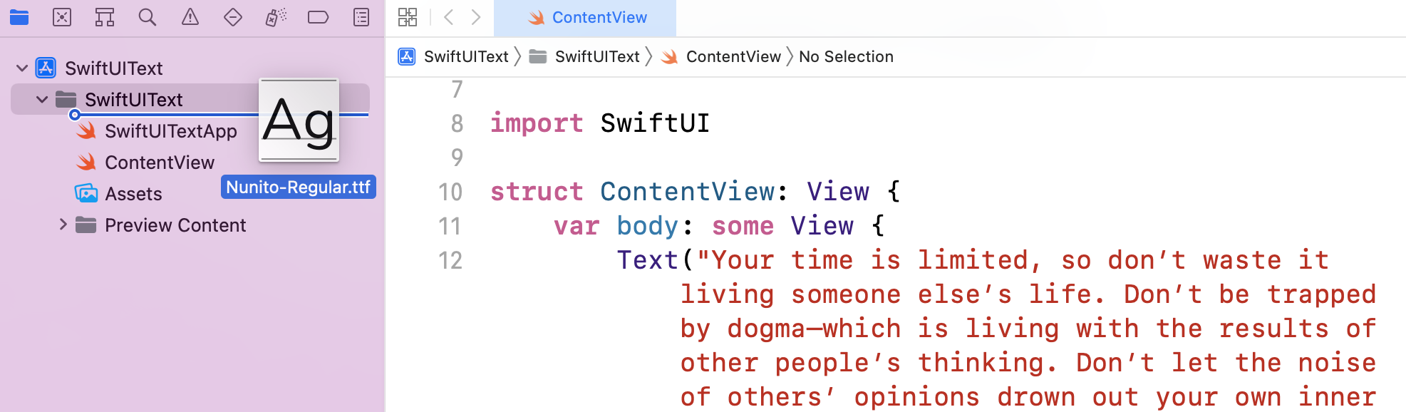
Once you save the project, Xcode should load the ContentView.swift file and display a design/preview canvas. If you can't see the design canvas, you can go up to the Xcode menu and choose Editor > Canvas to enable it. To give yourself more space for writing code, you can hide both the project navigator and the inspector (see figure 2).
By default, Xcode generates some SwiftUI code for ContentView.swift. In Xcode 26, the preview canvas should automatically render the app preview in a simulator that you choose in the simulator selection (e.g. iPhone 16/17 Pro).
Displaying Simple Text
The sample code generated in ContentView shows you how to display a single line of text and images. It also uses a VStack to embed the text and image. We will discuss both images and stack views in later chapters. Now let's focus on the usage of Text first.
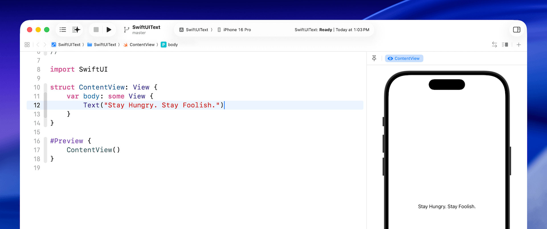
To display text on screen, you initialize a Text object and pass to it the text (e.g. Hello World) to display. Update the code of body like this:
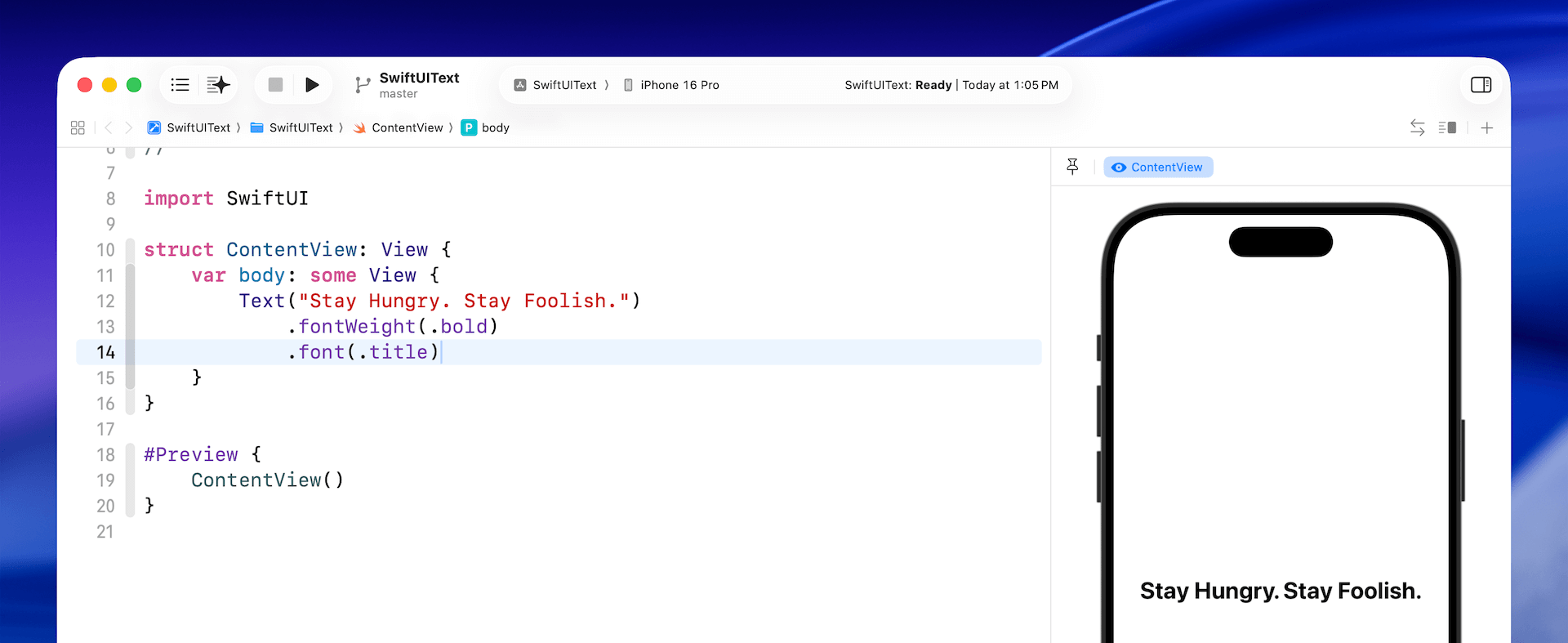
Text("Stay Hungry. Stay Foolish.")
The preview canvas should display the text Stay Hungry. Stay Foolish. on the screen. This is the basic syntax for creating a text view in SwiftUI. You are free to change the text to any value you want, and the canvas will update instantaneously to show you the change.
Changing the Font Type and Color
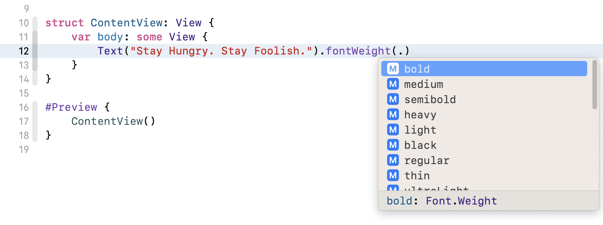
In SwiftUI, you can change the properties (e.g. color, font, weight) of a control by calling methods that are known as Modifiers. Let's say, you want to bold the text. You can use the modifier fontWeight and specify your preferred font weight (e.g. .bold) like this:
Text("Stay Hungry. Stay Foolish.").fontWeight(.bold)
To access a modifier in SwiftUI, use the dot syntax. As you type a dot, Xcode will display a list of possible modifiers or values that you can use. For example, when you type a dot after the fontWeight modifier, you will see various font weight options. You can select bold to make the text bold. To make it even bolder, you can use heavy or black.
When you call fontWeight with the value .bold in SwiftUI, it returns a new view with the text bolded. In SwiftUI, it's possible to chain this new view with other modifiers. For example, if you want to make the bolded text slightly bigger, you can write the code like this:
Text("Stay Hungry. Stay Foolish.").fontWeight(.bold).font(.title)
Since we may chain multiple modifiers together, we usually write the code above in the following format:
Text("Stay Hungry. Stay Foolish.")
    .fontWeight(.bold)
    .font(.title)
The functionality is the same, but I believe that you will find the code above easier to read. We will continue to use this coding convention throughout the rest of this book.
In SwiftUI, the font modifier allows you to change the font properties of a text view. In the code above, we specify the title font style to enlarge the text. SwiftUI provides several built-in text styles, such as title, largeTitle, body, and others. If you want to further increase the font size, you can replace .title with .largeTitle.
Note: You can always to refer the documentation (https://developer.apple.com/documentation/swiftui/font) to find out all the supported values of the font modifier.
You can also use the font modifier to specify the font design. Let's say, if you want the font to be rounded, you can write the font modifier like this:
.font(.system(.title, design: .rounded))
Here, you specify to use the system font with title text style and rounded design. The preview canvas should immediately respond to the change and show you the rounded text.

Dynamic Type is an iOS feature that automatically adjusts the font size based on the user's setting (Settings > Display & Brightness > Text Size). When you use text styles (such as .title), the font size will be adjusted automatically by your app to match the user's preferred font size. This ensures that the text is always legible and accessible, regardless of the user's visual acuity.
To use a fixed-size font, you write the code like this:
.font(.system(size: 20))
This tells the system to use a fixed font size of 20 points.
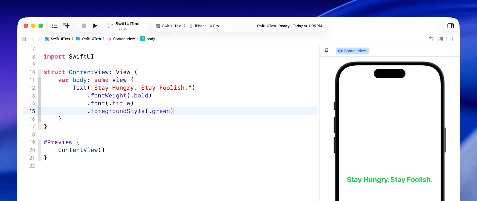
You can chain other modifiers to further customize the text. Let's change the font color. To do that, you use the foregroundStyle modifier like this:
.foregroundStyle(.green)
The foregroundStyle modifier accepts a value of Color. Here we specify .green, which is a built-in color. You may use other built-in values like .red, .purple, etc.
Working with Multiline Text
Text supports multiple lines by default, so it can display a paragraph of text without using any additional modifiers. Replace your current code with the following:
Text("Your time is limited, so don’t waste it living someone else’s life. Don’t be trapped by dogma—which is living with the results of other people’s thinking. Don’t let the noise of others’ opinions drown out your own inner voice. And most important, have the courage to follow your heart and intuition.")
    .fontWeight(.bold)
    .font(.title)
    .foregroundStyle(.gray)
You're free to replace the paragraph of text with your own text. Just make sure it's long enough. Once you have made the change, the design canvas will render a multiline text label.
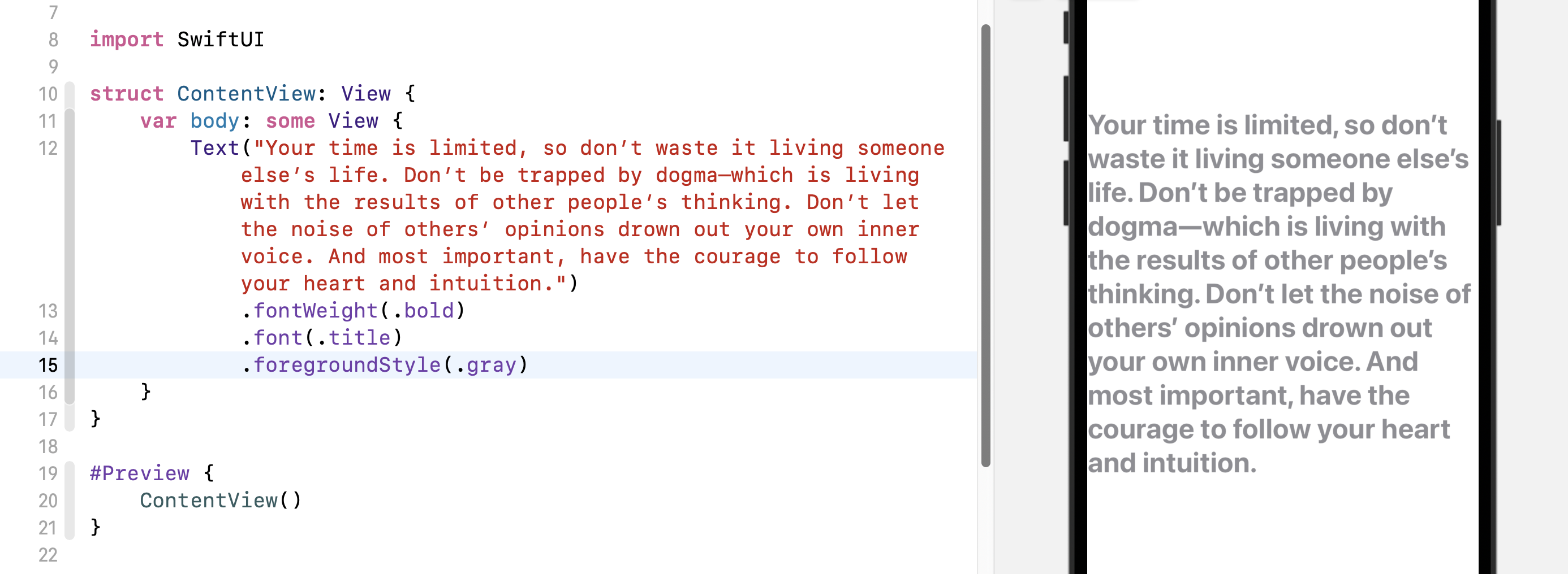
To center align the text, insert the multilineTextAlignment modifier after the .foreground modifier and set its value to .center like this:
.multilineTextAlignment(.center)
In some cases, you may want to limit the number of lines to a certain number. You use the lineLimit modifier to control it. Here is an example:
.lineLimit(3)
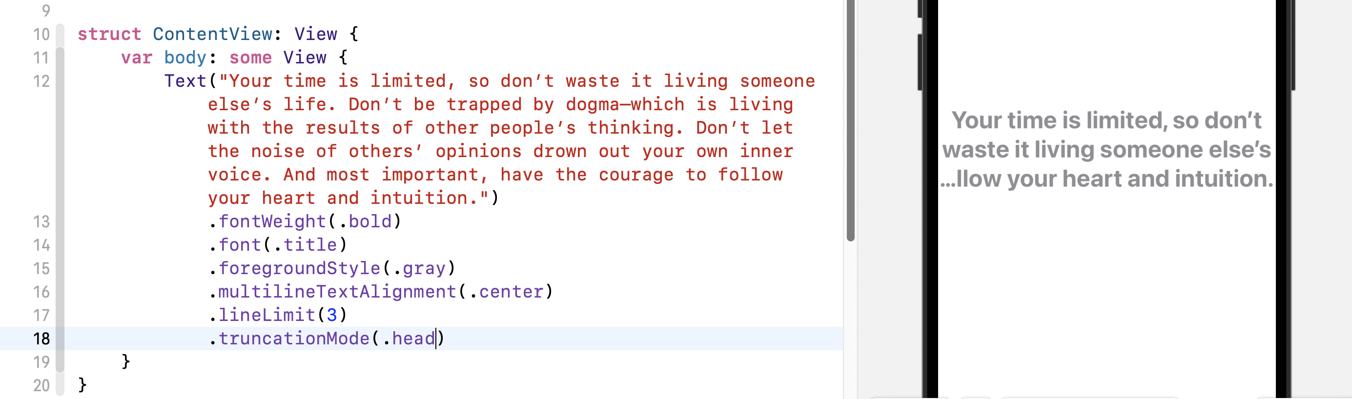
Another modifier, truncationMode specifies where to truncate the text within the text view. You can truncate at the beginning, middle, or end of the text view. By default, the system is set to use tail truncation. To modify the truncation mode of the text, you use the truncationMode modifier and set its value to .head or .middle like this:
.truncationMode(.head)
After the change, your text should look like the figure below.
Earlier, I mentioned that the Text control displays multiple lines by default. The reason is that the SwiftUI framework has set a default value of nil for the lineLimit modifier. You can change the value of .lineLimit to nil and see the result:
.lineLimit(nil)
Setting the Padding and Line Spacing
Normally the default line spacing is good enough for most situations. To alter the default setting, you adjust the line spacing by using the lineSpacing modifier.
.lineSpacing(10)
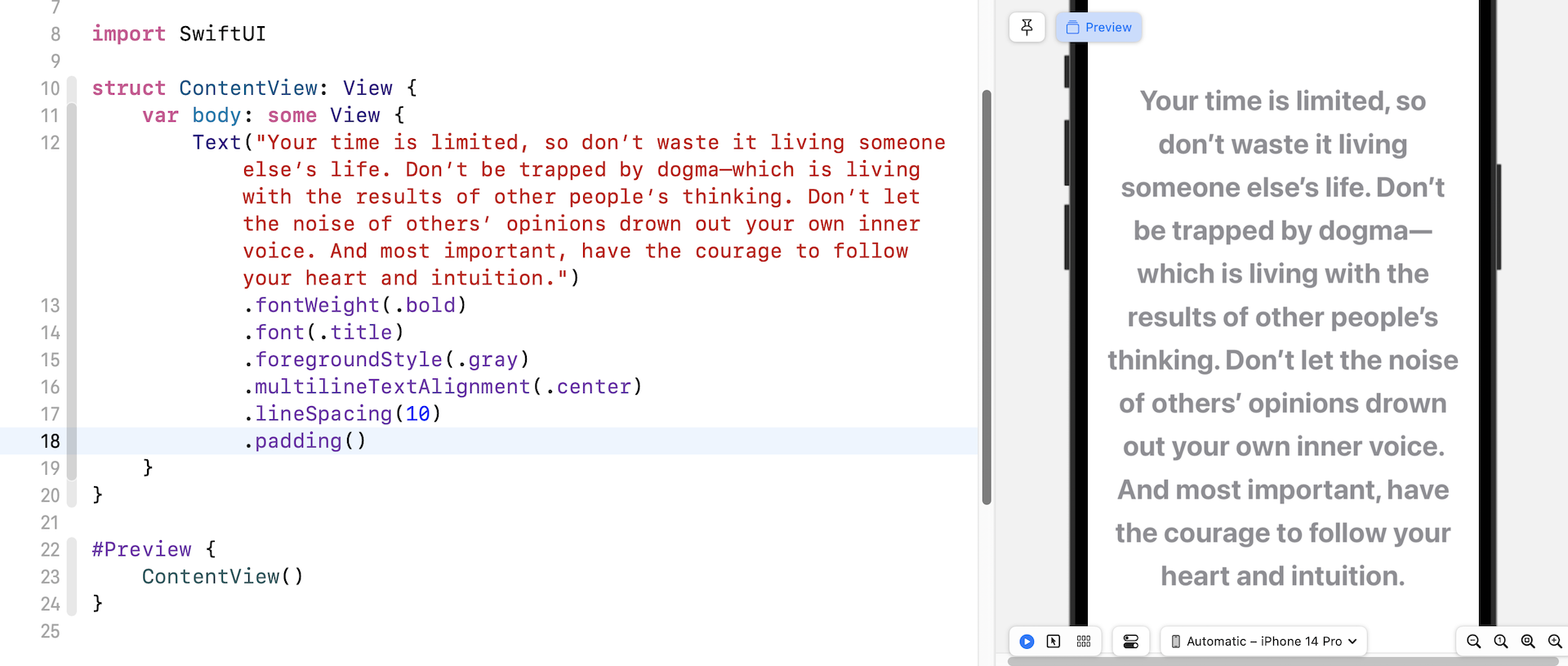
As you see, the text is too close to the left and right side of the edges. To give it some more space, you can use the padding modifier, which adds some extra space to each side of the text. Insert the following line of code after the lineSpacing modifier:
.padding()
Your design canvas should now look like this:
Rotating the Text
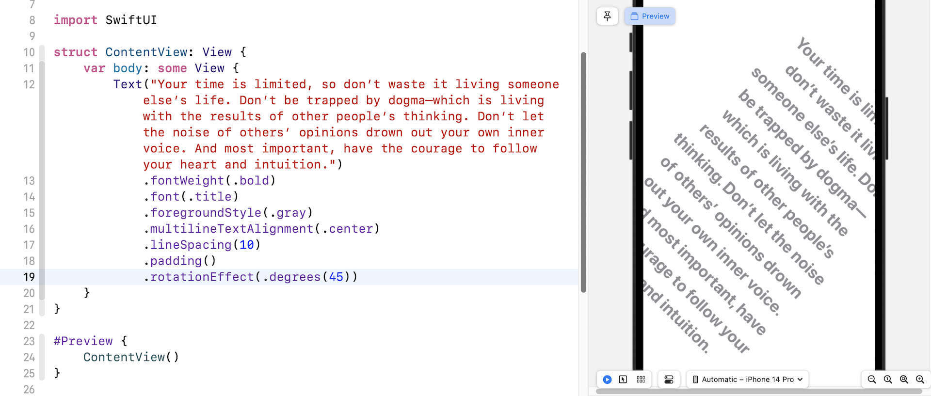
The SwiftUI framework provides a modifier to let you easily rotate the text. You use the rotateEffect modifier and pass the degree of rotation like this:
.rotationEffect(.degrees(45))
If you insert the above line of code after padding(), you will see the text is rotated by 45 degrees.
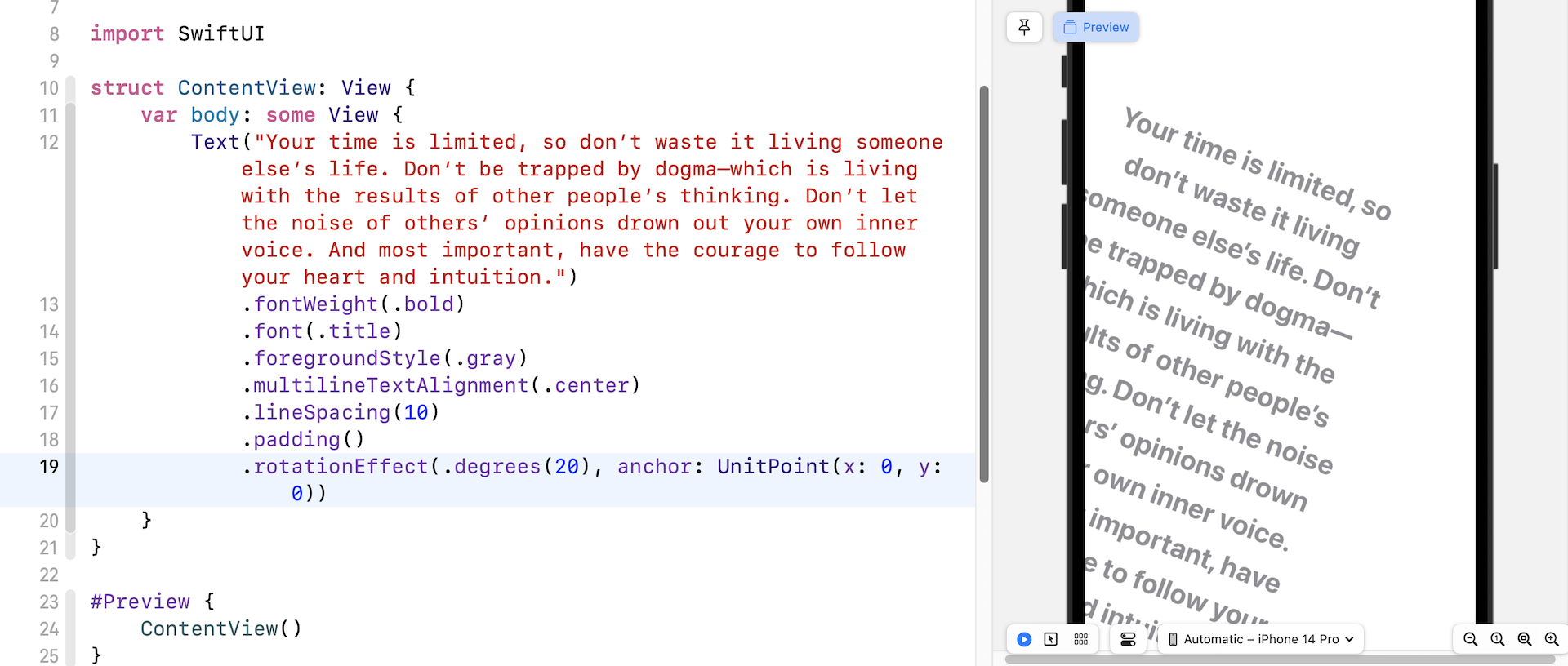
By default, the rotation happens around the center of the text view. If you want to rotate the text around a specific point (say, the top-left corner), you write the code like this:
.rotationEffect(.degrees(20), anchor: UnitPoint(x: 0, y: 0))
We pass an extra parameter anchor to specify the point of the rotation.
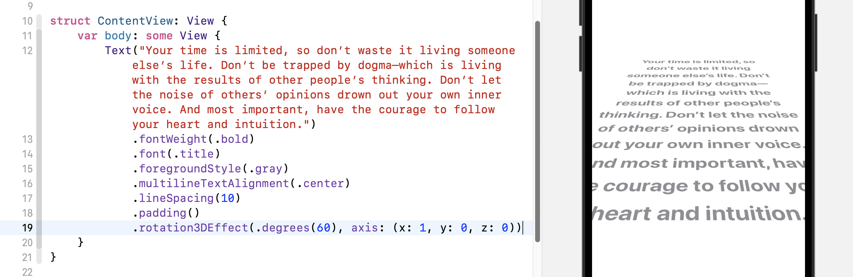
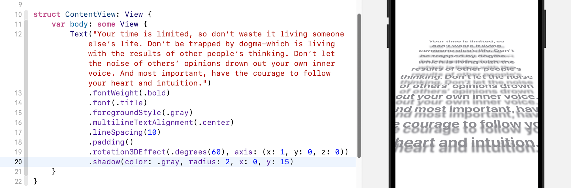
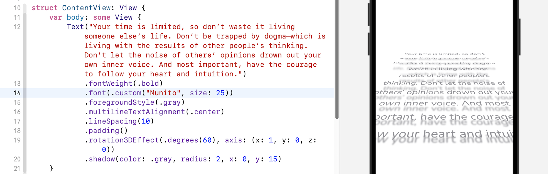
Not only can you rotate the text in 2D, SwiftUI provides a modifier called rotation3DEffect that allows you to create some amazing 3D effects. The modifier takes two parameters: rotation angle and the axis of the rotation. Say, you want to create a perspective text effect, you write the code like this:
.rotation3DEffect(.degrees(60), axis: (x: 1, y: 0, z: 0))
With just a line of code, you have created the Star Wars perspective text!
You can further insert the following line of code to create a drop shadow effect for the perspective text:
.shadow(color: .gray, radius: 2, x: 0, y: 15)
The shadow modifier will apply the shadow effect to the text. All you need to do is specify the color and radius of the shadow. Optionally, you can tell the system the position of the shadow by specifying the x and y values.
Using Custom Fonts
By default, all text is displayed using the system font. Say, if you want to use a custom font that you have found on Google Fonts (e.g. https://fonts.google.com/specimen/Nunito), how can you use the custom font in the app?
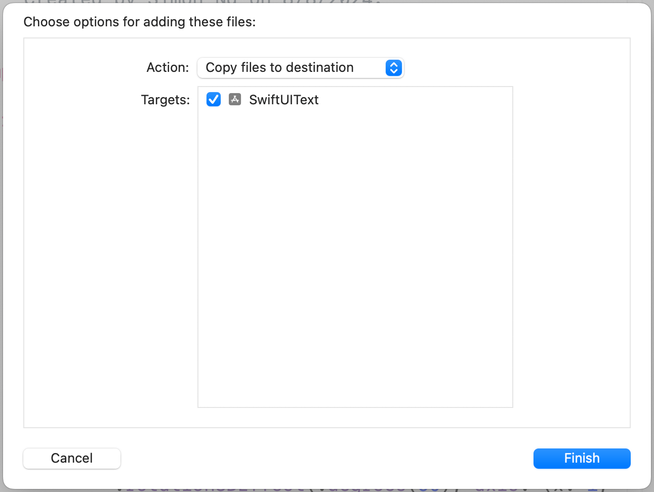
Assuming you've downloaded the font files, you should first add them to your Xcode project. You can simply drag the font files to the project navigator and insert them under the SwiftUIText folder. For the purposes of this demo, I just add the regular font file (i.e. Nunito-Regular.ttf). If you need to use the bold or italic font, you will need to add the corresponding font files as well.
Once you added the font, Xcode will prompt you an option dialog. Please make sure you choose Copy files to destination and check the SwiftUIText target.
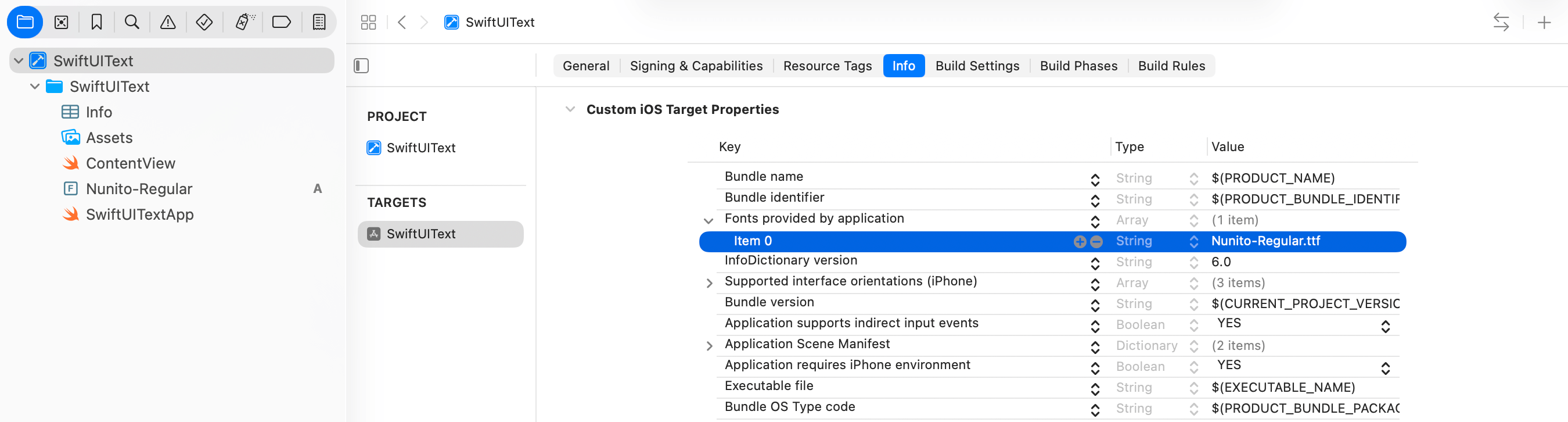
After adding the font file, it is not immediately usable in the app. Xcode requires developers to register the font in the project configuration. To do this, select SwiftUIText in the project navigator and then click on SwiftUIText under Targets. This will bring up the Info tab, where you can configure the project.
Under the Info tab, scroll down to find the Custom iOS Target Properties section. Expand the section by clicking the disclosure indicator next to it, and then click on the + button to add a new row. Set the key name to Fonts provided by application. Expand the entry by clicking on the disclosure indicator and then set the value for item 0 to Nunito-Regular.ttf, which is the font file you have just added. If you have added multiple font files, you can click the + button to add additional items.
Now you can go back to ContentView.swift. To use the custom font, you can replace the following line of code:
.font(.title)
With:
.font(.custom("Nunito", size: 25))
Rather than using the system font style, the code above uses .custom and specifies the preferred font name. The font names can be found in the "Font Book" application. To access Font Book, open Finder and navigate to the "Applications" folder. From there, click on "Font Book" to launch the application.
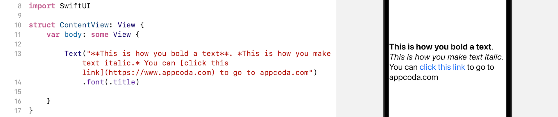
Displaying Markdown Text
Markdown is a lightweight markup language that you can use to add formatting elements to plaintext text documents. Created by John Gruber in 2004, Markdown is now one of the world’s most popular markup languages.
SwiftUI has a built-in capability for rendering Markdown. For those unfamiliar with Markdown, it is a way of styling plain text using a simple and easy-to-read format. If you would like to learn more about Markdown, you can check out this guide (https://www.markdownguide.org/getting-started/).
To use Markdown for rendering text in your SwiftUI app, all you need to do is to specify the text in Markdown format. The Text view will automatically render the text for you. Here is an example:
Text("**This is how you bold a text**. *This is how you make text italic.* You can [click this link](https://www.appcoda.com) to go to appcoda.com")
    .font(.title)
If you write the code in the ContentView file, you will be able to see how the given text is rendered. To test the hyperlink, you will need to run the app in the iOS simulator. When you tap on the link, the iOS device will redirect you to mobile Safari and open the URL.
Summary
Do you enjoy creating user interfaces with SwiftUI? Hopefully, you do. The declarative syntax of SwiftUI makes the code more readable and easier to understand. As you have experienced, it only takes a few lines of code in SwiftUI to create fancy 3D-style text.
To access the full content and the complete source code, please get your copy at https://www.appcoda.com/swiftui.