Chapter 5
Introduction to Auto Layout
Life is short. Build stuff that matters. – Siqi Chen
Wasn't it fun to create the Hello World app? Before we move onto building a real app, we will look into Auto Layout in this chapter.
Auto layout is a constraint-based layout system. It allows developers to create an adaptive UI that responds appropriately to changes in screen size and device orientation. Some beginners find it hard to learn. Even some developers avoid using it. But believe me, you won't be able to live without it when developing an app today.
When iPhone was first released over ten years ago, it only came with a single screen size: 3.5-inch. Later we had the 4-inch iPhone. In September 2014, Apple introduced the iPhone 6 and 6 Plus. Now Apple's iPhones are available in different screen sizes including 3.5-inch, 4-inch, 4.7-inch, 5.5-inch, 5.8-inch, 6.1-inch, 6.5-inch, and 6.7-inch displays. When you design your app UI, you have to cater for all these screen sizes. If your app is going to support both iPhone and iPad (also known as a universal app), you will need to make sure the app fits additional screen sizes including 7.9-inch, 9.7-inch, 10.5-inch, 11-inch, and 12.9-inch.
Without using auto layout, it would be very hard for you to create an app that supports all screen resolutions. This is why I want to teach you auto layout at the very beginning of this book, rather than jumping right into coding a real app. It will take you some time to master the skill but I want you to understand the underlying concept. In this chapter and the one that follows, I want to help you build a solid foundation on designing an adaptive user interface.
Quick note: Auto layout is not as difficult as some developers thought. Once you understand the basics, together with stack views you will learn in the next chapter, you will be able to use auto layout to create complex user interfaces for all types of iOS devices.
Why Auto Layout?
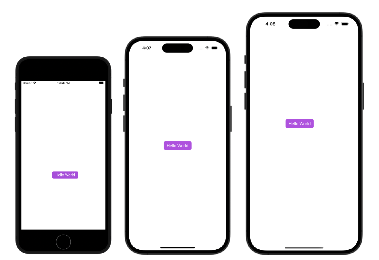
Let me give you an example, and you'll have a better idea why auto layout is needed. Open the HelloWorld project you built in chapter 3. Instead of running the app on iPhone 15 Pro simulator, run it using the iPhone SE or 15 Pro Max simulators. You'll end up with the results illustrated in figure 5-1. It turns out that the button isn't centered when running on other iPhone devices, except the one with a 6.1-inch screen.
Let's try one more thing.
Click the Stop button and run the app using the iPhone 12 Pro simulator. After the simulator launches, go up to the menu and select Device > Rotate Left (or Rotate Right) from the menu. This rotates the device to landscape mode. Alternatively, you can press command+left arrow/right arrow to rotate the device sideway. Again, the Hello World button is not centered (and it even goes off the screen).
Why? What's wrong with it?
As you know, the iPhone devices have different screen dimensions:
- For iPhone SE (old model), the screen in portrait mode consists of 320 points (or 640 pixels) horizontally and 568 points (or 1136 pixels) vertically.
- For iPhone 6/6s/7/8/SE (new model), the screen consists of 375 points (or 750 pixels) horizontally and 667 points (or 1334 pixels) vertically.
- For iPhone 6/6s/7/8 Plus, the screen consists of 414 points (or 1242 pixels) horizontally and 736 points (or 2208 pixels) vertically.
- For iPhone X/XS/11/12 Pro/13 mini, the screen consists of 375 points (or 1125 pixels) horizontally and 812 points (or 2436 pixels) vertically.
- For iPhone 13/14/13 Pro/14 Pro, the screen consists of 390 points (or 1170 pixels) horizontally and 844 points (or 2532 pixels) vertically.
- For iPhone XR/11/12, the screen consists of 414 points (or 828 pixels) horizontally and 896 points (or 1792 pixels) vertically.
- For iPhone XS Max/11/12 Pro Max, the screen consists of 414 points (or 1242 pixels) horizontally and 896 points (or 2688 pixels) vertically.
- For iPhone 13/14 Pro Max, the screen consists of 428 points (or 1284 pixels) horizontally and 926 points (or 2778 pixels) vertically.
- For iPhone 15 Pro, the screen consists of 393 points (or 1179 pixels) horizontally and 852 points (or 2556 pixels) vertically.
- For iPhone 15 Pro Max, the screen consists of 430 points (or 1290 pixels) horizontally and 932 points (or 2796 pixels) vertically.
- For iPhone 4s, the screen consists of 320 points (or 640 pixels) and 480 points (or 960 pixels).
Why Points instead of Pixels?
Back in 2007, Apple introduced the original iPhone with a 3.5-inch display with a resolution of 320x480. That is 320 pixels horizontally and 480 pixels vertically. Apple retained this screen resolution with the succeeding iPhone 3G and iPhone 3GS. Obviously, if you were building an app at that time, one point corresponds to one pixel. Later, Apple introduced iPhone 4 with retina display. The screen resolution was doubled to 640x960 pixels. So one point corresponds to two pixels for retina display. The point system makes our developers' lives easier. No matter how the screen resolution is changed (say, the resolution is doubled again to 1280x1920 pixels), we still deal with points and the base resolution (i.e. 320x480 for iPhone 4/4s or 320x568 for iPhone 5/5s/SE). The translation between points and pixels is handled by iOS.
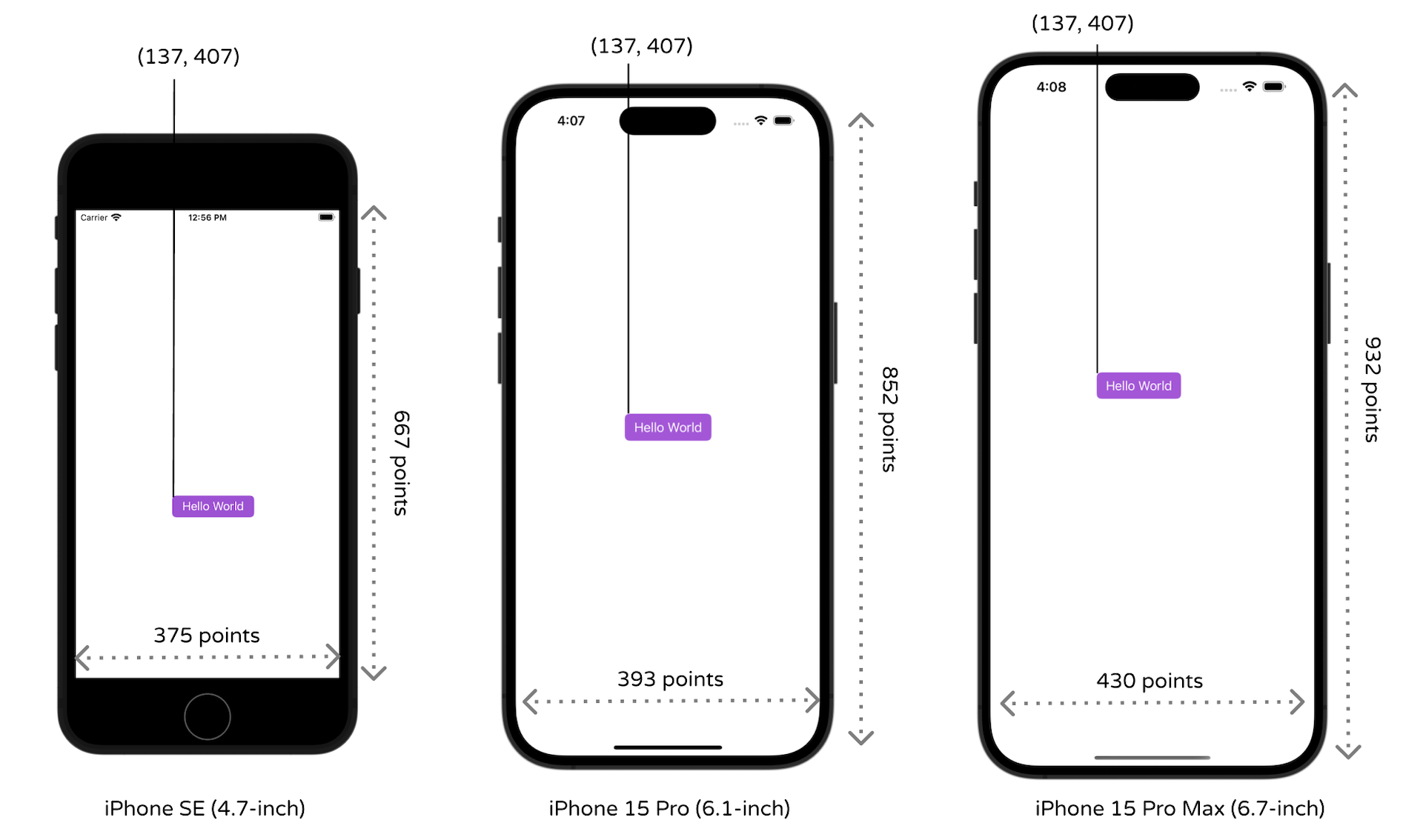
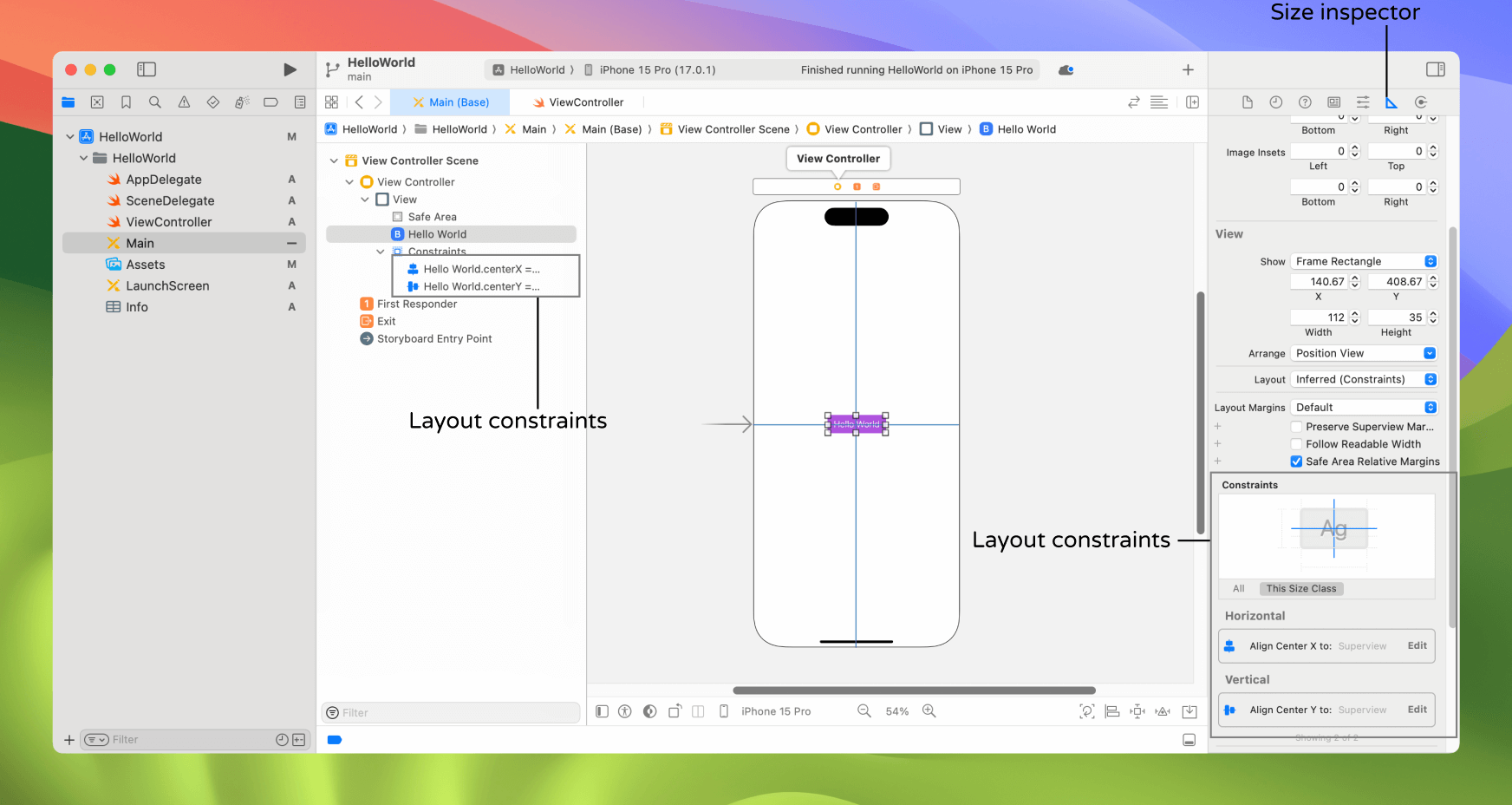
Without using auto layout, the position of the button we lay out in the storyboard is fixed. In other words, we "hard-code" the frame origin of the button. In our example, the "Hello World" button's frame origin is set to (137, 407). You can find out the absolute position in the Size inspector, which is the button next to the Attributes inspector.
Whether you're using a 4.7-inch or 6.7-inch simulator, iOS draws the button in the specified position. Figure 5-2 illustrates the frame origin on different devices. This explains why the "Hello World" button can only be centered on iPhone 15 Pro and it is shifted away from the screen center on other iOS devices, as well as, in landscape orientation.
Obviously, we want the app to look good on all iPhone models and in both portrait & landscape orientation. This is why we have to learn auto layout. It's the answer to the layout issues that we have just talked about.
Auto Layout is All About Constraints
As mentioned before, auto layout is a constraint-based layout system. It allows developers to create an adaptive UI that responds appropriately to changes in screen size and device orientation. Okay, it sounds good. But what does the term "constraint-based layout" mean?
Let me put it in a more descriptive way. Consider the "Hello World" button again, how do you describe its position if you want to place the button at the center of the view? You would probably describe it like this:
The button should be centered both horizontally and vertically, regardless of the screen resolution and orientation.
Here you actually define two constraints:
- center horizontally
- center vertically
These constraints express rules for the layout of the button in the interface.
Auto layout is all about constraints. While we describe the constraints in words, the constraints in auto layout are expressed in mathematical form. For example, if you're defining the position of a button, you might want to say "the left edge should be 30 points from the left edge of its containing view." This translates to button.left = (container.left + 30).
Fortunately, we do not need to deal with the formulas. All you need to know is how to express the constraints descriptively and use Interface Builder to create them.
Okay, that's quite enough for the auto layout theory. Now let's see how to define layout constraints in Interface Builder to center the "Hello World" button.
Live Previewing in Interface Builder
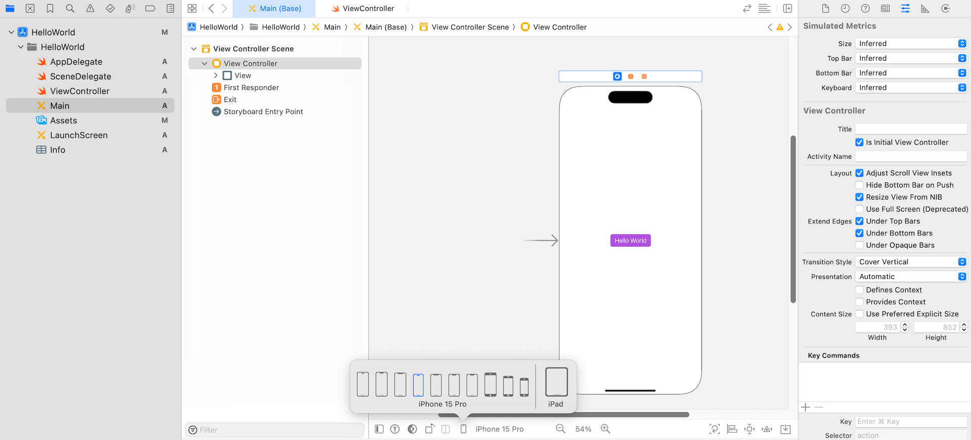
First, open Main.storyboard of your HelloWorld project (or download it from http://www.appcoda.com/resources/swift59/HelloWorld.zip). Before we add the layout constraints to the user interface, let me introduce a handy feature in Xcode.
You can test the app UI in simulators to see how it looks in different screen sizes. However, Xcode provides a configuration bar in Interface Builder for developers to live preview the user interface.
For my Interface Builder, it is set to preview the UI on iPhone 15 Pro. Your default device may also be differed. To see how your app looks on a specific device, click the device button to choose your preferred iPhone/iPad devices to test. You can also alter the device's orientation to see how it affects your app's UI by clicking the orientation button. Figure 5-3 shows a live preview of the Hello World app on iPhone 15 Pro.
The configuration bar is a great feature for previewing the UI on different devices. Take some time to play around with it.
Using Auto Layout to Center the Button
Now let's continue to talk about auto layout. Xcode provides two ways to define auto layout constraints:
- Auto layout bar
- Control-drag
We'll demonstrate both approaches in this chapter. First, we begin with the auto layout bar. At the bottom-right corner of the Interface Builder editor, you should find 5 buttons. These buttons are from the layout bar. You can use them to define various types of layout constraints and resolve layout issues.

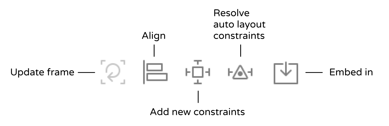
Each button has its own function:
- Align – Create alignment constraints, such as aligning the left edges of two views.
- Add new constraints – Create spacing constraints, such as defining the width of a UI control.
- Embed in – Embed views into a stack view (or other views). We will further discuss it in the next chapter.
- Resolve auto layout issues – Resolve layout issues.
- Update frames - Update the frame's position and size in reference to the given layout constraints.
As discussed earlier, to center the "Hello World" button, you have to define two constraints: center horizontally and center vertically. Both constraints are with respect to the view.
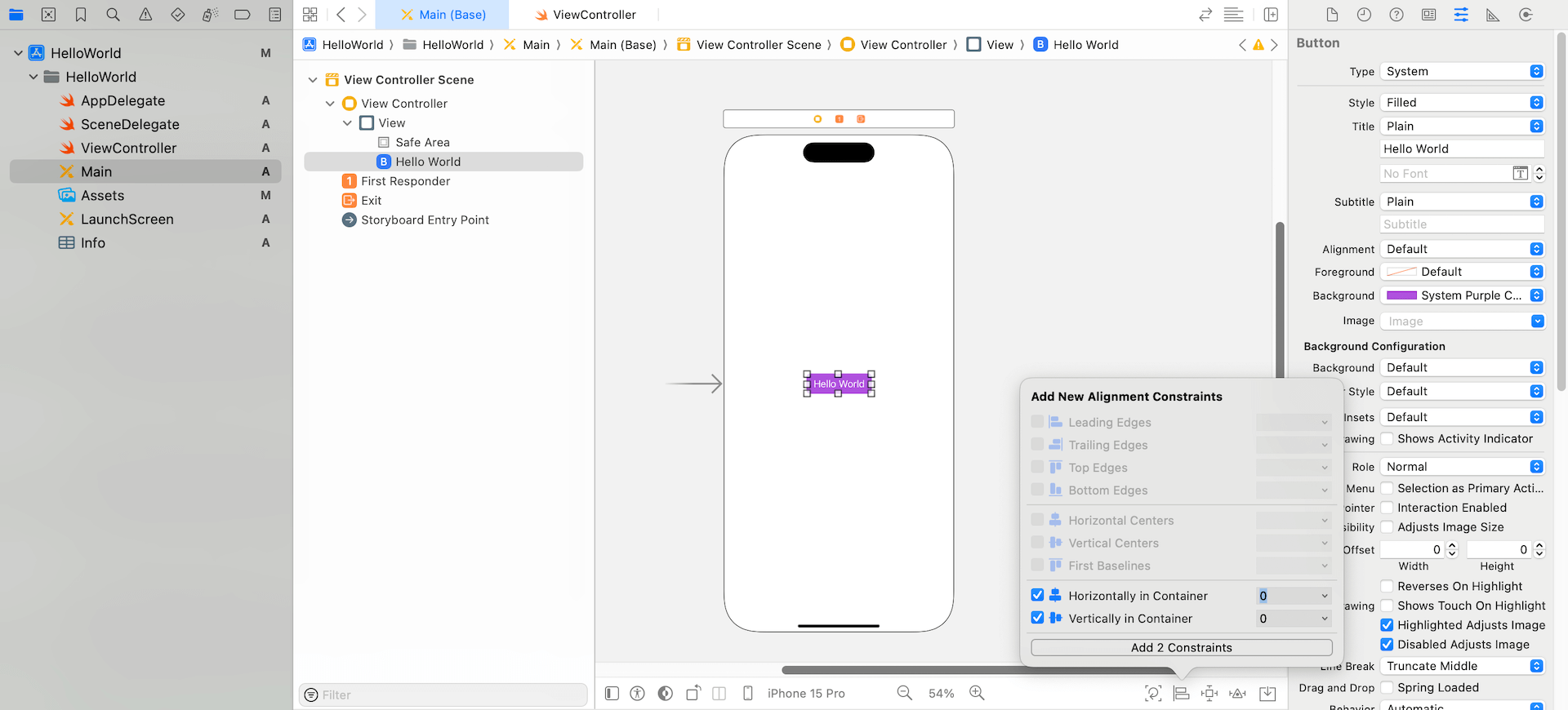
To create the constraints, we use the Align button. First, select the Hello World button in Interface Builder and then click the Align icon in the layout bar. In the pop-over menu, check both "Horizontally in Container" and "Vertically in Container" options. Then click the "Add 2 Constraints" button.
Quick tip: You can press command+0 to hide the project navigator. This will free up more screen space for you to work on the app design.
You should now see a set of constraint lines in blue. If you expand the Constraints option in the document outline view, you will find two new constraints for the button. These constraints ensure the button is always positioned at the center of the view. Alternatively, you can view these constraints in the Size inspector.
Quick note: When your view layout is being configured correctly and there is no ambiguity, the constraint lines are in blue.
Okay, you're ready to test the app. You can click the Run button to launch the app on iPhone 8 (or iPhone SE). Alternatively, just switch to another device or change the device's orientation by using the configuration bar to verify the layout. The button should be centered perfectly, regardless of screen size and orientation.
Resolving Layout Constraint Issues
The layout constraints that we have just set are perfect. But that is not always the case. Xcode is intelligent enough to detect any constraint issues.
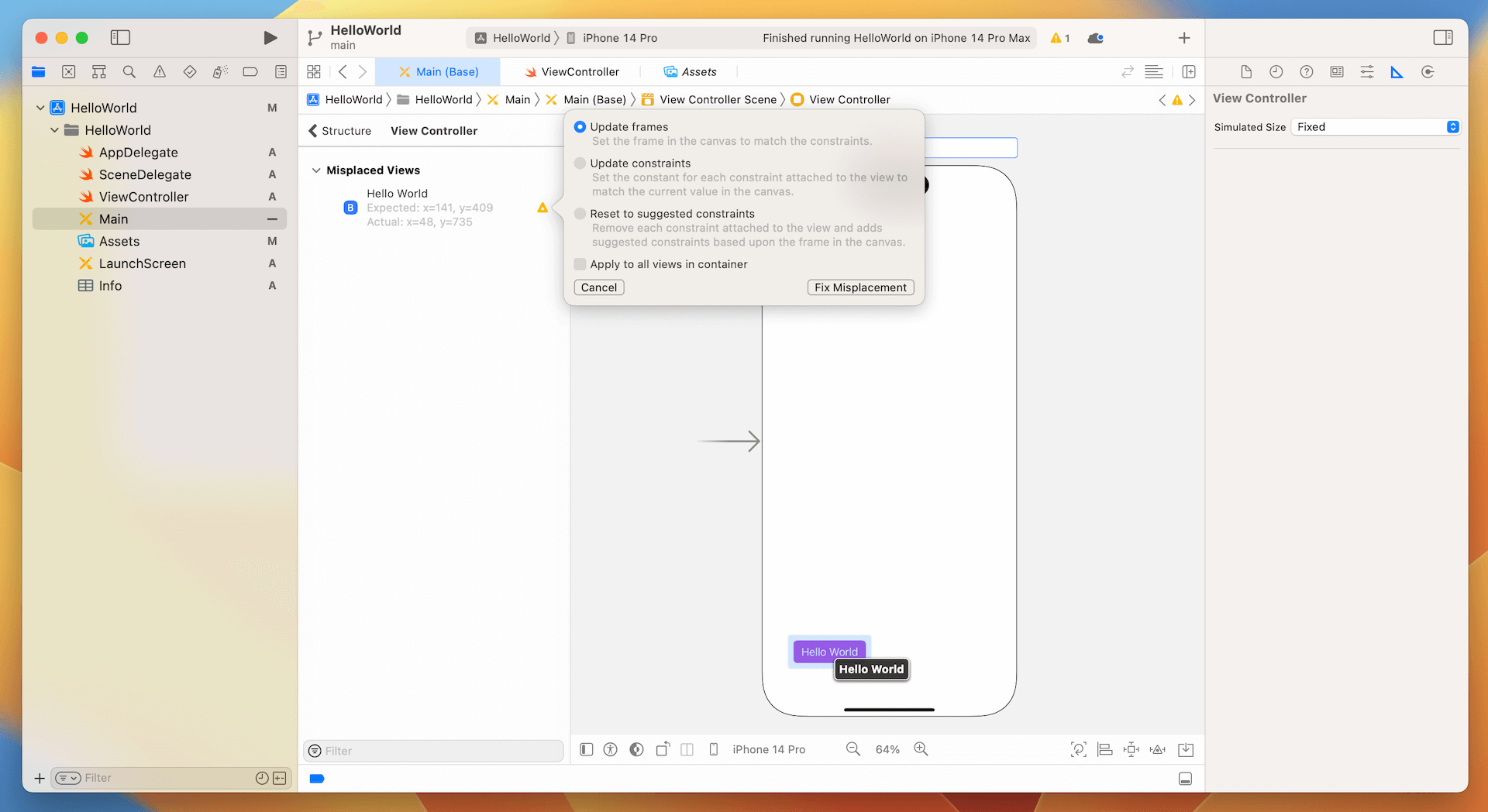
Now, try to drag the Hello World button to the lower-left part of the screen. Xcode immediately detects some layout issues and the corresponding constraint lines turn orange that indicates a misplaced item.
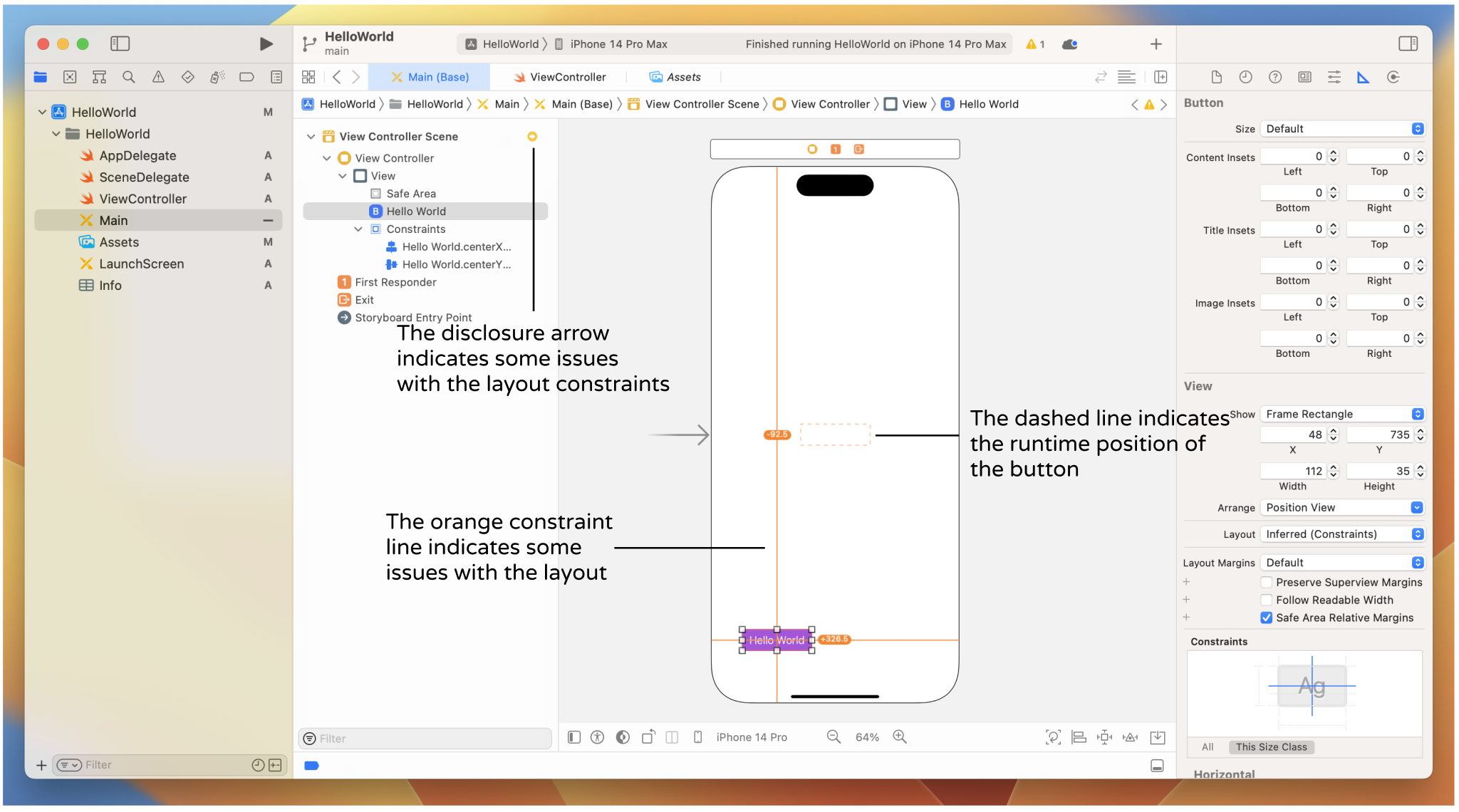
Auto layout issues occur when you create ambiguous or conflicting constraints. Base on the constraints configured, they specified that the button should be vertically and horizontally centered in the container (i.e. the view). However, the button is now placed at the lower-left corner of the view. Interface Builder is now confused, thus it uses orange lines to indicate the layout issues. The dash lines indicate the expected position of the button.
When there is any layout issue, the Document Outline view displays a disclosure arrow (red/orange). Now click the disclosure arrow to see a list of the issues. For layout issues like this one, Interface Builder is smart enough to resolve the layout issues for us. Click the indicator icon next to the issue and a pop-over shows you a number of solutions. In this case, select the "Update frames" option and click "Fix Misplacement" button. The button will then be moved to the center of the view.
Alternatively, you can simply click the "Update frames" button of the layout bar to resolve the issue.
This layout issue was triggered manually. I just wanted to demonstrate how to find the issues and fix them. As you go through the exercises in the later chapters, you will probably face a similar layout issue. You should know how to resolve layout issues easily and quickly.
Adding a Label
Now that you have some ideas about auto layout and the preview feature, let's add a label to the lower-right part of the view and see how to define the layout constraints for the label. Labels in iOS are usually used for displaying simple text and messages.
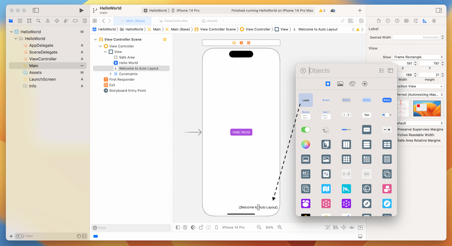
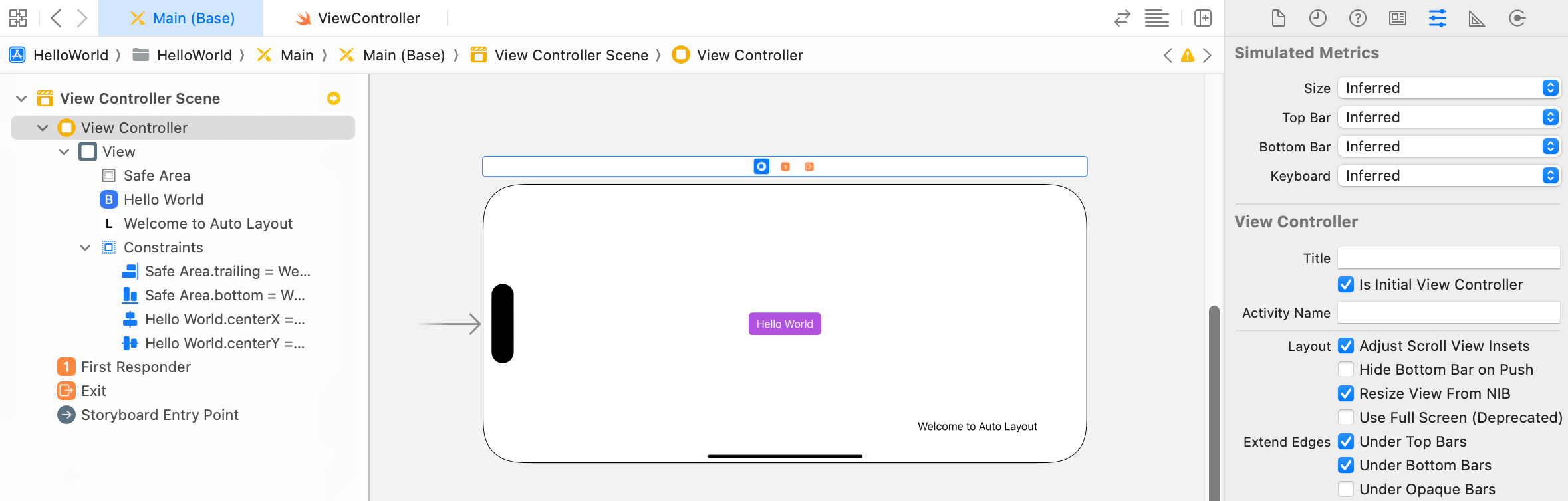
In the Interface Builder editor, click the Object library button to open the Object library. Drag a label from the Object library and place it near the lower-right corner of the view. Double-click the label and change it to "Welcome to Auto Layout" or whatever title you want.
If you switch to another iPhone model (say, iPhone 15 Pro Max), you should notice the label moves a bit away from the edge (see figure 5-10). Click the Orientation icon in the configuration bar to rotate the device to landscape orientation. The label even disappears.
How can you resolve this issue? Obviously, we need to set up a couple of constraints to make it work properly. The question is: what constraints should we add?
Let's try to describe the requirement of the label in words. You probably describe it like this:
The label should be placed at the lower-right corner of the view.
That's okay, but not precise enough. A more precise way to describe the location of the label is like this:
The label is located 20 points away from the right margin of the view and 20 points away from the bottom of the view.
This is much better. When you describe the position of an item precisely, you can easily come up with the layout constraints. Here, the constraints of the label are:
The label is 20 points away from the right margin of the view.
The label is 20 points away from the bottom of the view.
In auto layout, we refer this kind of constraints as spacing constraints. To create these spacing constraints, you can use the "Add new constraints" button of the layout button. But this time we'll use the Control-drag approach to apply auto layout. In Interface Builder, you can control-drag from an item to itself or to another item along the axis for which you want to add constraints.
To add the first spacing constraint, hold the control key and drag from the label to the right until the view becomes highlighted in blue. Now release the button, you'll see a pop- over menu showing a list of constraint options. Select "Trailing space to Safe Area" to add a spacing constraint from the label to the view's right margin.
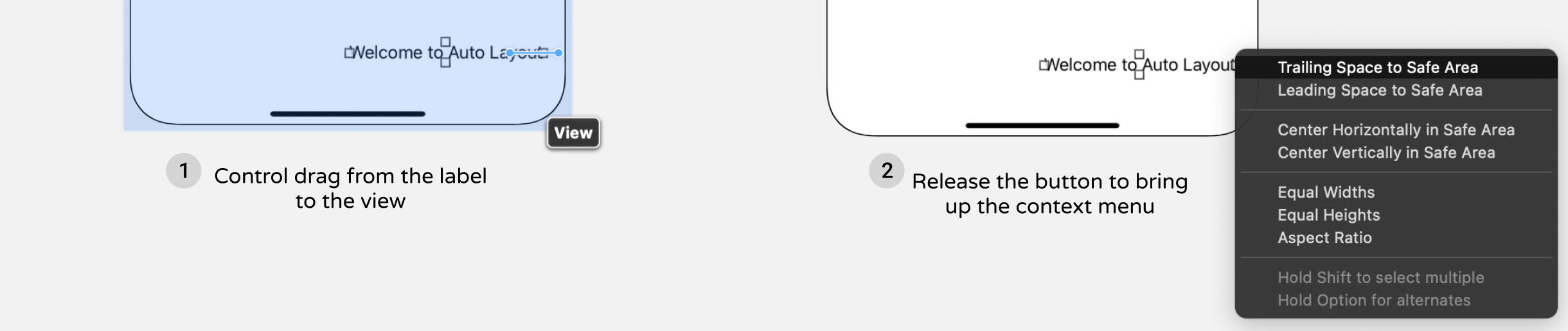
In the document outline view, you should see the new constraint. Interface Builder now displays constraint lines in red indicating that there are some missing constraints. That's normal as we haven't defined the second constraint.
Now control-drag from the label to the bottom of the view. Release the button and select "Bottom Space to Safe Area" in the shortcut menu. This creates a spacing constraint from the label to the bottom layout guide of the view.
Once you added the two constraints, all constraint lines should be in solid blue. When you preview the UI on iPhone 15 Pro Max again, the label should display properly and even in landscape mode.
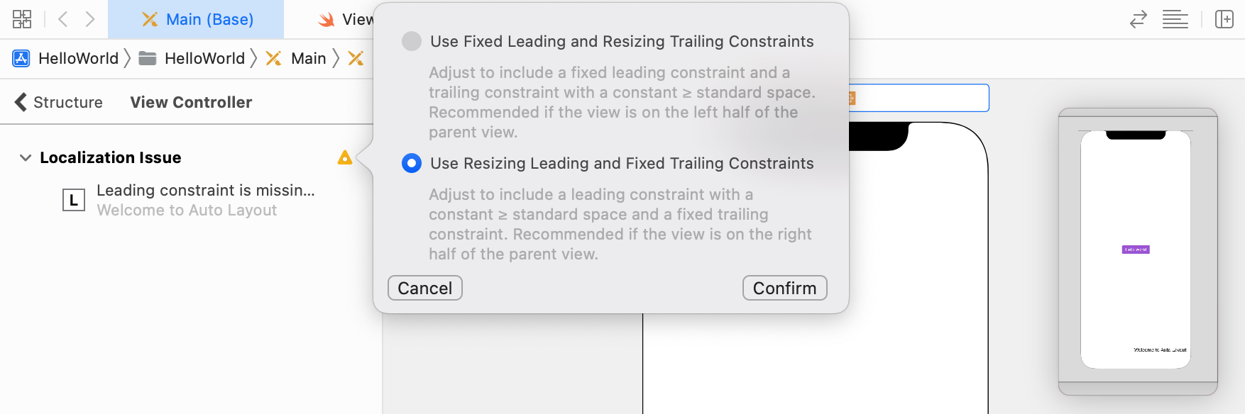
Great! You've defined the constraints correctly. Having that said, you may notice the yellow indicator in the document outline. If you click the indicator, you will find a layout warning related to localization.
Why is that?
Our demo app now only supports English. The layout constraints we defined work perfectly for English. But what if it requires to support other languages? Will the current layout constraints still work for the right-to-left languages (e.g. Arabic)?
In Xcode 15, Interface Builder automatically reviews your layout constraints and sees if they are suitable for all languages. If it finds some problems, it will issue a localization warning. To fix the issue, you can choose the second option to add the leading constraint.
Safe Areas
In the document outline, did you notice an item called Safe Area? And, did you remember the spacing constraints we defined earlier were related to Safe Area? We defined two spacing constraints:
- Trailing space to Safe Area
- Bottom space to Safe Area
So, what is safe area?
Safe area was first introduced in Xcode 9 to replace top & bottom layout guides used in older versions of Xcode. Rather than explaining the term in words, it is better to show you what Safe Area is.
Go to the document outline and select Safe Area. The area in blue is the safe area. Safe area is actually a layout guide, representing the portion of your view that is unobscured by bars and other content. In the view shown in figure 5-15, the safe area is the entire view excluding the status bar.
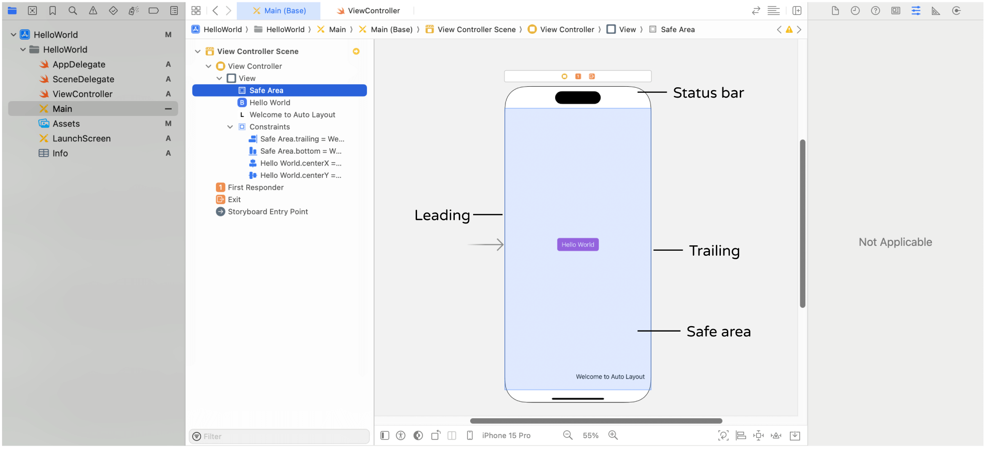
The safe area layout guides help developers easier to work with layout constraints because the safe area updates itself automatically when the view is covered by navigation bar or other content.
Take a look at figure 5-16. The Hello World button is defined to place 20 points under the top anchor of the safe area. If the view doesn't have any navigation bar or tab bar, the safe area is the entire view excluding the status bar. Thus, the button is placed 20 points below the status bar.
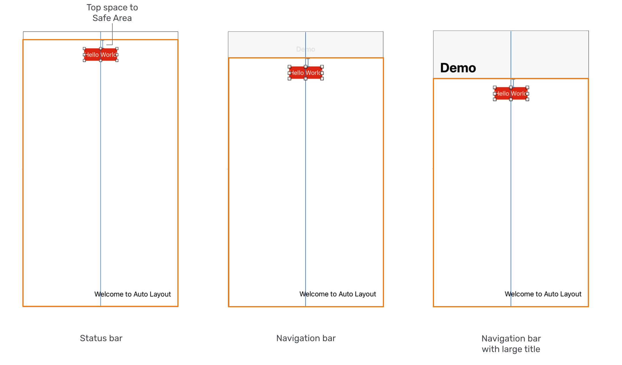
In case if the view contains a navigation bar, whether it uses the standard title or large title, the safe area adjusts itself automatically. The button is then placed below the navigation bar. Therefore, as long as the UI object is constrained relative to the safe area layout guides, your interface will layout correctly even if you add a navigation or tab bar to the interface.
Editing Constraints
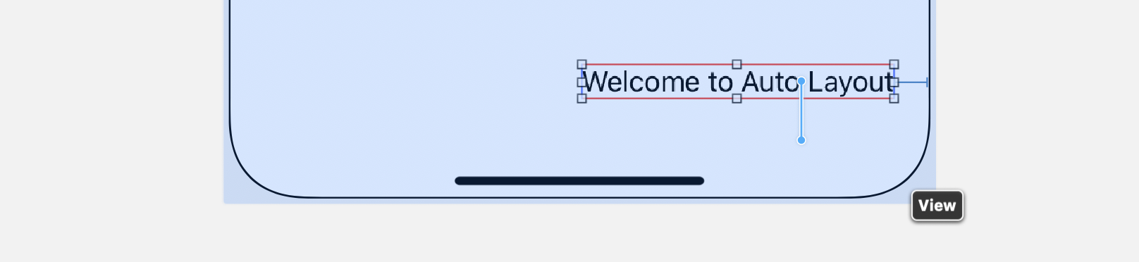
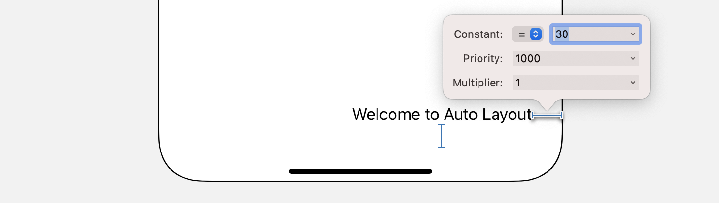
The "Welcome to Auto Layout" label is now located 16 points away from the trailing anchor of the safe area. What if you want to increase the space between the label and the right side of the view? Interface Builder provides a convenient way to edit the constant of a constraint.
You can simply choose the constraint in the document outline view or select the constraint directly. In the Attributes inspector, you can find the properties of this constraint including relation, constant, and priority. You can change the value of Constant to 30 to add some extra space.
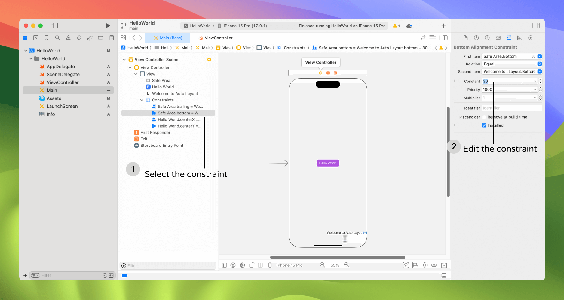
Alternatively, you can double-click the constraint to edit its properties through the popover menu.
Your Exercise
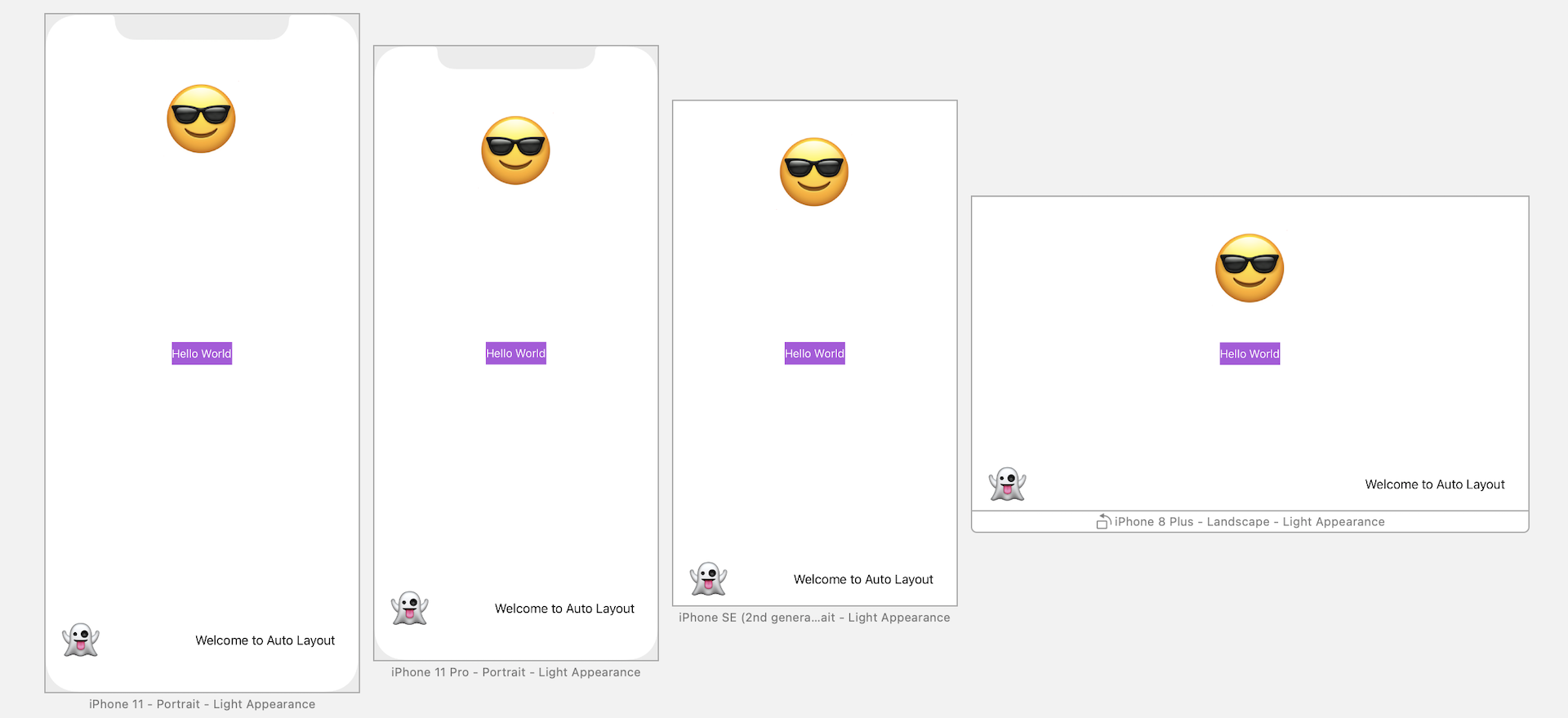
By now, I hope you should have some basic ideas about how to lay out your app UI and make it fit for all screen sizes. Let's have a simple exercise before moving on to the next chapter. All I need you to do is add two more emoji labels to the view. Figure 5-19 shows the expected result. Let me give you some hints:
- The "smiling face" emoji label should be 33 points away from the top anchor of the safe area, and centered horizontally.
- The "ghost" label has two spacing constraints.
You can adjust the font size of the label by editing its Font option in the Attributes inspector. However, even if you do not know how to do it, that's completely fine. I will show you how in later chapters. For now, just focus on defining the layout constraints.
Summary
In this chapter, we went through the basics of Auto Layout. It's just the basics because I don't want to scare you away from learning auto layout. As we dig deeper and create a real app, we'll continue to explore some other features of auto layout.
Most of the beginners (and even some experienced iOS programmers) avoid using auto layout because it looks confusing. If you thoroughly understand what I have covered in this chapter, you're on your way to becoming a competent iOS developer. The original iPhone was launched in 2007. Over these years, there have been tons of changes and advancements in the area of iOS development. Unlike the good old days when your apps just needed to run on a 3.5-inch, non-retina device, your apps now have to cater to various screen resolution and sizes. This is why I devoted a whole chapter to Auto Layout.
So take some time to digest the materials.
To access the full version of the book, please get the full copy here. You will also be able to access the full source code of the project.