Chapter 6
Designing UI Using Stack Views
To the user, the interface is the product.
- Aza Raskin
I have given you a brief overview of auto layout. The examples that we have worked on were pretty easy. However, as your app UI becomes more complex, you will find it more difficult to define the layout constraints for all UI objects. Starting from iOS 9, Apple introduced a powerful feature called Stack Views that would make our developers' life a little bit simpler. You no longer need to define auto layout constraints for every UI objects. Stack views will take care of most of that.
In this chapter, we will continue to focus on discussing UI design with Interface Builder. I will teach you how to build a more comprehensive UI, which you may come across in a real-world application. You will learn how to:
- Use stack views to lay out user interfaces.
- Use image views to display images.
- Manage images using the built-in asset catalog.
- Adapt stack views using Size Classes.
On top of the above, we will explore more about auto layout. You'll be amazed how much you can get done without writing a line of code.
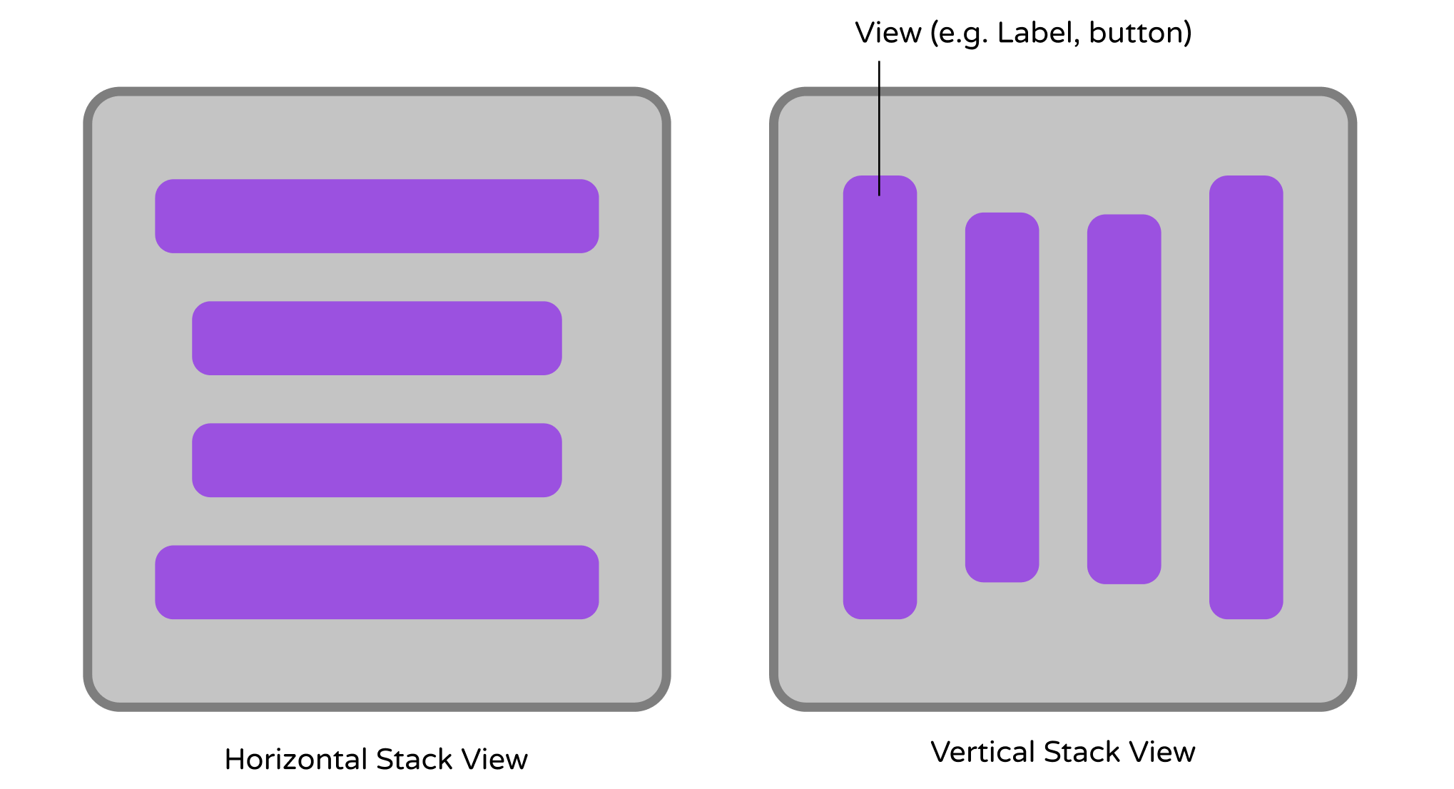
What is a Stack View
First things first, what is a stack view? The stack view provides a streamlined interface for laying out a collection of views in either a column or a row. In Keynote or Microsoft Powerpoint, you can group multiple objects together so that they can be moved or resized as a single object. Stack views offer a very similar feature. You can embed multiple UI objects into one by using stack views. In most cases, for views embedded in a stack view, you no longer need to define auto layout constraints.
Quick note: For views embedded in a stack view, they are usually known as arranged views.The stack view manages the layout of its subviews and automatically applies layout constraints for you. That means the subviews are ready to adapt to different screen sizes. Furthermore, you can embed a stack view in another stack view to build more complex user interfaces. Sounds cool, right?
Don’t get me wrong. It doesn’t mean you do not need to deal with auto layout. You still need to define the layout constraints for the stack views. It just saves you time from creating constraints for every UI element and makes it super easy to add/remove views from the layout.
Xcode provides two ways to use stack view:
- You can drag a Stack View (horizontal / vertical) from the Object library, and put it right into the storyboard. You then drag and drop view objects such as labels, buttons, image views into the stack view.
- Alternatively, you can use the Stack option in the auto layout bar. For this approach, you select two or more view objects and then choose the Stack option. Interface Builder then embeds the objects into a stack view and resizes it automatically.
If you still have no ideas about stack views, no worries. We’ll go through both approaches in this chapter. Just read on and you’ll understand what I mean in a minute.
The Sample App
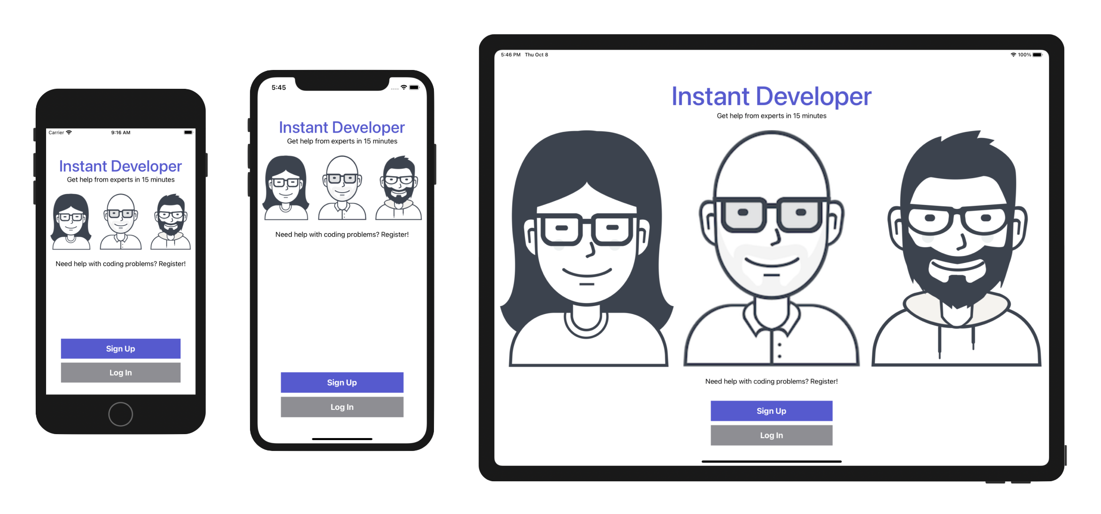
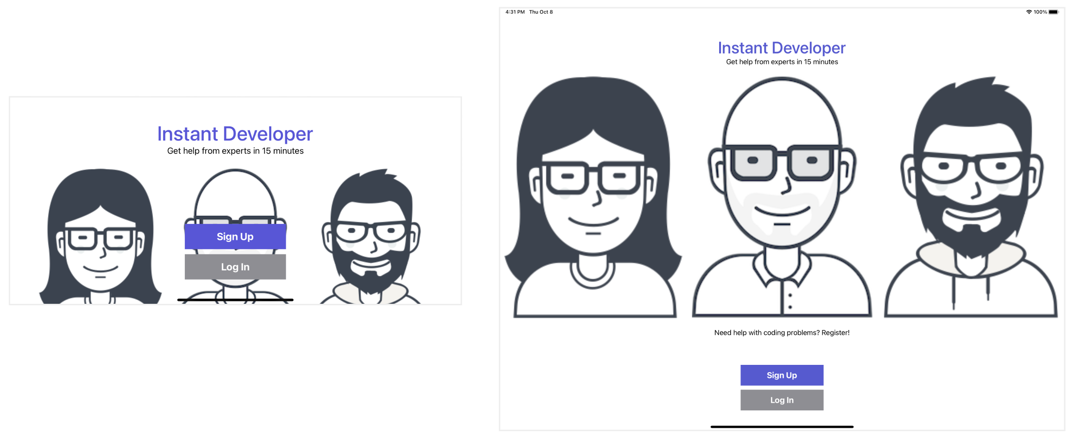
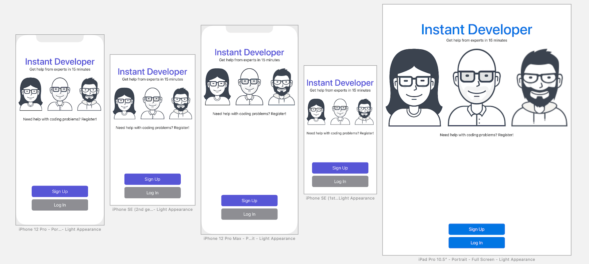
Let’s first take a look at the demo app we’re going to build. I will show you how to lay out a welcome screen like this using stack views:
You can create the same UI without using stack views. But you will soon see how stack views completely change the way how you layout user interfaces. Again, there is no coding in this chapter. We will just focus on using Interface Builder to build an adaptive user interface. This is a crucial skill you will need in app development.
Creating a New Project
Now fire up Xcode and create a new Xcode project. Choose Application (under iOS) > App and click "Next". You can simply fill in the project options as follows:
- Product Name: StackViewDemo – This is the name of your app.
- Team: Just leave it as it is.
- Organization Identifier: com.appcoda – It's actually the domain name written the other way round. If you have a domain, you can use your own domain name. Otherwise, you may use "com.appcoda" or just fill in "edu.self".
- Bundle Identifier: com.appcoda.StackViewDemo - It's a unique identifier of your app, which is used during app submission. You do not need to fill in this option. Xcode automatically generates it for you.
- Interface: Storyboard - As explained before, Xcode now supports two ways to build UI. Please change the option to
Storyboardbecause this book uses UIKit and Storyboard for UI development. - Language: Swift – We'll use Swift to develop the project.
- Use Core Data: [unchecked] – Do not select this option. You do not need Core Data for this simple project.
- Include Tests: [unchecked] – Do not select this option. You do not need any tests for this simple project.
Click "Next" to continue. Xcode then asks you where to save the StackViewDemo project. Pick a folder on your Mac. Click "Create" to continue.
Adding Images to the Xcode Project
As you may notice, the sample app has three images. The question is how can you bundle images in Xcode projects?
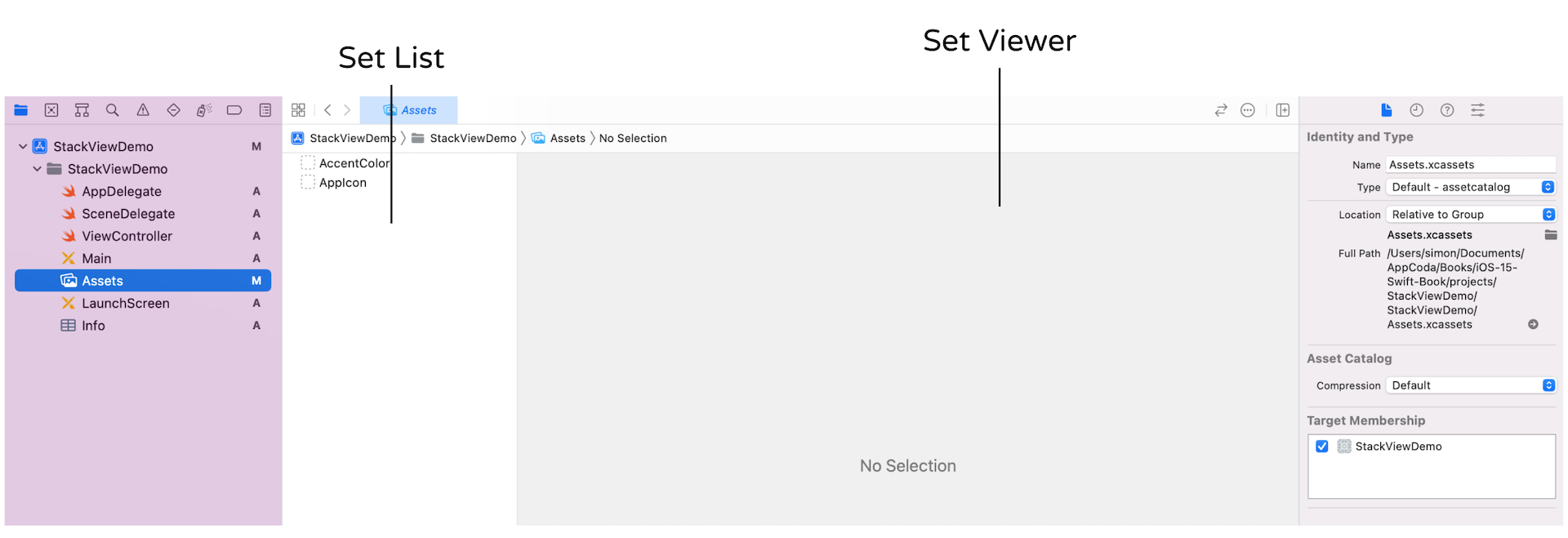
In each Xcode project, it includes an asset catalog (i.e. Assets.xcassets) for managing images and icons that are used by your app. Go to the project navigator and select the Assets.xcassets folder. By default, it is empty with a blank Appicon set. We are not going to talk about app icons in this chapter, but will revisit it after building a real-world app.
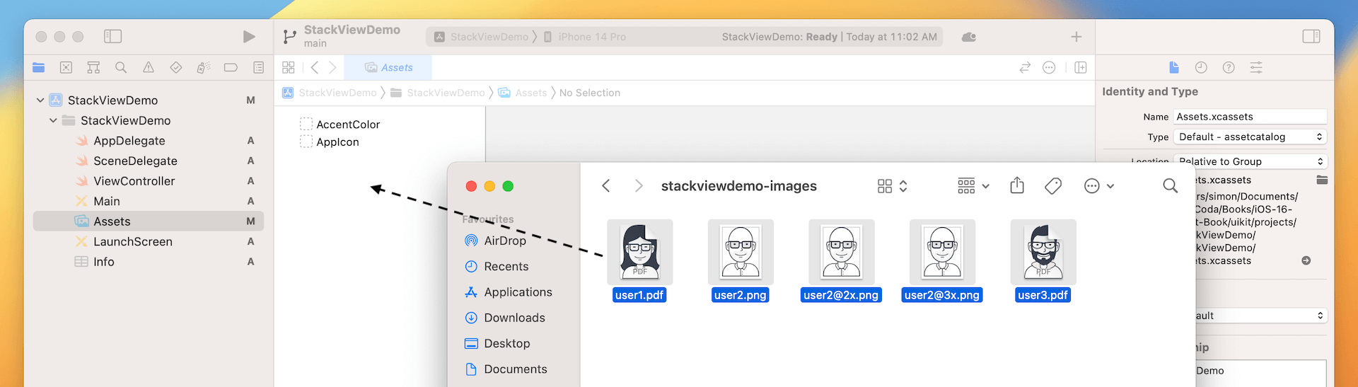
Now download this image set (https://www.appcoda.com/resources/swift4/stackviewdemo-images.zip) and unzip it on your Mac. The zipped archive contains a total of 5 image files:
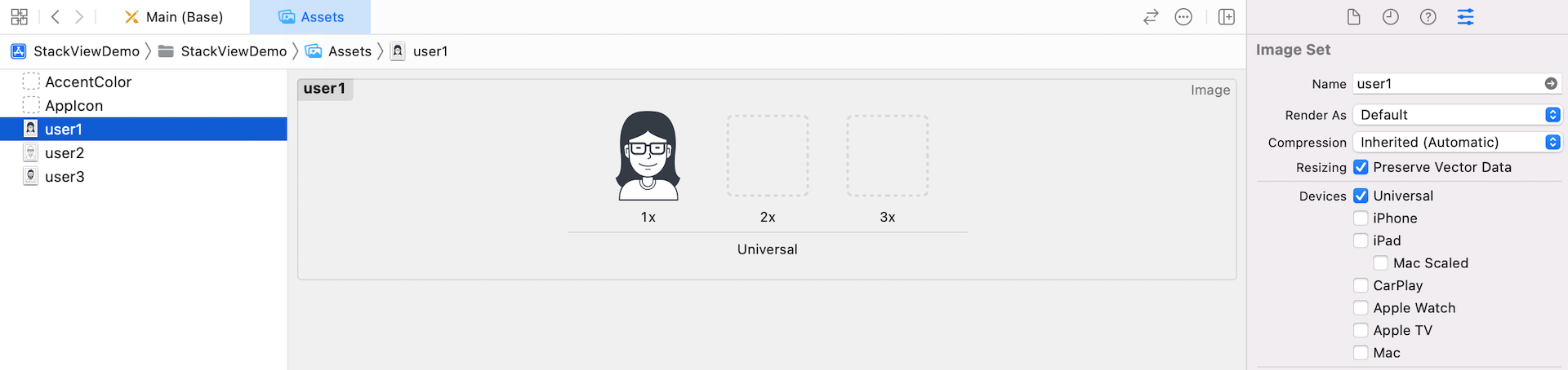
- user1.pdf
- user2.png
- [email protected]
- [email protected]
- user3.pdf
Credit: The images are provided by usersinsights.com.iOS supports two categories of images: raster images and vector images. Common image formats like PNG and JPEG are classified as raster images. Raster images use a grid of pixels to form a complete image. One problem of raster images is that it doesn't scale up well. Increasing the size of a raster image usually means a significant loss of quality. This is why Apple recommends developers to provide three different resolutions of images when PNG is used. In this example, the image files comes with three versions. The one with @3x suffix, which has the highest resolution, is for iPhone 8 Plus, iPhone 14/15 Pro and Pro Max. The one with @2x suffix is for iPhone SE, iPhone 8, and iPhone 11, while the one without the @ suffix is for older devices with non-Retina display (e.g. iPad 2). For details about how the images are used, you can further refer to this link (https://developer.apple.com/design/human-interface-guidelines/ios/icons-and-images/image-size-and-resolution/).
Vector images usually have file types such as PDF and SVG. You can use tools like Sketch and Pixelmator to create vector images. Unlike raster images, vector images are comprised of paths instead of pixels. This allows the images to scale up without losing any image quality. Because of this feature, you just need to provide a single version of the image in PDF format for Xcode.
I intentionally include both image types in the example for illustration purpose. When developing a real world app, you usually work with either one or the other. So, which image type is more preferable? Whenever possible, ask your designer to prepare the images in PDF format. The overall file size is smaller and the images are scalable without losing quality.
To add the images to the asset catalog, all you need to do is drag the images from Finder, and drop them into the set list or set viewer.
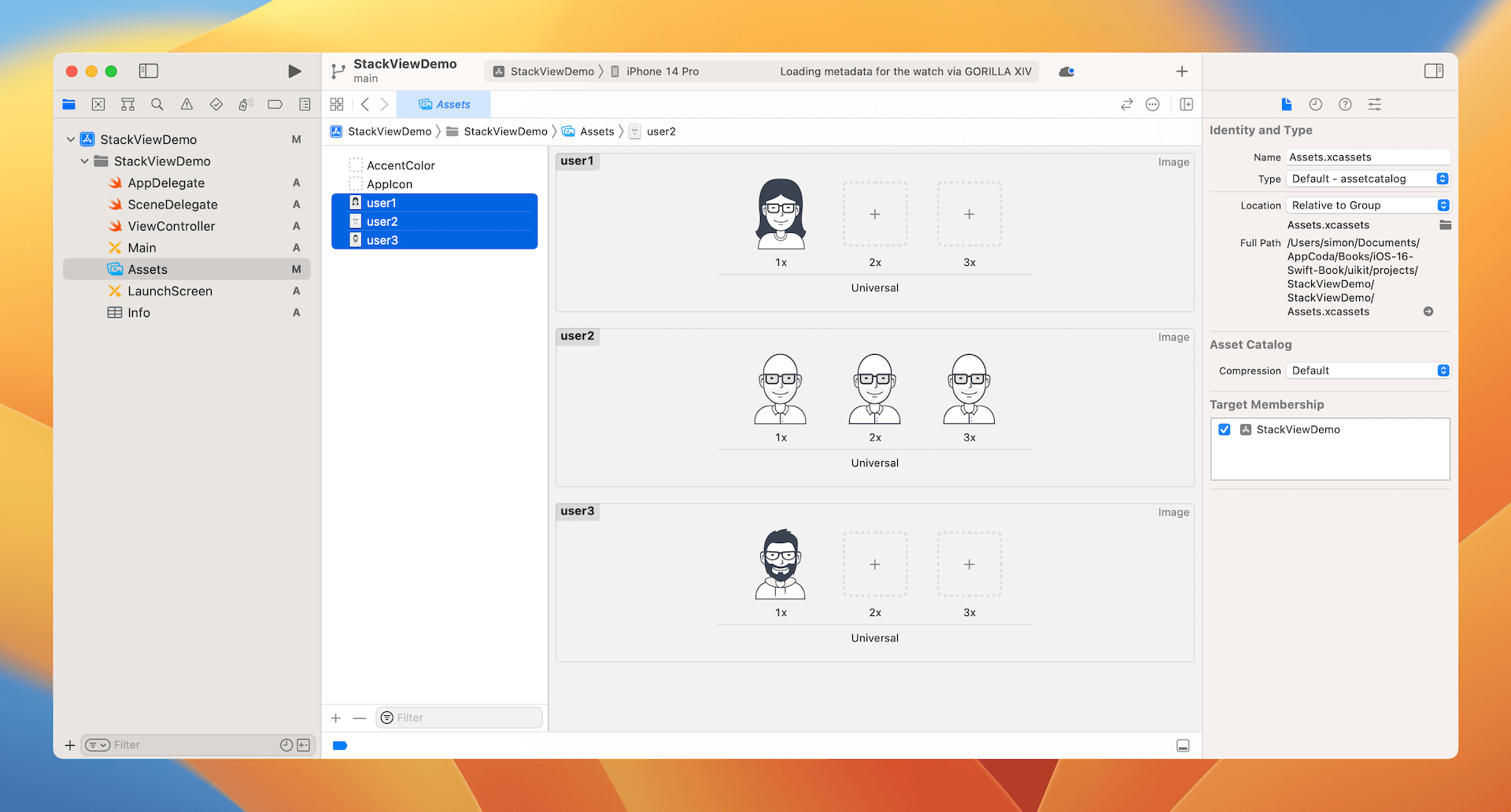
Once you add the images to the asset catalog, the set view automatically organizes the images into different wells. Later, to use the image, you just need to use the set name of a particular image (e.g. user1). You can omit the file extension. Even if you have multiple versions of the same image (e.g. user2), you don't have to worry about which version (@2x/@3x) of the image to use. All these are handled by iOS accordingly.
Layout the Title Labels with Stack Views
Now that you've bundled the necessary images in the project, let's move onto the creation of stack views. First, open Main.storyboard. We'll start with the layout of these two labels.

Stack view can arrange multiple views (known as arranged views) in both vertical and horizontal layouts. So first, you have to decide whether you want to use a vertical or horizontal stack view. The title and subtitle labels are arranged vertically. Therefore, vertical stack view is a suitable choice.
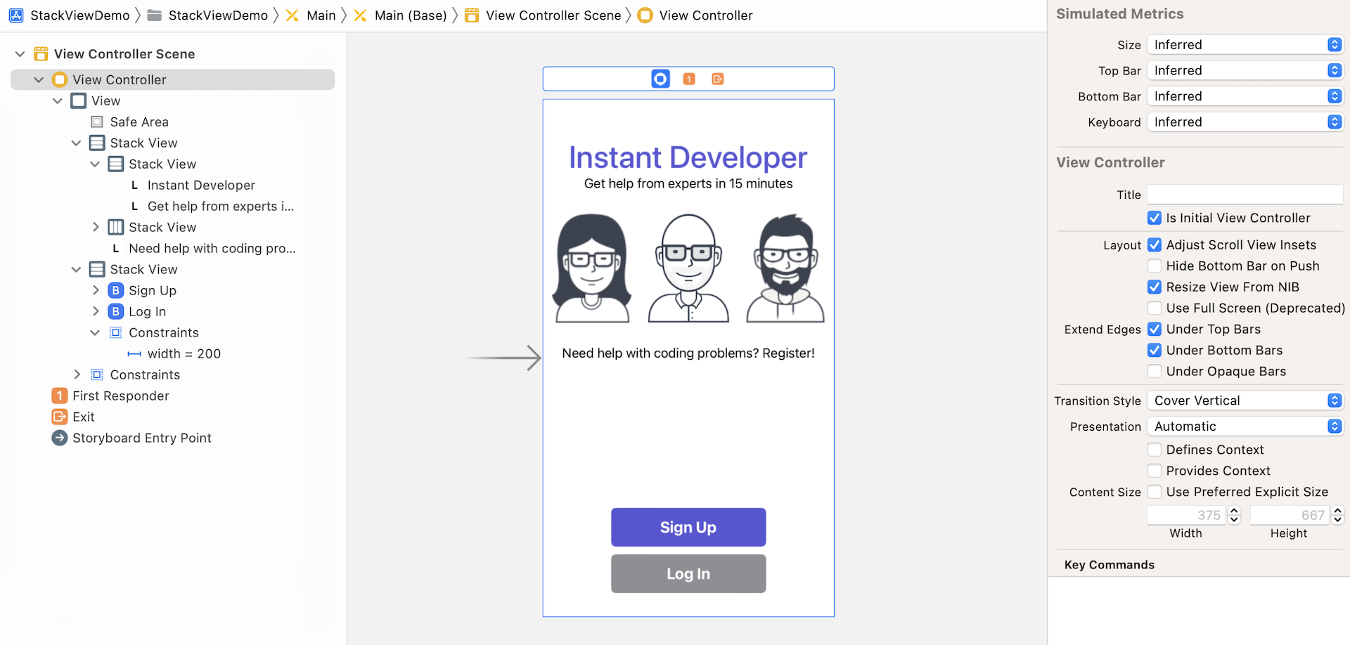
I used to lay out the UI on iPhone 14/15 Pro. Actually, you are free to use any device. However, to follow this chapter, I highly recommend you to design the user interface using iPhone 14/15 Pro. Please check the View as option in the configuration bar and make sure iPhone 14/15 Pro is used.
Note: While the screenshots may feature the usage of iPhone 14 Pro, please select iPhone 15 Pro when working with Xcode 15.
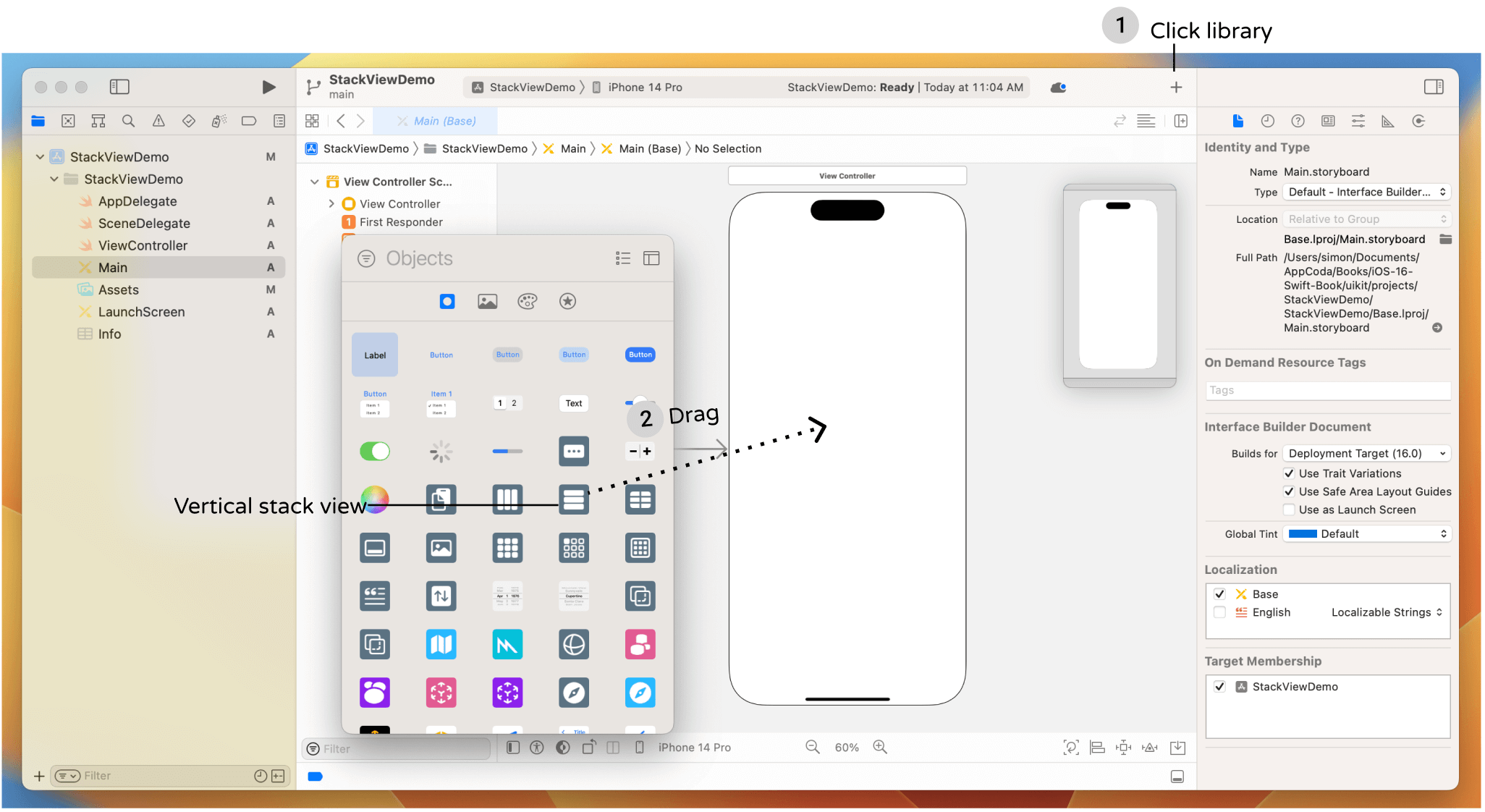
Now click the + button to display the Object library. Drag a Vertical Stack View object to the view controller in the storyboard.
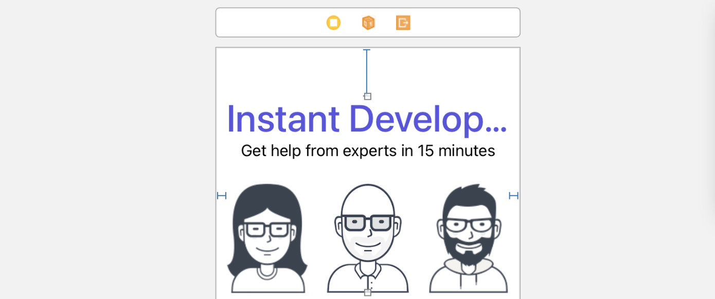
Next, drag a label from the Object library and put it right into the stack view. Once you drop the label into the stack view, the stack view automatically embeds it and resizes itself to fit the label. Double click the label and change the title to "Instant Developer". In the Attributes inspector, increase the font size to 40 points, and font style to medium. Optionally, you can change the color to System Indigo Color or whatever color you like.
Now, drag another label from the Object library to the stack view. As soon as you release the label, the stack view embeds the new label and arranges the two labels vertically like this:
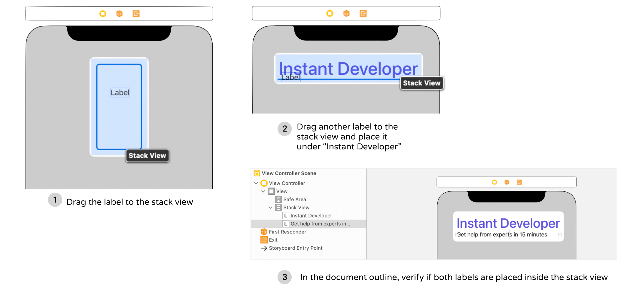
Edit the title of the new label and change it to "Get help from experts in 15 minutes". If you've done it correctly, the two labels should be placed inside the stack view. You can verify it by reviewing the objects in the document outline.
Currently, both labels are aligned to the left of the stack view. To change its alignment and appearance, you can modify the built-in properties of the stack view. Select the stack view and you can find its properties in the Attributes inspector.
As a side note, if you have any problems selecting the stack view, you can hold the shift key and right-click the stack view. Interface Builder will then show you a shortcut menu for selection. Alternatively, you can select the stack view in the document outline. Both approaches would work.
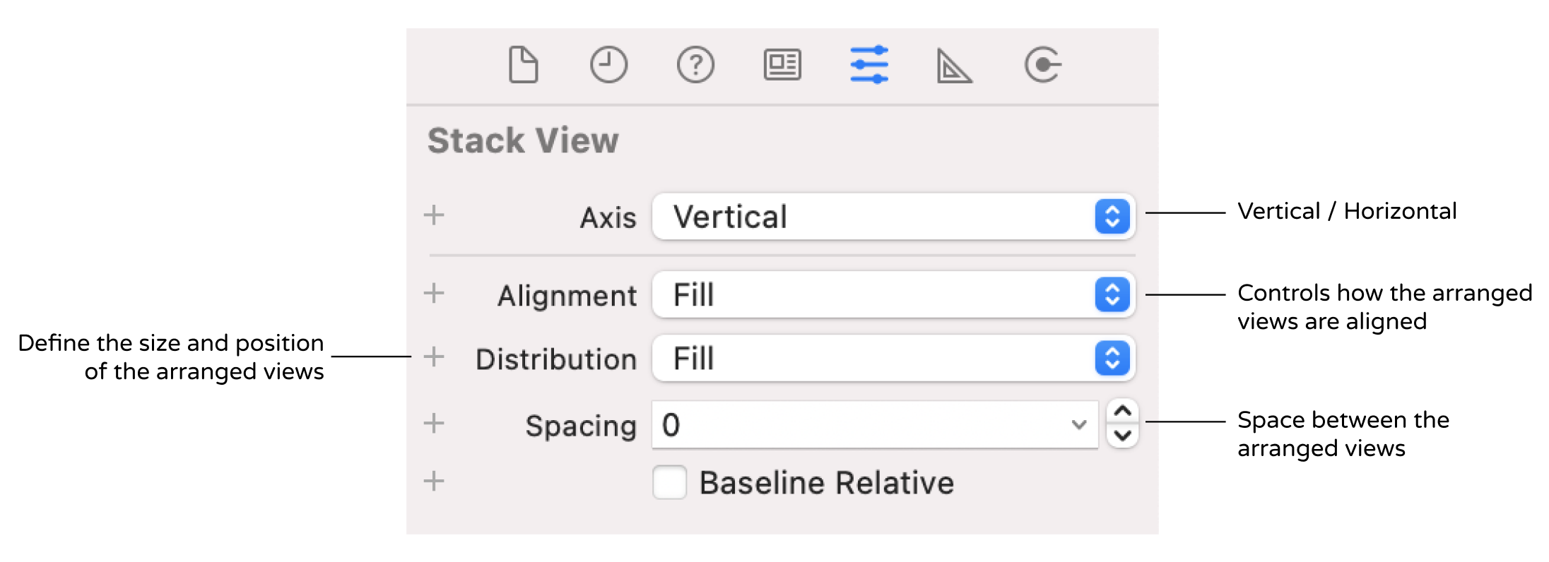
Let's briefly talk about each property of the stack view:
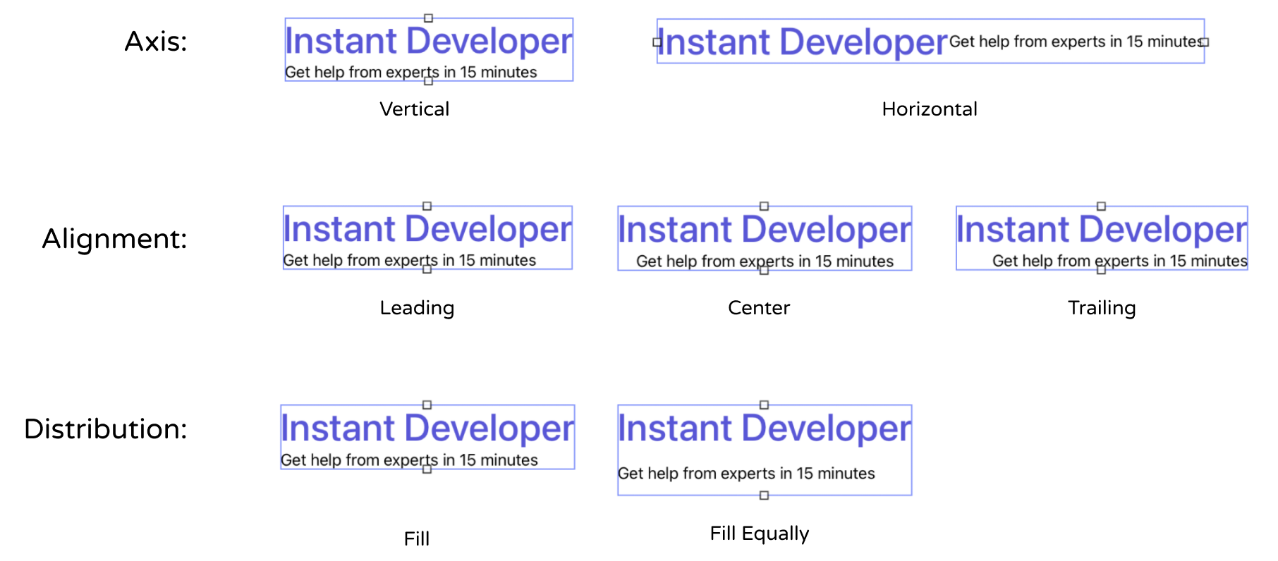
The axis option indicates whether the arranged views should be layout vertically or horizontally. By changing it from vertical to horizontal, you can turn the existing stack view to a horizontal stack view.
The alignment option controls how the arranged views are aligned. For example, if it is set to Leading, the stack view aligns the leading edge (i.e. left) of its arranged views along its leading edge.
The distribution option defines the size and position of the arranged views. By default, it is set to Fill. In this case, the stack view tries its best to fit all subview in its available space. If it is set to Fill Equally, the vertical stack view distributes both labels equally so that they are all the same size along the vertical axis.
Figure 6-11 shows some sample layouts of different properties.
For our demo app, we just need to change the Alignment option from Fill to Center and keep other options intact. This should center both labels.
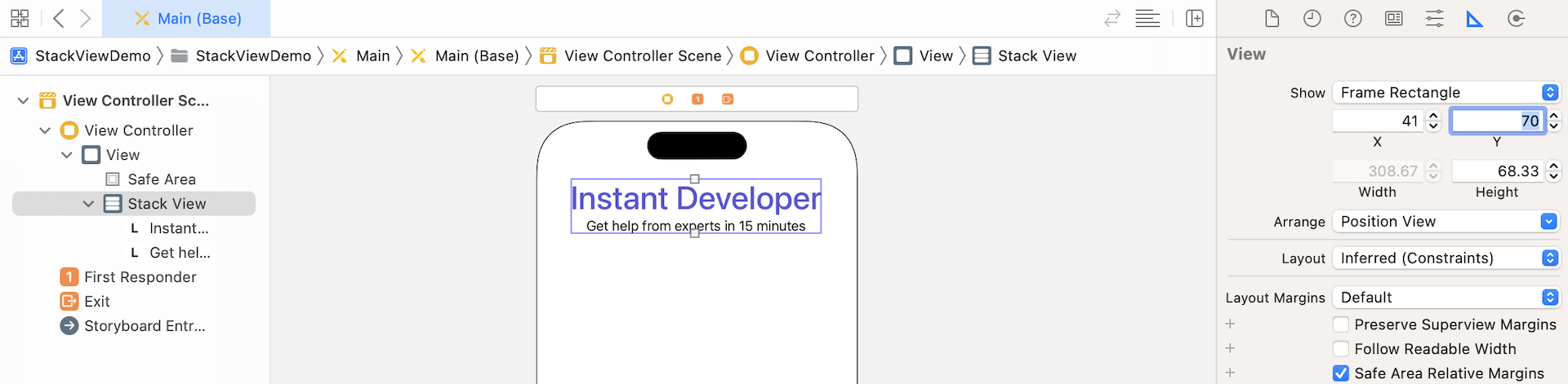
Before moving onto the next section, make sure you position the stack view correctly. This would help you easier to follow the rest of the materials. You can select the stack view and go to the Size inspector. Ensure you set the value of X to 41 and Y to 70.
Layout the Images Using the Stack Button
At the very beginning of this tutorial, I mentioned that there are two ways to use stack views. Earlier, you added a stack view from the object library. Now I'd like to show you another approach.
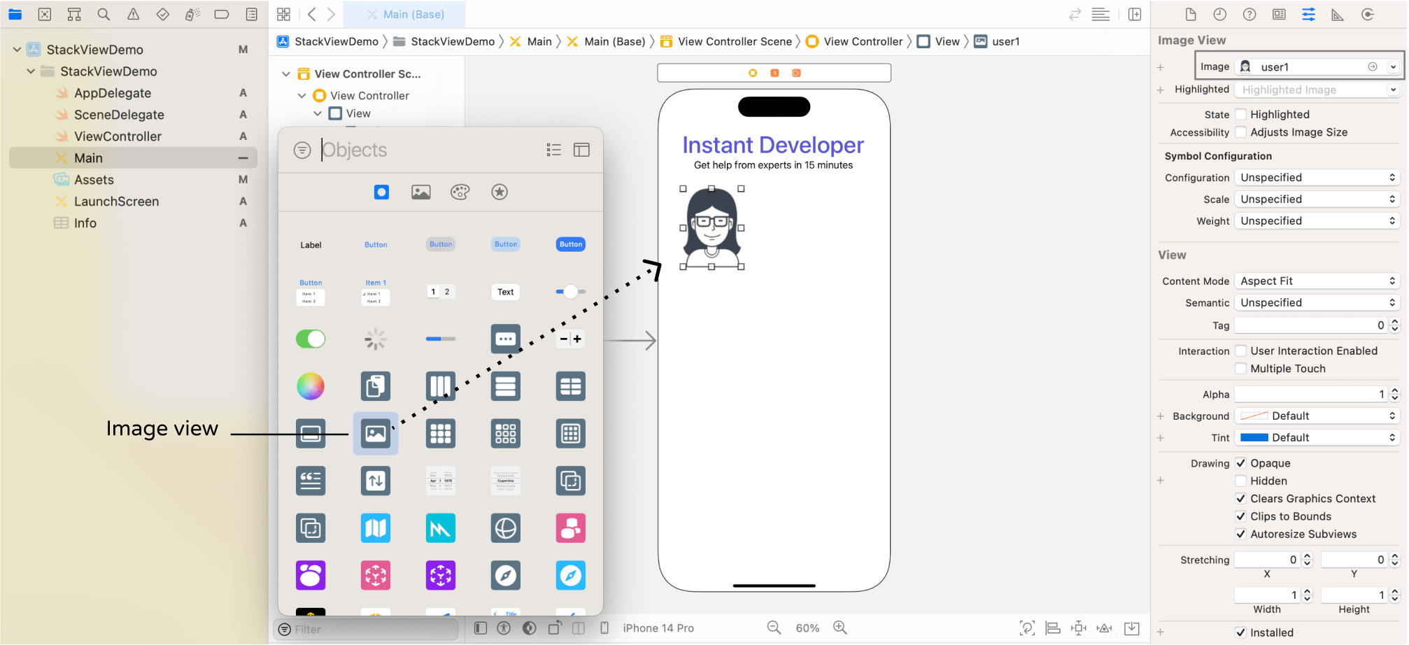
We're going to lay out the three user images. In iOS, we use image views to display images. From the Object library, look for the image view object, and drag it into the view. Once you added the image view, select the Attributes inspector. The image option already loads the available images from the asset catalog. Simply set it to user1. In the Size inspector, set the width of the image to 100 and height to 134.
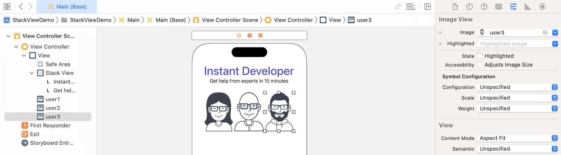
Repeat the procedures to add two more image views, and place them next to each other. Set the image of the second and third image view to user2 and user3 respectively. Your layout should look like this:
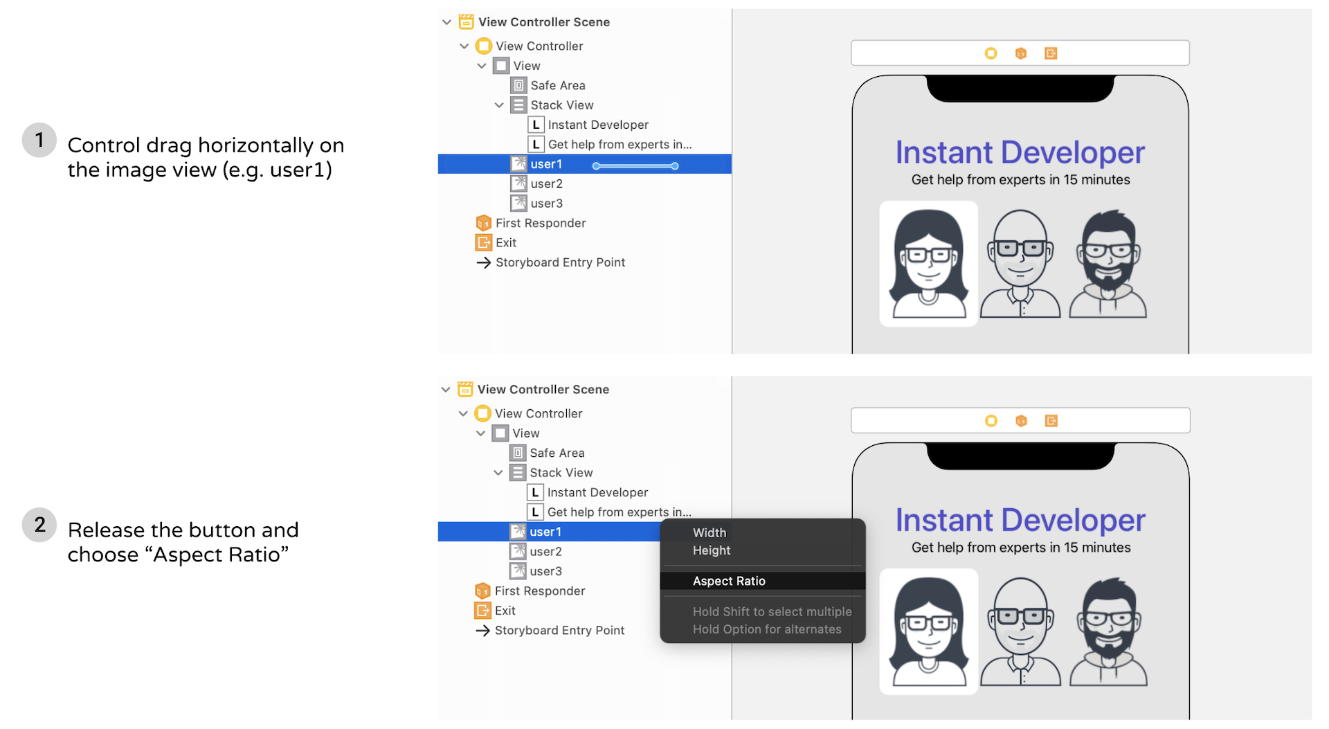
Using stack views minimizes the number of layout constraints you have to define, but it doesn't mean you do not need to define any auto layout constraints. For the image views, we want each of them to keep its aspect ratio. Later, the size of these images varies depending on the screen size. We want them to retain their aspect ratio, no matter they are stretched or squeezed.
To do that, in the document outline view, control-drag horizontally on the image view of user1. In the shortcut menu, select Aspect Ratio. Repeat the same procedure for the other two image views.
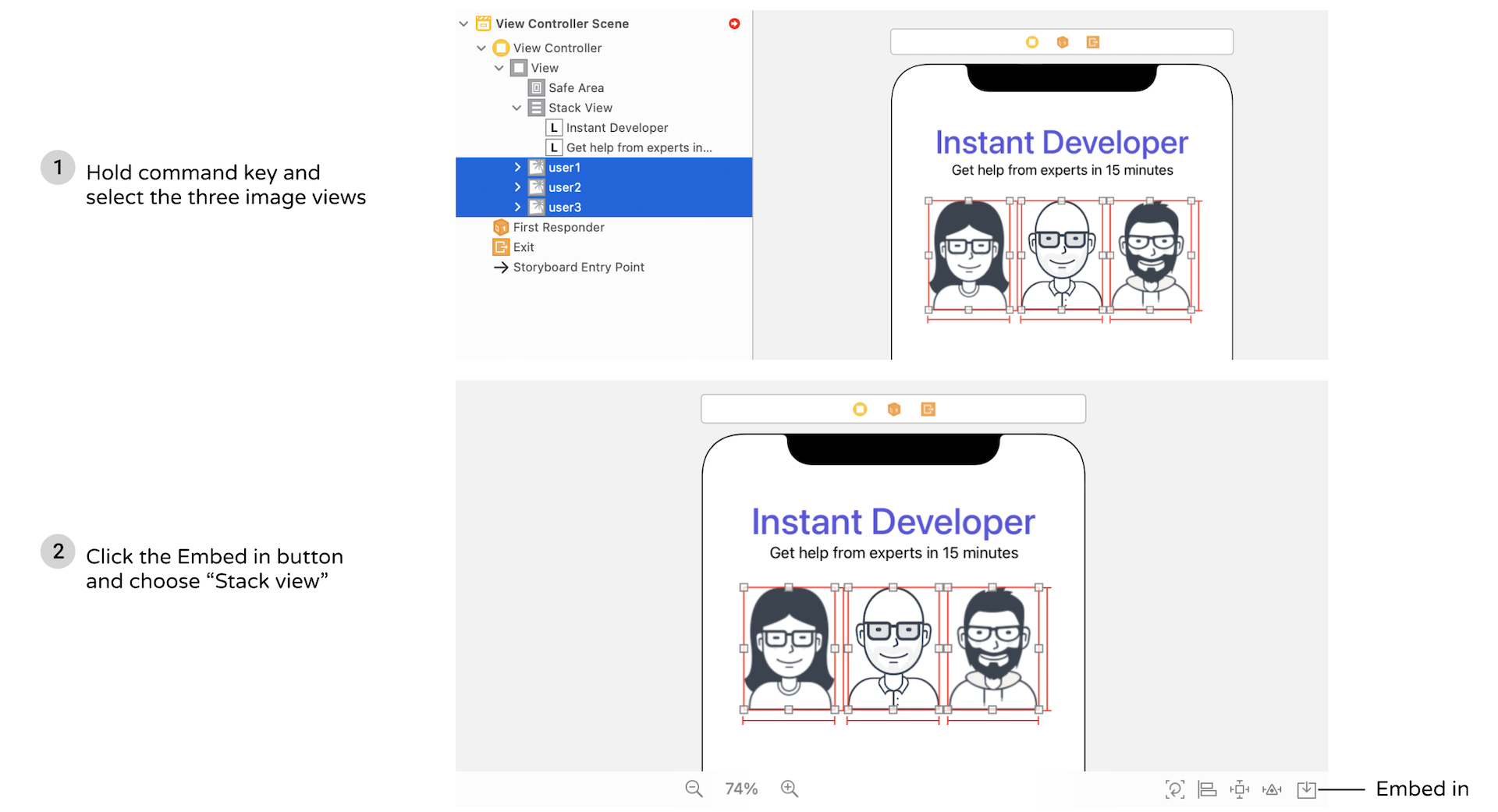
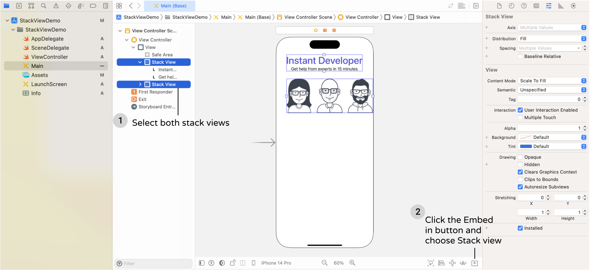
Now I want to group these three image views together using a stack view, so it is easier to manage. However, we will use an alternative approach to create the stack view.
Hold the command key and click the three image views to select them. Then click the Embed in button in the layout bar and choose Stack View. Interface Builder automatically embeds the image views in a horizontal stack view.
To add some spacing between the image views, select the stack view and set the spacing to 20.
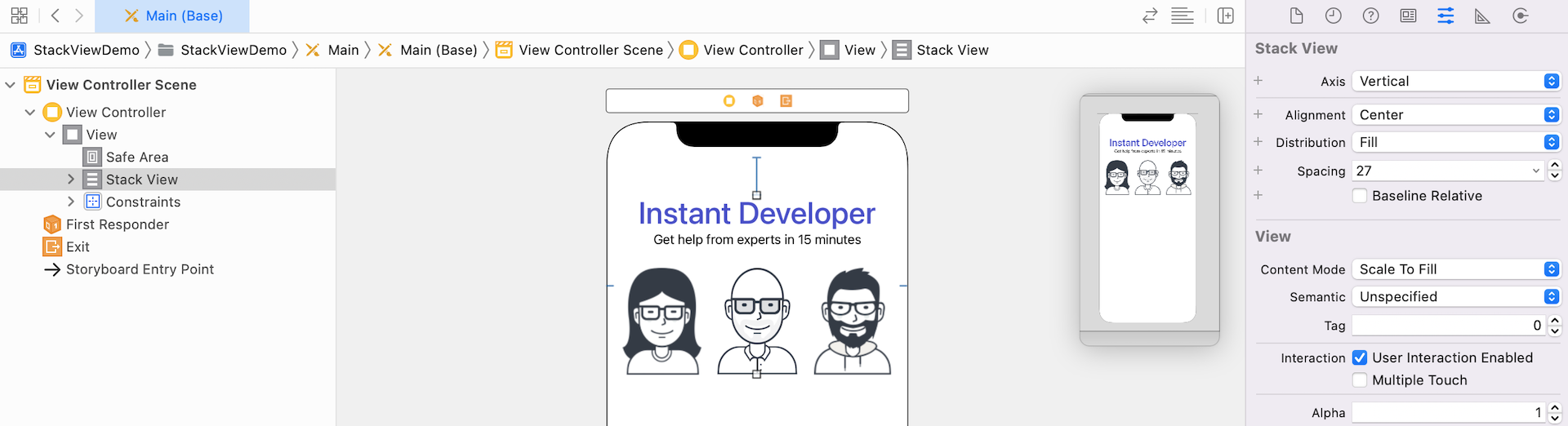
Now you have two stack views: one for the labels, and the other for the image views. These two stack views can actually be combined together for easier management. One great thing about stack views is that you can nest multiple stack views together.
To do that, select both stack views in the document outline view. Then click the Embed in > Stack View to embed both stack views in a vertical stack view. After that, make sure that the alignment of the new stack view is set to Fill. By setting the alignment property to Fill, this ensures the image views are resized automatically on larger screens. You will understand what I mean when we preview the UI on iPad.
Cool, right? So far the UI looks good on iPhone 14/15 Pro. But if you preview the UI on other devices, it doesn't look as expected. The reason is that we haven't defined the layout constraints for the stack views.
Adding Layout Constraints for the Stack View
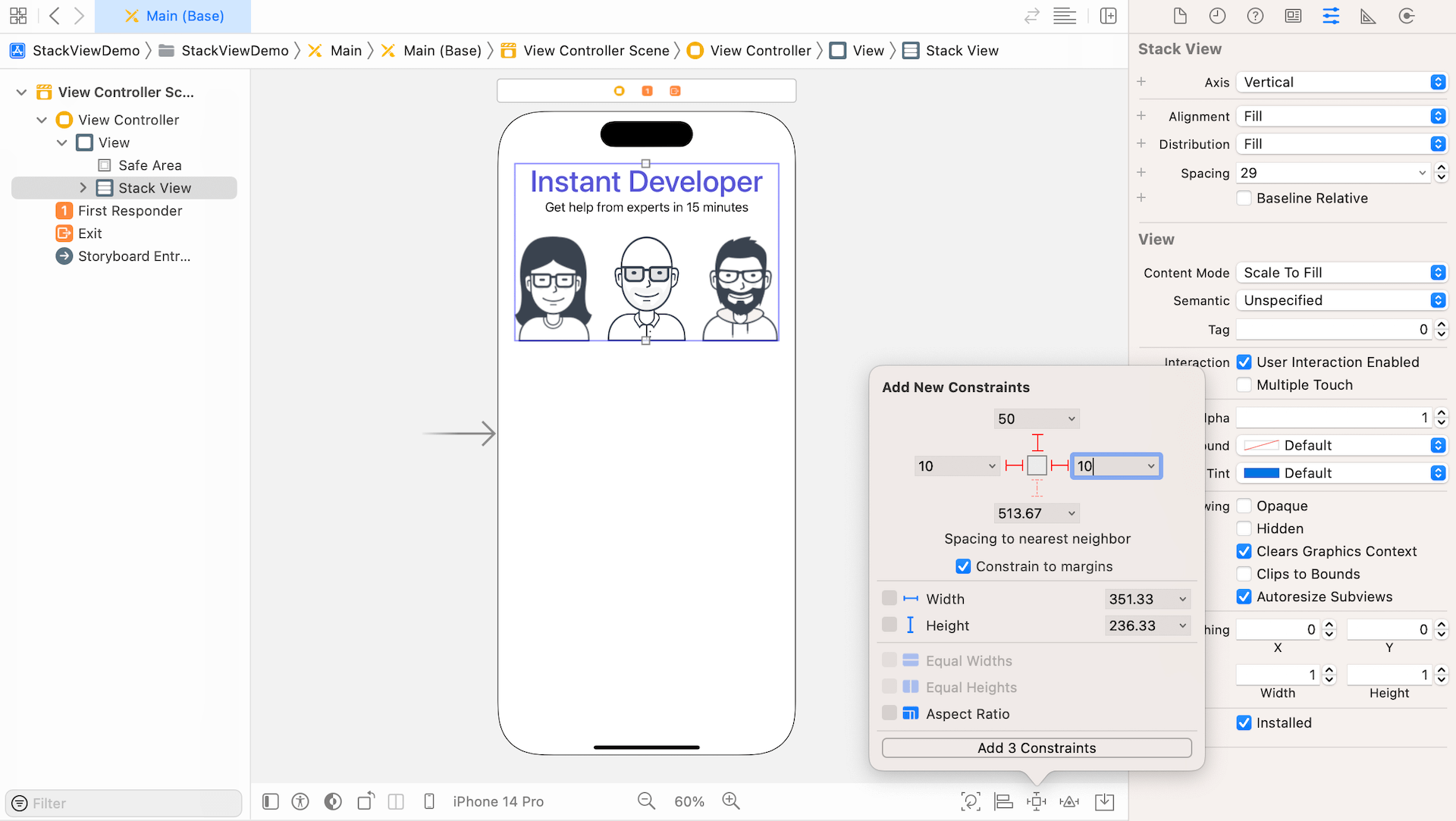
For the stack view, we will define the following layout constraints:
- Set a spacing constraint between itself and the top layout guide, such that it is 50 points away from the top anchor of the safe area layout guide.
- Set a spacing constraint between the left side of the stack view and the leading anchor of the safe area, such that there is a space of 10 points between them.
- Set a spacing constraint between the right side of the stack view and the trailing anchor of the safe area, such that there is a space of 10 points between them.
Now click the Add New Constraint button in the layout bar. Set the space constraints of the top, left and right side to 50, 10 and 10 respectively. When the constraint is enabled, it is indicated by a solid red bar. Then click the "Add 3 Constraints" button to add the constraints.
Once you added the constraints, Interface Builder automatically re-positions the stack view to the correct position that conforms to your layout constraints.
Now try to preview the interface on other devices. They should look pretty good. However, you may notice an issue:
- The Instant Developer label is truncated for iPhone SE.
So how can we fix the issue?
It is quite obvious that we can decrease the font size of the label. Xcode provides an automatic way to adjust the font size on the fly. Now select the Instant Developer label, and go to the Attributes inspector. Set the Autoshrink option to Minimum Font Size, and the value to 20.
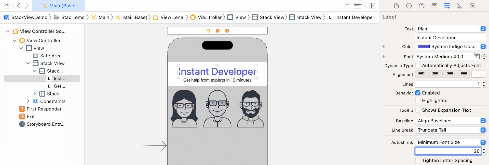
By doing so, you tell Xcode (or iOS) to determine the suitable font size for the label such that it can perfectly be displayed. Now choose iPhone SE in the configuration bar to test out the UI. The label should be fully displayed.
Adding a Label Below the Images
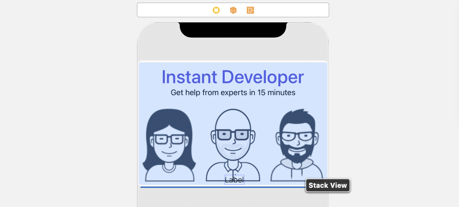
There is a label right below the images that we haven't added yet. I intentionally left it out so that I can show you how easy you can add an object to an existing stack view.
Open the Object library, drag a label object to the stack view holding the other two stack views. You will see a blue line that indicates the position of the insertion point.
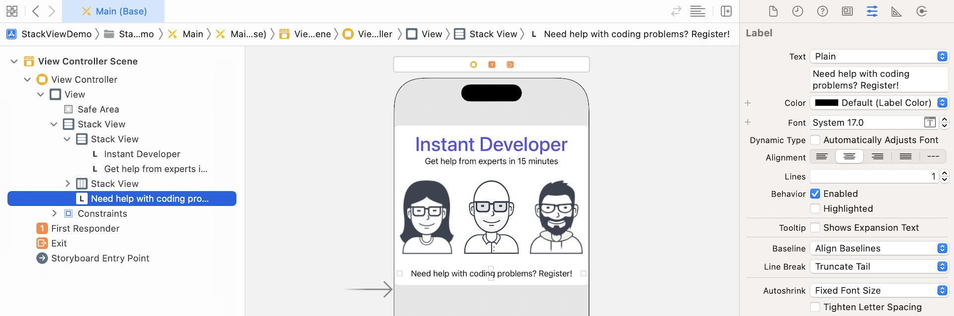
Next, select the new label. Go to the Attributes inspector, set the text to the following:
Need help with coding problems? Register!
Also, change the text alignment option to center.
Now the UI looks pretty good on all devices. As you can see, stack views save you from defining constraints for the new label. It just inherits the constraints that you have defined earlier.
Layout the Buttons Using a Stack View
We haven’t finished yet. Let's continue to layout the two buttons at the bottom of the screen.
First, click the + button to open the object library and drag a button from the library to the view. Double click the button to name it "Sign up". In the Attributes inspector, change the Style option to Filled. iOS 15 comes with a number of built-in button style. The Filled style allows you to quickly create a button with solid background and rounded corners.
By default, the background color is set to blue. You can change its background option to System Indigo Color. Also, edit the Font option, set its size to 20 points and style to bold.
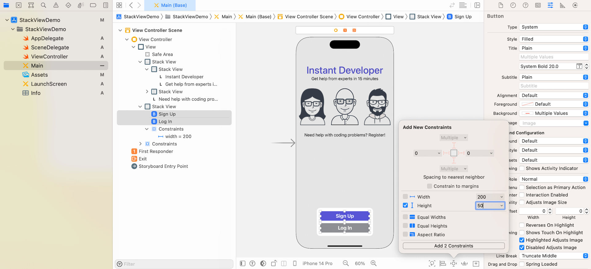
To make the button a bit bigger, you can go to the Size inspector and change the Size option to Large. If you want to make it even bigger, you can customize it width and height to 200 and 50 points respectively.
Next, let's create the Log In button. However, instead of repeating all the procedures. You can select the Sign Up button and press command-D to make a duplicate. Then move the new button and place it under the Sign Up button. You can change the new button's text to Log In. In the Attributes inspector, change its background color to System Gray Color. Your UI should now look like that shown in figure 6-24.
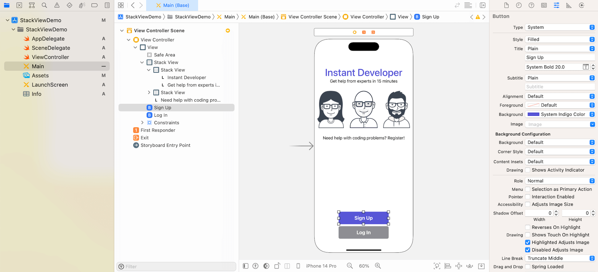
Again, you do not need to set the layout constraints for these buttons, just let the stack view do the magic for you. Hold the command key and select both buttons. Then click the Embed in > Stack View in the layout bar to group them in a vertical stack view. Next, center the stack view horizontally. To add a space between the buttons, select the stack view. In the Attributes inspector, set the value of spacing to 10.
Similarly, we have to define layout constraints for this stack view so that it is positioned close to the bottom of the view. Here are the layout constraints we're going to define:
- Center the stack view horizontally, with respect to the container view.
- Set a spacing constraint so that there is a space between the stack view and the bottom anchor of the safe area.
Select the stack view that you just created. Click the Align button in the layout bar. Check the Horizontally in Container option and click Add 1 Constraint.
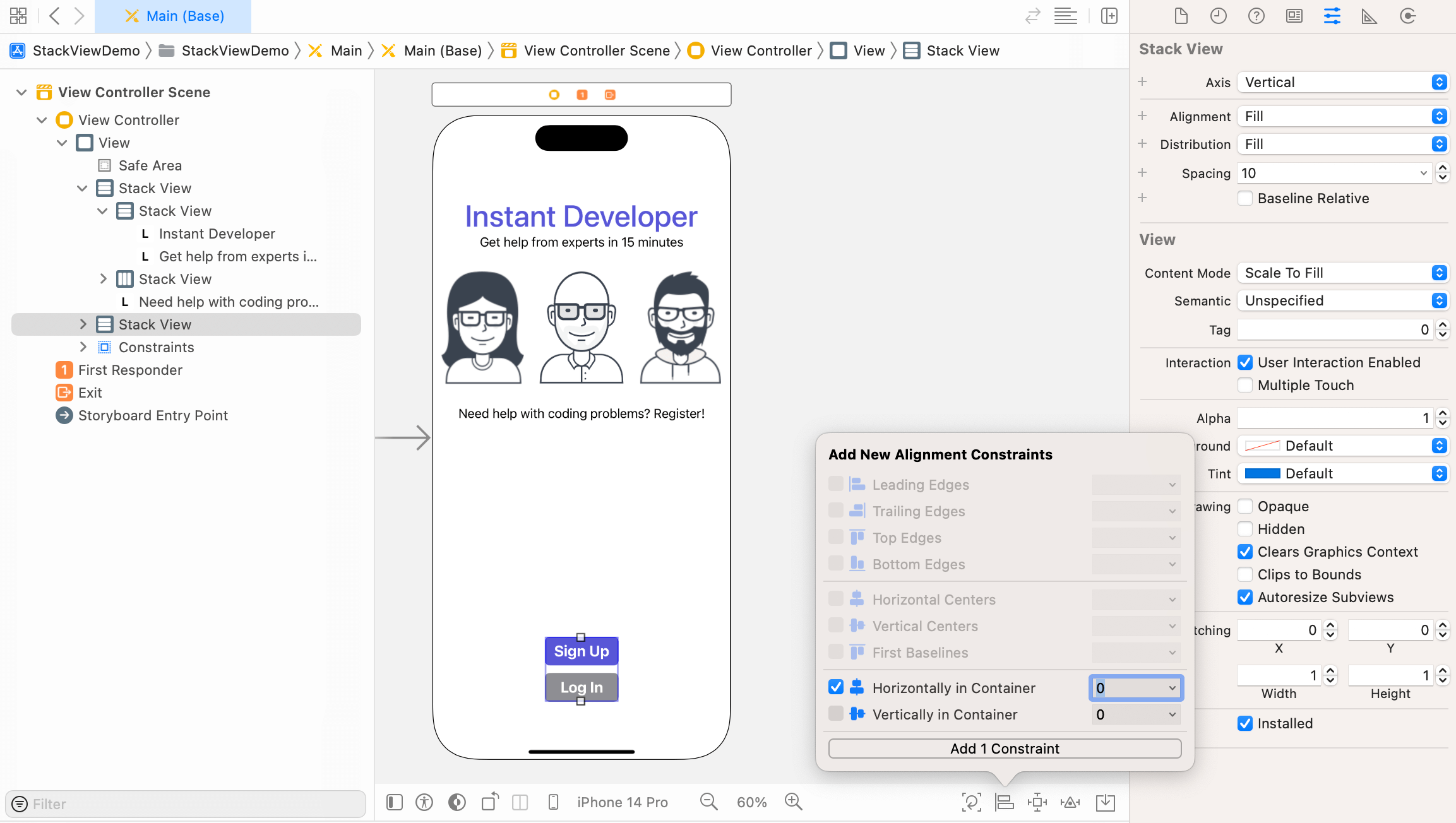
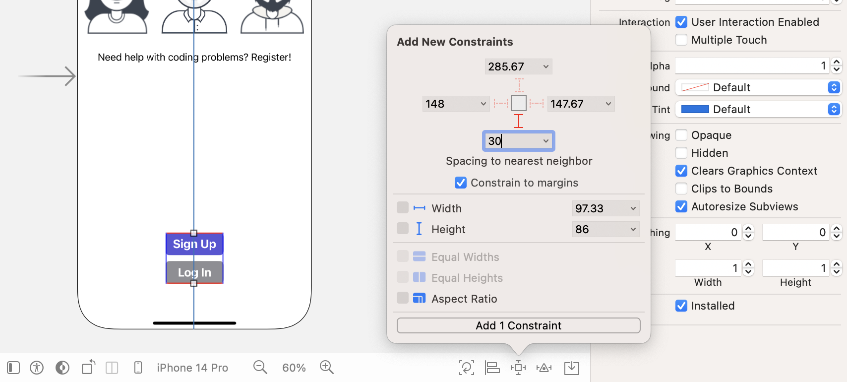
Next, to add a spacing constraint, click the Add New Constraints button and set the value of the bottom side to 30. Make sure the bar is in solid red. Click Add 1 Constraint to add the constraint.
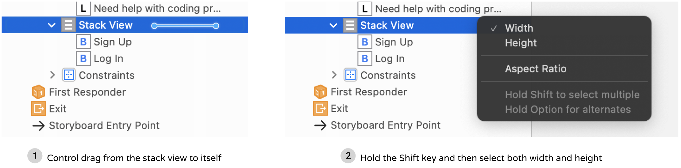
One thing you may notice is that the button is narrower than expected. As you embed the buttons in the stack view, they are resized to its intrinsic size. If you want to set the width to 200, you will need to add the size constraint to the stack view. In the document view, control-drag from the stack view to itself to bring up the context menu. Choose Width to add the width constraint.
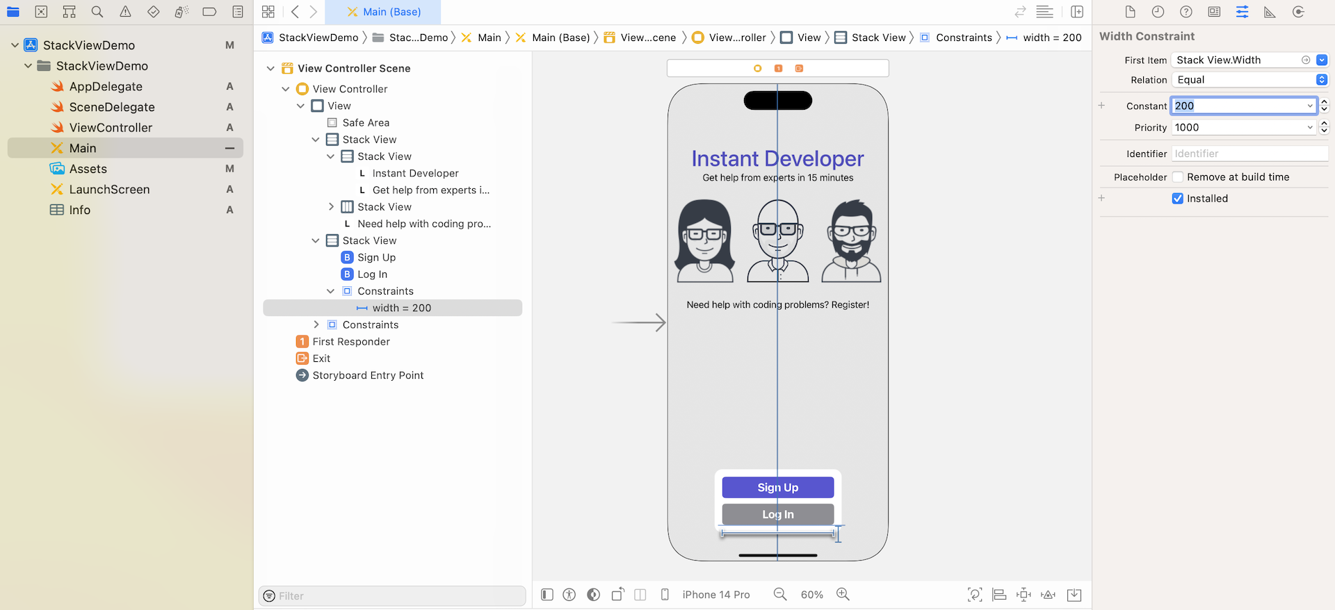
Once you added the constraints, you should see the constraints in the document outline. Expand it to reveal the width constraint. Since we need to change the width to 200 points, select the width constraint and go to the Attributes inspector. Change the constant value to 200. The stack view now has a fixed width of 200 points.
Both buttons should have a height of 50 points. As you may know, we need to add a height constraint for both of them. Xcode allows you to add the same constraints to multiple objects at the same time. In this case, you can hold the command key and select both buttons. Then click the Add new constraints button and set the height to 50. Once you confirm to add the constraint, Xcode applies the constraint to both items.
It's time to test the app again. You can preview the UI in Interface Builder or run the project on different devices. Your UI should look great on all devices.
Do you notice the message "Need help with coding problems? Register!" was truncated on iPhone SE (1st generation)? Try to fix it by yourself. If you don't know how to resolve the issue, go back to the earlier section to find the solution.
Adapting Stack Views Using Size Classes
Now that you've already built a nice UI using stack views, have you tested the layout in landscape orientation? If you turn the iPhone (or iPad) simulator sideway, the UI in landscape orientation looks like this:
It still looks pretty good on iPad. But it looks a bit weird on iPhone. There are a couple of things I want to customize to make it look better:
- Move the whole stack view a little bit closer to the top edge of the view.
- The images are too big and the middle one was overlapped with the buttons.
Please keep in mind that all the changes above are applied to iPhones in landscape orientation only. How can you do that?
This leads to the UI design concept known as Adaptive Layout. With adaptive layout, your apps can adapt their UI to a particular device and device orientation.
To achieve adaptive layout, Apple introduced a concept called Size Classes. This is probably the most important aspect which makes adaptive layout possible. Size classes are an abstraction of how a device is categorized depending on its screen size and orientation. You can use both size classes and auto layout together to design adaptive user interfaces.
A size class identifies a relative amount of display space for both vertical (height) and horizontal (width) dimensions. There are two types of size classes: regular and compact. A regular size class denotes a large amount of screen space, while a compact size class denotes a smaller amount of screen space.
By describing each display dimension using a size class, this will result in four abstract devices: Regular width-Regular Height, Regular width-Compact Height, Compact width-Regular Height and Compact width-Compact Height.
The table below shows the iOS devices and their corresponding size classes:
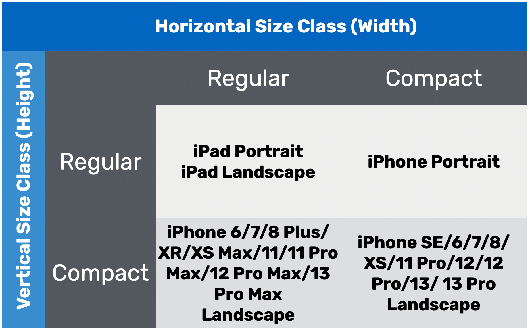
To characterize a display environment, you must specify both a horizontal size class and vertical size class. For instance, an iPad has a regular horizontal (width) size class and a regular vertical (height) size class. For our customization, we want to provide layout specializations for iPhones in landscape orientation. In other words, here are the two size classes we have to deal with:
- Compact width-Compact height
- Regular width-Compact height
With an understanding of size classes, now go back to the Main storyboard. In the configuration bar, click the Orientation button to rotate the device. Next, select the spacing constraint between the top anchor of the safe area and the top side of the stack view. In the Attributes inspector, click the + button next to the Constant option. Select Any Width, Compact height and Any Gamut, and then set the value of this size class to -40.
Quick note: Here, any width means both compact and regular width.
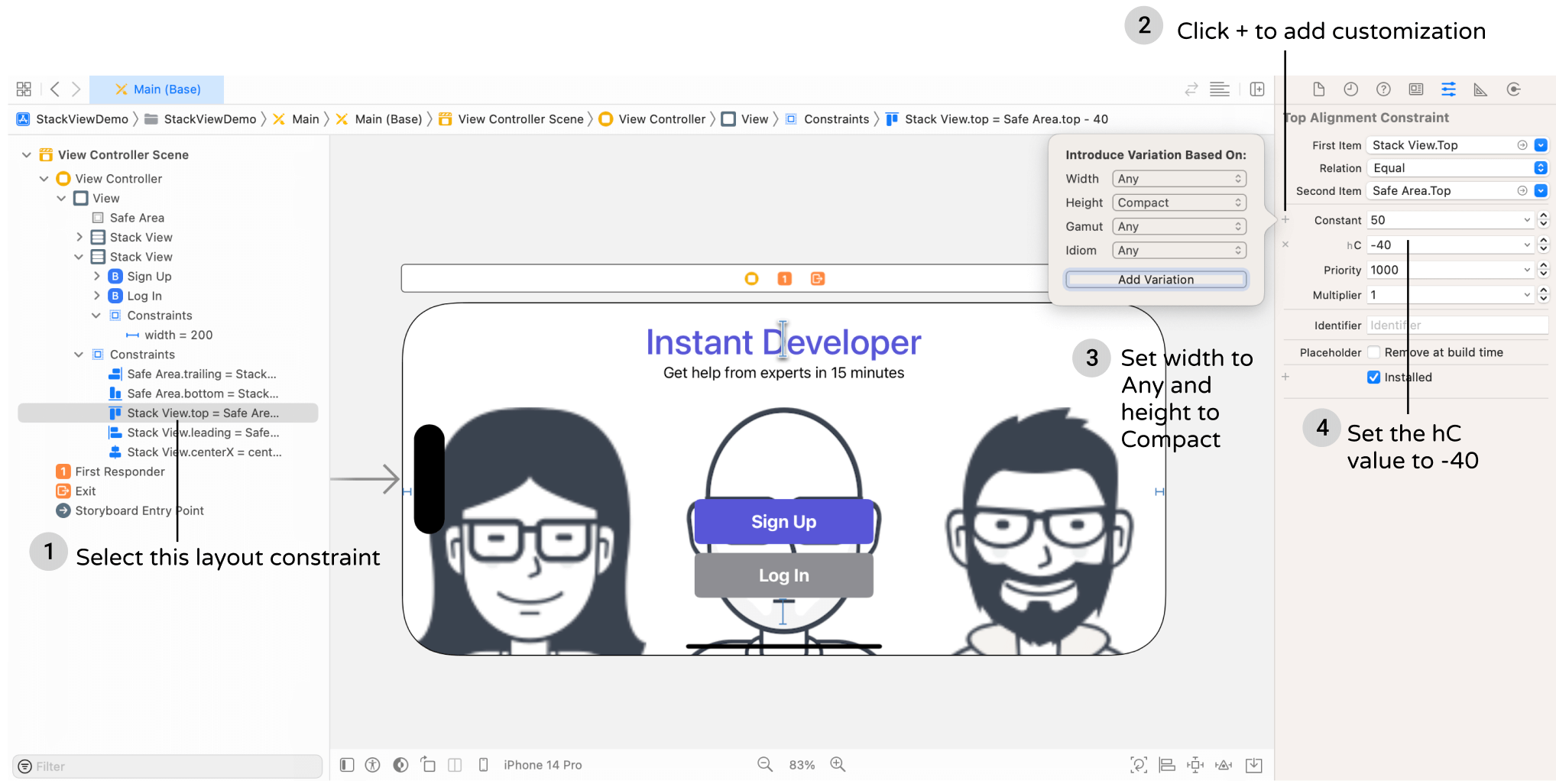
By doing so, the space between the stack view and top edge of the view will be decreased when the iPhone is turned sideway. Preview the UI in Interface Builder or run the project on various iOS devices to see the result. You should notice that the spacing constraint only reduces its value when the device is an iPhone and in landscape mode.
Now let's see take a look at the second issue, and see how we can reduce the size of the images when iPhone is in landscape orientation.
You are not only allowed to provide customization for constraints. Xcode lets you specify the size-class-specific property for stack views. Select the root stack view, which is the one that holds other stack views.
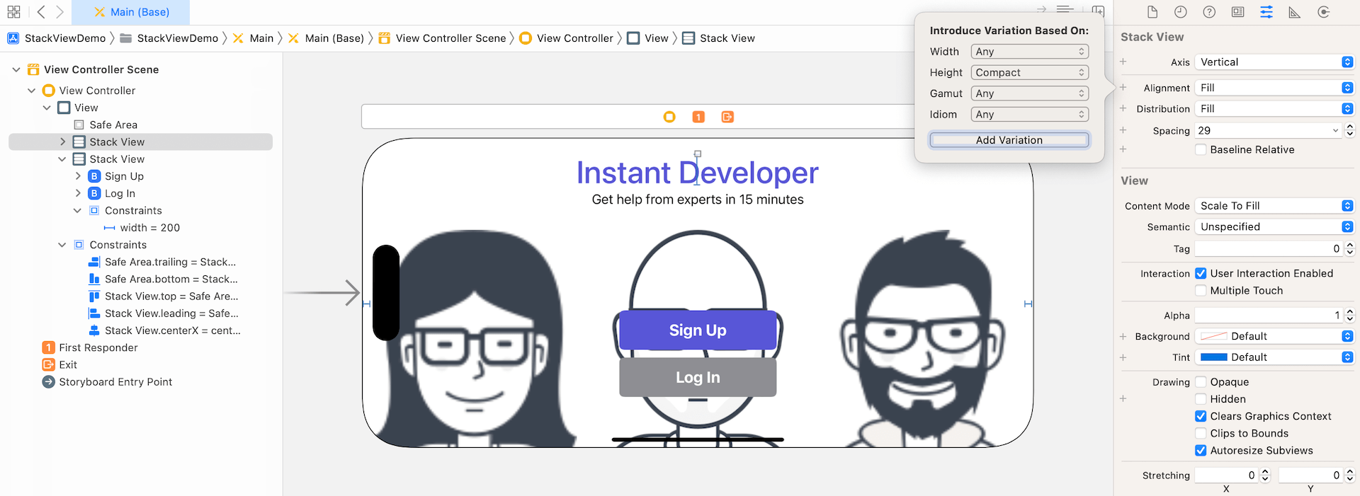
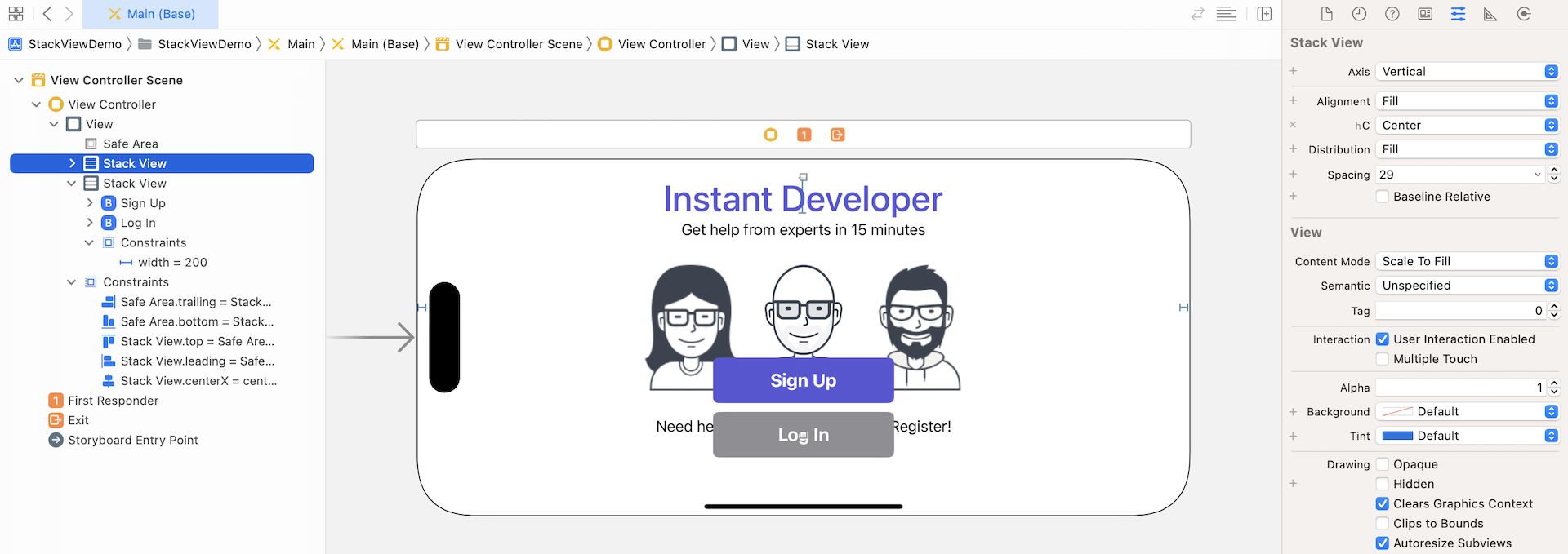
In the Attributes inspector, click + next to Alignment to add a customization. Choose Any width, Compact height and Any Gamut, then click Add Variation. This lets you provide a customization for the alignment. Set the hC field to Center. In landscape orientation (iPhone only), we will keep the alignment as Center so that the image will not resize.
It now looks better on iPhone landscape. But there is still an issue with the "Need help with coding problems? Register!" message. It is still covered by the buttons. To resolve the issue, let me show you another trick of using size classes.
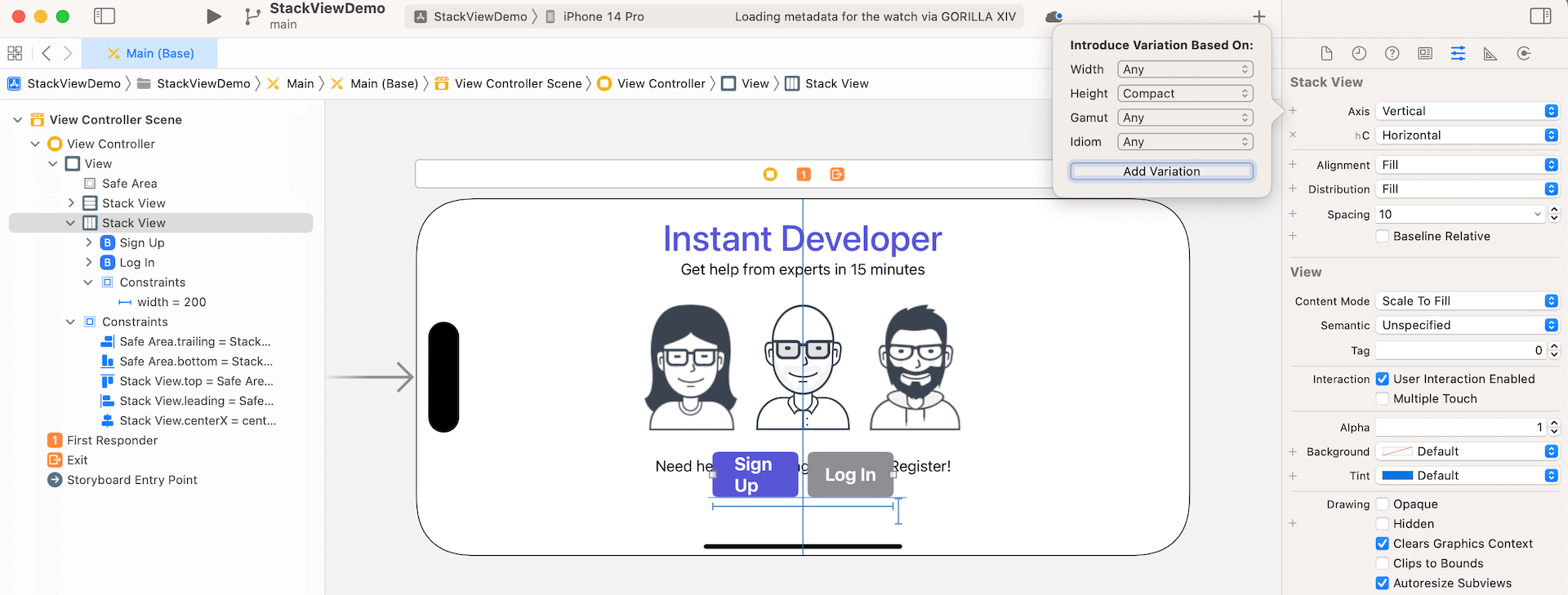
Select the stack view which holds both Sign Up and Log In button. In the Attributes inspector, click the + button next to Axis. Choose Any width and Compact height, and click Add Variation to confirm. In the new hC field, set it to Horizontal. This means that both buttons should be arranged horizontally instead of vertically for iPhone landscape.
Now part of the "Need help" message is still obscured by the buttons. There are a couple of constraints we have to tweak to make the UI look better. The width of the buttons' stack view is limited to 200 points. Select the constraint and add another variation. Again, choose Any width and Compact height, and click Add Variation to add a specialization for the Constant option. In the new hC field, set its value to 300.
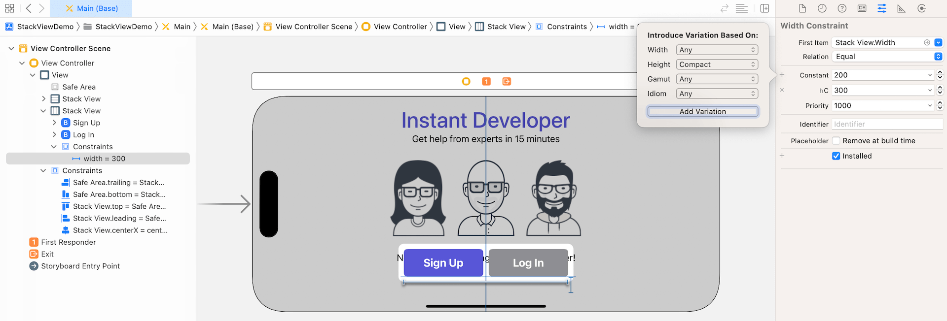
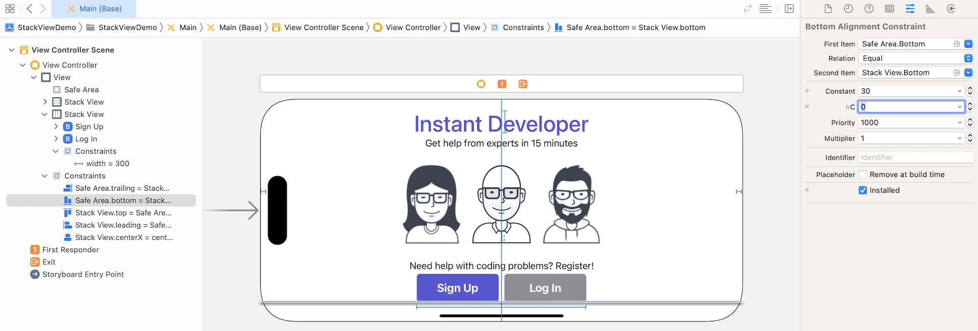
Once you made the change, both buttons are having the same size. It's not done yet. Select the bottom spacing constraint of the stack view. Again, choose Any width and Compact height, and click Add Variation to add a specialization for the Constant option. In the new hC field, set its value to 0.
That's it! You can run the app on different simulators again. The user interface will be adapted to fit different screen sizes and orientation.
Preserving Vector Data
Before I end this chapter, I want to show you a feature in Xcode known as Preserve Vector Data. I mentioned that we prefer to use vector images over raster images in iOS development because they can scale up or down without losing their quality. That's partially true.
When a vector image is used, Xcode automatically converts it into static images (@1x, @2x @3x). It is pretty much like the user2 image we prepared, but the conversion is handled by Xcode. In this case, the image quality will still be slightly affected when the image is enlarged. If you try to run the demo on iPad Pro (12.9-inch), you should find that the image quality is not perfect.
Xcode comes with a feature called Preserve Vector Data that lets you preserve the vector data of the images. The option is disabled by default. To enable it, you can go to Assets.xcassets and choose one of the images. In the Attributes inspector, tick the Preserve Vector Data checkbox to enable the option.
Now if you run the app on iPad Pro (12.9-inch) again, you will find the image looks much better. Figure 6-40 illustrates the image difference when the option is enabled or disabled.
Exercise #1
To help you better understand how auto layout and size classes work, let's have another simple exercise. You are required to update some constraints and create another layout specialization for iPhone (Portrait) and iPad. Here are the requirements:
- For all devices, change the width of the "Sign Up" and "Log in" buttons from 200 to 250 points.
- For iPad, increase the font size of the "Instant Developer" label to 65 points.
Exercise #2
If exercise #1 is too simple for you, exercise #2 is for you. Try to build a UI like the one shown in figure 6-42. You can download the required images from http://www.appcoda.com/resources/swift4/student-tutor.zip
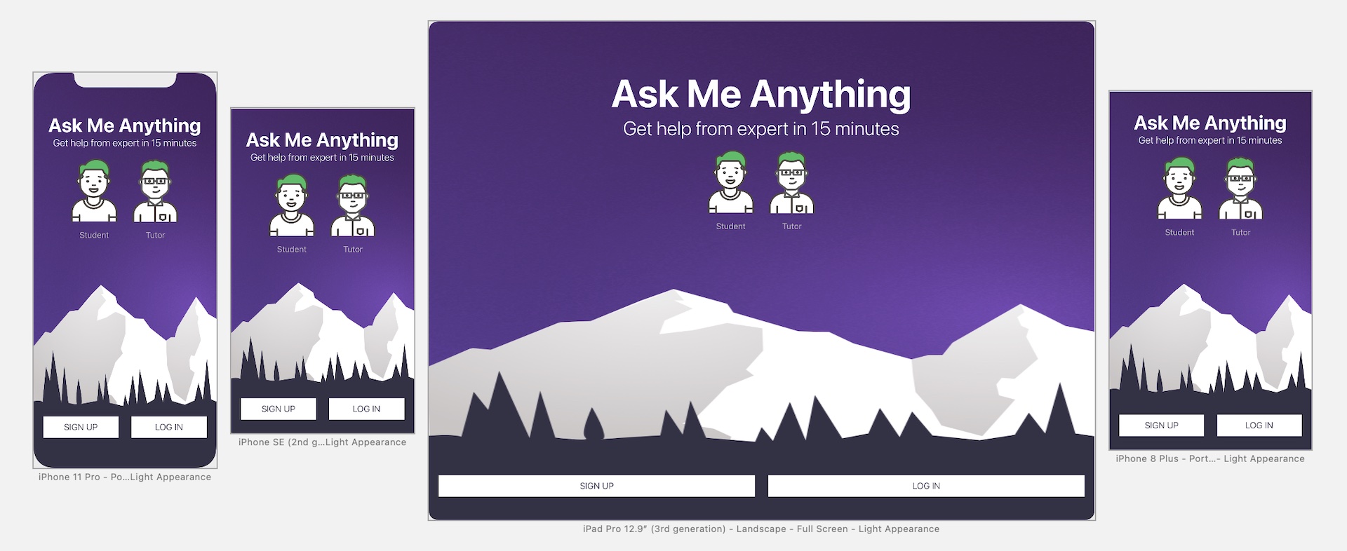
Credit: The background image is provided by Luka Dadiani.
Exercise #3
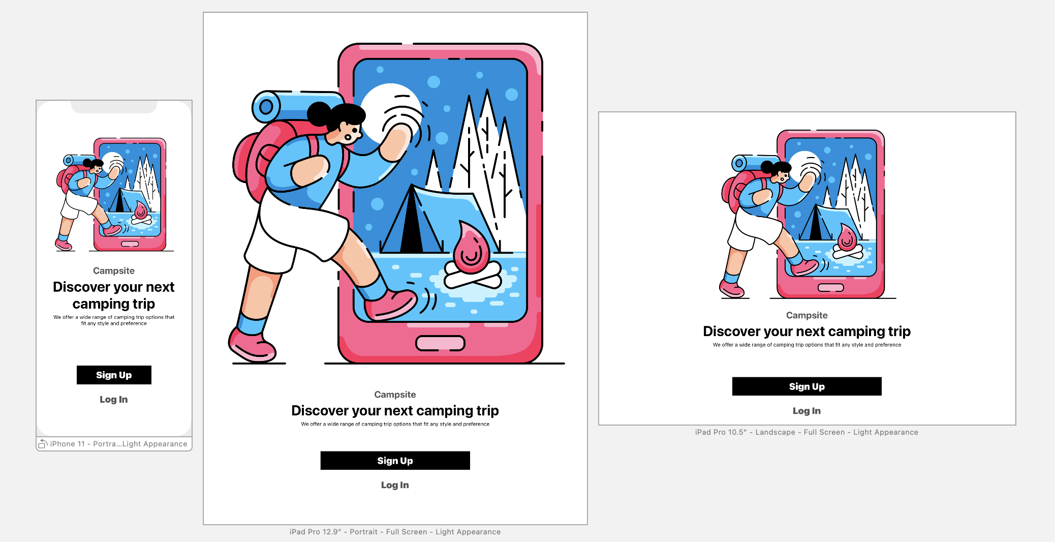
Here is one more exercise for you to practice what you learned. Try to build a UI like the one shown in figure 6-43. You can use any of your photos for building the user interface. There is one feature about the Label object that we haven't covered but you need to use it in the exercise. By default, a label is set to display text in a single line. If you need the label to display multiple lines of text, you need to change the value of the Lines option. Say, to display two lines of text, you can simply set it to 2.
Summary
Congratulations! You have finished the chapter and learned how to build an adaptive UI using stack views and size classes.
Stack views streamline the way you build user interfaces on iOS, with very minimal constraints. One question you may have is: when should you use stack views? Apple's engineers recommended developers to adopt stack views first, and then only when you need to actually use raw constraints. So throughout this book, we will design the user interfaces using stack views.
To access the full version of the book, please get the full copy here. You will also be able to access the full source code of the project.