Chapter 1
Building Adaptive User Interfaces
In the beginning, there was only one iPhone with a fixed 3.5-inch display. It was very easy to design your apps; you just needed to account for two different orientations (portrait and landscape). Later on, Apple released the iPad with a 9.7-inch display. If you were an iOS developer at that time, you had to create two different screen designs (i.e. storyboards / XIBs) in Xcode for an app - one for the iPhone and the other for the iPad.
Gone are the good old days. Fast-forward to 2023: Apple's iPhone and iPad lineup has changed a lot. With the launch of the iPhone 14, 14 Pro, and 14 Pro Max, your apps are required to support an array of devices with various screen sizes and resolutions including:
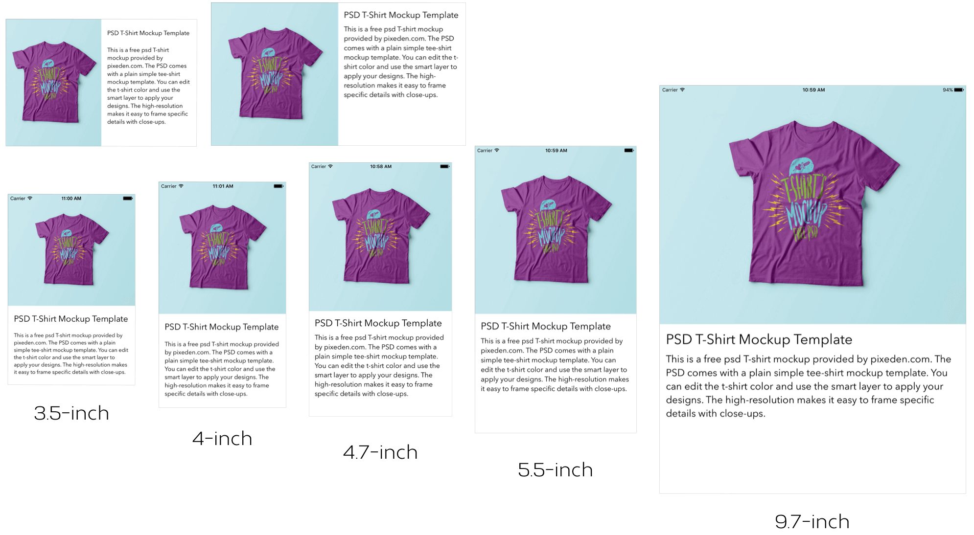
- iPhone 4/4s (3.5-inch)
- iPhone 5/5c/5s (4-inch)
- iPhone 6/6s/7/8/SE (4.7-inch)
- iPhone 6/6s/7/8 Plus (5.5-inch)
- iPhone X/XS/11 Pro (5.8-inch)
- iPhone XR/11/12/12 Pro/13 Pro/14 Pro (6.1-inch)
- iPhone XS Max/11 Pro Max (6.5-inch)
- iPhone 12 Pro Max/13 Pro Max/14 Pro Max (6.7-inch)
- iPad (9.7-inch)
- iPad Mini (7.9-inch)
- iPad Pro (10.5/12.9-inch)
It is a great challenge for iOS developers to create a universal app that adapts its UI for all of the listed screen sizes and orientations. So what can you do to design pixel-perfect apps?
Starting from iOS 8, the mobile OS comes with a new concept called Adaptive User Interfaces, which is Apple's answer to support any size display or orientation of an iOS device. Now apps can adapt their UI to a particular device and device orientation.
This leads to a new UI design concept known as Adaptive Layout. Starting from Xcode 7, the development tool allows developers to build an app UI that adapts to all different devices, screen sizes and orientation using Interface Builder. From Xcode 8, the Interface Builder is further re-engineered to streamline the making of an adaptive user interface. It even comes with a full live preview of how things will render on any iOS device. You will understand what I mean when we check out the new Interface Builder.
To achieve adaptive layout, you will need to make use of a concept called Size Classes, which is available on iOS 8 or up. This is probably the most important aspect which makes adaptive layout possible. Size classes are an abstraction of how a device is categorized depending on its screen size and orientation. You can use both size classes and auto layout together to design adaptive user interfaces. In iOS, the process for creating adaptive layouts is as follows:
- You start by designing a generic layout. The base layout is good enough to support most of the screen sizes and orientations.
- You choose a particular size class and provide your layout specializations. For example, you want to increase the spacing between two labels when a device is in landscape orientation.
In this chapter, I will walk you through all the adaptive concepts such as size classes, by building a universal app. The app supports all available screen sizes and orientations.
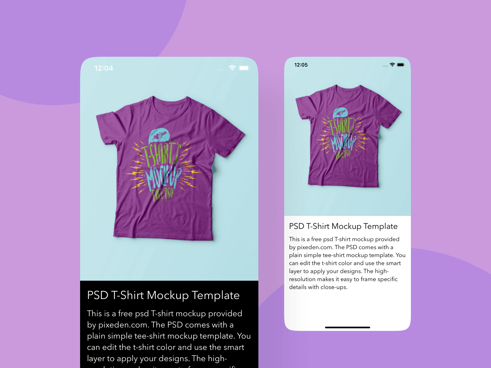
Adaptive UI demo
No coding is required for this project. You will primarily use Storyboard to lay out the user interface components and learn how to use auto layout and size classes to make the UI adaptive. After going through the chapter, you will have an app with a single view controller that adapts to multiple screen sizes and orientations.
To continue reading and access the full version of the book, please get the full copy here. You will also be able to access the full source code of the project.