Chapter 18
Building Grid Layouts Using Collection Views and Diffable Data Source
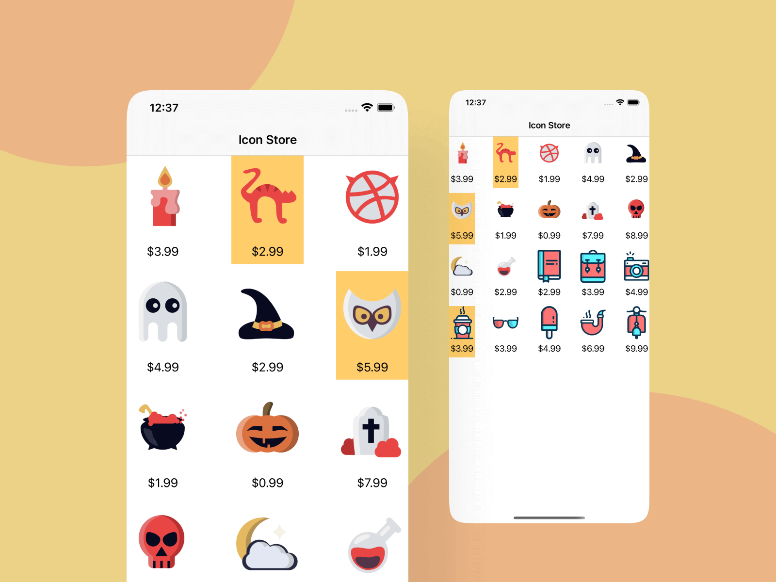
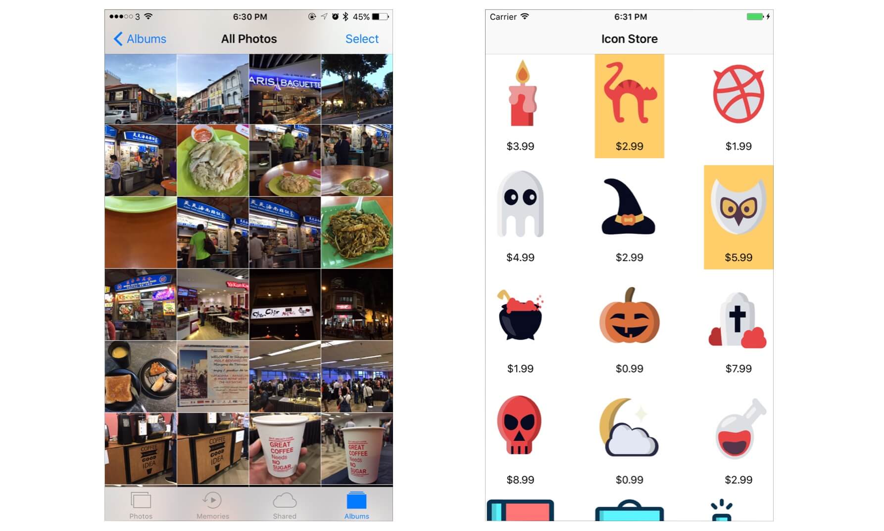
If you have no idea about what grid-like layout is, just take a look at the built-in Photos app. The app presents photos in grid format. Before Apple introduced UICollectionView, you had to write a lot of code or make use of third-party libraries to build a similar layout.
UICollectionView, in my opinion, is one of the most spectacular APIs in the iOS SDK. Not only can it simplify the way to arrange visual elements in a grid layout, it even lets developers customize the layout (e.g. circular, cover flow style layout) without changing the data.
In this chapter, we will build a simple app to display a collection of icons in grid layout. Here is what you're going to learn:
- An introduction to
UICollectionViewandUICollectionViewDiffableDataSource - How to use
UICollectionViewto build a simple grid-based layout - How to customize the background of a collection view cell
Let's get started.
Getting Started with UICollectionView and UICollectionViewController
UICollectionView operates pretty much like the UITableView class. While UITableView manages a collection of data items and displays them on screen in a single-column layout, the UICollectionView class offers developers the flexibility to present items using customizable layouts. You can present items in multi-column grids, tiled layout, circular layout, etc.
By default, the SDK comes with the UICollectionViewFlowLayout class that organizes items into a grid with optional header and footer views for each section. Later, we'll use the layout class to build the demo app.
The UICollectionView is composed of several components:
- Cells – instances of
UICollectionViewCell. LikeUITableViewCell, a cell represents a single item in the data collection. The cells are the main elements organized by the associated layout. IfUICollectionViewFlowLayoutis used, the cells are arranged in a grid-like format. - Supplementary views – Optional. It's usually used for implementing the header or footer views of sections.
- Decoration views – think of it as another type of supplementary view but for decoration purpose only. The decoration view is unrelated to the data collection. We simply create decoration views to enhance the visual appearance of the collection view.
What we're going to do is to build an icon store app. When a user launches the app, it displays a set of icons (with price included) in grid form.
To continue reading and access the full version of the book, please get the full copy here. You will also be able to access the full source code of the project.