Chapter 9
Basic Animations and Transitions
Have you ever used the Magic Move animation in Keynote? With Magic Move, you can easily create slick animations between slides. Keynote automatically analyzes the objects between slides and renders the animations automatically. To me, SwiftUI has brought Magic Move to app development. Animations using the framework are automatic and magical. You define two states of a view, and SwiftUI will figure out the rest, animating the changes between the two states.
SwiftUI empowers you to animate changes for individual views and transitions between views. The framework comes with a number of built-in animations to create different effects.
In this chapter, you will learn how to animate views using implicit and explicit animations provided by SwiftUI. As usual, we'll work on a few demo projects and learn the programming techniques along the way.
Implicit and Explicit Animations
SwiftUI provides two types of animations: implicit and explicit. Both approaches allow you to animate views and view transitions. For implementing implicit animations, the framework provides a modifier called animation. You attach this modifier to the views you want to animate and specify your preferred animation type. Optionally, you can define the animation duration and delay. SwiftUI will then automatically render the animation based on the state changes of the views.
Explicit animations offer more fine control over the animations you want to present. Instead of attaching a modifier to the view, you tell SwiftUI what state changes you want to animate inside the withAnimation() block.
Feeling a bit confused? That's completely fine. You will have a better understanding after going through a couple of examples.
Implicit Animations
Let's begin with implicit animations. Create a new project and name it SwiftUIAnimation (or choose any name you prefer). Make sure to select SwiftUI as the interface framework!
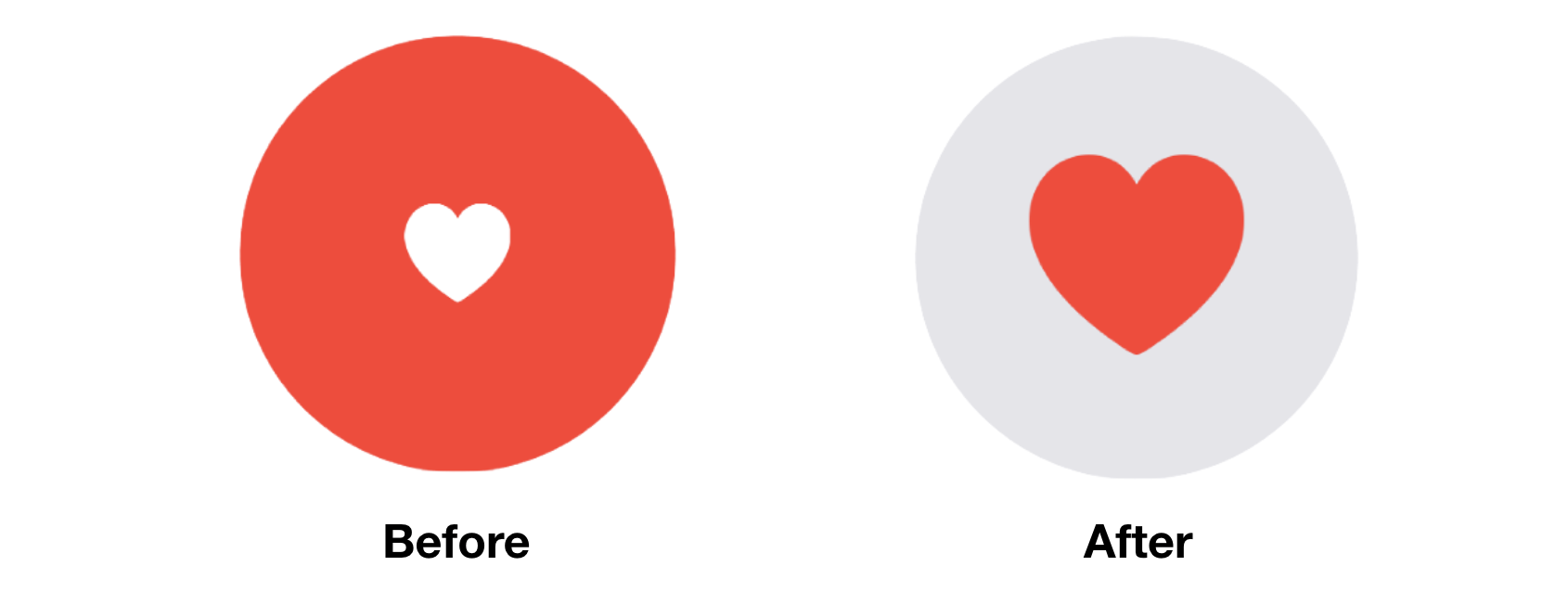
Take a look at figure 1. It's a simple tappable view consisting of a red circle and a heart. When a user taps the heart or circle, the circle's color changes to light gray and the heart's color changes to red. Additionally, the heart icon grows bigger in size. We have various state changes here:
- The color of the circle changes from red to light gray.
- The color of the heart icon changes from white to red.
- The heart icon doubles its original size.
To implement the tappable circle using SwiftUI, add the following code to ContentView.swift:
To access the full content and the complete source code, please get your copy at https://www.appcoda.com/swiftui.