Chapter 35
Working with Tab View and Tab Bar Customization
The tab bar interface appears in some of the most popular mobile apps such as Facebook, Instagram, and Twitter. A tab bar appears at the bottom of an app screen and let users quickly switch between different functions of an app. In UIKit, you use the UITabBarController to create the tab bar interface. The SwiftUI framework provides a UI component called TabView for developers to display tabs in the app.
In this chapter, we will show you how to create a tab bar interface using TabView, handle the tab selection, and customize the appearance of the tab bar.
Using TabView to Create the Tab Bar Interface
Assuming you've created a SwiftUI project using Xcode, let's start with a simple text view like this:
struct ContentView: View {
    var body: some View {
        Text("Home Tab")
            .font(.system(size: 30, weight: .bold, design: .rounded))
    }
}
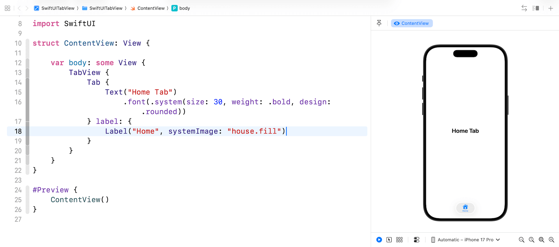
To embed this text view in a tab bar, all you need to do is wrap it with the TabView component and create a Tab item like this:
struct ContentView: View {

    var body: some View {
        TabView {
            Tab {
                Text("Home Tab")
                    .font(.system(size: 30, weight: .bold, design: .rounded))
            } label: {
                Label("Home", systemImage: "house.fill")
            }
        }
    }
}
This creates a tab bar with a single tab item with the name Home. In the sample code, the tab item has both image and text.
To display more tabs, you just need to add child views inside the TabView like this:
To access the full content and the complete source code, please get your copy at https://www.appcoda.com/swiftui.