Chapter 43
Using Gauge to Display Progress and Create a Speedometer

In iOS 16, SwiftUI introduced a new view called Gauge for displaying progress. You can use it to show any values within a range. In this chapter, we will see how to use the Gauge view and work with different gauge styles.

A gauge is a view that shows a current level of a value in relation to a specified finite capacity, very much like a fuel gauge in an automobile. Gauge displays are configurable; they can show any combination of the gauge’s current value, the range the gauge can display, and a label describing the purpose of the gauge itself.

- Apple's official documentation

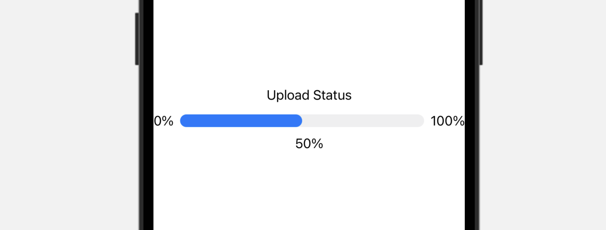
The simplest way to use Gauge is like this:

struct ContentView: View {
    @State private var progress = 0.5

    var body: some View {
        Gauge(value: progress) {
            Text("Upload Status")
        }
    }
}

In the most basic form, a gauge has a default range from 0 to 1. If we set the value parameter to 0.5, SwiftUI renders a progress bar indicating the task is 50% complete.

Figure 1. A basic gauge with descriptive labels

Optionally, you can provide labels for the current, minimum, and maximum values:

Gauge(value: progress) {
    Text("Upload Status")
} currentValueLabel: {
    Text(progress.formatted(.percent))
} minimumValueLabel: {
    Text(0.formatted(.percent))
} maximumValueLabel: {
    Text(100.formatted(.percent))
}

Using Custom Range

The default range is set to 0 and 1. However, you can provide your own custom range. For example, if you are building a speedometer with a maximum speed of 200km/h, you can specify the range in the in parameter as follows:

struct SpeedometerView: View {
    @State private var currentSpeed = 100.0

    var body: some View {
        Gauge(value: currentSpeed, in: 0...200) {
            Text("Speed")
        } currentValueLabel: {
            Text("\(currentSpeed.formatted(.number))km/h")
        } minimumValueLabel: {
            Text(0.formatted(.number))
        } maximumValueLabel: {
            Text(200.formatted(.number))
        }
    }
}

In the code above, we set the range to 0...200. If you have already added the SpeedometerView to the #Preview code block, your preview should show the progress bar filled halfway, as we set the current speed to 100km/h.

Figure 2. A basic gauge with custom range

Using Image Labels

You are not limited to use text labels for displaying ranges and current value. Here is an example:

Gauge(value: currentSpeed, in: 0...200) {
    Image(systemName: "gauge.medium")
        .font(.system(size: 50.0))
} currentValueLabel: {
    HStack {
        Image(systemName: "gauge.high")
        Text("\(currentSpeed.formatted(.number))km/h")
    }
} minimumValueLabel: {
    Text(0.formatted(.number))
} maximumValueLabel: {
    Text(200.formatted(.number))
}

We changed the text label of the gauge to a system image. For the current value label, we created a stack to arrange the image and text. Your preview should display the gauge as shown in Figure 3.

Figure 3. A speedometer view with image labels

Customizing the Gauge Style

Figure 4. Customizing the gauge view's color

The default color of the Gauge view is blue. To customize its color, attach the tint modifier and set the value to your preferred color like this:

To access the full content and the complete source code, please get your copy at https://www.appcoda.com/swiftui.

results matching ""

    No results matching ""