Chapter 3
Working with Images and Labels
Now that you have a basic introduction to SwiftUI and understand how to display textual content, it's time to learn how to display images in your app. In this chapter, we will explore the usage of Label, one of the most common user interface components, as well as the Image view for rendering images on screen. Similar to what we did in the previous chapter, I'll show you how to work with Image by building a simple demo. This chapter covers the following topics:
- What is SF Symbols and how to display a system image
- How to display custom images
- How to resize an image
- How to display a full-screen image using
ignoresSafeArea - How to create a circular image
- How to apply an overlay to an image
Creating a New Project for Playing with Images
To begin, fire up Xcode and create a new project using the App template (under iOS). Name the project SwiftUIImage. For the organization name, you can enter your company or organization name. In this example, com.appcoda is used, but you should set it to your own value. To use SwiftUI, make sure you select SwiftUI for the User Interface option. Click Next and choose a folder to create the project.
After saving the project, Xcode should load the ContentView.swift file and display a design/preview canvas.
Understanding SF Symbols
SF Symbols 7 is a library of over 6,900 symbols designed to integrate seamlessly with San Francisco, the system font for Apple platforms. Symbols come in nine weights and three scales, automatically align with text, and can be exported and edited using vector graphics tools to create custom symbols with shared design characteristics and accessibility features. SF Symbols 7 introduces Draw animations and variable rendering, enhanced Magic Replace, gradients, and hundreds of new symbols.
Before I show you how to display an image on the screen, let's discuss where the images come from. You can provide your own images for use in the app, but starting from iOS 13, Apple introduced a large set of system images called SF Symbols that developers can use in any apps. With the release of iOS 26, Apple further improved the image set by releasing SF Symbols 7, which features over 6,900 symbols and supports a collection of animations.
These icons are known as symbols because they seamlessly integrate with Apple's built-in San Francisco font. One of the key advantages is that no additional installation is required to use these symbols in your app. They're readily accessible on any device running iOS 13 or later.
However, it's important to note that symbol availability varies across iOS versions. While the basic set of symbols works on iOS 13 and up, the most recent additions to SF Symbols are exclusive to iOS and iPadOS 26.0. This means that if you want to use the latest symbols in your app, you'll need to consider your app's minimum supported iOS version and potentially provide fallback options for users on older systems.
By leveraging SF Symbols, you can ensure a consistent and native look for your app's icons across Apple platforms, while also benefiting from their scalability and accessibility features. Just remember to account for version compatibility when incorporating newer symbols into your designs.
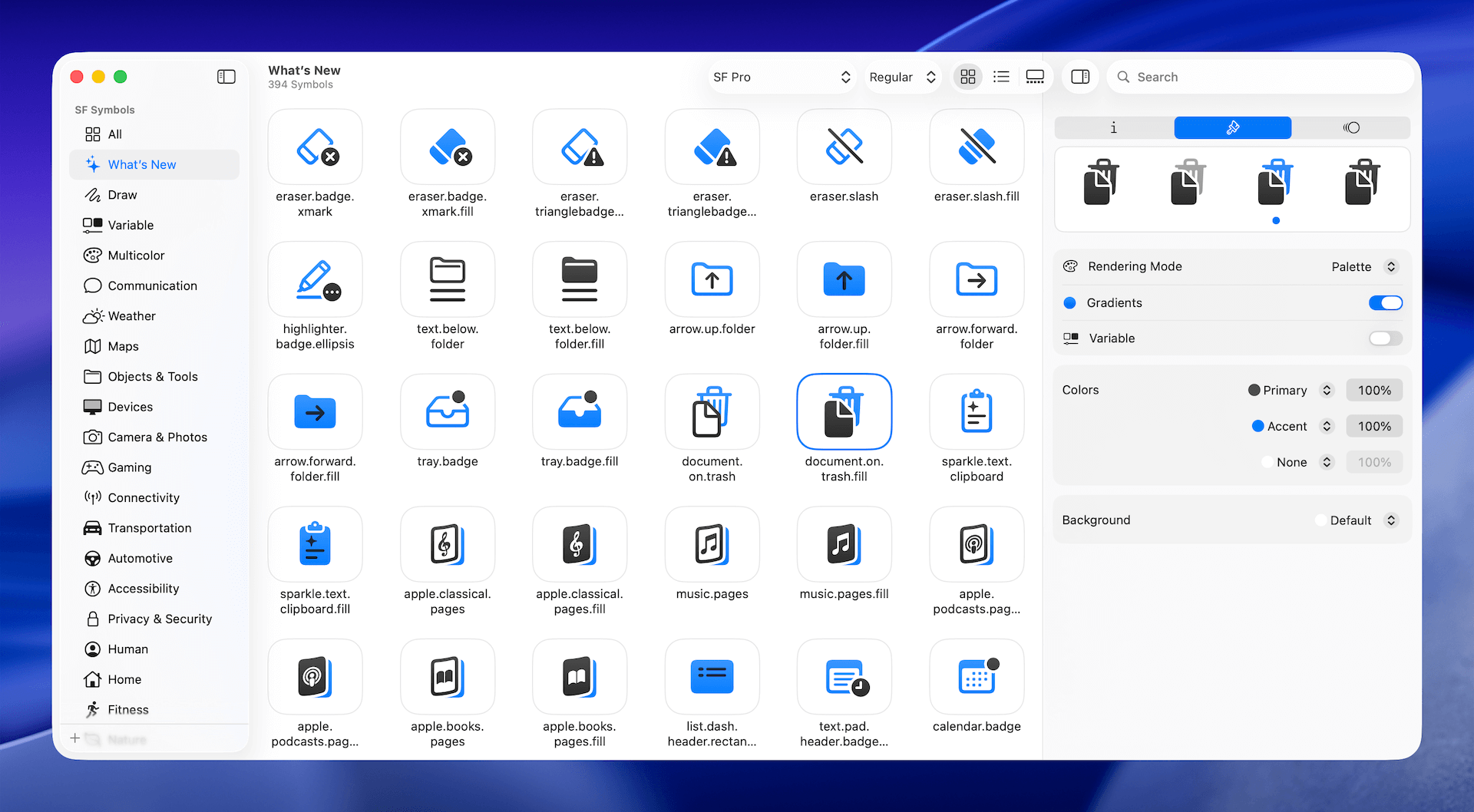
To use the symbols, all you need is the name of the symbol. With over 6,900 symbols available for your use, Apple has released an app called SF Symbols (https://developer.apple.com/sf-symbols/), which allows you to easily explore the symbols and find the one that fits your needs. It is highly recommended that you install the app before proceeding to the next section.
Displaying a System Image
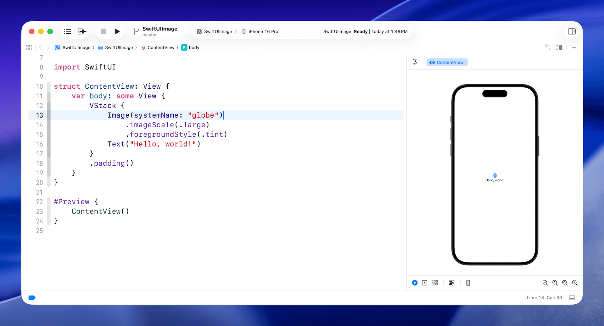
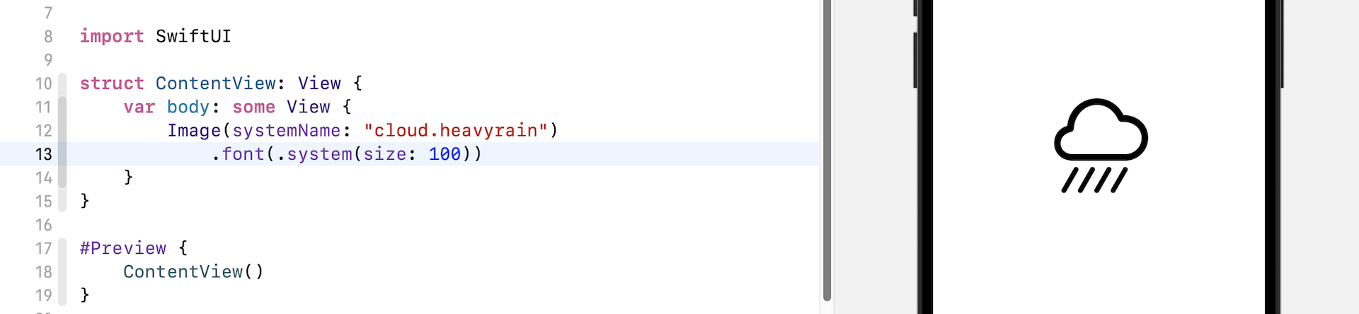
To display a system image (symbol) on screen, you initialize an Image view with the systemName parameter like this:
Image(systemName: "cloud.heavyrain")
This will create an image view and load the specified system image. As mentioned before, SF Symbols are seamlessly integrated with the San Francisco font. You can easily scale the image by applying the font modifier:
Image(systemName: "cloud.heavyrain")
    .font(.system(size: 100))
Given that the image is part of a font family, you can vary the font size using the size parameter, as we did in the previous chapter.
Again, since SF Symbols are actually fonts, you can apply modifiers, such as foregroundStyle, that you learned in the previous chapter, to change their appearance.
For example, if you want to change the symbol's color to blue, you can write the code like this:
Image(systemName: "cloud.heavyrain")
    .font(.system(size: 100))
    .foregroundStyle(.blue)
To add a drop shadow effect, you use the shadow modifier:
Image(systemName: "cloud.heavyrain")
    .font(.system(size: 100))
    .foregroundStyle(.blue)
    .shadow(color: .gray, radius: 10, x: 0, y: 10)
Using Your Own Images
Obviously, other than using system images, you will need to use your own images when building apps. Let's see how you can load your images using the Image view.
Note: You are free to use your own image. However, if you don't have a suitable image to use, you can download this image (https://unsplash.com/photos/Q0-fOL2nqZc) from unsplash.com to follow along with the rest of the material. After downloading the photo, make sure you change the filename to "paris.jpg".
Before you can use an image in your project, you must import the image into the asset catalog (Assets). Assuming you have already prepared the image (paris.jpg), press Command+0 in Xcode to reveal the project navigator, then choose Assets. Open Finder and drag the image to the outline view. Alternatively, you can right-click the blank area of the outline view and select Import....
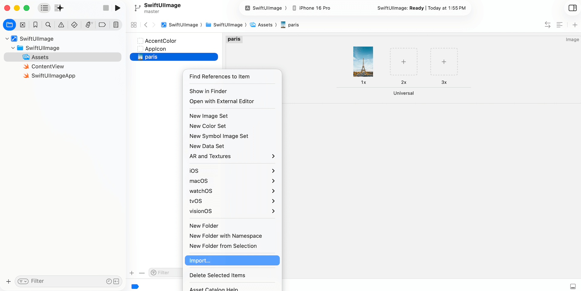
If you're new to iOS app development, the asset catalog is where you store application resources such as images, colors, and data. Once you add an image to the asset catalog, you can load the image by referring to its name. Additionally, you can configure on which device the image can be loaded (e.g., iPhone only).
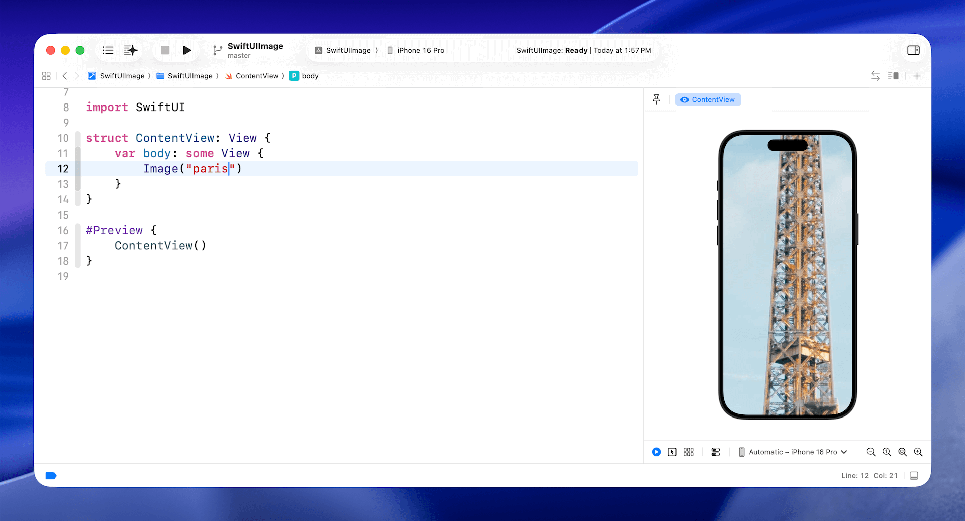
To display the image on the screen, write the code like this (see figure 6):
Image("paris")
All you need to do is specify the name of the image, and you should see the image in the preview canvas. However, since the image is a high-resolution image (4437x6656 pixels), you will only see a part of the image.
Resizing an Image
To resize the image, the resizable modifier is used:
Image("paris")
    .resizable()
By default, the image resizes the image using the stretch mode. This means the original image will be scaled to fill the whole screen (except the top and bottom area).
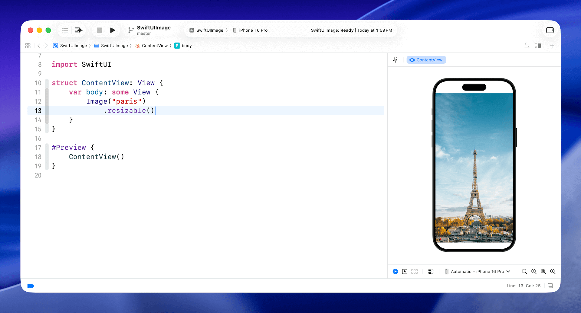
Technically speaking, the image fills the whole safe area as defined by iOS. The concept of the safe area has been around for quite a long time. The safe area is defined as the view area that is safe to lay out UI components. For example, as you can see in the figure, the safe area is the view area that excludes the top bar (i.e., status bar) and the bottom bar. The safe area will prevent you from accidentally hiding system UI components, such as the status bar, navigation bar, and tab bar.
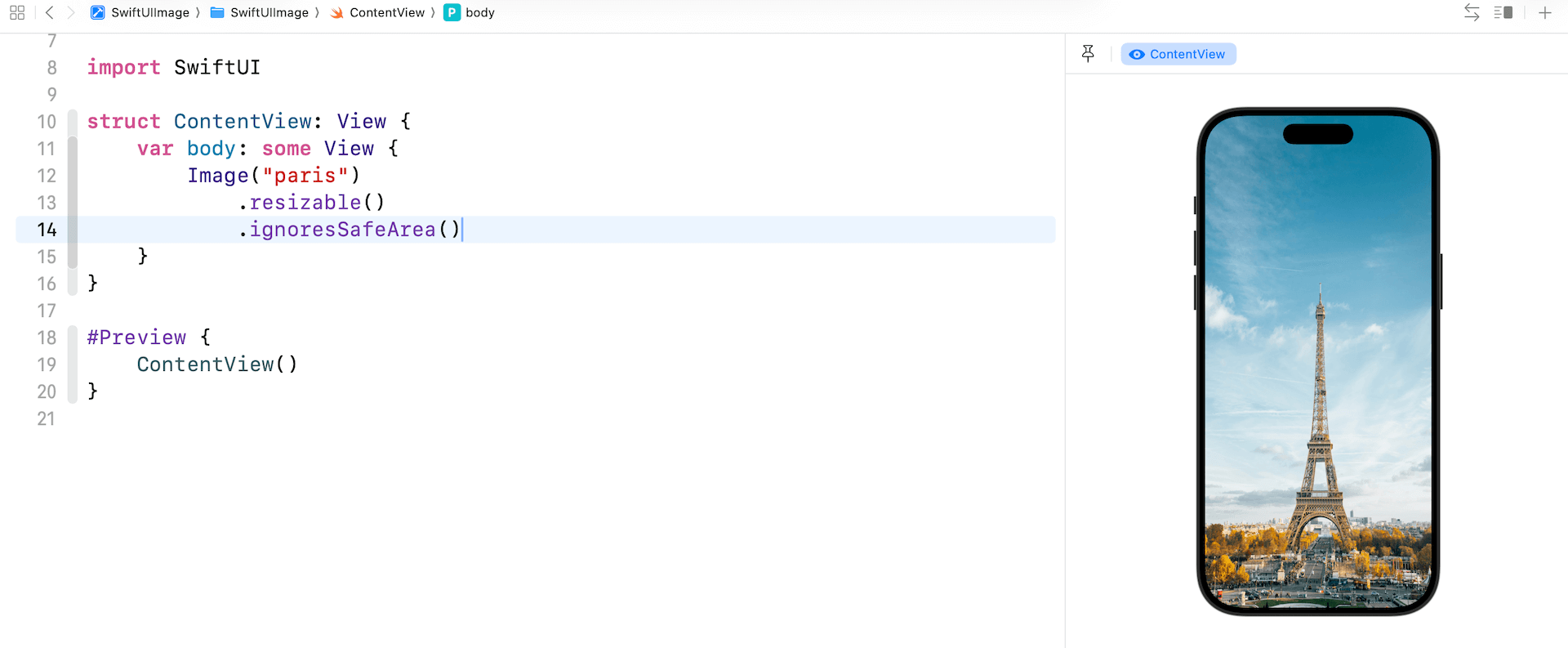
If you want to display a full-screen image, you can ignore the safe area by setting the ignoresSafeArea modifier.
You can also choose to ignore the safe area for a specific edge. To ignore the safe area for the top edge but keep it for the bottom edge, you can specify the parameter .bottom like this:
.ignoresSafeArea(.container, edges: .bottom)
Aspect Fit and Aspect Fill
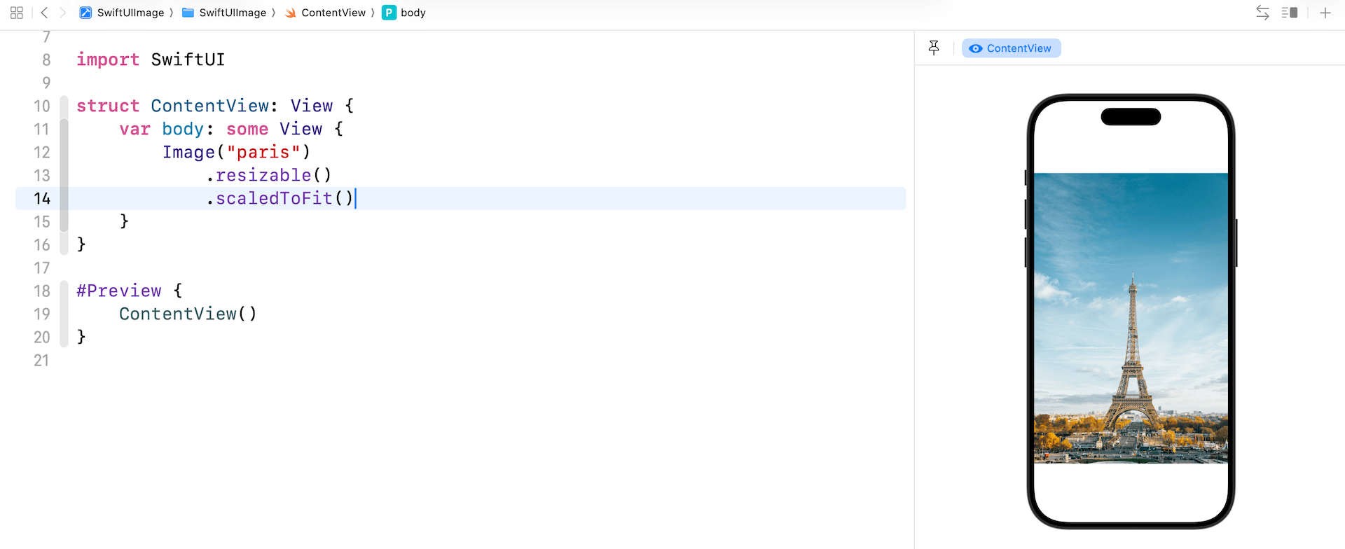
If you look into both images in the previous section and compare it with the original image, you will find that the aspect ratio is a bit distorted. The stretch mode doesn't take into account the aspect ratio of the original image. It stretches each side to fit the view area. To keep the original aspect ratio, you can apply the modifier scaledToFit like this:
Image("paris")
    .resizable()
    .scaledToFit()
Alternatively, you can use the aspectRatio modifier and set the content mode to .fit. This will achieve the same result.
Image("paris")
    .resizable()
    .aspectRatio(contentMode: .fit)
In some cases you may want to keep the aspect ratio of the image but stretch the image to as large as possible, to do this, apply the .fill content mode:
Image("paris")
    .resizable()
    .aspectRatio(contentMode: .fill)
To get a better understanding of the difference between these two modes, Let's limit the size of the image. The frame modifier allows you to control the size of a view. By setting the frame's width to 300 points, the image's width will be limited to 300 points.
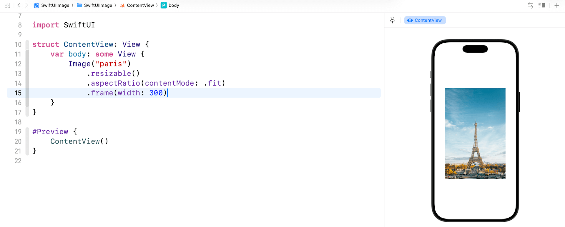
Now replace the Image code with the following:
Image("paris")
    .resizable()
    .aspectRatio(contentMode: .fill)
    .frame(width: 300)
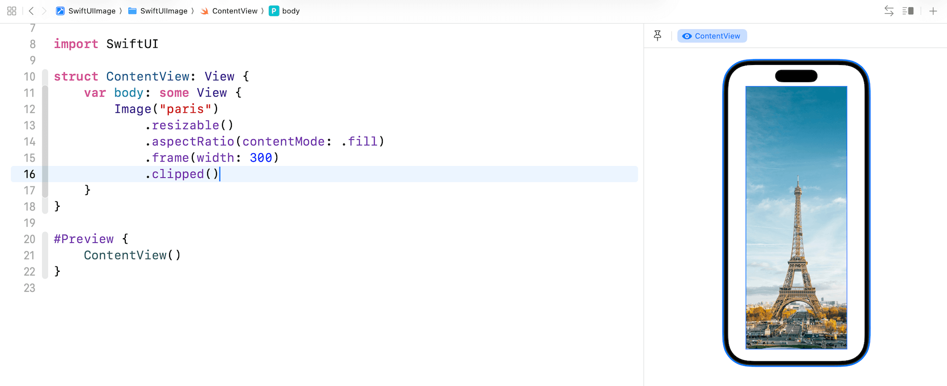
The image will be scaled down in size but the original aspect ratio is kept. If you change the content mode to .fill, the image looks pretty much the same as figure 7. However, if you switch over to the Selectable mode and look at the image carefully, the aspect ratio of the original image is maintained.
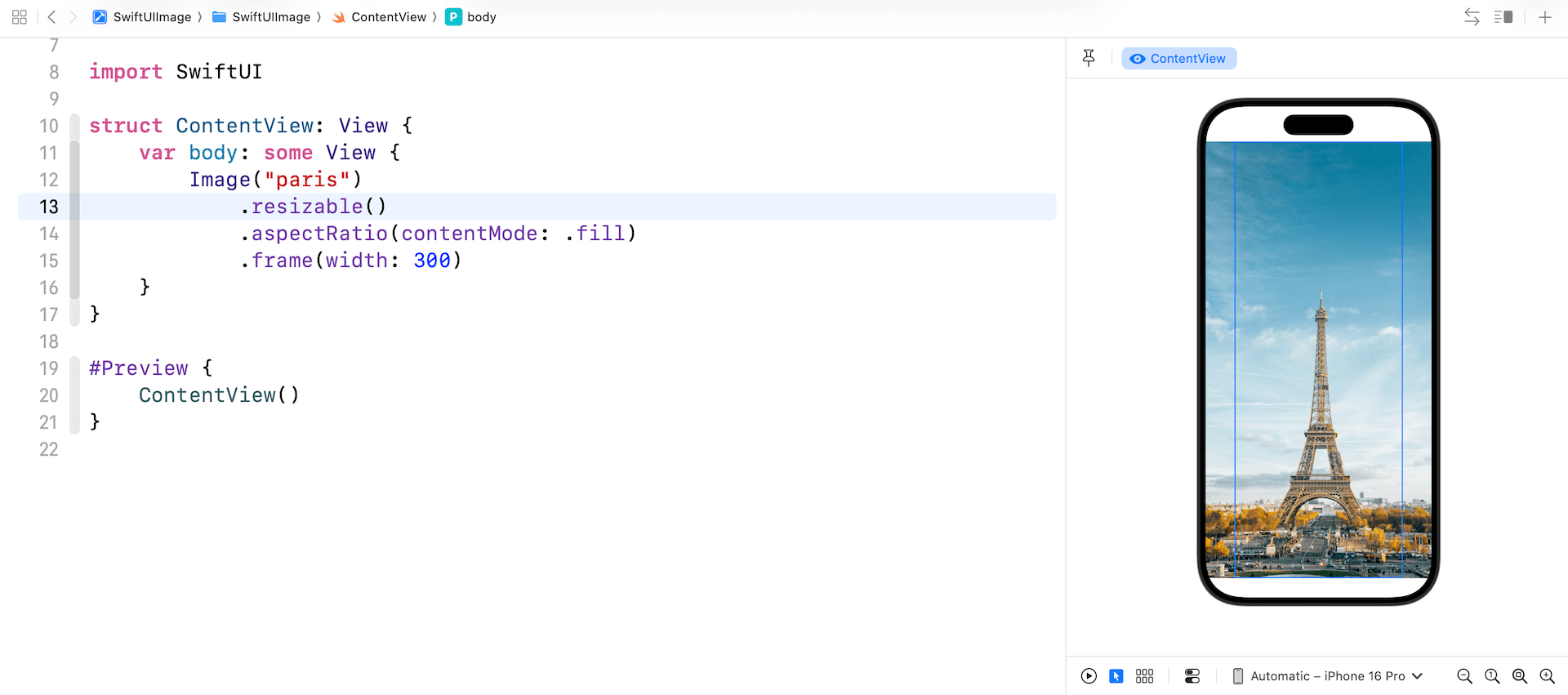
One thing you may notice is that the image's width still takes up the whole screen width. To make it scale correctly, you use the clipped modifier to eliminate extra parts of the view (the left and right edges).
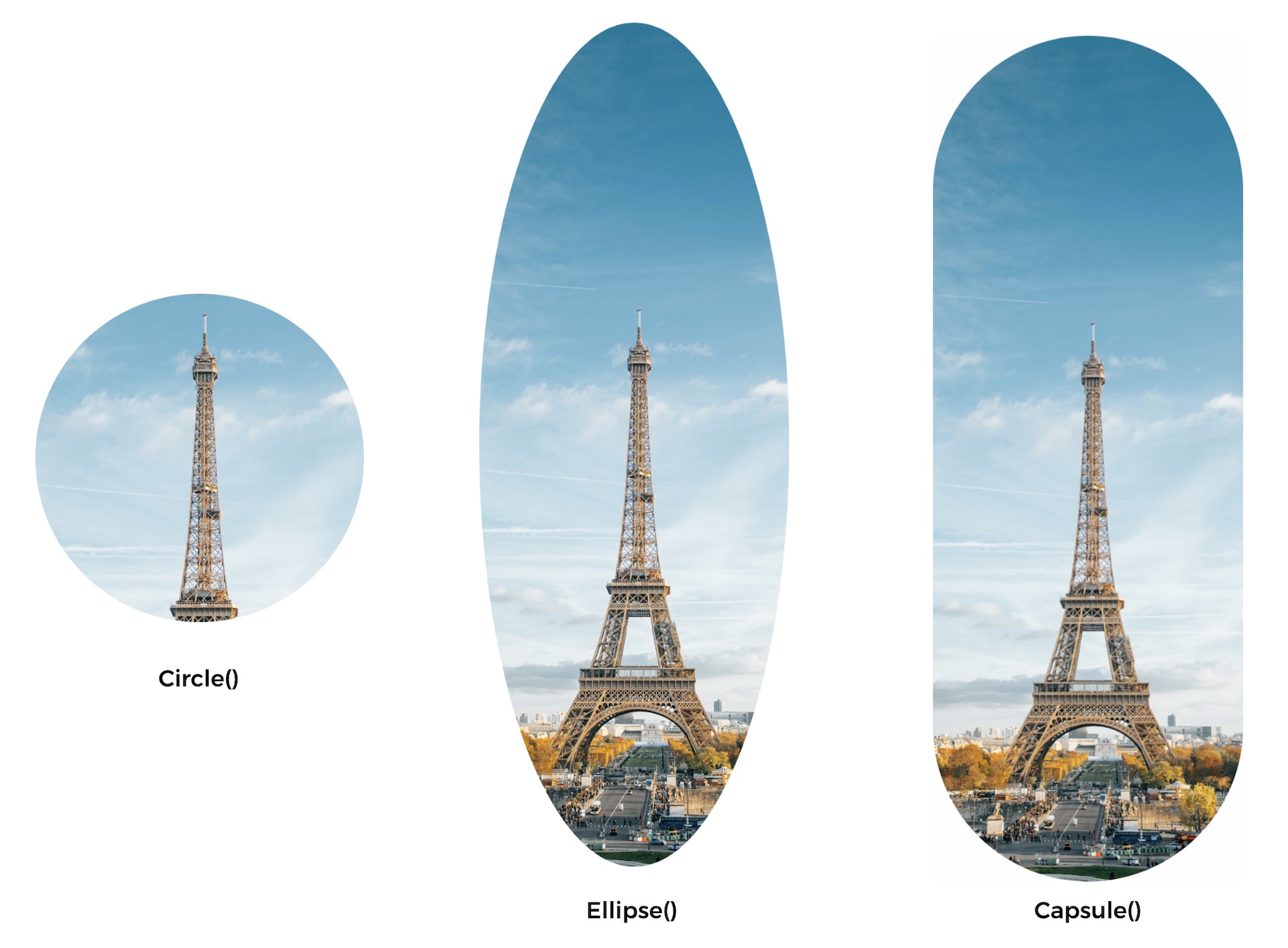
Creating a Circular Image
Apart from clipping the image in a rectangle shape, SwiftUI offers various other modifiers that allow you to clip the image into different shapes such as circle, ellipse, and capsule. To create a circular image, you can use the clipShape modifier in the following way:
Image("paris")
    .resizable()
    .aspectRatio(contentMode: .fill)
    .frame(width: 300)
    .clipShape(Circle())
Alternatively, you can use .circle instead of Circle():
Image("paris")
    .resizable()
    .aspectRatio(contentMode: .fill)
    .frame(width: 300)
    .clipShape(.circle)
Here, we specify to clip the image into a circular shape. You can pass different parameters to create an image with various shapes. Figure 13 shows you some examples.
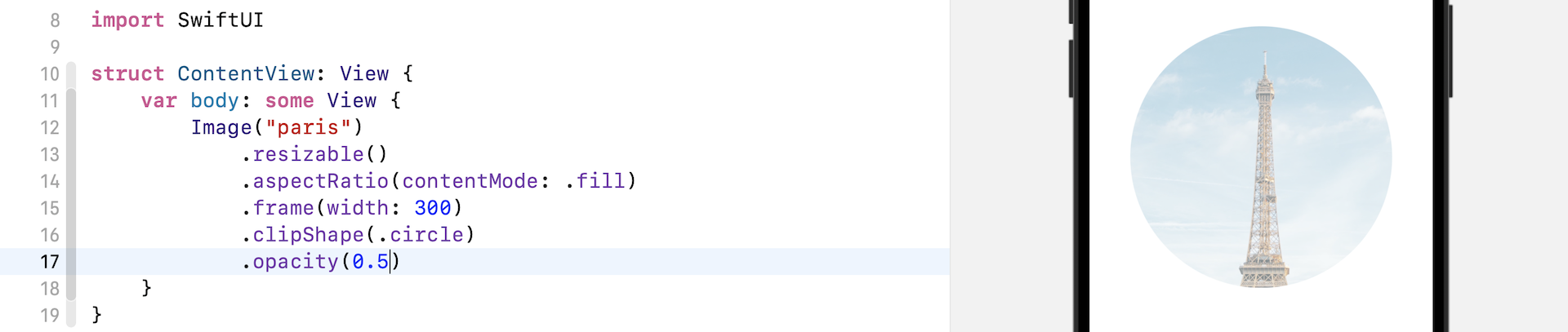
Adjusting the Opacity
SwiftUI comes with a modifier named opacity that you can utilize to control the transparency of an image (or any view). You can pass a value between 0 and 1 to indicate the opacity of the image, where a value of 0 means the view is completely invisible, and a value of 1 indicates the image is fully opaque.
For instance, if you apply the opacity modifier to an image view and set its value to 0.5, the image will appear partially transparent.
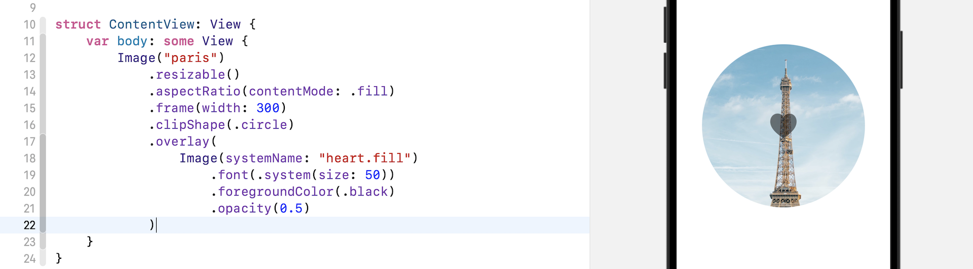
Applying an Overlay to an Image
When designing your app, you may require layering another image or text on top of an image view. To achieve this, SwiftUI offers a modifier called overlay. Developers can use this modifier to apply an overlay to an image. For example, if you want to overlay a system image (i.e., heart.fill) on top of an existing image, you can write the following code:
Image("paris")
    .resizable()
    .aspectRatio(contentMode: .fill)
    .frame(width: 300)
    .clipShape(.circle)
    .overlay(
        Image(systemName: "heart.fill")
            .font(.system(size: 50))
            .foregroundColor(.black)
            .opacity(0.5)
    )
The .overlay modifier takes in a View as parameter. In the code above, we create another image (i.e. heart.fill) and lay it over the existing image (i.e. Paris).
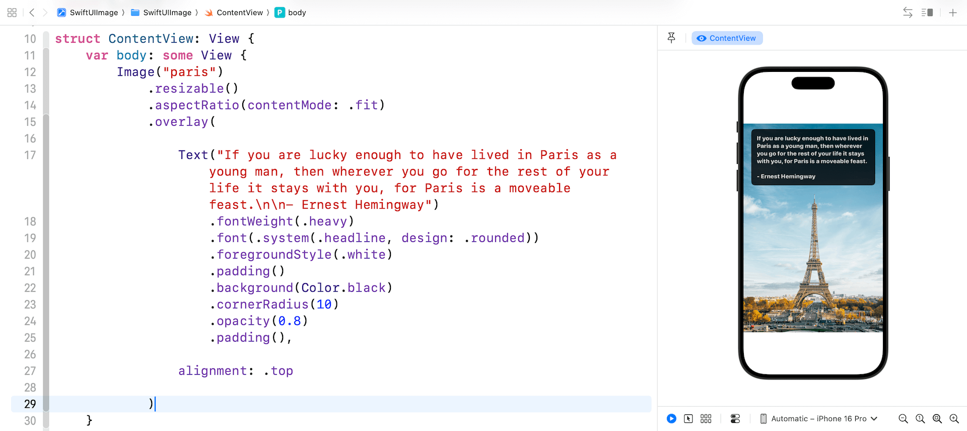
In fact, you can apply any view as an overlay. For example, you can overlay a Text view on the image, like this:
Image("paris")
    .resizable()
    .aspectRatio(contentMode: .fit)
    .overlay(

        Text("If you are lucky enough to have lived in Paris as a young man, then wherever you go for the rest of your life it stays with you, for Paris is a moveable feast.\n\n- Ernest Hemingway")
            .fontWeight(.heavy)
            .font(.system(.headline, design: .rounded))
            .foregroundStyle(.white)
            .padding()
            .background(Color.black)
            .cornerRadius(10)
            .opacity(0.8)
            .padding(),

        alignment: .top

    )
In the overlay modifier, you create a Text view that will be applied as an overlay to the image. As we have discussed in the previous chapter, you should be familiar with the modifiers available for the Text view. To change the text, we can adjust the font and its color. Additionally, we can add some padding and apply a background color.
It's important to note the alignment parameter, which is optional for the overlay modifier. You can use this parameter to adjust the alignment of the view, which is set to center by default. In this case, we want to position the text overlay at the top part of the image. To achieve this, change the value of the alignment parameter from .center to .top. You can see how this works by making this change to the code.
Darken an Image Using Overlay
Not only can you overlay an image or text on another image, you can also apply an overlay to darken an image. To see this effect, replace the existing Image code with the following:
Image("paris")
    .resizable()
    .aspectRatio(contentMode: .fit)
    .overlay(
        Rectangle()
            .foregroundStyle(.black)
            .opacity(0.4)
    )
To apply a darkening effect to an image, we can draw a Rectangle over it and set its foreground color to black. Then we can set the opacity of the Rectangle to 0.4, giving it a 40% opacity. This will cause the image to appear darker.
Alternatively, we can achieve the same effect by rewriting the code in the following way:
Image("paris")
    .resizable()
    .aspectRatio(contentMode: .fit)
    .overlay(
        Color.black
            .opacity(0.4)
    )
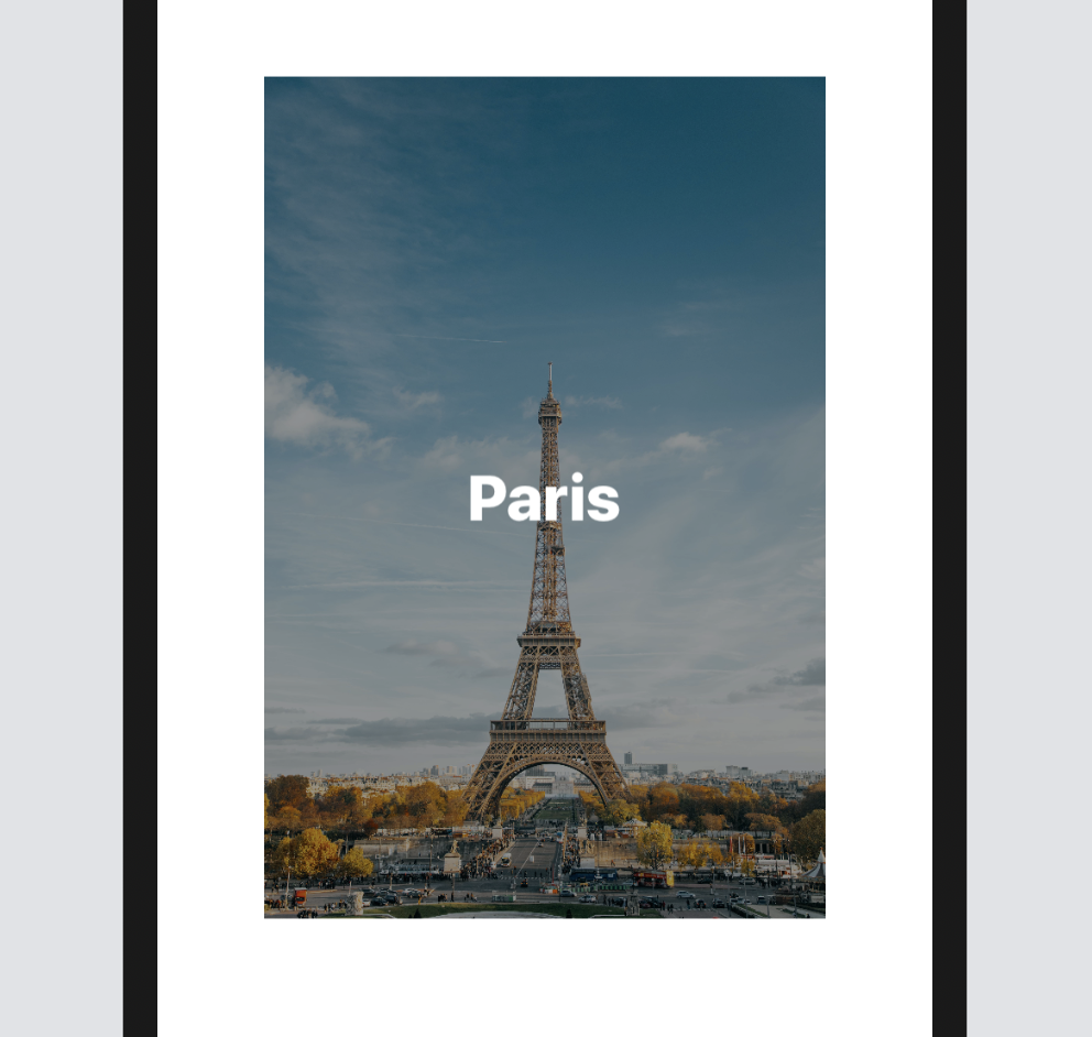
In SwiftUI, Color is also a view, which means we can use it as the top layer to darken the image underneath. This technique is especially useful if you want to overlay light-colored text on a bright image to make the text more legible. To achieve this, replace the existing Image code with the following:
Image("paris")
    .resizable()
    .aspectRatio(contentMode: .fit)
    .frame(width: 300)
    .overlay(
        Color.black
            .opacity(0.4)
            .overlay(
                Text("Paris")
                    .font(.largeTitle)
                    .fontWeight(.black)
                    .foregroundStyle(.white)
                    .frame(width: 200)
            )
    )
As mentioned earlier, the overlay modifier is not limited to Image views, but can be applied to any other view. In the code above, we use Color.black to darken the image and then apply an overlay to place a Text view on top of it. If you have made the change correctly, you should see the word "Paris" in bold white, positioned over the darkened image.
Applying Multicolors to SF Symbols
SF Symbols offers four rendering modes, providing a range of options for applying color to symbol. Depending on the mode you choose, you can apply a single color or multicolours to a symbol. For example, "square.and.arrow.down" is a symbol which supports Palette Rendering. You can apply two or more contrasting colors to the symbol. The figure below shows you how to test palette rendering using the SF Symbols app.
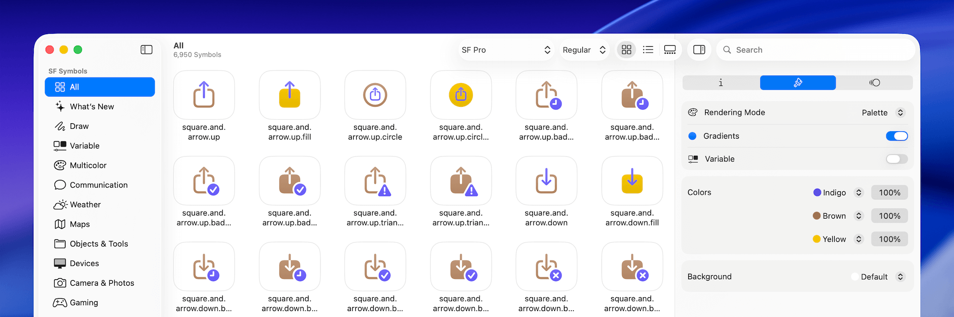
In SwiftUI, you can attach the symbolRenderingMode modifier to change the mode. To create the same symbol with multiple colors, you can write the code like this:
Image(systemName: "square.and.arrow.down")
    .symbolRenderingMode(.palette)
    .foregroundStyle(.indigo, .yellow, .gray)
    .font(.system(size: 200))
We specify in the code to use the palette mode and then apply the colors by using the foregroundStyle modifier.
Variable Colors
SF Symbols also comes with a feature called Variable Color. You can adjust the color of the symbol by changing a percentage value. This is especially useful when you use some of the symbols to indicate a progress.
After you open the SF Symbols application, choose the Variable category and pick one of the symbols. In the inspector, you can click the Variable switch to activate the feature. As you change the percentage value, the symbol reacts and fills certain parts accordingly. For instance, consider the trash.circle symbol: when the percentage value is set to 58%, the ring is partially filled to indicate progress.
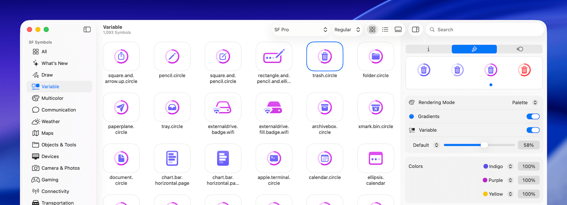
Variable Color is compatible with every available rendering mode in SF Symbols, and you can switch between modes to observe the various effects.
To set the percentage value programmatically, you can instantiate the Image view with an additional variableValue parameter and pass the desired percentage value as follows:
Image(systemName: "slowmo", variableValue: 0.6)
    .symbolRenderingMode(.palette)
    .foregroundStyle(.indigo)
    .font(.largeTitle)
Wrap Up
This chapter has explored the versatile ways of working with images in SwiftUI. We've demonstrated how developers can effortlessly display images and apply a range of modifiers to achieve desired visual effects. One standout feature we've covered is SF Symbols, which proves to be a game-changer, especially for indie developers. This built-in icon system eliminates the need to search for and integrate third-party icons, significantly streamlining the development process.
By leveraging SwiftUI's image capabilities and SF Symbols, you can create visually appealing and consistent interfaces with minimal effort. This not only saves time but also ensures your app aligns with Apple's design language, enhancing the overall user experience. As you continue to build your SwiftUI projects, remember to explore the full potential of these image tools to create polished and professional-looking apps.
To access the sample project, please download it from the following link:
- Demo project (https://www.appcoda.com/resources/swiftui7/SwiftUIImage.zip)
To access the full content and the complete source code, please get your copy at https://www.appcoda.com/swiftui.