Chapter 38
Creating Bar Charts and Line Charts with the Charts Framework
You no longer need to build your own chart library or rely on third-party libraries to create charts. The SwiftUI framework now comes with the Charts APIs. With this Charts framework, available in iOS 16 or later, you can present animated charts with just a few lines of code.
Building a Simple Bar Chart
The Charts framework is very simple to use. In brief, you build SwiftUI Charts by defining what it calls Mark. Here is a quick example:
import SwiftUI
import Charts
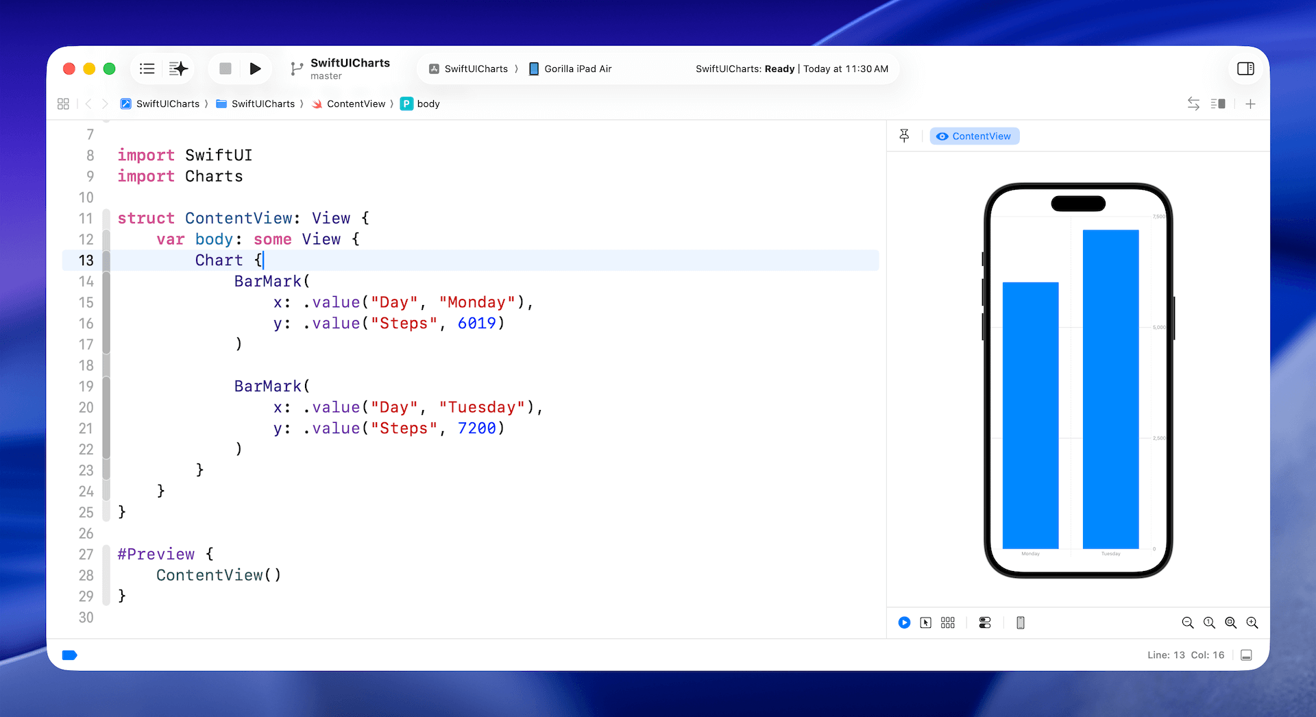
struct ContentView: View {
var body: some View {
Chart {
BarMark(
x: .value("Day", "Monday"),
y: .value("Steps", 6019)
)
BarMark(
x: .value("Day", "Tuesday"),
y: .value("Steps", 7200)
)
}
}
}
Whether you want to create a bar chart or a line chart, you start with the Chart view. In the chart view, we define the bar marks to provide the chart data. The BarMark view is used for creating a bar chart. Each BarMark view accepts the x and y values. The x value is used for defining the chart data for the x-axis. In the code above, the label of the x-axis is set to "Day". The y-axis shows the total number of steps.
If you enter the code in Xcode, the preview automatically displays the bar chart with two vertical bars.
The code above shows you the simplest way to create a bar chart. However, instead of hardcoding the chart data, you usually use the Charts API with a collection of data. Here is an example:
To access the full content and the complete source code, please get your copy at https://www.appcoda.com/swiftui.