Chapter 31
Working with AnimatableModifier and LibraryContentProvider
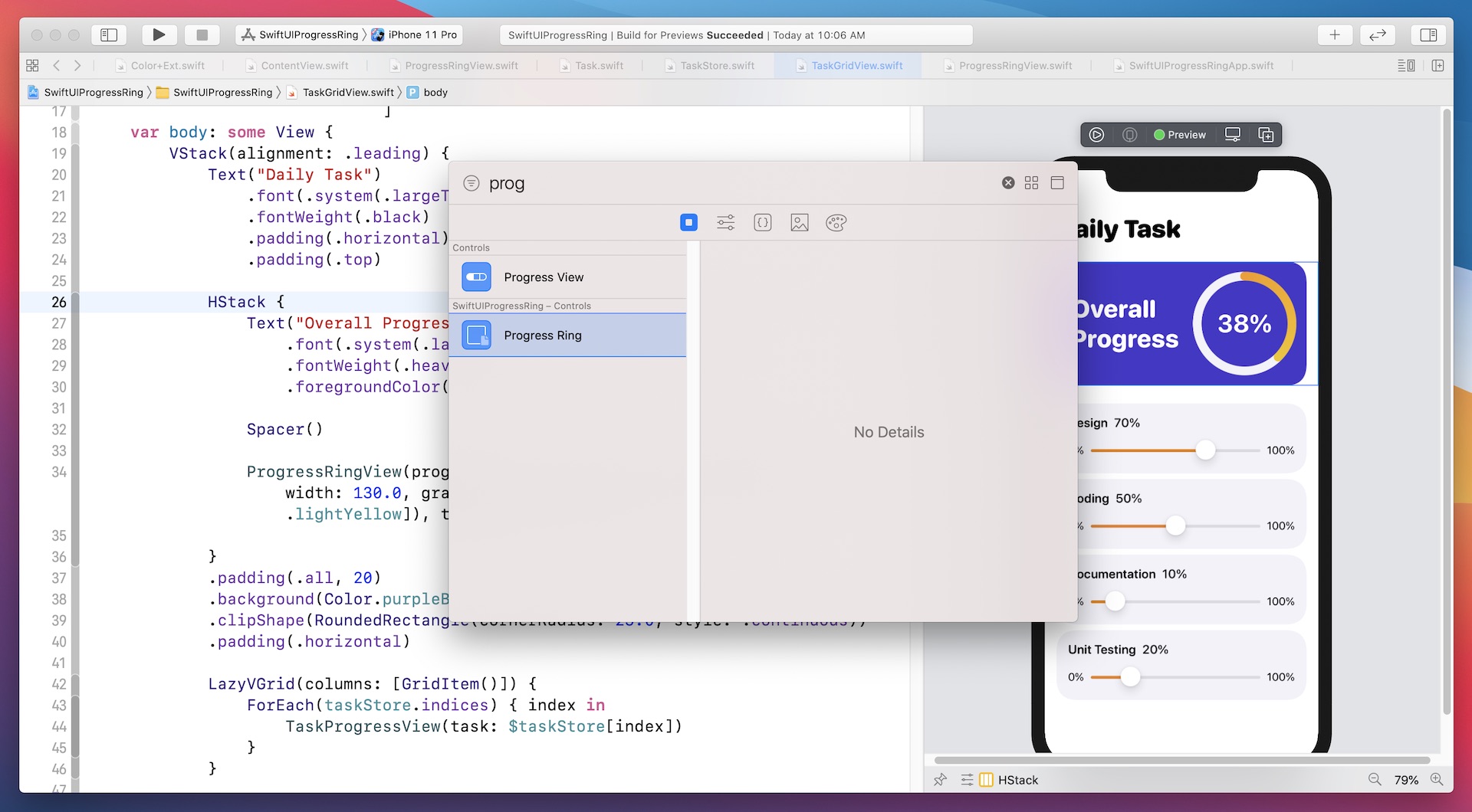
Earlier, you learned how to animate a shape using Animatable and AnimatableData. In this chapter, we will take it a step further and show you how to animate a view using another protocol called AnimatableModifier. Additionally, I will guide you through a new feature of SwiftUI that makes it easier for developers to share custom views in the View library, enhancing reusability. Later, I will demonstrate how to integrate the progress ring view into the View library for seamless reuse. As a sneak peek, you can refer to Figure 1 or watch this demo video (https://link.appcoda.com/librarycontentprovider) to see it in action.
Understanding AnimatableModifier
Let's begin by examining the AnimatableModifier protocol. As the name suggests, AnimatableModifier is a view modifier that conforms to the Animatable protocol. This allows for powerful animation of value changes for various types of views.
To access the full content and the complete source code, please get your copy at https://www.appcoda.com/swiftui.