Chapter 26
Creating an App Store like Animated View Transition

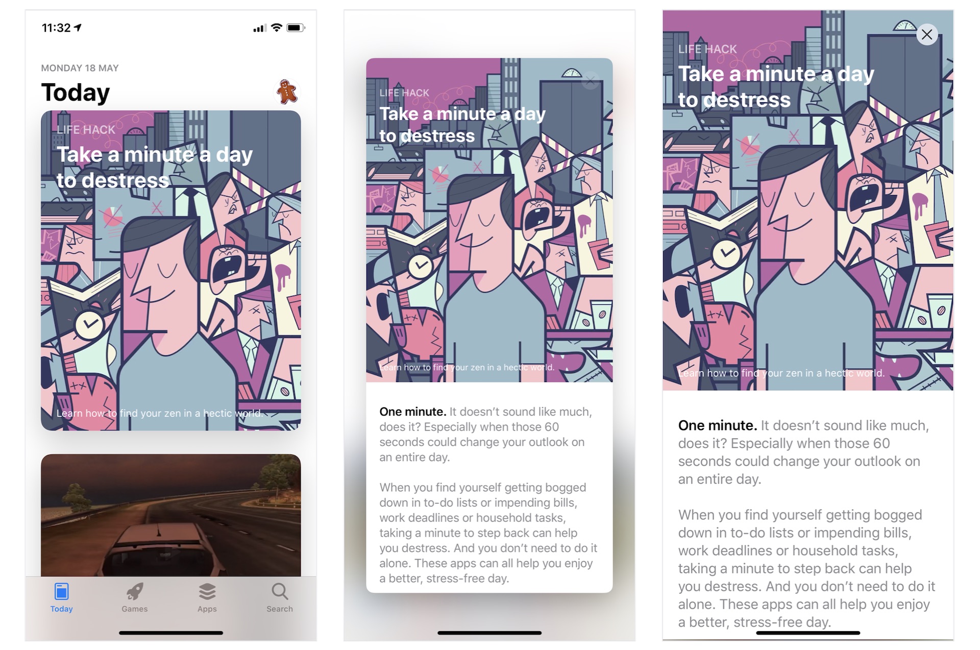
You have likely used Apple's built-in App Store app. In the Today section, it presents users with headlines, various articles, and app recommendations. What interests many of us is the animated view transition. As shown in Figure 1, the articles are listed in a card-like format. When tapped, the card pops out to reveal the full content. To dismiss the article view and return to the list view, simply tap the close button. If you are unsure about what I mean, the best way to understand these views is to open the App Store app on your iPhone and try it out.

Figure 1. Apple's App Store app

In this chapter, we will construct a list view and implement an animated transition using SwiftUI that is similar to the one we discussed earlier. Specifically, you will learn the following techniques:

  • How to use GeometryReader to detect screen sizes
  • How to create a variable-sized card view
  • How to implement an animated view transition similar to the one found in the App Store

Let's get started!

Introducing the Demo App

As usual, we will build a demo app together. The app looks similar to the App Store app, but without the tab bar. It only features a list view that displays all the articles in card format. When a user taps on any of the articles, the card expands to full screen and displays the article details. To return to the list view, the user can either tap the close button or drag down the article view to collapse it.

Figure 2. The demo app

We will build the app from scratch. But to save you time from typing some of the code, I have prepared a starter project [only available in the full version of the book] for you. After downloading the project, unzip it and open SwiftUIAppStore.xcodeproj to take a look.

Figure 3. The starter project

The starter projects comes with the following implementation:

  1. It already bundles the required images in the asset catalog.
  2. The ContentView.swift file is the default SwiftUI view generated by Xcode.
  3. The Article.swift file contains the Article struct, which represents an article in the app. For testing purposes, this file also creates the sampleArticles array which includes some test data. You may modify its content if you want to change the article data.

Understanding the Card View

You have learned how to create a card-like UI before. This card view is similar to the one implemented in chapter 5, but it will be more flexible to support scrollable content. In other words, it has two modes: excerpt and full content. In excerpt mode, it only displays the image, category, headline, and sub-headline of the article. As its name suggests, the full content mode will display the article details as shown in Figure 2.

Figure 4. The sample card views

If you look a bit closer into the card views shown in figure 4, you will find that the size of card views varies according to the height of the image. However, the height of the card will not exceed 500 points.

Figure 5. The components of a card view in excerpt mode

Let's also examine how the card view looks in full content mode. As shown in the figure below, the card view expands to full screen and displays the content. Additionally, the image is slightly larger, and the sub-headline is hidden. Furthermore, the close button appears on the screen for users to dismiss the view. Please note that this is a scrollable view.

Figure 6. The components of a card view in full content mode

To access the full content and the complete source code, please get your copy at https://www.appcoda.com/swiftui.

results matching ""

    No results matching ""