Chapter 6
Working with SwiftUI Buttons, Labels and Gradient

Buttons initiate app-specific actions, have customizable backgrounds, and can include a title or an icon. The system provides a number of predefined button styles for most use cases. You can also design fully custom buttons.

- Apple's documentation (https://developer.apple.com/design/human-interface-guidelines/ios/controls/buttons/)

I don't think I need to explain what a button is. It's a very basic UI control that you can find in all apps and has the ability to handle users' touch, and trigger a certain action. If you have learned iOS programming before, Button in SwiftUI is very similar to UIButton in UIKit. It's just more flexible and customizable. You will understand what I mean in a while. In this chapter, I will go through this SwiftUI control and you will learn the following techniques:

  1. How to create a simple button and handle the user's selection
  2. How to customize the button's background, padding and font
  3. How to add borders to a button
  4. How to create a button with both image and text
  5. How to create a button with a gradient background and shadows
  6. How to create a full-width button
  7. How to create a reusable button style
  8. How to add a tap animation

Creating a New Project with SwiftUI enabled
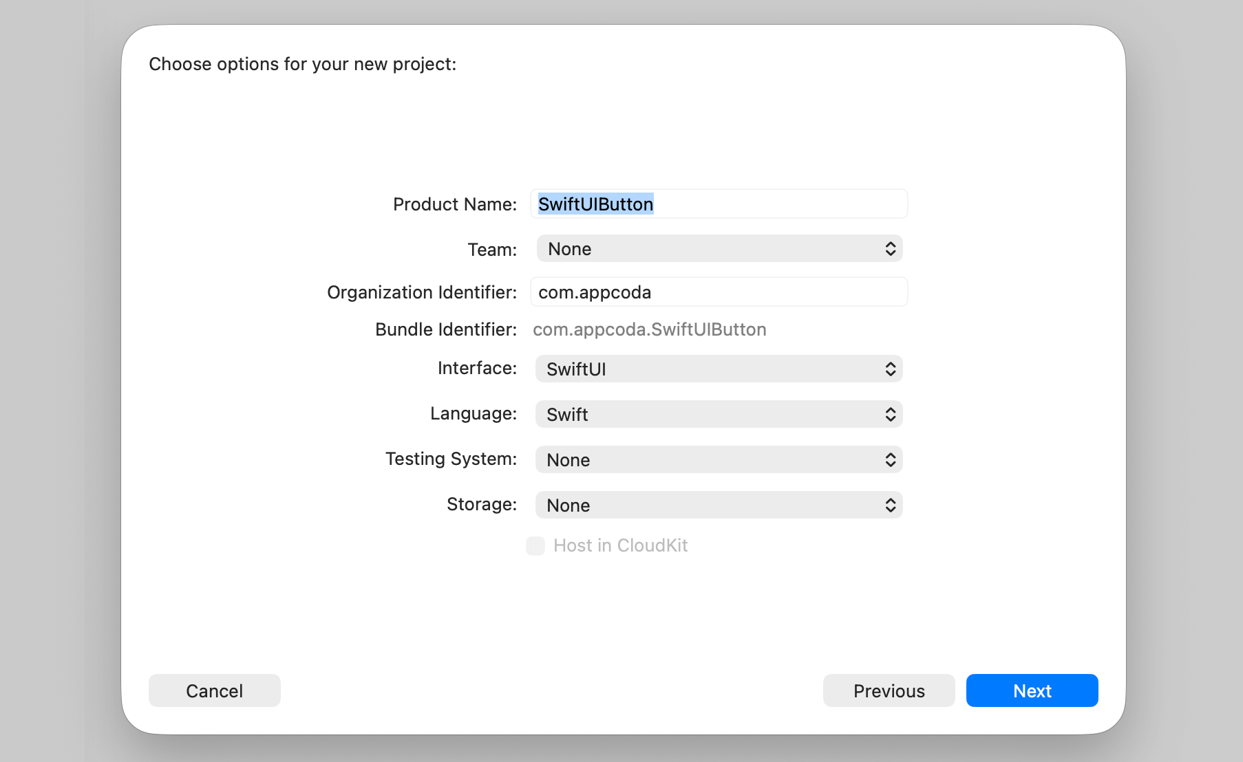
Okay, let's start with the basics and create a simple button using SwiftUI. First, fire up Xcode and create a new project using the App template. In the next screen, type the name of the project. I set it to SwiftUIButton but you're free to use any other name. You need to make sure you select SwiftUI for the Interface option.

Figure 1. Creating a new project

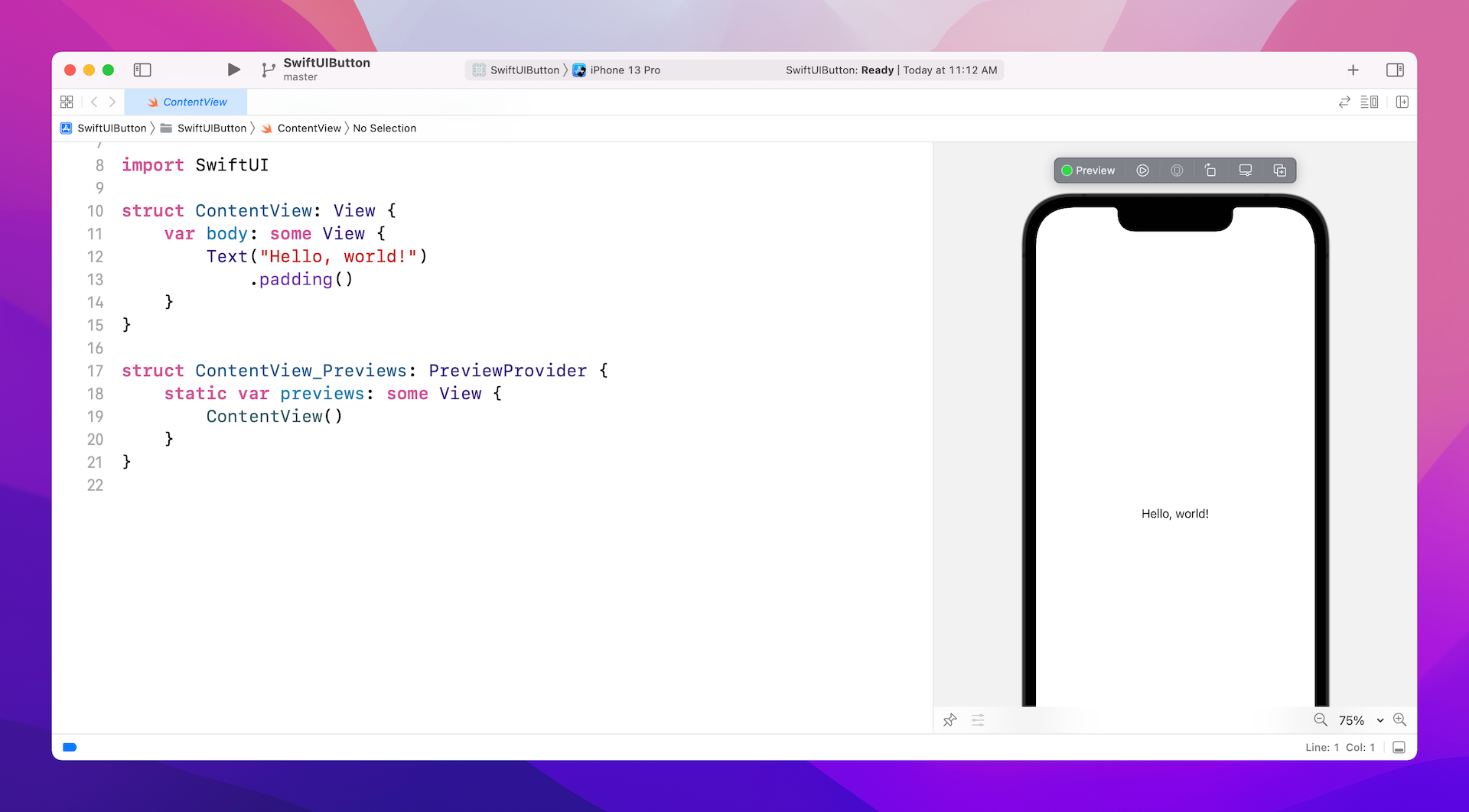
Once you save the project, Xcode should load the ContentView.swift file and display a preview in the design canvas. In case the preview is not displayed, click the Resume button in the canvas.

Figure 2. Previewing the default content view

It's very easy to create a button using SwiftUI. Basically, you use the code snippet below to create a button:

Button(action: {
    // What to perform
}) {
    // How the button looks like
}

When creating a button, you need to provide two code blocks:

  1. What action to perform - the code to perform after the button is tapped or selected by the user.
  2. How the button looks - the code block that describes the look & feel of the button.

For example, if you just want to turn the Hello World label into a button, you can update the code like this:

struct ContentView: View {
    var body: some View {
        Button(action: {
            print("Hello World tapped!")
        }) {
            Text("Hello World")
        }
    }
}

Now the Hello World text becomes a tappable button as you see it in the canvas.

Figure 3. Creating a simple button

The button is non-tappable in the design canvas. To test it, click the Play button to run the app. For Xcode 12 (or lower), you can right-click the Play button and then choose Debug Preview. You will see the Hello World tapped message on the console when you tap the button. If you can't see the console, go up to the Xcode menu and choose View > Debug Area > Activate Console.

Figure 4. The console message can only be displayed in debug mode

For Xcode 13 (or up), it seems Apple has removed the Debug Preview feature. To see the console message, you have to run the app on a simulator.

Customizing the Button's Font and Background

Now that you know how to create a simple button, let's customize its look & feel with the built-in modifiers. To change the background and text color, you can use the background and foregroundColor modifiers like this:

Text("Hello World")
    .background(Color.purple)
    .foregroundColor(.white)

If you want to change the font type, you use the font modifier and specify the font type (e.g. .title) like this:

Text("Hello World")
    .background(Color.purple)
    .foregroundColor(.white)
    .font(.title)

After the change, your button should look like the figure below.

Figure 5. Customizing the background and foreground color of a button

As you can see, the button doesn't look very good. Wouldn't it be great to add some space around the text? To do that, you can use the padding modifier like this:

Text("Hello World")
    .padding()
    .background(Color.purple)
    .foregroundColor(.white)
    .font(.title)

After you make the change, the canvas will update the button accordingly. The button should now look much better.

Figure 6. Adding padding to the button

The Order of Modifiers is Important

One thing I want to highlight is that the padding modifier should be placed before the background modifier. If you write the code as illustrated below, the end result will be different.

Figure 7. Placing the padding modifier after the background modifier

If you place the padding modifier after the background modifier, you can still add some padding to the button but without the preferred background color. If you wonder why, the modifiers like this:

Text("Hello World")
    .background(Color.purple) // 1. Change the background color to purple
    .foregroundColor(.white)  // 2. Set the foreground/font color to white
    .font(.title)             // 3. Change the font type
    .padding()                // 4. Add the paddings with the primary color (i.e. white)

Conversely, the modifiers will work like this if the padding modifier is placed before the background modifier:

Text("Hello World")
    .padding()                // 1. Add the paddings
    .background(Color.purple) // 2. Change the background color to purple including the padding
    .foregroundColor(.white)  // 3. Set the foreground/font color to white
    .font(.title)             // 4. Change the font type

Adding Borders to the Button

This doesn't mean the padding modifier should always be placed at the very beginning. It just depends on your button design. Let's say, you want to create a button with borders like this:

Figure 8. A button with borders

You can change the code of the Text control like below:

Text("Hello World")
    .foregroundColor(.purple)
    .font(.title)
    .padding()
    .border(Color.purple, width: 5)

Here we set the foreground color to purple and then add some empty paddings around the text. The border modifier is used to define the border's width and color. Please alter the value of the width parameter to see how it works.

Let me give you another example. Let's say, a designer shows you the following button design. How are you going to implement it with what you've learned? Before you read the next paragraph, Take a few minutes to figure out the solution.

Figure 9. A button with both background and border

Okay, here is the solution:

Text("Hello World")
    .fontWeight(.bold)
    .font(.title)
    .padding()
    .background(Color.purple)
    .foregroundColor(.white)
    .padding(10)
    .border(Color.purple, width: 5)

We use two padding modifiers to create the button design. The first padding, together with the background modifier, is for creating a button with padding and a purple background. The padding(10) modifier adds extra padding around the button and the border modifier specifies a rounded border in purple.

Let's look at a more complex example. What if you wanted a button with rounded borders like this?

Figure 10. A button with a rounded border

SwiftUI comes with a modifier named cornerRadius that lets you easily create rounded corners. To render the button's background with rounded corners, you simply use the modifier and specify the corner radius:

.cornerRadius(40)

To access the full content and the complete source code, please get your copy at https://www.appcoda.com/swiftui.

results matching ""

    No results matching ""