Chapter 28
Building an Expandable List View Using OutlineGroup

The SwiftUI list is very similar to UITableView in UIKit. In the first release of SwiftUI, Apple's engineers made list view construction a breeze. You do not need to create a prototype cell, and there is no delegate/data source protocol. With just a few lines of code, you can build a list view with custom cells. Starting from iOS 14, Apple continued to improve the List view and introduced several new features. In this chapter, we will show you how to build an expandable list/outline view and explore the inset grouped list style.

The Demo App

First, let's take a look at the final deliverable. I'm a big fan of La Marzocco, so I used the navigation menu on its website as an example. The list view below shows an outline of the menu. Users can tap the disclosure button to expand the list.

Figure 1. The expandable list view

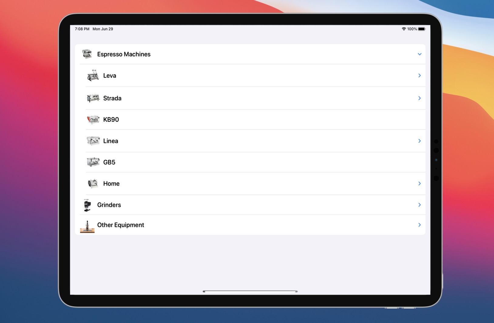
Of course, you can build this outline view using your own implementation. Starting from iOS 14, Apple made it simpler for developers to build this kind of outline view, which automatically works on iOS, iPadOS, and macOS.

Creating the Expandable List

To follow this chapter, please download these image assets from https://www.appcoda.com/resources/swiftui/expandablelist-images.zip. Then, create a new SwiftUI project using the App template. I named the project SwiftUIExpandableList, but you are free to set the name to whatever you want.

Once the project is created, unzip the image archive and add the images to the asset catalog.

In the project navigator, right click SwiftUIExpandableList and choose to create a new file. Select the Swift File template and name it MenuItem.swift.

Setting up the data model

To make the list view expandable, all you need to do is create a data model like this. Insert the following code in the file:

struct MenuItem: Identifiable {
    var id = UUID()
    var name: String
    var image: String
    var subMenuItems: [MenuItem]?
}

In the code above, we have a struct that models a menu item. The key to making a nested list is to include a property that contains an optional array of child menu items (i.e. subMenuItems). Note that the children are of the same type (MenuItem) as their parent.

For the top level menu items, we create an array of MenuItem in the same file like this:

// Main menu items
let sampleMenuItems = [ MenuItem(name: "Espresso Machines", image: "linea-mini", subMenuItems: espressoMachineMenuItems),
                        MenuItem(name: "Grinders", image: "swift-mini", subMenuItems: grinderMenuItems),
                        MenuItem(name: "Other Equipment", image: "espresso-ep", subMenuItems: otherMenuItems)
                    ]

For each of the menu item, we specify the array of the sub-menu items. If there are no sub-menu items, you can omit the subMenuItems parameter or pass it a nil value. We define the sub-menu items like this:

// Sub-menu items for Espressco Machines
let espressoMachineMenuItems = [ MenuItem(name: "Leva", image: "leva-x", subMenuItems: [ MenuItem(name: "Leva X", image: "leva-x"), MenuItem(name: "Leva S", image: "leva-s") ]),
                                 MenuItem(name: "Strada", image: "strada-ep", subMenuItems: [ MenuItem(name: "Strada EP", image: "strada-ep"), MenuItem(name: "Strada AV", image: "strada-av"), MenuItem(name: "Strada MP", image: "strada-mp"), MenuItem(name: "Strada EE", image: "strada-ee") ]),
                                 MenuItem(name: "KB90", image: "kb90"),
                                 MenuItem(name: "Linea", image: "linea-pb-x", subMenuItems: [ MenuItem(name: "Linea PB X", image: "linea-pb-x"), MenuItem(name: "Linea PB", image: "linea-pb"), MenuItem(name: "Linea Classic", image: "linea-classic") ]),
                                 MenuItem(name: "GB5", image: "gb5"),
                                 MenuItem(name: "Home", image: "gs3", subMenuItems: [ MenuItem(name: "GS3", image: "gs3"), MenuItem(name: "Linea Mini", image: "linea-mini") ])
                                ]

// Sub-menu items for Grinder
let grinderMenuItems = [ MenuItem(name: "Swift", image: "swift"),
                         MenuItem(name: "Vulcano", image: "vulcano"),
                         MenuItem(name: "Swift Mini", image: "swift-mini"),
                         MenuItem(name: "Lux D", image: "lux-d")
                        ]

// Sub-menu items for other equipment
let otherMenuItems = [ MenuItem(name: "Espresso AV", image: "espresso-av"),
                         MenuItem(name: "Espresso EP", image: "espresso-ep"),
                         MenuItem(name: "Pour Over", image: "pourover"),
                         MenuItem(name: "Steam", image: "steam")
                        ]

Presenting the List

With the data model prepared, we can now create the list view. The List view has an optional children parameter. If you have any sub items, you can provide their key path. SwiftUI will then look up the sub menu items recursively and present them in outline form. Open ContentView.swift and insert the following code in body:

List(sampleMenuItems, children: \.subMenuItems) { item in
    HStack {
        Image(item.image)
            .resizable()
            .scaledToFit()
            .frame(width: 50, height: 50)

        Text(item.name)
            .font(.system(.title3, design: .rounded))
            .bold()
    }
}

In the closure of the List view, you describe how each row looks. In the code above, we layout an image and a text description using HStack. If you've added the code in ContentView correctly, SwiftUI should render the outline view as shown in figure 2.

Figure 2. The expandable list view

To test the app, run it in a simulator or the preview canvas. You can tap the disclosure indicator to access the submenu.

Using the Plain List Style

Apple sets the default style of the list view to Inset Grouped, where the grouped sections are inset with rounded corners. If you want to switch it back to the plain list style, you can attach the .listStyle modifier to the List view and set its value to .plain like this:

List {
  ...
}
.listStyle(.plain)

If you've followed me, the list view should now change to the plain style.

Figure 3. Using inset grouped list style

Using OutlineGroup to Customize the Expandable List

As you can see in the earlier example, it is quite easy to create an outline view using the List view. However, if you want to have better control over the appearance of the outline view (e.g., adding a section header), you will need to use OutlineGroup. This view is for presenting a hierarchy of data.

If you understand how to build an expandable list view, the usage of OutlineGroup is very similar. For example, the following code allows you to build the same expandable list view as shown in Figure 1:

List {
    OutlineGroup(sampleMenuItems, children: \.subMenuItems) {  item in
        HStack {
            Image(item.image)
                .resizable()
                .scaledToFit()
                .frame(width: 50, height: 50)

            Text(item.name)
                .font(.system(.title3, design: .rounded))
                .bold()
        }
    }
}

Similar to the List view, you just need to pass OutlineGroup the array of items and specify the key path for the sub menu items (or children).

With OutlineGroup, you have better control on the appearance of the outline view. For example, we want to display the top-level menu items as the section header. You can write the code like this:

List {
    ForEach(sampleMenuItems) { menuItem in

        Section(header:
            HStack {

                Text(menuItem.name)
                    .font(.title3)
                    .fontWeight(.heavy)

                Image(menuItem.image)
                    .resizable()
                    .scaledToFit()
                    .frame(width: 30, height: 30)

            }
            .padding(.vertical)

        ) {
            OutlineGroup(menuItem.subMenuItems ?? [MenuItem](), children: \.subMenuItems) {  item in
                HStack {
                    Image(item.image)
                        .resizable()
                        .scaledToFit()
                        .frame(width: 50, height: 50)

                    Text(item.name)
                        .font(.system(.title3, design: .rounded))
                        .bold()
                }
            }
        }
    }
}

In the code above, we use ForEach to loop through the menu items. We present the top-level items as section headers. For the rest of the submenu items, we rely on OutlineGroup to create the hierarchy of data. If you have made the change in ContentView.swift, you should see an outline view like the one shown in Figure 4.

Figure 4. Building the outline view using OutlineGroup

Similarly, if you prefer to use the plain list style, you can attach the listStyle modifier to the List view:

.listStyle(.plain)

Your preview should display an outline view like figure 5.

Figure 5. Applying the inset grouped list style

Understanding DisclosureGroup

In the outline view, you can show/hide the submenu items by tapping the disclosure indicator. Whether you use List or OutlineGroup to implement the expandable list, this "expand & collapse" feature is supported by a new view called DisclosureGroup.

The disclosure group view is designed to show or hide another content view. While DisclosureGroup is automatically embedded in OutlineGroup, you can use this view independently. For example, you can use the following code to show & hide a question and an answer:

DisclosureGroup(
    content: {
        Text("Absolutely! You are allowed to reuse the source code in your own projects (personal/commercial). However, you're not allowed to distribute or sell the source code without prior authorization.")
            .font(.body)
            .fontWeight(.light)
    },
    label: {
        Text("1. Can I reuse the source code?")
            .font(.body)
            .bold()
            .foregroundColor(.black)
    }
)

The disclosure group view takes in two parameters: label and content. In the code above, we specify the question in the label parameter and the answer in the content parameter. Figure 6 shows you the result.

Figure 6. Using DisclosureGroup for showing and hiding content

By default, the disclosure group view is in hidden mode. To reveal the content view, you tap the disclosure indicator to switch the disclosure group view to the "expand" state.

Optionally, you can control the state of DisclosureGroup by passing it a binding which specifies the state of the disclosure indicator (expanded or collapsed) like this:

struct FaqView: View {
    @State var showContent = true

    var body: some View {
        DisclosureGroup(
            isExpanded: $showContent,
            content: {
                ...
            },
            label: {
                ...
            }
        )
        .padding()
    }
}

Exercise

The DisclosureGroup view allows you to have finer control over the state of the disclosure indicator. Your exercise is to create a FAQ screen similar to the one shown in figure 7.

Figure 7. Your exercise

Users can tap the disclosure indicator to show or hide an individual question. Additionally, the app provides a "Show All" button to expand all questions and reveal the answers at once.

Summary

In this chapter, I have introduced a couple of new features of SwiftUI. As you can see in the demo, it is effortless to build an outline view or expandable list view. All you need to do is define a correct data model. The List view handles the rest, traverses the data structure, and renders the outline view. On top of that, the new update provides OutlineGroup and DisclosureGroup for you to further customize the outline view.

To access the full content and the complete source code, please get your copy at https://www.appcoda.com/swiftui.

results matching ""

    No results matching ""